디지털 환경과 스마트 IT기반의 큐레이션을 반영한 "STAMP CURATION PROJECT"
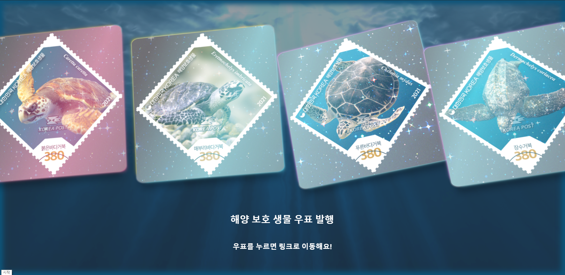
5월 발행 우표
우표를 통해 매력적인 4종 바다거북들을 살펴보며 소중한 해양동물을 기억해주세요!
3D 느낌이 나면서 잠시라도 푸른 빛을 보시는게 좋지 않을까하는 마음으로 제작했습니다🐢
HTML
<main id=app>


  <section class="cards">

    <div class="card turtle1" OnClick="location.href ='https://stamp.epost.go.kr/sp2/sg/spsg0102.jsp?tbsmh15seqnum=3773&tbsmh01seqnum=4801&page_num=1&mainThemeCode=&stampCode=&yearCode=&strKeyword='" style="cursor:pointer;">
    </div>

    <div class="card turtle2"
OnClick="location.href='https://stamp.epost.go.kr/sp2/sg/spsg0102.jsp?tbsmh15seqnum=3774&tbsmh01seqnum=4802&page_num=1&mainThemeCode=&stampCode=&yearCode=&strKeyword='" style="cursor:pointer;">
    </div>

    <div class="card turtle3"
OnClick="location.href='https://stamp.epost.go.kr/sp2/sg/spsg0102.jsp?tbsmh15seqnum=3775&tbsmh01seqnum=4803&page_num=1&mainThemeCode=&stampCode=&yearCode=&strKeyword='" style="cursor:pointer;">
    </div>

    <div class="card turtle4"
OnClick="location.href='https://stamp.epost.go.kr/sp2/sg/spsg0102.jsp?tbsmh15seqnum=3776&tbsmh01seqnum=4804&page_num=1&mainThemeCode=&stampCode=&yearCode=&strKeyword='" style="cursor:pointer;">
    </div>
  </section>


  <h1>해양 보호 생물 우표 발행</h1>
  <h2>우표를 누르면 링크로 이동해요!</h2>

  <style class="hover"></style>

</main>

<svg>
  <defs>
    <filter id="f">
      <feTurbulence id="turbulence" baseFrequency="0.01" numOctaves="2" seed="1"/>
      <feDisplacementMap in="SourceGraphic" scale="16" />
    </filter>
  </defs>
</svg>
CSS
.card {
  --color1: rgb(0, 231, 255);
  --color2: rgb(255, 0, 231);


  width: 500px;
  height: 500px;
  transform: rotate(45deg);
  background-color: #211799;
  background-image: url(http://image.epost.go.kr/stamp/data_img/so/116185378945770.jpg);
  background-size: 100%;
  background-repeat: no-repeat;
  background-position: center;
  border-radius: 5% / 3.5%;
  box-shadow: -13px -13px 13px -15px var(--color1),
    13px 13px 13px -15px var(--color2),
    0 0 4px 2px rgba(255,255,255,0.5),
    0 35px 25px -15px rgba(0, 0, 0, 0.3);
  position: relative;
  overflow: hidden;
  display: block;
  vertical-align: middle;
  margin: 100px 10px;
  animation: holoCard 15s ease infinite;
  transform-origin: center;
  z-index: 10;
  overflow: hidden;
  transform: translate3d(0,0,-1px);
}

.card.turtle1 {
  --color1: rgb(255, 148, 54);
  --color2: rgb(255, 90, 144);
}


.card.turtle2 {
  --color1: #ffdf35;
  --color2: #65f0ff;
  background-image: url(http://image.epost.go.kr/stamp/data_img/so/116185382201460.jpg);
}
.card.turtle3 {
  --color1: #eb8bff;
  --color2: #7eeefa;
  background-image: url(http://image.epost.go.kr/stamp/data_img/so/116185383951350.jpg);
}
.card.turtle4 {
  --color1: #eb8bff;
  --color2: #7eeefa;
  background-image: url(http://image.epost.go.kr/stamp/data_img/so/116185385494860.jpg);
}

.card > span {
  position: relative;
  top: 45%;
}

.card:before,
.card:after {
  content: "";
  opacity: .1;
  mix-blend-mode: screen;
  position: absolute;
  left: 0;
  right: 0;
  bottom: 0;
  top: 0;
  background-repeat: no-repeat;
}
.card:before {
  background-position: 50% 50%;
  background-size: 300% 300%;
  animation: holoGradient 15s ease infinite both;
  background-image: linear-gradient(
    115deg,
    transparent 0%,
    var(--color1) 30%,
    transparent 47.5%,
    transparent 52.5%,
    var(--color2) 70%,
    transparent 100%
  );
}
.card:after {
  opacity: 1;
  background-image: url("https://assets.codepen.io/13471/sparkles.gif");
  background-position: center;
  background-size: 160%;
  z-index: 2;
  animation: holoSparkle 15s ease infinite both;
  filter: brightness(1);
  transition: filter 0.5s ease;
}

.card.active {
  animation: none;
}

.card.active:before {
  opacity: 1;
  animation: none;
  transition: none;
  background-image: linear-gradient(
    115deg,
    transparent 30%,
    var(--color1) 48%,
    var(--color2) 53%,
    transparent 70%
  );
  filter: opacity(0.66);
  mix-blend-mode: screen;
}

.card.active:before,
.card.active:after {
  animation: none;
}
.card.active:after {
  filter: brightness(2.5);
  mix-blend-mode: screen;
}


@keyframes holoSparkle {
  0%, 5%, 100% { opacity: 0.2; background-position: 50% 50%; }
  33% { opacity: 1; background-position: 40% 40%; filter: brightness(2); }
  45% { opacity: 0.4; }
  66% { opacity: 1; background-position: 60% 60%; filter: brightness(2); }
}

@keyframes holoGradient {
  0%, 100% {
    opacity: 0.05;
    background-position: 50% 50%;
  }
  33% {
    background-position: 100% 100%;
    opacity: .66;
  }
  66% {
    background-position: 0% 0%;
    opacity: .66;
  }
}

@keyframes holoCard {
  0%, 100% {
    transform: rotateZ(0deg) rotateX(0deg) rotateY(0deg);
  }
  33% {
    transform: rotateZ(-10deg) rotateX(20deg) rotateY(-12deg);
  }
  66% {
    transform: rotateZ(10deg) rotateX(-20deg) rotateY(12deg);
  }
}


html, body {
  height: 100%;
  background-color: #333844;
  padding: 0;
  z-index: -1;
  transform: translate3d(0,0,0.1px);
  //background-image: url("https://assets.codepen.io/13471/sparkles.gif");
  overflow: hidden;
	background: #000;


body { margin: 0; }

div, img {
	position: absolute;
	top: 0; left: 0;
	-webkit-user-select: none;
}

img {
	-webkit-filter: blur(1px) drop-shadow(0 0 1px #fff);
	filter: blur(1px) drop-shadow(0 0 1px #fff);
	transform: translate(-50%, -50%);
}

}

body {
  color: white;
  background-color: #333844;
  font-family: "Heebo", sans-serif;
  display: flex;
  justify-content: center;
  vertical-align: middle;
  height: 100%;
  text-align: center;
  &:before {
		position: absolute;
		z-index: -1;
		top: -8em; right: -8em; bottom: -8em; left: -8em;
		opacity: .5;
		background: url(https://s3-us-west-2.amazonaws.com/s.cdpn.io/2017/ccc_15.08.21_bg.jpg) 50% 25%/cover;
		-webkit-filter: url(#f);
		filter: url(#f);
		animation: rot 3.2s ease-in-out infinite alternate;
		content: '';
	}

	&:after {
		position: absolute;
		top: 0; right: 0; bottom: 0; left: 0;
		-webkit-box-shadow:
			inset 0 0 1em .5em #0d5378,
			inset 0 0 1.5em .5em #0d5378;
		content: '';
	}


@keyframes rot {
	from { transform: rotate(-1deg); }
	to { transform: rotate(1deg); }
}

body { margin: 0; }

div, img {
	position: absolute;
	top: 0; left: 0;
	-webkit-user-select: none;
}

img {
	-webkit-filter: blur(1px) drop-shadow(0 0 1px #fff);
	filter: blur(1px) drop-shadow(0 0 1px #fff);
	transform: translate(-50%, -50%);
}
}

h1 {
  display: block;
  margin: 30px 0 60px;
}

.container {
  display: flex;
  justify-content: center;
  align-items: center;
  align-content: center;
  flex-wrap: wrap;
  width: 60vw;
  max-width: 1200px;
  margin: 0 auto;
  min-height: 100vh;
}

p {
  margin-top: 5px;
  font-weight: 200;
}
#app {
  position: relative;
}


.demo,
.cards {
  display: flex;
  align-items: center;
  justify-content: center;
  perspective: 2000px;
  position: relative;
  z-index: 1;
  transform: translate3d(0.1px, 0.1px, 0.1px, 0.1px )
}

.cards .card {
  &:nth-child(4) {
    &, &:before, &:after {
      animation-delay: 0.2s;
    }
  }
  &:nth-child(4) {
    &, &:before, &:after {
      animation-delay: 0.4s;
    }
  }
}
Javascript
var $cards = $(".card");
var $style = $(".hover");
$cards.on("mousemove", function(e) {
  var $card = $(this);
  var l = e.offsetX;
  var t = e.offsetY;
  var h = $card.height();
  var w = $card.width();
  var lp = Math.abs(Math.floor(100 / w * l)-100);
  var tp = Math.abs(Math.floor(100 / h * t)-100);
  var lp2 = (50 - (Math.abs(Math.floor(100 / w * l)-100))/10)+5;
  var tp2 = (50 - (Math.abs(Math.floor(100 / h * t)-100))/10)+5;
  var ty = (tp - 50)/2;
  var tx = ((lp - 50) * .5) * -1;
  var bg = `background-position: ${lp}% ${tp}%;`
  var bg2 = `background-position: ${lp2}% ${tp2}%;`
  var tf = `transform: rotateX(${ty}deg) rotateY(${tx}deg)`
  var style = `
    .card.active:before { ${bg} }
    .card.active:after { ${bg2} }
    .card.active { ${tf} }
  `
  $cards.removeClass("active");
  $card.addClass("active");
  $style.html(style);
}).on("mouseout", function() {
  $cards.removeClass("active");
});

/* because me lazy */
Object.getOwnPropertyNames(Math).map(function(p) {
  window[p] = Math[p];
});

var rand = function(min, max, isInt) {
  var max = ((max - 1) || 0) + 1,
      min = min || 0,
      gen = min + (max - min)*random();

  return (isInt)?(~~gen):gen;
};

var σ = function() {
  return (random() < .5)?-1:1;
};

Node.prototype.setAttrs = function(attr_obj) {
  for(var prop in attr_obj) {
    this.setAttribute(prop, attr_obj[prop]);
  }
};

var BF_MIN = .01, NO_MIN = 2,
		BF_MAX = .02, NO_MAX = 8,
		BASE = 'https://s3-us-west-2.amazonaws.com/s.cdpn.io/2017/ccc_15.08.21_sea_creatures_',
		EXT = '.gif',
		PRIMARY = [
			{ 'fix': null, 'dir': -1 },
			{ 'fix': 1, 'dir': null },
			{ 'fix': null, 'dir': 1 },
			{ 'fix': null, 'dir': null },
			{ 'fix': 0, 'dir': -1 },
		],
		N_PRIMARY = PRIMARY.length,

		w, h,
		creatures = [], n = 0,
		fe_t = document.getElementById('turbulence'),
		curr_bf = 1*fe_t.getAttribute('baseFrequency'),
		curr_no = ~~fe_t.getAttribute('numOctaves'),
		bf_step = .0001, no_step = .002, t = 0,
		r_id_bg = null, r_id_fish = null, t = 0;

var Creature = function(x, y) {
	this.idx = rand(N_PRIMARY, 0, 1);
	this.prim = PRIMARY[this.idx];
	this.x = x || rand(w, 0, 1);
	this.y =
		(this.prim.fix === null) ?
		(y || rand(h, 0, 1)) :
		this.prim.fix*h;
	this.el = document.createElement('div');
	this.img = document.createElement('img')
	this.rev = round(random());
	this.dir = pow(-1, this.rev)*((this.prim.dir !== null)?this.prim.dir:σ());
	this.sf = 1*(rand(1, .56).toFixed(2));
	this.hue = rand(360, 0, 1);
	this.v = this.dir*rand(8, 1, 1);
	this.f = 1/rand(120, 60, 1);

	this.init = function() {
		var filter = 'hue-rotate(' + this.hue + 'deg) brightness(.5)';

		this.img.setAttribute('src', BASE + this.idx + EXT);

		this.img.style.transform =
			'translate(-50%, -50%)' +
			'scale(' + pow(-1, this.rev)*this.sf + ',' + this.sf + ')' +
			((this.prim.fix !== null) ?
			'translate(0, ' + pow(-1, this.prim.fix)*50 + '%)' : '');
		this.img.style.webkitFilter = filter;
		this.img.style.filter = filter;

		this.position();

		this.el.appendChild(this.img);

		document.body.appendChild(this.el);
	};

	this.position = function() {
		this.el.style.transform =
			'translate(' + this.x + 'px,' + this.y + 'px)';
	};

	this.move = function() {
		this.x += this.v*(1 + .75*sin(t*2*PI*this.f));

		if(this.x < - w) {
			this.x = 2*w
		}
		if(this.x > 2*w) {
			this.x = -w;
		}

		this.position();
	};

	this.init();
;};

var init = function() {
	size();
};

var size = function() {
	var s = getComputedStyle(document.body);

	w = ~~s.width.split('px')[0];
	h = ~~s.height.split('px')[0];
};

var life = function() {
	for(var i = 0; i < n; i++) {
		creatures[i].move();
	}

	t++;
	r_id_fish = requestAnimationFrame(life);
};

var alterFilter = function() {
		curr_bf += bf_step;
		curr_no += no_step;

		if(curr_bf < BF_MIN || curr_bf > BF_MAX) {
			bf_step *= -1;
		}
		if(curr_no < NO_MIN || curr_no > NO_MAX) {
			no_step *= -1;
		}

		fe_t.setAttrs({
			'baseFrequency': curr_bf.toFixed(4)/*,
			'numOctaves': curr_no.toFixed(3)*/
		});

	r_id_bg = requestAnimationFrame(alterFilter);
};

init();
alterFilter();

addEventListener('resize', size, false);
addEventListener('dblclick', function(e) {
	creatures.push(new Creature(e.clientX, e.clientY));
	n++;
	if(n === 1) { life(); }
}, false);
why?
한국우편사업진흥원에서 운영하고 있는 한국우표포털에는 매월 발행되는 우표를 실시간으로 업로드 하고 있습니다. 우표수집에 취미가 있지 않은 이상 이미 일반인들에게 우표라는 존재는 추억속 물건일뿐 잊혀져 가는 상태죠.
IT기반의 인프라 확산에 따라 잊혀져가는 아날로그에 대한 접근성을 새롭게 바라볼 시각이 필요하다고 생각했습니다. Art&Tech를 다루는 creative coder로서 시각예술 정보를 다룰 수 있는 진보된 역할을 수행해야 하는 시점에 놓이게 된 것이죠.
이 점을 이용해 감성 소비의 욕구가 높아진 요즘 MZ세대 또는 예술 콘텐츠 수요자들을 타겟으로 온라인 환경과 디지털 기기에서 손쉽게 활용할 수 있는 다양한 스마트 미디어 콘텐츠를 생산했습니다.
월별로 발행되는 우표 특성상 웹기반 큐레이션 전시를 특정 기간에만 제공함으로써 스마트폰, PC사용자들이 일시적인 스마트 가이드로서 활용할 수 있도록 했습니다.
나 개발자가 맞을까....?