css flexbox
웹페이지 구성요소를 배치하기 위해, css를 사용함, 기존에는 float/postion 기반 레이아웃 설정을 하였으나, 최근에는 css3의 프로퍼티인 flexbox를 점차적으로 많이 사용하는 편임
1. 수평 정렬 방법과 flexbox (flexible box)
- 뷰포트나 요소 사이즈가 불명확하거나, 동적으로 변할 때에도 요소를 적절히 배치할 수 있는 기능을 제공
- 기존에는 float와 postition 프로퍼티를 기반으로 레이아웃 작업을 했음
- float 와 postion은 엄밀히는 레이아웃을 위한 프로퍼티가 아니어서, 표현이 불가능한 레이아웃이 있기도 하고, 구현이 복잡하였음
- css3에서는 레이아웃을 위해 flexbox 프로퍼티를 제공하였으나, 그 동안 IE가 완벽한 지원을 해주지 않아서 사용하기 어려웠음
flexbox의 이해
Div.item은 디폴트로 display가 block이므로, 수직으로 쌓임
<!DOCTYPE html>
<html lang="en">
<head>
    <meta charset="UTF-8">
    <meta http-equiv="X-UA-Compatible" content="IE=edge">
    <meta name="viewport" content="width=device-width, initial-scale=1.0">
    <title>Document</title>
    <style>
        .container {
            border: 1px solid red;
        }
        .item {
            border: 1px solid blue;
            width: 100px;
            height: 100px;
            border-radius: 10px;
        }
    </style>
</head>
<body>
    <div class="container">
        <div class="item"></div>
        <div class="item"></div>
        <div class="item"></div>
    </div>
</body>
</html>
Div.item 을 수평으로 정렬하려면?
item 클래스에 diplay를 inline-block으로 변경하면 됨 (inline 으로 변경하면 , width/height등을 가질 수 없음)
하지만, 이 경우, div.item 사이에 원치 않은 스페이스 한 칸이 들어가게됨
따라서 다음과 같이 태그 사이에 스페이스/ 탭/ 줄바꿈등이 없도록 임의로 변경해야 함
.item {
            border: 1px solid blue;
            width: 100px;
            height: 100px;
            border-radius: 10px;
            display: inline;
        }
        <div class="item"></div>
        <div class="item"></div>
        <div class="item"></div>
float을 left로 설정하면 수평으로 정렬됨
하지만, 이 경우 부모 태그인 div. container 안에 div.item이 포함되지 않게 됨
이유: 자식 태그에 float가 적용되면, 부모 태그는 자식 태그의 height를 인식하지 못해서, height가 0px가 됨
.item {
            border: 1px solid blue;
            width: 100px;
            height: 100px;
            border-radius: 10px;
            float:left;
        }
clearfix를 사용하는 방법
float 설정 요소 뒤에 나오는 요소에 clear 프로퍼티를 both로 설정하면, 왼쪽/ 오른쪽 둘다 float가 해제되면서, float 설정 요소 다음 라인에 해당 요소가 표시됨
이 경우, 기존의 div.container는 다음 라인에 표시되는 요소 앞까지 흘러내리게 되어(즉 float로 설정된 요소의 높이까지 내려오게 됨) 결과적으로 float로 설정된 요소를 감싸게 됨
단, clear 프로퍼티를 쓰려면 다음에 나오는 요소가 있어야 하므로, 다음에 나오는 요소가 없어도, 사용할 수 있는 가상 요소 셀렉터의 ::after 클래스를 사용함
<style>
      .container {
        border: 1px solid red;
      }
      .item {
        border: 1px solid blue;
        width: 100px;
        height: 100px;
        border-radius: 10px;
        display: inline;
      }
      .claerfix::after {
        content: '';
        clear: both;
        display: block;
      }
</style>

<div class="container clearfix">
      <div class="item"></div>
      <div class="item"></div>
      <div class="item"></div>
    </div>
ie9 이하까지 지원하기 위해서는 float를 사용하므로 참고용임
-
flexbox 이용방법
부모요소에 display를 flex라고 선언해주면 끝
<!DOCTYPE html>
<html lang="en">
  <head>
    <meta charset="UTF-8" />
    <meta http-equiv="X-UA-Compatible" content="IE=edge" />
    <meta name="viewport" content="width=device-width, initial-scale=1.0" />
    <title>Document</title>
    <style>
      .container {
        border: 1px solid red;
        display: flex;
      }
      .item {
        border: 1px solid blue;
        width: 100px;
        height: 100px;
        border-radius: 10px;
      }
    </style>
  </head>
  <body>
    <div class="container">
      <div class="item"></div>
      <div class="item"></div>
      <div class="item"></div>
    </div>
  </body>
</html>
2. Flex box container 관련 프로퍼티
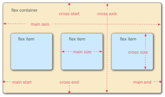
flexbox는 상위 부모요소인 flex container와 하위 자식 요소인 flex item들로 구성
즉 flex item이 수평 정렬할 요소들이라면 해당 요소를 감싸고 있는 부모 요소로 flex container가 필수적
2-1 flex container 관련 프로퍼티 요약
flex container 와 flex item에 적용할 수 있는 프로퍼티가 분리되어 있음
| 프로퍼티 | 의미 |
|---|---|
| display | flex container 정의 |
| flex-direction | flex item 들의 주 축 방향설정 |
| Flex-wrap | flex item 들을 1행 또는 복수의 행으로 배치하는 설정 |
| flex-flow | flex-direction 과 flex-wrap을 한 번에 설정할 수 있는 단축 프로퍼티 |
| Justify-content | 주 축 기반 정렬 방법 설정 |
| align-content | 교차 축 기반 정렬방법 설정(2행 이상) |
| align-items | 교착 축(cross-axis) 기반 정렬 방법 설정(각 행 마다 적용) |
2-2 display
- Flex: block 특성 flex container 정의(flex container 간에 수직 정렬)
- Inline-flex: inline 특성의 flex container정의(flex container 간에 수평 정렬)
부모 요소에 display를 위와 같이 설정하면 자동으로 자식 요소들은 flex item이 됨
<!DOCTYPE html>
<html lang="en">
  <head>
    <meta charset="UTF-8" />
    <meta http-equiv="X-UA-Compatible" content="IE=edge" />
    <meta name="viewport" content="width=device-width, initial-scale=1.0" />
    <title>Document</title>
    <style>
      .container {
        border: 2px solid #f2e3d5;
        background-color: #f20505;
        display: inline-flex;
        width: 200px;
      }
      .item {
        border: 2px solid blue;
        width: 50px;
        margin: 5px;
        height: 50px;
        border-radius: 10px;
      }
    </style>
  </head>
  <body>
    <div class="container">
      <div class="item"></div>
      <div class="item"></div>
      <div class="item"></div>
    </div>
    <div class="container">
      <div class="item"></div>
      <div class="item"></div>
      <div class="item"></div>
    </div>
  </body>
</html>
2-3 flex-direction 정렬 방법 설정
flex-direction 프로퍼티 값
- row: 좌에서 우로 수평정렬
- row-reverse: 우에서 좌로 수평 정렬
- column: 위에서 아래로 수직 정렬
- Column-reverse: 아래에서 위로 수직정렬
팁: div 박스 내의 텍스트의 가운데 정렬
- 수평 가운데 정령: text-align:center;
- 수직 가운데 정렬:line-height:height에서 설정한 높이 값을 동일하게 써줌
<!DOCTYPE html>
<html lang="en">
  <head>
    <meta charset="UTF-8" />
    <meta http-equiv="X-UA-Compatible" content="IE=edge" />
    <meta name="viewport" content="width=device-width, initial-scale=1.0" />
    <title>Document</title>
    <style>
      .container {
        border: 2px solid #f2e3d5;
        background-color: #f20505;
        display: inline-flex;
        width: 200px;
        flex-direction: row-reverse;
      }
      .item {
        border: 2px solid blue;
        width: 50px;
        margin: 5px;
        height: 50px;
        border-radius: 10px;
        text-align: center;
        line-height: 50px;
        color: white;
      }
    </style>
  </head>
  <body>
    <div class="container">
      <div class="item"></div>
      <div class="item"></div>
      <div class="item"></div>
    </div>
    <div class="container">
      <div class="item"></div>
      <div class="item"></div>
      <div class="item"></div>
    </div>
  </body>
</html>
2-4 flex-wrap
Flex item 들을 1행 또는 복수의 행으로 배치하는 설정
주요 프로퍼티 값
- nowrap: flex item 들을 개행하지 않고, 한 행에 배치(디폴트)
- flex item 들의 너비 합이 flex container 너비보다 큰 경우 flex item들이 넘쳐서 flex container 밖에서 표시 될 수 있기에 flex container에 overflow:auto 설정을 넣어주면 넘치지 않고 flex container안에 스크롤이 생김
- wrap: flex item 들의 너비 합이 flex container 너비 보다 큰 경우, 복수의 행에 표시
- wrap-reverse: flex item 들의 너비 합이 flex container 너비 보다 큰 경우, wrap 과 동일하게 복수의 행에 표시 되지만, 순서가 역방향으로 표시 됨
<!DOCTYPE html>
<html lang="en">
  <head>
    <meta charset="UTF-8" />
    <meta http-equiv="X-UA-Compatible" content="IE=edge" />
    <meta name="viewport" content="width=device-width, initial-scale=1.0" />
    <title>Document</title>
    <style>
      .container {
        border: 2px solid #f2e3d5;
        background-color: #f20505;
        display: flex;
        width: 400px;
        overflow: auto;
      }
      .item {
        border: 2px solid blue;
        width: 50px;
        margin: 10px;
        height: 50px;
        border-radius: 10px;
        text-align: center;
        line-height: 50px;
        color: white;
      }
    </style>
  </head>
  <body>
    <div class="container">
      <div class="item">1</div>
      <div class="item">2</div>
      <div class="item">3</div>
      <div class="item">4</div>
      <div class="item">5</div>
    </div>
    <\
  </body>
</html>
2-5 flex-flow
flex-direction 과 flex-wrap 프로퍼티를 한번에 쓸 수 있는 단축 프로퍼티
flex-flow: flex-direction flex-wrap2-6 justify-content
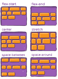
주 축(main-axis)기반 수평 정렬 방법 설정
<!DOCTYPE html>
<html lang="en">
  <head>
    <meta charset="UTF-8" />
    <meta http-equiv="X-UA-Compatible" content="IE=edge" />
    <meta name="viewport" content="width=device-width, initial-scale=1.0" />
    <title>Document</title>
    <style>
      .container {
        border: 2px solid #f2e3d5;
        background-color: #f20505;
        display: flex;
        width: 400px;
      }
      .item {
        border: 2px solid blue;
        width: 50px;
        margin: 10px;
        padding: 20px;
        height: 50px;
        border-radius: 10px;
        text-align: center;
        line-height: 50px;
        color: white;
      }
    </style>
  </head>
  <body>
    <div class="container">
      <div class="item">1</div>
      <div class="item">2</div>
      <div class="item">3</div>
    </div>
    <\
  </body>
</html>
2-7 align-items 과 align-content
- align-items: 교차 축 기반 정렬 방법을 설정(각 행 마다 적용)
- align-content: 교차 축 기반 정렬 방법을 설정(복수의 행을 하나의 그룹처럼 적용)
<!DOCTYPE html>
<html lang="ko">
  <head>
    <meta charset="UTF-8" />
  <style>
    .container {
      margin: 0 auto;
      width: 400px;
      height: 500px;
      border: 2px solid #F2E3D5;
      background-color: #F20505;
      display: flex;
      justify-content: space-around;
      flex-wrap: wrap;
    }
    .item {
      border: 2px solid #F2E3D5;
      margin: 10px;
      padding: 20px;
      text-align: center;
      line-height: 50px;
      background-color: #03658C;
      border-radius: 10px;
      color: white;
    }
    .item1 {
      height: 100px;
    }
    .item2 {
      height: 150px;
    }
    .item3 {
      height: 200px;
    }
    .item4 {
      height: 50px;
    }
    .item5 {
      height: 100px;
    }
    .itemfont {
      font-size: 3em;
    }

  </style>
</head>
<body>
  <div class="container">
    <div class="item item1">item1</div>
    <div class="item item2">item2</div>
    <div class="item item3">item3</div>
    <div class="item item4">item4</div>
    <div class="item item5">item5</div>
  </div>
</body>
</html>
<!DOCTYPE html>
<html lang="ko">
<head>
<meta charset="UTF-8" />
<style>
.container {
margin: 0 auto;
width: 400px;
height: 500px;
border: 2px solid #F2E3D5;
background-color: #F20505;
display: flex;
justify-content: space-around;
flex-wrap: wrap-reverse;
align-items: flex-start;
}
.item {
border: 2px solid #F2E3D5;
margin: 10px;
padding: 20px;
text-align: center;
background-color: #03658C;
border-radius: 10px;
color: white;
}
.item1 {
height: 100px;
}
.item2 {
height: 150px;
}
.item3 {
height: 200px;
}
.item4 {
height: 50px;
}
.item5 {
height: 100px;
}
.itemfont {
font-size: 3em;
}
</style>
</head>
<body>
<div class="container">
<div class="item item1">item1</div>
<div class="item item2">item2</div>
<div class="item item3">item3</div>
<div class="item item4">item4</div>
<div class="item item5">item5</div>
</div>
</body>
</html>3. flexbox item 관련 프로퍼티
| 프로퍼티 | 의미 |
|---|---|
| order | flex item 배치 순서 설정 |
| flex-grow | flex item 너비 증가 비율 설정 |
| flex-shrink | flex item 너비 축소 비율 설정 |
| flex-basis | flex item 기본 너비 설정(공간 분배 전) |
| flex | flex-grow, flex-shrink, flex-basis를 한번에 설정할 수 있는 프로퍼티 |
| align-self | flex container의 align-items/align-content보다 우선해서 개별 flex item 수직 정렬 방법 설정 |
3-2 order
flex item 배치 순서 절정으로 디플트 값은 0 임의로 정한 정수값을 설정할 수 있으며 order값이 낮은 순서대로 배치 됨
<!DOCTYPE html>
<html lang="ko">
  <head>
    <meta charset="UTF-8" />
  <style>
    .container {
      margin: 0 auto;
      width: 400px;
      height: 500px;
      border: 2px solid #F2E3D5;
      background-color: #F20505;
      display: flex;
      justify-content: space-around;
      flex-wrap: wrap;
    }
    .item {
      border: 2px solid #F2E3D5;
      margin: 10px;
      padding: 20px;
      text-align: center;
      background-color: #03658C;
      border-radius: 10px;
      color: white;
    }
    .item1 {
      order:8
    }
    .item2 {
      order:7
    }
  </style>
</head>
<body>
  <div class="container">
    <div class="item">item1</div>
    <div class="item">item2</div>
  </div>
</body>
</html>
3-3 flex-grow
flex item 너비 증가 비율 설정
flex item 들이 동일한 flex-grow 값을 가지면 flex item 들은 동일한 너비를 가지며, flex-grow 값이 다르면,
해당 flex item의 flex-grow 값/ 전체 flex item 의 flex-grow 총 합
비율로 너비가 늘어날 수 있음 (단 내부 텍스트, margin/padding 등 다양한 요소에 의해 너비 비율은 완벽하게 위의 비율로 나눠지지는 않을 수 있고, 너비가 위와 유사한 비율 늘어난다고 이해하면 됨)
<!DOCTYPE html>
<html lang="ko">
  <head>
    <meta charset="UTF-8" />
  <style>
    .container {
      margin: 0 auto;
      width: 400px;
      height: 500px;
      border: 2px solid #F2E3D5;
      background-color: #F20505;
      display: flex;
      justify-content: space-around;
      flex-wrap: wrap;
    }
    .item {
      border: 2px solid #F2E3D5;
      margin: 10px;
      padding: 20px;
      text-align: center;
      background-color: #03658C;
      border-radius: 10px;
      color: white;
    }
    .item1 {
      flex-grow:1;
    }
    .item2 {
      flex-grow:1;
    }
    .item3 {
      flex-grow:1;
    }
  </style>
</head>
<body>
  <div class="container">
    <div class="item">item1</div>
    <div class="item">item2</div>
    <div class="item">item3</div>
  </div>
</body>
</html>
3-4 flex-shrink
flex item 너비 축소 비율 설정
- 디폴트 값은 1이며 0이면 축소를 해제하고 원래 너비로 표시
- flex item 들의 flex-shrink 값이 동일하면, 동일한 비율로 flex container안에서 축소
- flex item 들의 flex-shrink 값이 다르면 flex item1과 item2가 있고 각각 flex-shrink 값은 1, 3이면
- item1은 3/4 만큼 축소 item2는 1/4만큼 축소
<!DOCTYPE html>
<html lang="ko">
  <head>
    <meta charset="UTF-8" />
  <style>
    .container {
      margin: 0 auto;
      width: 400px;
      height: 500px;
      border: 2px solid #F2E3D5;
      background-color: #F20505;
      display: flex;
      justify-content: space-around;
      flex-wrap: wrap;
    }
    .item {
      border: 2px solid #F2E3D5;
      margin: 10px;
      padding: 20px;
      text-align: center;
      background-color: #03658C;
      border-radius: 10px;
      color: white;
    }
    .item1 {
      flex-shrink:1;
    }
    .item2 {
      flex-shrink:3;
    }

  </style>
</head>
<body>
  <div class="container">
    <div class="item">item1</div>
    <div class="item">item2</div>
  </div>
</body>
</html>
3-5 flex-basis
flex item 기본 너비 설정 기본값은 auto이면 강제로 지정할 수 있음
<!DOCTYPE html>
<html lang="ko">
  <head>
    <meta charset="UTF-8" />
  <style>
    .container {
      margin: 0 auto;
      width: 400px;
      height: 500px;
      border: 2px solid #F2E3D5;
      background-color: #F20505;
      display: flex;
      justify-content: space-around;
      flex-wrap: wrap;
    }
    .item {
      border: 2px solid #F2E3D5;
      margin: 10px;
      padding: 20px;
      text-align: center;
      background-color: #03658C;
      border-radius: 10px;
      color: white;
    }
    .item1 {
      flex-basis:300px;
    }
    .item2 {
      flex-basis:100px;
    }

  </style>
</head>
<body>
  <div class="container">
    <div class="item">item1</div>
    <div class="item">item2</div>
  </div>
</body>
</html>
3-6 flex
flex: flex-grow flex-shrik flex-basis3-7 align-self
flex container 레벨에서 전체 flex item 수직 정렬 방법을 적용하는 것에서 우선해서 개별 flex item의 수직 정렬 방법을 설정
- align-content/align-items 와 동일 한 프로퍼티 값으로 수직 정렬 설정 가능
align-self: flex-start | flex-end | center| baseline| stretch