gradient
- 위 화살표 투명도
- 아래 색깔 정도
- 화살표를 아래로 내리면 삭제 가능
gradient 적용
⌨️ 문법
.box{
gradient generator의 css 코드;
}
- 사이트에서 원하는 gradient css 코드 복사하여 붙여넣기
shadow
<!DOCTYPE html>
<html lang="en">
<head>
<meta charset="UTF-8">
<meta name="viewport" content="width=device-width, initial-scale=1.0">
<title>02_shadow</title>
<style>
*{
margin: 0;
padding: 0;
}
.wrapper{
width: 600px;
height: 300px;
background-image: url(../fff/img/bg2.jpg);
}
.wrapper > div{
width: 100px;
height: 100px;
background-color: #ff0;
margin: 20px;
float: left;
}
.wrapper:nth-of-type(1) > div:nth-child(1){
box-shadow: 5px 10px 20px #000;
}
.wrapper:nth-of-type(1) > div:nth-child(2){
box-shadow: 5px 10px 20px rgba(0,0,0,0.5);
}
.wrapper:nth-of-type(1) > div:nth-child(3){
box-shadow: 10px 0px 0px #f00;
}
.wrapper:nth-of-type(1) > div:nth-child(4){
box-shadow: 20px 20px 30px #000;
}
.wrapper:nth-of-type(1) > div:nth-child(5){
box-shadow: 3px 3px 2px #000;
}
.wrapper:nth-of-type(1) > div:nth-child(6){
box-shadow: 10px 0px 0px #f00,
0px 10px 0px #0f0,
-10px 0px 0px #00f,
0px -10px 0px #fa0;
}
.wrapper:nth-of-type(1) > div:nth-child(7){
background-color: #fff;
box-shadow: 0px -10px 0px #fa0,
0px 10px 0px #008,
10px 0px 0px #0f0,
-10px 0px 0px #000,
10px -10px 0px #ff0,
10px 10px 0px #00f,
-10px 10px 0px #f0f,
-10px -10px 0px #f00;
}
.wrapper:nth-of-type(2) > div:nth-child(1){
box-shadow: inset 1px 10px 20px #000;
}
.wrapper:nth-of-type(2) > div:nth-child(2){
box-shadow: inset 10px 0px 0px #f00,
inset 0px 10px 0px #fa0,
inset 0px -10px 0px #0f0,
inset -10px 0px 0px #00f;
}
.wrapper:nth-of-type(2) > div:nth-child(3){
box-shadow: inset 10px 10px 20px #00f,
10px 10px 20px #f00;
}
.wrapper:nth-of-type(2) > div:nth-child(4){
border-radius: 25px;
box-shadow: inset 10px 10px 20px #00f,
10px 10px 20px #f00;
}
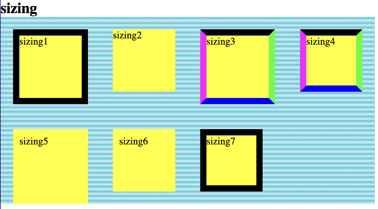
.wrapper:nth-of-type(3) > div:nth-child(1){
border: 10px solid #000;
}
.wrapper:nth-of-type(3) > div:nth-child(2){
box-sizing: border-box;
}
.wrapper:nth-of-type(3) > div:nth-child(3){
border-top: 10px solid #000;
border-right: 10px solid #0f0;
border-bottom: 10px solid #00f;
border-left: 10px solid #f0f;
}
.wrapper:nth-of-type(3) > div:nth-child(4){
box-sizing: border-box;
border-top: 10px solid #000;
border-right: 10px solid #0f0;
border-bottom: 10px solid #00f;
border-left: 10px solid #f0f;
}
.wrapper:nth-of-type(3) > div:nth-child(5){
padding: 10px;
}
.wrapper:nth-of-type(3) > div:nth-child(6){
box-sizing: border-box;
padding: 10px;
}
.wrapper:nth-of-type(3) > div:nth-child(7){
box-sizing: border-box;
border: 10px solid #000;
}
</style>
</head>
<body>
<h1>02_shadow</h1>
<h2>shadow</h2>
<div class="wrapper">
<div>그림자1</div>
<div>그림자2</div>
<div>그림자3</div>
<div>그림자4</div>
<div>그림자5</div>
<div>그림자6</div>
<div>그림자7</div>
</div>
<h2>inset</h2>
<div class="wrapper">
<div>inset1</div>
<div>inset2</div>
<div>inset3</div>
<div>inset4</div>
</div>
<h2>sizing</h2>
<div class="wrapper">
<div>sizing1</div>
<div>sizing2</div>
<div>sizing3</div>
<div>sizing4</div>
<div>sizing5</div>
<div>sizing6</div>
<div>sizing7</div>
</div>
</body>
</html>
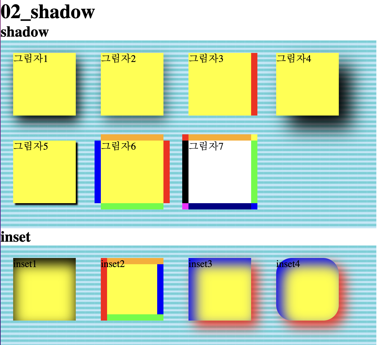
box-shadow
⌨️ 문법
div{
	box-shadow: 10px 0px 0px #00f,
    			5px 0px 10px #f00;
}
- 순서대로 오른쪽으로, 아래로, 번지기, 그림자 색상 설정
- 여러개 쓸 경우 위 문법과 같이 적음
- 먼저 쓴게 위에 적용됨
inset - 음각
⌨️ 문법
div{
	box-shadow: inset 10px 0px 0px #00f;
}
- box-shadow 맨 앞에 inset 작성
- 양각과 빛의 방향은 같음
sizing - 음각
⌨️ 문법
div{
	box-sizing: border-box;
}
- border, padding 등 보이는 내용을 크기안에 포함하지만 margin은 포함하지 않음