
기업용 데이터 그리드를 구현할 때, 단순한 텍스트 셀로는 정보를 효과적으로 전달하기 어렵습니다. 판매 실적이 목표 미달이면 빨간색으로 경고하고, 프로젝트 상태를 색상 배지로 표시하거나, 진행률 바를 셀 안에 직접 그려야 하는 요구가 빈번합니다.
Wijmo FlexGrid는 itemFormatter 프로퍼티 하나로 데이터 셀부터 헤더까지 그리드의 모든 영역을 완전히 제어할 수 있습니다. 이 글에서는 두 가지 실전 예제를 통해 각각의 구현 방법을 단계별로 설명합니다.
- 예제 1 — 판매 실적 그리드: 실적 값에 따른 조건부 셀 색상 적용
- 예제 2 — 프로젝트 현황 그리드:
cell.innerHTML로 상태 배지와 진행률 바 삽입
핵심 내용
itemFormatter는(panel, r, c, cell)네 파라미터를 받는 함수로, 그리드가 셀을 렌더링할 때마다 호출된다panel.cellType을wijmo.grid.CellType열거형과 비교해 데이터 셀, 열 헤더, 행 헤더를 구분한다cell.style로 배경색·글꼴을 제어하고,cell.innerHTML로 배지·진행률 바 등 HTML 요소를 삽입한다- FlexGrid는 셀 DOM을 재활용하므로 수정하는 모든 스타일 속성을 빈 문자열로 초기화해야 한다
cell.innerHTML = panel.getCellData(r, c, true)로 기존 텍스트를 유지하면서 요소를 추가할 수 있다
예제 1: 판매 실적 그리드 — 조건부 셀 색상
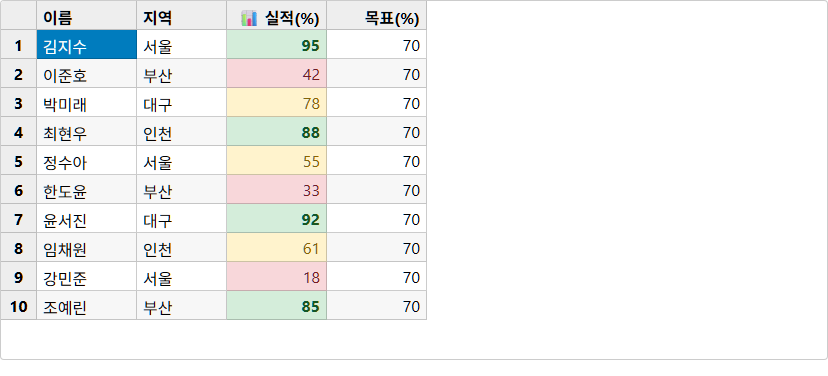
판매 직원별 실적을 표시하는 그리드에서, 실적(%)에 따라 셀 배경색과 글꼴 색상을 자동으로 다르게 표시합니다.
STEP 1: HTML 컨테이너 준비
FlexGrid는 DOM 요소를 선택자로 받아 그 안에 그리드를 렌더링합니다. 먼저 컨테이너 div를 준비합니다.
<!-- 그리드가 렌더링될 컨테이너 -->
<div id="salesGrid" style="width:100%; height:420px;"></div>width와 height를 반드시 지정해야 합니다. 높이가 없으면 그리드가 보이지 않습니다. FlexGrid는 CSS 선택자(#salesGrid)를 new wijmo.grid.FlexGrid('#salesGrid', {...})에 그대로 전달합니다.
요약: 그리드 컨테이너는
id를 가진div이며, 반드시 높이(height)를 지정해야 합니다.
STEP 2: 데이터와 FlexGrid 초기화
데이터는 wijmo.collections.CollectionView로 감쌉니다. CollectionView는 정렬, 필터링, 그룹핑을 제공하는 Wijmo의 데이터 래퍼입니다.
var salesData = [
    { name: '김지수', region: '서울', sales: 95, quota: 70 },
    { name: '이준호', region: '부산', sales: 42, quota: 70 },
    { name: '박미래', region: '대구', sales: 78, quota: 70 },
    { name: '최현우', region: '인천', sales: 88, quota: 70 },
    { name: '정수아', region: '서울', sales: 55, quota: 70 },
    { name: '한도윤', region: '부산', sales: 33, quota: 70 }
];

var flex = new wijmo.grid.FlexGrid('#salesGrid', {
    isReadOnly: true,
    itemsSource: new wijmo.collections.CollectionView(salesData),
    columns: [
        { binding: 'name',   header: '이름',    width: 100 },
        { binding: 'region', header: '지역',    width: 90  },
        { binding: 'sales',  header: '실적(%)', width: 100 },
        { binding: 'quota',  header: '목표(%)', width: 100 }
    ]
});
isReadOnly: true는 사용자가 셀을 편집하지 못하도록 합니다. columns 배열의 binding은 데이터 객체의 필드명과 일치해야 합니다.
요약:
wijmo.collections.CollectionView로 데이터를 감싸고,columns배열의binding을 데이터 필드명과 정확히 일치시킵니다.
STEP 3: itemFormatter 기본 구조 작성
itemFormatter를 그리드 인스턴스에 연결합니다. 먼저 panel.cellType을 확인해 데이터 셀, 열 헤더, 행 헤더 등 셀 영역을 구분합니다. 조건에 따라 일부 스타일만 적용하는 경우에는 이전 셀의 스타일이 남지 않도록, 변경한 스타일 속성을 초기화하거나 각 조건 분기에서 값을 명시적으로 다시 설정해야 합니다.
flex.itemFormatter = function(panel, r, c, cell) {
    var CellType = wijmo.grid.CellType;

    // 데이터 셀에만 진입
    if (panel.cellType !== CellType.Cell) return;

    // 스타일 초기화 — 셀 재활용(cell recycling) 대비 필수
    cell.style.backgroundColor = '';
    cell.style.color = '';
    cell.style.fontWeight = '';

    var col  = panel.columns[c];
    var item = panel.rows[r].dataItem;

    // 열별 커스터마이징 로직은 STEP 4에서 추가
};
FlexGrid는 렌더링 성능을 위해 셀 DOM을 재활용합니다. 이전 행에서 설정한 backgroundColor가 다른 행으로 번지지 않으려면 매 호출마다 초기화 코드를 먼저 실행해야 합니다.
CellType 열거형 값:
| 값 | 숫자 | 설명 |
|---|---|---|
CellType.Cell | 1 | 일반 데이터 셀 |
CellType.ColumnHeader | 2 | 열 헤더 셀 |
CellType.RowHeader | 3 | 행 헤더 셀 |
CellType.TopLeft | 4 | 좌상단 교차점 셀 |
요약:
itemFormatter는 항상 ①CellType 분기 → ②스타일 초기화 → ③커스터마이징 순서로 작성합니다.
STEP 4: 조건부 셀 색상 적용
STEP 3의 구조 위에 실적 열(sales)에 값 조건에 따른 배경색과 글꼴 스타일을 추가합니다.
flex.itemFormatter = function(panel, r, c, cell) {
    var CellType = wijmo.grid.CellType;
    if (panel.cellType !== CellType.Cell) return;

    cell.style.backgroundColor = '';
    cell.style.color = '';
    cell.style.fontWeight = '';

    var col  = panel.columns[c];
    var item = panel.rows[r].dataItem;

    if (col.binding === 'sales') {
        var pct = item.sales;
        if (pct >= 80) {
            cell.style.backgroundColor = '#d4edda';  // 목표 초과 달성 — 녹색
            cell.style.color           = '#155724';
            cell.style.fontWeight      = 'bold';
        } else if (pct >= 50) {
            cell.style.backgroundColor = '#fff3cd';  // 목표 근접 — 노란색
            cell.style.color           = '#856404';
        } else {
            cell.style.backgroundColor = '#f8d7da';  // 목표 미달 — 빨간색
            cell.style.color           = '#721c24';
        }
    }
};panel.rows[r].dataItem은 해당 행에 바인딩된 원본 JavaScript 객체입니다. item.sales처럼 필드에 직접 접근해 조건을 검사합니다.
아래 CodePen에서 완성된 예제를 확인하세요.
JavaScript
// HTML: <div id="salesGrid"></div>

var salesData = [
    { name: '김지수', region: '서울', sales: 95, quota: 70 },
    { name: '이준호', region: '부산', sales: 42, quota: 70 },
    { name: '박미래', region: '대구', sales: 78, quota: 70 },
    { name: '최현우', region: '인천', sales: 88, quota: 70 },
    { name: '정수아', region: '서울', sales: 55, quota: 70 },
    { name: '한도윤', region: '부산', sales: 33, quota: 70 },
    { name: '윤서진', region: '대구', sales: 92, quota: 70 },
    { name: '임채원', region: '인천', sales: 61, quota: 70 },
    { name: '강민준', region: '서울', sales: 18, quota: 70 },
    { name: '조예린', region: '부산', sales: 85, quota: 70 }
];

var flex = new wijmo.grid.FlexGrid('#salesGrid', {
    isReadOnly: true,
    itemsSource: new wijmo.collections.CollectionView(salesData),
    columns: [
        { binding: 'name',   header: '이름',    width: 100 },
        { binding: 'region', header: '지역',    width: 90  },
        { binding: 'sales',  header: '실적(%)', width: 100 },
        { binding: 'quota',  header: '목표(%)', width: 100 }
    ]
});

flex.itemFormatter = function(panel, r, c, cell) {
    var CellType = wijmo.grid.CellType;

    if (panel.cellType === CellType.Cell) {
        cell.style.backgroundColor = '';
        cell.style.color = '';
        cell.style.fontWeight = '';

        var col  = panel.columns[c];
        var item = panel.rows[r].dataItem;

        if (col.binding === 'sales') {
            var pct = item.sales;
            if (pct >= 80) {
                cell.style.backgroundColor = '#d4edda';
                cell.style.color           = '#155724';
                cell.style.fontWeight      = 'bold';
            } else if (pct >= 50) {
                cell.style.backgroundColor = '#fff3cd';
                cell.style.color           = '#856404';
            } else {
                cell.style.backgroundColor = '#f8d7da';
                cell.style.color           = '#721c24';
            }
        }
    } else if (panel.cellType === CellType.ColumnHeader) {
        cell.style.backgroundColor = '';
        var col = panel.columns[c];
        if (col.binding === 'sales') {
            cell.innerHTML = '📊 ' + col.header;
        }
    } else if (panel.cellType === CellType.RowHeader) {
        cell.innerHTML = (r + 1) + '';
    }
};
요약:
col.binding으로 열을 식별하고item필드값으로 조건을 분기해cell.style에 색상을 지정합니다.
예제 2: 프로젝트 현황 그리드 — HTML 배지 & 진행률 바
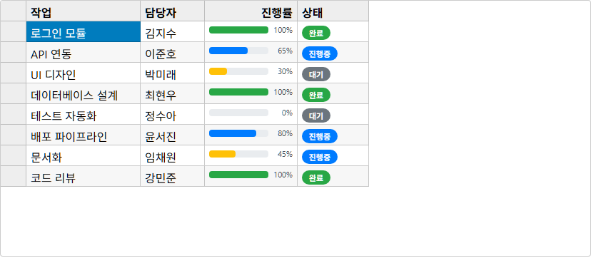
cell.style이 스타일만 바꿨다면, cell.innerHTML은 셀 내부 콘텐츠를 완전히 교체합니다. 상태 배지, 진행률 바, 아이콘 등 임의의 HTML 요소를 삽입할 수 있습니다.
STEP 1: HTML 컨테이너 준비
예제 1과 동일하게 FlexGrid를 렌더링할 div 컨테이너를 먼저 준비합니다. 이 예제는 statusGrid라는 ID를 사용합니다.
<!-- 프로젝트 현황 그리드 컨테이너 -->
<div id="statusGrid" style="width:100%; height:400px;"></div>
이 예제에서 cell.innerHTML로 HTML 요소를 삽입할 열은 두 개입니다.
열 (binding) | 삽입할 HTML 요소 | 목적 |
|---|---|---|
status | 색상 배지(<div>) | 작업 상태를 시각적으로 구분 |
progress | 진행률 바(중첩 <div>) | 완료 비율을 게이지로 표시 |
요약: 그리드 컨테이너를 준비하고, 어느 열에 HTML을 삽입할지 미리 설계합니다.
STEP 2: 데이터와 FlexGrid 초기화
status와 progress 필드를 가진 프로젝트 데이터를 CollectionView로 감싸 그리드에 바인딩합니다.
var projectData = [
    { task: '로그인 모듈',      assignee: '김지수', progress: 100, status: 'done'    },
    { task: 'API 연동',         assignee: '이준호', progress: 65,  status: 'active'  },
    { task: 'UI 디자인',        assignee: '박미래', progress: 30,  status: 'pending' },
    { task: '데이터베이스 설계', assignee: '최현우', progress: 100, status: 'done'    },
    { task: '테스트 자동화',     assignee: '정수아', progress: 0,   status: 'pending' },
    { task: '배포 파이프라인',   assignee: '윤서진', progress: 80,  status: 'active'  }
];

var flex = new wijmo.grid.FlexGrid('#statusGrid', {
    isReadOnly: true,
    itemsSource: new wijmo.collections.CollectionView(projectData),
    columns: [
        { binding: 'task',     header: '작업',  width: 160 },
        { binding: 'assignee', header: '담당자', width: 90  },
        { binding: 'progress', header: '진행률', width: 130 },
        { binding: 'status',   header: '상태',  width: 100 }
    ]
});status와 progress 열은 기본 텍스트로 렌더링되며, 다음 STEP에서 itemFormatter로 교체합니다.
요약:
progress(숫자)와status(문자열) 필드를 가진 데이터를CollectionView로 바인딩합니다.
STEP 3: itemFormatter로 상태 배지 삽입
STATUS_MAP으로 상태별 색상과 레이블을 정의하고, cell.innerHTML에 배지 HTML을 할당합니다. 초기화와 CellType 분기를 먼저 작성합니다.
var STATUS_MAP = {
    done:    { color: '#28a745', label: '완료'  },
    active:  { color: '#007bff', label: '진행중' },
    pending: { color: '#6c757d', label: '대기'  }
};

flex.itemFormatter = function(panel, r, c, cell) {
    if (panel.cellType !== wijmo.grid.CellType.Cell) return;

    // 초기화 — 셀 재활용 대비
    cell.style.backgroundColor = '';
    cell.innerHTML = panel.getCellData(r, c, true);

    var col  = panel.columns[c];
    var item = panel.rows[r].dataItem;

    if (col.binding === 'status') {
        var s = STATUS_MAP[item.status] || STATUS_MAP.pending;
        cell.innerHTML =
            '<div style="display:inline-flex;align-items:center;' +
            'background-color:' + s.color + ';color:#fff;' +
            'padding:2px 10px;border-radius:12px;font-size:11px;font-weight:bold;">' +
            s.label + '</div>';
    }
};display:inline-flex를 사용하는 이유: CMS 환경에서는 <span>의 background-color 인라인 스타일이 PHP sanitizer에 의해 제거될 수 있습니다. <div style="display:inline-flex">로 동일한 시각 효과를 안전하게 적용합니다.
요약:
STATUS_MAP으로 색상·레이블을 관리하고,cell.innerHTML에 배지 HTML을 할당합니다.
STEP 4: 진행률 바 추가 — 완성
기존 itemFormatter에 progress 열 처리 분기를 추가합니다. 외부 컨테이너와 내부 채움 바를 중첩한 HTML 구조를 cell.innerHTML로 직접 렌더링합니다.
} else if (col.binding === 'progress') {
    var pct      = item.progress;
    var barColor = pct === 100 ? '#28a745' : pct >= 50 ? '#007bff' : '#ffc107';
    cell.innerHTML =
        '<div style="display:flex;align-items:center;gap:6px;">' +
        '<div style="flex:1;background-color:#e9ecef;border-radius:4px;height:10px;">' +
        '<div style="width:' + pct + '%;background-color:' + barColor + ';' +
        'height:10px;border-radius:4px;"></div></div>' +
        '<span style="font-size:11px;color:#495057;min-width:28px;">' + pct + '%</span>' +
        '</div>';
}
진행률에 따른 막대 색상:
pct === 100→ 녹색(#28a745) — 완료pct >= 50→ 파란색(#007bff) — 진행 중pct < 50→ 노란색(#ffc107) — 초기 단계
기존 셀 텍스트를 유지하면서 요소를 앞에 추가하고 싶다면 panel.getCellData(r, c, true)로 포맷된 값을 가져와 조합합니다.
var formatted = panel.getCellData(r, c, true); // true = 포맷 적용된 문자열
cell.innerHTML = '⭐ ' + formatted;
아래 CodePen에서 배지와 진행률 바가 포함된 완성 예제를 확인하세요.
JavaScript
// HTML: <div id="statusGrid"></div>

var projectData = [
    { task: '로그인 모듈',      assignee: '김지수', progress: 100, status: 'done'    },
    { task: 'API 연동',         assignee: '이준호', progress: 65,  status: 'active'  },
    { task: 'UI 디자인',        assignee: '박미래', progress: 30,  status: 'pending' },
    { task: '데이터베이스 설계', assignee: '최현우', progress: 100, status: 'done'    },
    { task: '테스트 자동화',     assignee: '정수아', progress: 0,   status: 'pending' },
    { task: '배포 파이프라인',   assignee: '윤서진', progress: 80,  status: 'active'  },
    { task: '문서화',           assignee: '임채원', progress: 45,  status: 'active'  },
    { task: '코드 리뷰',        assignee: '강민준', progress: 100, status: 'done'    }
];

var flex = new wijmo.grid.FlexGrid('#statusGrid', {
    isReadOnly: true,
    itemsSource: new wijmo.collections.CollectionView(projectData),
    columns: [
        { binding: 'task',     header: '작업',  width: 160 },
        { binding: 'assignee', header: '담당자', width: 90  },
        { binding: 'progress', header: '진행률', width: 130 },
        { binding: 'status',   header: '상태',  width: 100 }
    ]
});

var STATUS_MAP = {
    done:    { color: '#28a745', label: '완료'  },
    active:  { color: '#007bff', label: '진행중' },
    pending: { color: '#6c757d', label: '대기'  }
};

flex.itemFormatter = function(panel, r, c, cell) {
    if (panel.cellType !== wijmo.grid.CellType.Cell) return;

    cell.style.backgroundColor = '';
    cell.innerHTML = panel.getCellData(r, c, true);

    var col  = panel.columns[c];
    var item = panel.rows[r].dataItem;

    if (col.binding === 'status') {
        var s = STATUS_MAP[item.status] || STATUS_MAP.pending;
        cell.innerHTML =
            '<div style="display:inline-flex;align-items:center;' +
            'background-color:' + s.color + ';color:#fff;' +
            'padding:2px 10px;border-radius:12px;font-size:11px;font-weight:bold;">' +
            s.label + '</div>';

    } else if (col.binding === 'progress') {
        var pct      = item.progress;
        var barColor = pct === 100 ? '#28a745' : pct >= 50 ? '#007bff' : '#ffc107';
        cell.innerHTML =
            '<div style="display:flex;align-items:center;gap:6px;">' +
            '<div style="flex:1;background-color:#e9ecef;border-radius:4px;height:10px;">' +
            '<div style="width:' + pct + '%;background-color:' + barColor + ';' +
            'height:10px;border-radius:4px;"></div></div>' +
            '<span style="font-size:11px;color:#495057;min-width:28px;">' + pct + '%</span>' +
            '</div>';
    }
};
요약:
cell.innerHTML에 HTML 문자열을 직접 할당해 배지, 진행률 바, 아이콘 등 임의의 UI 요소를 셀 안에 렌더링할 수 있습니다.
참고: itemFormatter vs formatItem 이벤트
FlexGrid는 두 가지 셀 커스터마이징 방법을 제공합니다.
| 구분 | itemFormatter 프로퍼티 | formatItem 이벤트 |
|---|---|---|
| 등록 방식 | flex.itemFormatter = fn | flex.formatItem.addHandler(fn) |
| 핸들러 수 | 1개만 등록 가능 | 여러 핸들러 독립 등록 가능 |
| 파라미터 | (panel, r, c, cell) | (flex, e) — e.panel, e.row, e.col, e.cell |
| 적합한 상황 | 단일 커스터마이징 로직 | 여러 모듈이 독립적으로 스타일 적용 시 |
컴포넌트 기반 구조에서 여러 기능이 같은 그리드에 각자의 스타일을 적용해야 할 때는 formatItem.addHandler()를 사용합니다. 핸들러끼리 서로 덮어쓰지 않습니다.
flex.formatItem.addHandler(function(flex, e) {
    if (e.panel.cellType === wijmo.grid.CellType.Cell) {
        e.cell.style.color = '';
        var val = e.panel.getCellData(e.row, e.col, false);
        if (typeof val === 'number' && val < 0) {
            e.cell.style.color = '#dc3545';
        }
    }
});
자주 묻는 질문 (FAQ)
Q. itemFormatter에서 스타일 초기화가 꼭 필요한가요?
항상 필수인 것은 아닙니다. FlexGrid는 렌더링 성능을 위해 셀 DOM 요소를 재활용하므로, 이전 셀에 적용한 스타일이 다른 셀에 남을 가능성이 있습니다. 다만 모든 조건 분기에서 동일한 CSS 속성을 새 값으로 다시 지정한다면 별도의 초기화 없이도 정상적으로 동작할 수 있습니다. 반대로 특정 조건에서만 일부 스타일을 적용하고, 조건을 만족하지 않을 때 해당 속성을 되돌리지 않는다면 이전 스타일이 남을 수 있습니다. 따라서 itemFormatter에서 변경한 CSS 속성이 모든 경우에 다시 지정되지 않는다면, 해당 속성을 빈 문자열로 초기화하거나 각 조건 분기에서 명시적으로 기본값을 설정하는 것이 안전합니다.
Q. itemFormatter와 CellType 열거형은 어떤 관계인가요?
itemFormatter는 데이터 셀, 열 헤더, 행 헤더 등 그리드의 모든 패널 셀에서 호출됩니다. panel.cellType 값을 wijmo.grid.CellType 열거형(Cell = 1, ColumnHeader = 2, RowHeader = 3, TopLeft = 4)과 비교해 어느 영역인지 판별하고, 각 영역에 맞는 로직을 적용합니다.
Q. 특정 열의 셀에만 스타일을 적용하려면 어떻게 하나요?
panel.cellType === wijmo.grid.CellType.Cell로 데이터 셀에 진입한 뒤, panel.columns[c].binding으로 열 이름을 확인하고, panel.rows[r].dataItem의 필드값으로 조건을 검사합니다.
Q. cell.innerHTML 사용 시 주의할 점이 있나요?
cell.innerHTML을 설정하면 FlexGrid가 렌더링한 기본 텍스트가 사라집니다. 원본 텍스트를 유지하려면 panel.getCellData(r, c, true)로 포맷된 값을 먼저 가져온 뒤 HTML과 조합합니다. 또한 셀 재활용 대비로 매 호출마다 cell.innerHTML을 초기화하는 것이 안전합니다.
Q. FlexGrid 셀 렌더링 성능을 최적화하는 방법은 무엇인가요?
itemFormatter 내부에서 ① 관련 없는 CellType은 즉시 return으로 탈출, ② document.createElement 대신 cell.innerHTML 문자열 할당 사용, ③ panel.rows[r].dataItem을 지역 변수에 캐싱, ④ 서버 요청이나 복잡한 연산 금지 규칙을 준수합니다. 이를 통해 수천 행의 그리드에서도 부드러운 스크롤 성능을 유지할 수 있습니다.
Wijmo 홈페이지: 바로가기
Wijmo 무료 체험판: 30일 무료 체험 시작하기
온라인 튜토리얼: Wijmo 튜토리얼 & 데모
온라인 문의: MESCIUS 온라인 상담