
📌 Visualization-ggplot
ggplot2
-
ggplot()함수는 앞에서 설명한 고수준, 저수준 작도를 편리하게 사용할 수 있도록 개발된 패키지
-
Advantages of ggplot2
consistent underlying grammar of graphics (Wilkinson, 2005)
plot specification at a high level of abstraction
very flexible
theme system for polishing plot appearance
mature and complete graphics system
many users, active mailing list
가본 syntax
library(ggplot2)
ggplot(df, aes(x=x축 데이터, y=y축 데이터)) + geom_함수
- In ggplot land aesthetic means "something you can see".
- geom_함수
geom_bar()
geom_line()
geom_point()
geom_histogram()
labs()
facet_wrap()
Ex
data <- read.csv("../mydata/경기도 화성시_관광통계_20231025.csv",fileEncoding="CP949")

data
# ggplot 객체 생성
p <- ggplot(data, aes(x = 번호, y = 공룡알화석산지))
# 점 추가
p <- p + geom_point(fill = 'red', color = 'blue', shape = 21, size = 4)
# 최종 플롯 출력
p + geom_line(color='blue', linetype=2)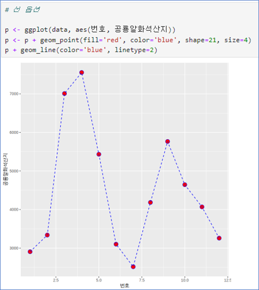
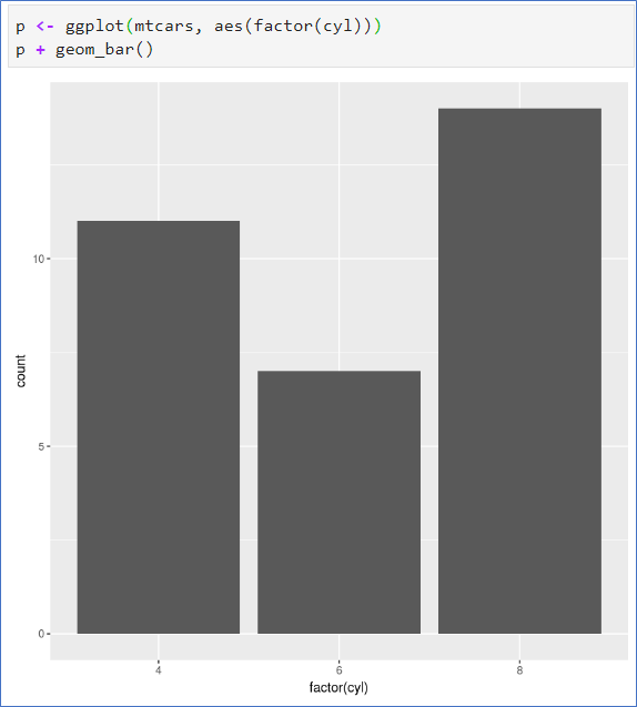
📌 막대그래프 - 빈도수를 높이로
- aes(변수 1개)
cyl은 숫자변수로 연속형 - factor()로 범주형으로 변환 - 기본 barplot에서는 table()의 결과가 있었어야 함.
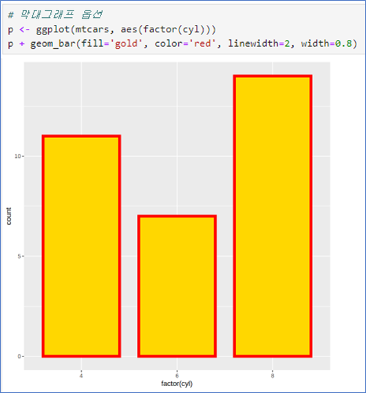
- fill은 내부 색상
- color는 테두리
- width는 막대의 너비
- linewidth는 선 두께
 |  |
|---|
- fill=범주형: 범주형 자료의 값에 따라 다른 색상 – - - aes 안에서 지정
- table(x, y)의 결과 필요 없음.
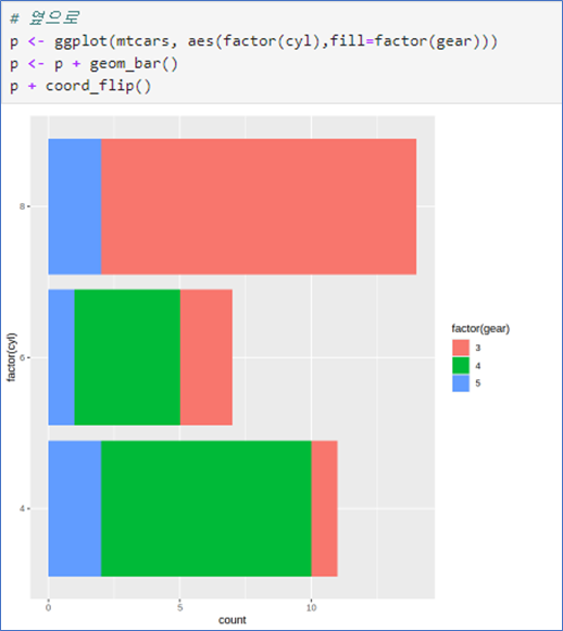
- coord_flip() 좌표축 회전
- 다른 그래프에서 적용 가능
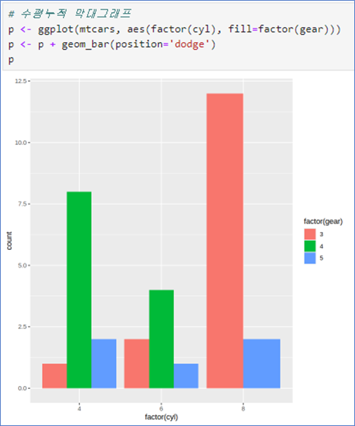
- position=‘dodge’ 사용
 |  |  |
|---|
```py
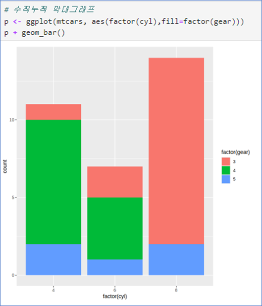
p <- ggplot(mtcars, aes(factor(cyl), fill=factor(gear)))
p + geom_bar()p <- ggplot(mtcars, aes(factor(cyl), fill=factor(gear)))
p <- p + geom_bar()
p + coord_flip()p <- ggplot(mtcars, aes(factor(cyl), fill=factor(gear)))
p <- p + geom_bar(position = 'dodge')
p📌 막대그래프 - 평균을 높이로, 수직누적 막대그래프- 두 그룹별 평균
- 그룹별 평균을 구할 때 tapply보다는 summaryBy를 이용(데이터프레임 필요)
- aes(변수 1개)
- 막대그래프의 y축은 기본적으로 주어진 변수의 count(빈도수)
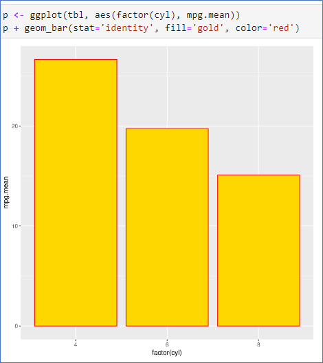
- 예제처럼 cyl에 따른 mpg의 평균을 높이로 지정할 때는 두 변수를 모두 지정하고, 옵션stat=‘identity’ 지정
- 데이터 mtcars에서 두 변수 cyl과 gear의 각 그룹별 평균 구하기
- geom_bar()
- stat=‘identity’ 옵션 사용
 |  |
|---|
library(doBy)
tbl <- summaryBy(mpg ~ cyl, data=mtcars, FUN=mean)
tbl

p <- ggplot(tbl, aes(factor(cyl), mpg.mean))
p + geom_bar(stat='identity', fill='gold', color='red')library(doBy)
tbl <- summaryBy(mpg ~ cyl+gear, data=mtcars, FUN=mean)
tbl
p <- ggplot(tbl, aes(factor(cyl), mpg.mean, fill=factor(gear)))
p + geom_bar(stat='identity')수평누적 막대그래프
-데이터 mtcars에서 두 변수 cyl과 gear의 각 그룹별 평균 구하기
- geom_col() 사용
- position=‘dodge’ 옵션 사용
 |  |
|---|
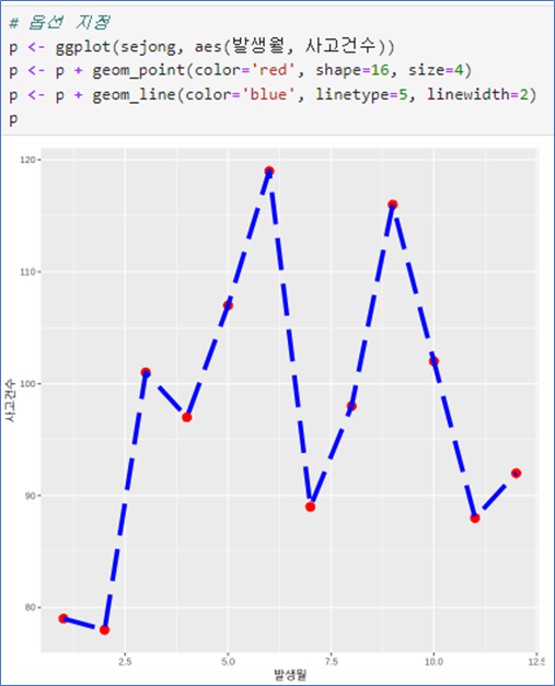
📌 시계열 그래프_ geom_line()
꺽은선 그래프 – no 옵션
- aes(x, y) 순서로
- geom_line(): 선추가
- geom_point(): 점추가
- color는 색상
- shape: 점모양
- size: 점 크기
- linetype: 선모양
- linewidth:선 굵기
 |  |
|---|
점모양
shape = 번호 (plot에서는 pch)
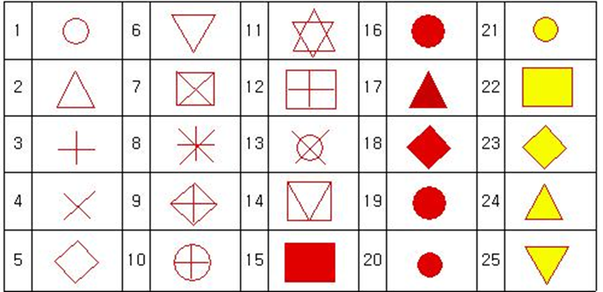
선 모양: plot에서는 lty, ggplot에서는 linetype
인 수 설명 linetype=0투명선 linetype=1실선 linetype=2대시선 linetype=3점선 linetype=4점선과 대시선 linetype=5긴 대시선 linetype=62개의 대시선
💻 Ex_여러 그래프를 한 화면에
# 데이터준비
library(dplyr)

data <- read.csv("../mydata/도로교통공단_시군구별 월별 교통사고 통계_20231231.csv",
                 fileEncoding="CP949")

chungju <- filter(data, 시군구=="충주시")
cheongju <- filter(data, 시군구=="청주시")
jecheon <- filter(data, 시군구=="제천시")

chungju
p <- ggplot()
p <- p + geom_line(data= chungju, aes(발생월, 사고건수), color='red') +
geom_point(data=chungju, aes(발생월, 사고건수), color='red')
p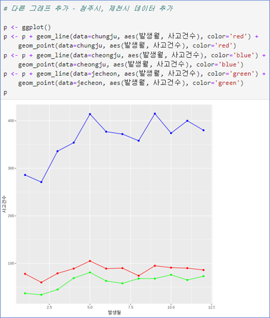 | 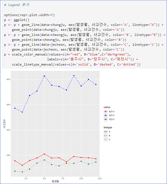 |
|---|
💻 EX_그룹 변수로 그래프 나누어 그리기
# 데이터 준비
library(dplyr)

cb <- data %>%
    filter(시도=='충북') %>%
    filter(grepl('시$', 시군구)) %>%
    select(발생월, 시군구, 사고건수)

head(cb)

table(cb$`시군구`)
# 1번쨰 그림
library(dplyr)
cb <- data %>%
filter(시도=='충북') %>%
filter(grepl('시$', 시군구)) %>%
select(발생월, 시군구, 사고건수)
head(cb)
table(cb$`시군구`)
p <- ggplot(cb, aes(발생월, 사고건수,
color=시군구, shape=시군구, linetype=시군구))
p + geom_point() + geom_line()# 2번째 그림
gang <- data %>%
filter(시도=='서울') %>%
filter(grepl('^강', 시군구)) %>%
select(발생월, 시군구, 사고건수)
head(cb)
p <- ggplot(gang, aes(발생월, 사고건수,
color=시군구, shape=시군구, linetype=시군구))
p + geom_point() + geom_line()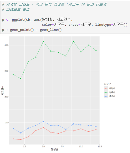 | 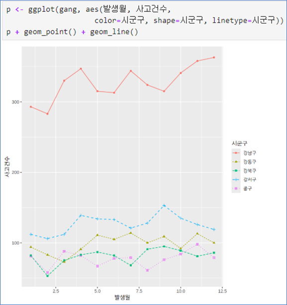 |
|---|
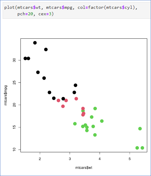
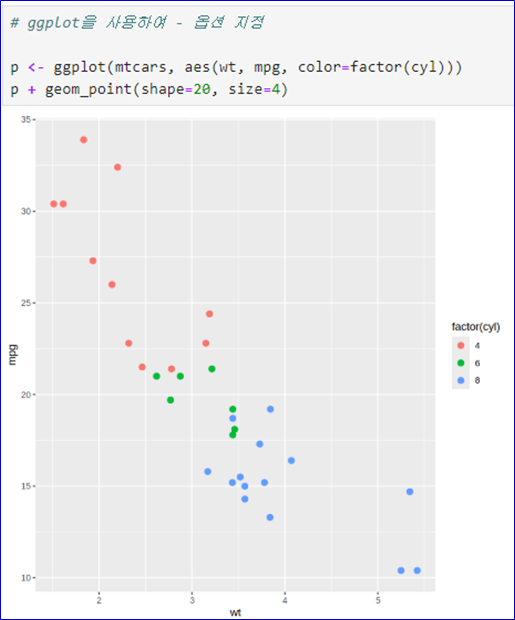
📌 산점도 그리기- geom_point()
데이터 mtcars- 기본 작도
- wt는 차의 무게
- mpg는 연비
- cyl는 실린더의 개수(연속형을 범주형으로 변환)
- pch는 점의 모양
- cex는 점의 크기
- ggplot()으로 그림 준비
- geom_point()로 점 그리기
- color: 색상
- size: 크기
- shape: 점의 모양
- 변수의 값에 따라 지정하려면 aes() 안에
 |  |  |
|---|

무지(無知)