Tailwind Variants - 편리한 TailwindCSS 관리 도구

Tailwind Variants는 TailwindCSS의 스타일 관리를 도와주는 라이브러리다. 우연히 관련 유튜브 영상을 보고 오랜만에 Tailwind Variants가 떠올랐다. 예전에 다른 사람들에게 이 라이브러리를 추천했을 때 이게 왜 좋고 어떤 기능이 있는지 자세하게 설명하지 못한 것 같아서, 이참에 글로 정리하게 되었다.
설치할 때 조심해야할 점
Tailwind Variants는 TailwindCSS의 클래스 충돌을 자동으로 해결하기 위해 tailwind-merge를 사용한다. 이를 위해서 아래와 같이 tailwind-merge를 설치해야 한다.
npm install tailwind-merge다만 번들 사이즈를 작게 유지하기 위해 tailwind-merge를 사용하지 않고 'tailwind-variants/lite' 버전을 사용할 수도 있다. 문서에 따르면 번들 사이즈를 약 80% 정도 줄여준다고 한다.
import { tv, createTV, cn } from 'tailwind-variants/lite';CVA를 사용하면 되지 않나요?
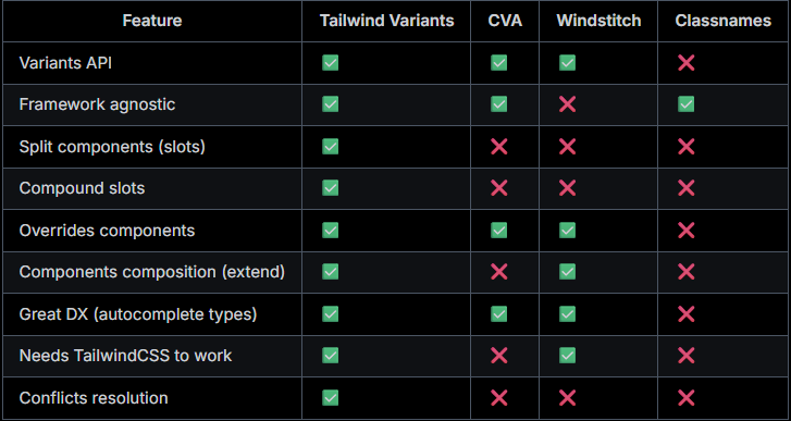
공식 문서에서는 다음과 같이 언급하고 있다. 요약하자면, CVA가 지원하지 않는 기능이 필요할 때만 Tailwind Variants를 사용하는 것이 좋다는 것이다.
Our goal is not to compete with CVA, but to provide an alternative that meets our needs to migrate HeroUI to TailwindCSS as smoothly as possible. We recommend to use CVA if don't need any of the Tailwind Variants features listed above.
(저희의 목표는 CVA와 경쟁하는 것이 아니라, HeroUI를 TailwindCSS로 최대한 원활하게 마이그레이션할 수 있는 대안을 제공하는 것입니다. 위에 나열된 Tailwind Variants 기능이 필요하지 않은 경우 CVA를 사용하는 것이 좋습니다.)
CVA와 비슷한 사용법
Tailwind Variants는 CVA와 매우 비슷한 사용법을 가지고 있다.
Variants 사용
import { tv } from 'tailwind-variants';

const button = tv({
  base: 'font-semibold text-white text-sm py-1 px-4 rounded-full active:opacity-80',
  variants: {
    color: {
      primary: 'bg-blue-500 hover:bg-blue-700',
      secondary: 'bg-purple-500 hover:bg-purple-700',
      success: 'bg-green-500 hover:bg-green-700'
    },
    size: {
      sm: 'py-1 px-3 text-sm',
      md: 'py-1.5 px-4 text-md',
      lg: 'py-2 px-6 text-lg'
    },
    disabled: {
      true: 'opacity-50 bg-gray-500 pointer-events-none'
    }
  },
  defaultVariants: {
    color: 'primary',
    size: 'md'
  },
  compoundVariants: [
    {
      color: 'success',
      disabled: true,
      class: 'bg-green-100 text-green-700 dark:text-green-800'
    }
  ]
});

button({ color: 'success', disabled: true });base: 공통 스타일을 정의한다variants: Variant마다 가지는 스타일을 정의한다. boolean도 지원한다.defaultVariants: 기본 스타일의 Variant를 정의한다.compoundVariants: 다른 Variant에 의존하는 경우를 정의한다.
- 예시:color: 'success',disabled: true일 때 배경색이 옅은 초록색이면 좋겠다
타입 지원
VariantProps 타입을 통해 해당 스타일 형태들의 타입을 자동으로 가져올 수 있다.
import { tv, type VariantProps } from 'tailwind-variants';

export const button = tv({
  base: 'px-4 py-1.5 rounded-full hover:opacity-80',
  variants: {
    color: {
      primary: 'bg-blue-500 text-white',
      neutral: 'bg-zinc-500 text-black dark:text-white'
    },
    flat: {
      true: 'bg-transparent'
    }
  },
  defaultVariants: {
    color: 'primary'
  },
  compoundVariants: [
    {
      color: 'primary',
      flat: true,
      class: 'bg-blue-500/40'
    },
    {
      color: 'neutral',
      flat: true,
      class: 'bg-zinc-500/20'
    }
  ]
});

/**
 * color?: "primary" | "neutral"
 * flat?: boolean
 */
type ButtonVariants = VariantProps<typeof button>;

interface ButtonProps extends ButtonVariants {
  children: React.ReactNode;
}

export const Button = (props: ButtonProps) => {
  return <button className={button(props)}>{props.children}</button>;
};
Tailwind Variants만 지원하는 기능
간단한 스타일 합성
Tailwind Variants는 extend 속성을 통해 간단하게 스타일을 합성할 수 있다.
import { tv } from 'tailwind-variants';

const baseButton = tv({
  base: 'font-semibold text-white rounded-full active:opacity-80',
  variants: {
    color: {
      primary: 'bg-blue-500 hover:bg-blue-700',
      secondary: 'bg-purple-500 hover:bg-purple-700',
      success: 'bg-green-500 hover:bg-green-700'
    },
    size: {
      small: 'py-0 px-2 text-xs',
      medium: 'py-1 px-3 text-sm',
      large: 'py-1.5 px-3 text-md'
    }
  }
});

const myButton = tv({
  extend: baseButton,
  variants: {
    isSquared: {
      true: 'rounded-sm'
    }
  }
});

myButton({ color: 'success', size: 'medium', isSquared: true });
Slot
Tailwind Variants는 Slot을 통해 컴포넌트 스타일을 손쉽게 나눌 수 있도록 도와준다. Variants와 Compound Variants, Slot Variant overrides와 같은 기능들을 제공한다. 이는 CVA와 차별화되는 기능이자, Tailwind Variants의 강점이다.
간단한 Slot 예시
import { tv } from 'tailwind-variants';

const card = tv({
  slots: {
    base: 'md:flex bg-slate-100 rounded-xl p-8 md:p-0 dark:bg-gray-900',
    avatar:
      'w-24 h-24 md:w-48 md:h-auto md:rounded-none rounded-full mx-auto drop-shadow-lg',
    wrapper: 'flex-1 pt-6 md:p-8 text-center md:text-left space-y-4',
    description: 'text-md font-medium',
    infoWrapper: 'font-medium',
    name: 'text-sm text-sky-500 dark:text-sky-400',
    role: 'text-sm text-slate-700 dark:text-slate-500'
  }
});

const { base, avatar, wrapper, description, infoWrapper, name, role } = card();

return (
  <figure className={base()}>
    <img
      className={avatar()}
      src="/intro-avatar.png"
      alt=""
      width="384"
      height="512"
    />
    <div className={wrapper()}>
      <blockquote>
        <p className={description()}>
          “Tailwind variants allows you to reduce repeated code in your project
          and make it more readable. They fixed the headache of building a
          design system with TailwindCSS.”
        </p>
      </blockquote>
      <figcaption className={infoWrapper()}>
        <div className={name()}>Zoey Lang</div>
        <div className={role()}>Full-stack developer, HeroUI</div>
      </figcaption>
    </div>
  </figure>
);
Slot과 Variants 동시 사용
import { useState } from 'react';
import { tv } from 'tailwind-variants';
import { RadioGroup, Radio } from '@components';

const item = tv({
  slots: {
    base: 'flex flex-col mb-4 sm:flex-row p-6 bg-white dark:bg-stone-900 drop-shadow-xl rounded-xl',
    imageWrapper:
      'flex-none w-full sm:w-48 h-48 mb-6 sm:mb-0 sm:h-auto relative z-10 before:absolute before:top-0 before:left-0 before:w-full before:h-full before:rounded-xl before:bg-[#18000E] before:bg-gradient-to-r before:from-[#010187]',
    img: 'sm:scale-125 absolute z-10 top-2 sm:left-2 inset-0 w-full h-full object-cover rounded-lg',
    title:
      'relative w-full flex-none mb-2 text-2xl font-semibold text-stone-900 dark:text-white',
    price: 'relative font-semibold text-xl dark:text-white',
    previousPrice: 'relative line-through font-bold text-neutral-500 ml-3',
    percentOff: 'relative font-bold text-green-500 ml-3',
    sizeButton:
      'cursor-pointer select-none relative font-semibold rounded-full w-10 h-10 flex items-center justify-center active:opacity-80 dark:text-white peer-checked:text-white',
    buyButton:
      'text-xs sm:text-sm px-4 h-10 rounded-lg shadow-lg uppercase font-semibold tracking-wider text-white active:opacity-80',
    addToBagButton:
      'text-xs sm:text-sm px-4 h-10 rounded-lg uppercase font-semibold tracking-wider border-2 active:opacity-80'
  },
  variants: {
    color: {
      primary: {
        buyButton: 'bg-blue-500 shadow-blue-500/50',
        sizeButton: 'peer-checked:bg-blue',
        addToBagButton: 'text-blue-500 border-blue-500'
      },
      secondary: {
        buyButton: 'bg-purple-500 shadow-purple-500/50',
        sizeButton: 'peer-checked:bg-purple',
        addToBagButton: 'text-purple-500 border-purple-500'
      },
      success: {
        buyButton: 'bg-green-500 shadow-green-500/50',
        sizeButton: 'peer-checked:bg-green',
        addToBagButton: 'text-green-500 border-green-500'
      }
    }
  }
});

const itemSizes = ['xs', 's', 'm', 'l', 'xl'];

const App = () => {
  const [size, setSize] = useState('xs');
  const [color, setColor] = useState('primary');

  const {
    base,
    imageWrapper,
    img,
    title,
    price,
    previousPrice,
    percentOff,
    sizeButton,
    buyButton,
    addToBagButton
  } = item({ color });

  return (
    <div>
      <div className={base()}>
        <div className={imageWrapper()}>
          <img alt="" className={img()} loading="lazy" src="/shoes-1.png" />
        </div>
        <div className="flex-auto pl-4 sm:pl-8">
          <div className="relative flex flex-wrap items-baseline">
            <h1 className={title()}>Nike Adapt BB 2.0</h1>
            <div className={price()}>$279.97</div>
            <div className={previousPrice()}>$350</div>
            <div className={percentOff()}>20% off</div>
          </div>
          <div className="my-4 flex items-baseline">
            <div className="flex space-x-3 text-sm font-medium">
              {itemSizes.map((itemSize) => (
                <label key={itemSize}>
                  <input
                    checked={size === itemSize}
                    className="peer sr-only"
                    name="size"
                    type="radio"
                    value={itemSize}
                    onChange={() => setSize(itemSize)}
                  />
                  <div className={sizeButton()}>{itemSize.toUpperCase()}</div>
                </label>
              ))}
            </div>
          </div>
          <div className="flex space-x-4">
            <button className={buyButton()}>Buy now</button>
            <button className={addToBagButton()}>Add to bag</button>
          </div>
        </div>
      </div>
      <RadioGroup label="Select color:" value={color} onChange={setColor}>
        <Radio value="primary">Primary</Radio>
        <Radio value="secondary">Secondary</Radio>
        <Radio value="success">Success</Radio>
      </RadioGroup>
    </div>
  );
};

export default App;
Slot & Compound Variants
import { tv } from 'tailwind-variants';

const alert = tv({
  slots: {
    root: 'rounded py-3 px-5 mb-4',
    title: 'font-bold mb-1',
    message: ''
  },
  variants: {
    variant: {
      outlined: {
        root: 'border'
      },
      filled: {
        root: ''
      }
    },
    severity: {
      error: '',
      success: ''
    }
  },
  compoundVariants: [
    {
      variant: 'outlined',
      severity: 'error',
      class: {
        root: 'border-red-700 dark:border-red-500',
        title: 'text-red-700 dark:text-red-500',
        message: 'text-red-600 dark:text-red-500'
      }
    },
    {
      variant: 'outlined',
      severity: 'success',
      class: {
        root: 'border-green-700 dark:border-green-500',
        title: 'text-green-700 dark:text-green-500',
        message: 'text-green-600 dark:text-green-500'
      }
    },
    {
      variant: 'filled',
      severity: 'error',
      class: {
        root: 'bg-red-100 dark:bg-red-800',
        title: 'text-red-900 dark:text-red-50',
        message: 'text-red-700 dark:text-red-200'
      }
    },
    {
      variant: 'filled',
      severity: 'success',
      class: {
        root: 'bg-green-100 dark:bg-green-800',
        title: 'text-green-900 dark:text-green-50',
        message: 'text-green-700 dark:text-green-200'
      }
    }
  ],
  defaultVariants: {
    variant: 'filled',
    severity: 'success'
  }
});

const { root, message, title } = alert({ severity, variant });

return (
  <div className={root()}>
    <div className={title()}>Oops, something went wrong</div>
    <div className={message()}>
      Something went wrong saving your changes. Try again later.
    </div>
  </div>
);
Compound Slots
Compound Variants와 비슷하게, Variant에 의존하는 Slot을 설정할 수 있다.
import { tv } from 'tailwind-variants';

const pagination = tv({
  slots: {
    base: 'flex flex-wrap relative gap-1 max-w-fit',
    item: 'data-[active="true"]:bg-blue-500 data-[active="true"]:text-white',
    prev: '',
    next: ''
  },
  variants: {
    size: {
      xs: {},
      sm: {},
      md: {}
    }
  },
  defaultVariants: {
    size: 'md'
  },
  compoundSlots: [
    // variants를 설정하지 않으면, 스타일이 해당 slot에 적용된다.
    {
      slots: ['item', 'prev', 'next'],
      class: [
        'flex',
        'flex-wrap',
        'truncate',
        'box-border',
        'outline-none',
        'items-center',
        'justify-center',
        'bg-neutral-100',
        'hover:bg-neutral-200',
        'active:bg-neutral-300',
        'text-neutral-500'
      ] // --> 이 클래스들이 slot에 적용된다.
    },
    // variant를 설정하면, 해당 variant가 활성화됬을 때 스타일이 해당 slot에 적용된다.
    {
      slots: ['item', 'prev', 'next'],
      size: 'xs',
      class: 'w-7 h-7 text-xs' // --> size가 'xs'일 때 적용된다.
    },
    {
      slots: ['item', 'prev', 'next'],
      size: 'sm',
      class: 'w-8 h-8 text-sm' // --> size가 'sm'일 때 적용된다.
    },
    {
      slots: ['item', 'prev', 'next'],
      size: 'md',
      class: 'w-9 h-9 text-base' // --> size가 'md'일 때 적용된다.
    }
  ]
});

const App = () => {
  const { base, item, prev, next } = pagination();

  return (
    <ul aria-label="pagination navigation" className={base()}>
      <li
        aria-label="Go to previous page"
        className={prev()}
        data-disabled="true"
        role="button"
      >
        {'<'}
      </li>
      <li aria-label="page 1" className={item()} role="button">
        1
      </li>
      <li aria-label="page 2" className={item()} role="button">
        2
      </li>
      <li
        aria-label="page 3"
        className={item()}
        data-active="true"
        role="button"
      >
        3
      </li>
      <li aria-label="page 4" className={item()} role="button">
        4
      </li>
      <li aria-label="page 5" className={item()} role="button">
        5
      </li>
      <li aria-hidden="true" className={item()} role="button">
        ...
      </li>
      <li aria-label="page 10" className={item()} role="button">
        10
      </li>
      <li aria-label="Go to next page" className={next()} role="button">
        {'>'}
      </li>
    </ul>
  );
};

export default App;
Slot Variant Override
Slot의 Variant를 내부 상태에 따라 자유롭게 변경할 수 있다.
import { tv } from 'tailwind-variants';

const card = tv({
  slots: {
    base: 'flex gap-2',
    tab: 'rounded'
  },
  variants: {
    color: {
      primary: {
        tab: 'text-blue-500 dark:text-blue-400'
      },
      secondary: {
        tab: 'text-purple-500 dark:text-purple-400'
      }
    },
    isSelected: {
      true: {
        tab: 'font-bold'
      }
    }
  }
});

const { base, tab } = card({ color: 'primary' });

return (
  <Tabs className={base()}>
    {items.map((item) => (
      <Tab className={({ isSelected }) => tab({ isSelected })} id={item.id}>
        {item.label}
      </Tab>
    ))}
  </Tabs>
);