HTML과 CSS를 이용해서 잔잔한 물결이 이는 버튼을 만들었다.🌊
버튼을 클릭하면 물결이 일도록 하면 더 멋있을 것 같다.
나중에 JS배우면 한번 시도해봐야지😎
Codepen에서 본 버튼을 참고해서 만들었다.
https://codepen.io/Wyper/pen/rNjrxrG
코드펜 코드를 보면서 이해가 안되는 코드들을 공책에 정리했다.
역시 타자보다는 손으로 쓰는게 훨씬 편하다.
그래서 아이패드가 좀 사고싶네... 근데 너무 비싸다.😢
What I learned
1. :root
: 웹 문서구조에서 가장 상위요소를 선택한다.
HTML에서의 root는 항상 html이다.
/*root 내부에 변수를 선언함*/

:root {
    --maincolor: #86a8e7;
    --darkcolor: #7f7fd5;
    --brightcolor: #f7f7f7;
}
2. calc
: 식의 계산 결과를 속성값으로 사용하게 해주는 함,
사칙연산자 사용
:root {
  --Shift: 6px;
  --Blur: 15px;
}

box-shadow: calc(var(--Shift) * -1) 0 var(--Blur) rgba(255 255 255 / 1);
3. :focus-visible
: focus와는 달리 키보드를 사용하여 포커스 할때만 적용됌,
(for. 스크린리더)
4. filter
: 흐림, 색상 변형 등의 그래픽 효과 적용
-
none : no effects (Default)
-
blur(px) : blur effect, larger value will create more blur.
-
brightness(%)
- 0% : will make the img completely black
- 100% (1) : is Default, original img
- over 100% : will provide brighter results
-
contrast(%)
-
drop-shadow
( h-shadow(px), v-shadow(px), blur(px), spread(px), color )- required: h-shadow(px), v-shadow(px)
-
grayscale(%) : 0% ~ 100% (Default ~ completely gray)
-
hue-rotate(deg) : 0deg ~ 360deg (0 is default)
-
invert(%) : 색상반전, 0% ~ 100%,
Negative values are not allowed -
opacity(%) : 0% ~ 100%(1),
(completely transparent ~ Default, original img) -
saturate(%) : 0% ~ over 100%
- 0% : un-saturated
- 100% : Default, original img
- over 100% : super-saturated
-
sepia(%) : 0% ~ 100% (Default ~ completely sepia),
Negative values are not allowed -
url() : XML, SVG
-
intial : Inherits from parent
-
inherit : default value
✨참고
https://www.w3schools.com/cssref/playit.asp?filename=playcss_filter&preval=saturate(8)
What I make
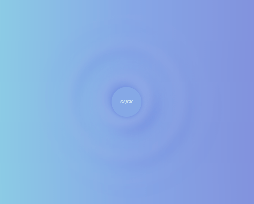
✨ Github: https://minbok-1998.github.io/Wave-button/
✨ Codepen: https://codepen.io/minbok-1998/pen/PoKgoKW
✨ Instagram: https://www.instagram.com/tv/CWgt7DsAd2L/?utm_source=ig_web_copy_link
Code
HTML
<!DOCTYPE html>
<html lang="ko">

<head>
    <meta charset="UTF-8">
    <meta http-equiv="X-UA-Compatible" content="IE=edge">
    <meta name="viewport" content="width=device-width, initial-scale=1.0">
    <title>Wave Button</title>
    <link rel="preconnect" href="https://fonts.googleapis.com">
    <link rel="preconnect" href="https://fonts.gstatic.com" crossorigin>
    <link href="https://fonts.googleapis.com/css2?family=Sriracha&display=swap" rel="stylesheet">
    <link rel="stylesheet" href="../reset.css">
    <link rel="stylesheet" href="style.css">
</head>

<body>
    <div class="container">
        <button class="btn"></button>
        <div class="wave_wrap">
            <div class="wave"></div>
            <div class="wave"></div>
            <div class="wave"></div>
        </div>
    </div>
</body>
</html>
CSS
*,
*::before,
*::after {
    box-sizing: border-box;
}

:root {
    --shadowShift: 6px;
    --shadowBlur: 15px;
    --circleColor: rgb(241, 243, 246);
}

body {
    position: relative;
    min-height: 100vh;
    display: flex;
    justify-content: space-around;
    align-items: center;
    background-image: linear-gradient(to right, #fafafa 0%, #d8d8d8 100%);
}

.wave {
    position: relative;
    width: 500px;
    height: 500px;
    display: flex;
    justify-content: center;
    align-items: center;
}

.wave__btn {
    z-index: 100;
    width: 80px;
    height: 80px;
    border-radius: 20px;
    border: none;
    background-color: var(--circleColor);
    transform: rotate(45deg);
    transition: transform 0.2s ease-out;

    box-shadow: var(--shadowShift) 0 var(--shadowBlur) rgba(55 84 170 / 0.2),
        calc(var(--shadowShift) * -1) 0 var(--shadowBlur) rgba(255 255 255 / 1);

    /*     box-shadow: inset var(--shadowShift) 0 var(--shadowBlur) rgba(55 84 170 / 0.2),
var(--shadowShift) 0 var(--shadowBlur) rgba(55 84 170 / 0.2),
inset calc(var(--shadowShift) * -1) 0 var(--shadowBlur)
rgba(255 255 255 / 1),
calc(var(--shadowShift) * -1) 0 var(--shadowBlur) rgba(255 255 255 / 1); */
}

.wave__btn:hover {
    cursor: pointer;
    transform: rotate(45deg) scale(1.1);
}

.wave__btn::before {
    content: "CLICK";
    color: #31373f;
    font-weight: bold;
    font-size: 12px;
    position: absolute;
    top: 0;
    left: 0;
    right: 0;
    bottom: 0;
    display: flex;
    justify-content: center;
    align-items: center;
    margin: auto;
    transform: rotate(-45deg);
}

.wave__btn:focus {
    outline: none;
}

.wave__btn:focus-visible {
    border-color: #89aedf;
}

.wave__btn:active {
    opacity: 0.7;
    transform: rotate(45deg) scale(1);
}

.wave__container {
    position: absolute;
    top: 0;
    left: 0;
    right: 0;
    bottom: 0;
}

.wave__circle {
    position: absolute;
    background-color: transparent;
    border: 10px solid var(--circleColor);
    border-radius: 50%;
    box-shadow: inset var(--shadowShift) var(--shadowShift) var(--shadowBlur) rgba(55 84 170 / 0.2),
        var(--shadowShift) var(--shadowShift) var(--shadowBlur) rgba(55 84 170 / 0.2),
        inset calc(var(--shadowShift) * -1) calc(var(--shadowShift) * -1) var(--shadowBlur) rgba(255 255 255 / 1),
        calc(var(--shadowShift) * -1) calc(var(--shadowShift) * -1) var(--shadowBlur) rgba(255 255 255 / 1);
    filter: blur(3px);

    animation-name: ripple;
    animation-duration: 3s;
    animation-timing-function: cubic-bezier(0, 0.2, 0.8, 1);
    animation-iteration-count: infinite;
}

.wave__container .wave__circle:nth-child(2) {
    animation-delay: -1s;
}

.wave__container .wave__circle:nth-child(3) {
    animation-delay: -2s;
}

@keyframes ripple {
    0% {
        top: 250px;
        left: 250px;
        width: 0;
        height: 0;
        opacity: 1;
    }

    100% {
        top: 0;
        left: 0;
        width: 500px;
        height: 500px;
        opacity: 0;
    }
}

헐 버튼 너무 예뻐요,, 담에 꼭 따라 만들어봐야겠어요