이번에 안드로이드 스터디를 진행하면서 Compose에 대해 알아보기로 했다!
지금까지 화면을 그릴 때 xml layout을 사용했다보니 생소하고 조금 어려웠다🥹
처음 공부하고 느낀 점은... xml 계속 쓸래.. 였다ㅎㅎ
지금까지 진행했던 프로젝트 화면을 Compose로 바꾸는 것도 해보려고 했는데 아직은 안 될 것 같다..ㅎㅎ
코틀린으로 프로젝트 진행한 거는 회사에서 한 거 밖에 없는데 화면이 넘 복잡해서 엄두를 못 내겠다😂
아직 익숙하지 않아서 이렇게 느꼈겠지만 언젠간 익숙해지길 바라며 남기는 Compose 공부 기록!
Compose란
- Jetpack Compose는 Android UI를 빌드하기 위해 사용하는 최신 도구 키트이다.
- 더 적은 수의 코드, 강력한 도구, 직관적인 Kotlin API로 Android에서의 UI 개발을 간소화하고 가속할 수 있다.
@Composable을 통해 함수가 데이터를 UI로 변환하게 되어 있다는 것을 Compose 컴파일러에게 알림- 선언형 UI 개발을 가능하게 하는 안드로이드 프레임워크
Android에서 Compose 시작하기
xml이 아닌 setContent에서 구성 가능한 함수를 호출해 레이아웃을 구성
class MainActivity : ComponentActivity() {
override fun onCreate(savedInstanceState: Bundle?) {
super.onCreate(savedInstanceState)
setContent {
AndroidComposeTheme {
// A surface container using the 'background' color from the theme
Surface(
modifier = Modifier.fillMaxSize(),
color = MaterialTheme.colorScheme.background
) {
GreetingText("minchae")
}
}
}
}
}
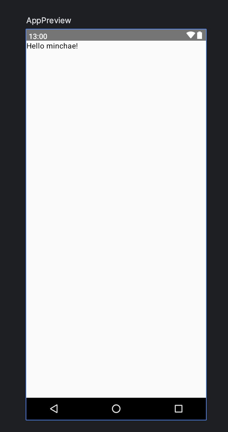
@Composable
private fun GreetingText(name: String) {
Text(
text = "Hello $name!"
)
}@Preview를 앞에 붙이면 안드로이드 스튜디오에서 미리보기가 가능하다!
@Preview(showSystemUi = true, showBackground = true)
@Composable
fun AppPreview() {
    AndroidComposeTheme {
        GreetingText("minchae")
    }
}
Compose의 세 가지 기본 표준 레이아웃 요소
Column: 하위 요소를 세로로 배치Row: 하위 요소를 가로로 배치Box: 여러 위젯을 겹쳐서 놓을 수 있는 레이아웃, 여러 Composable을 포함할 수 있음
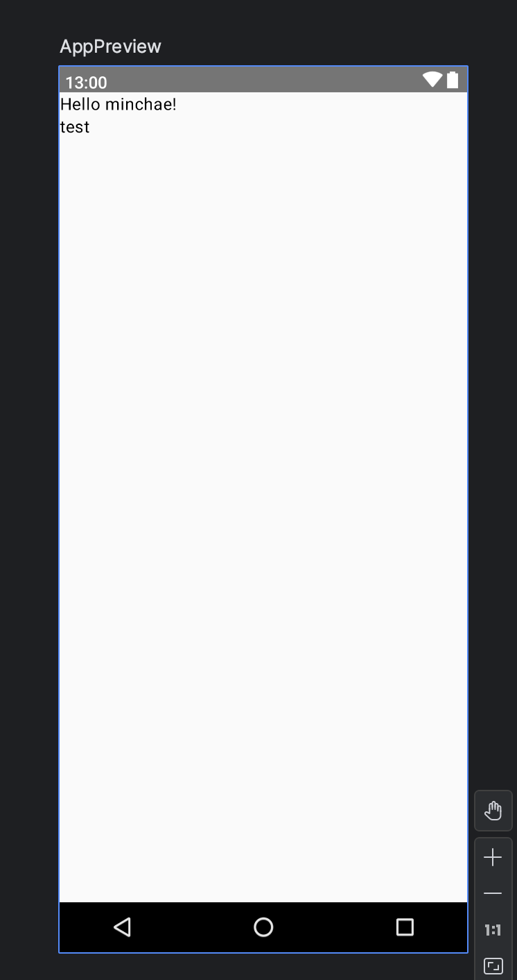
// Column을 이용해 두 개의 텍스트를 세로로 배치
@Composable
private fun Greeting(name: String) {
    Column {
        Text(
            text = "Hello $name!"
        )

        Text(
            text = "test"
        )
    }
}
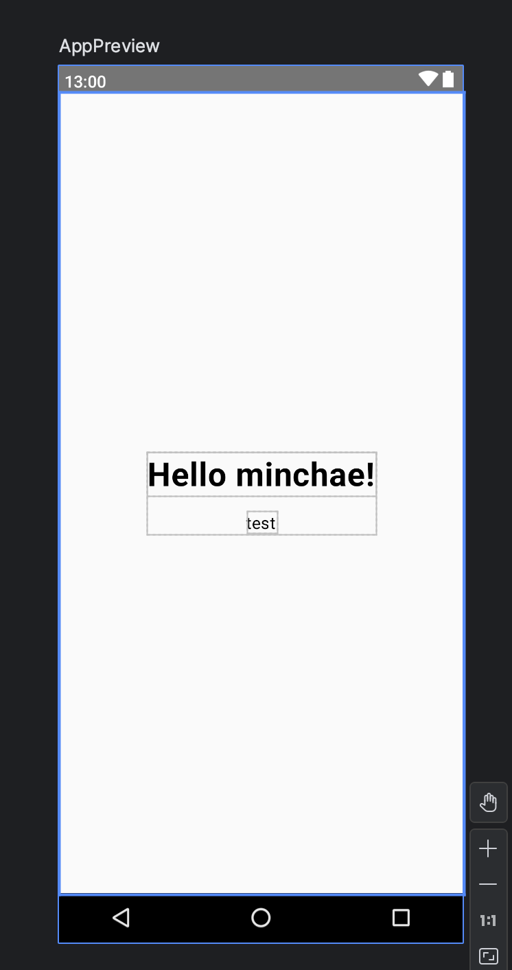
텍스트 수정
- 텍스트의 크기, 굵기 등을 변경할 때에는 해당 요소의 값을 수정하면 된다.
Text(
	text = "Hello $name!",
    fontWeight = FontWeight.Bold, // Bold체로 변경
    fontSize = 32.sp, // 크기 변경
    lineHeight = 116.sp, // 줄 높이 변경
    textAlign = TextAlign.Center, // 텍스트 중앙 정렬
)
Modifier
- Compose의 UI의 구성 요소를 꾸미거나 행동을 추가하기 위한 요소들의 모임
@Composable
private fun GreetingText(name: String, modifier: Modifier = Modifier) {
	/**
     * Row를 사용하는 경우
     * verticalAlignment = Alignment.CenterVertically,
     * horizontalArrangement = Arrangement.Center
     * */
    Column(
        modifier = modifier
        	.fillMaxSize() // 가로, 세로를 가득 채움
            .fillMaxWidth() // 가로로 가득 채움
            .fillMaxHeight(), // 세로로 가득 채움
        horizontalAlignment = Alignment.CenterHorizontally,
        verticalArrangement = Arrangement.Center
    ) {
        Text(
            text = "Hello $name!",
            fontWeight = FontWeight.Bold, // Bold로 변경
            fontSize = 32.sp, // 크기 변경
            lineHeight = 116.sp, // 줄 높이 변경
            textAlign = TextAlign.Center, // 텍스트 중앙 정렬
        )

        Text(
            text = "test",
            modifier = Modifier
                .padding(top = 16.dp)
//                .align(alignment = Alignment.CenterHorizontally) // 해당 요소를 수평 중앙 정렬
        )
    }
}
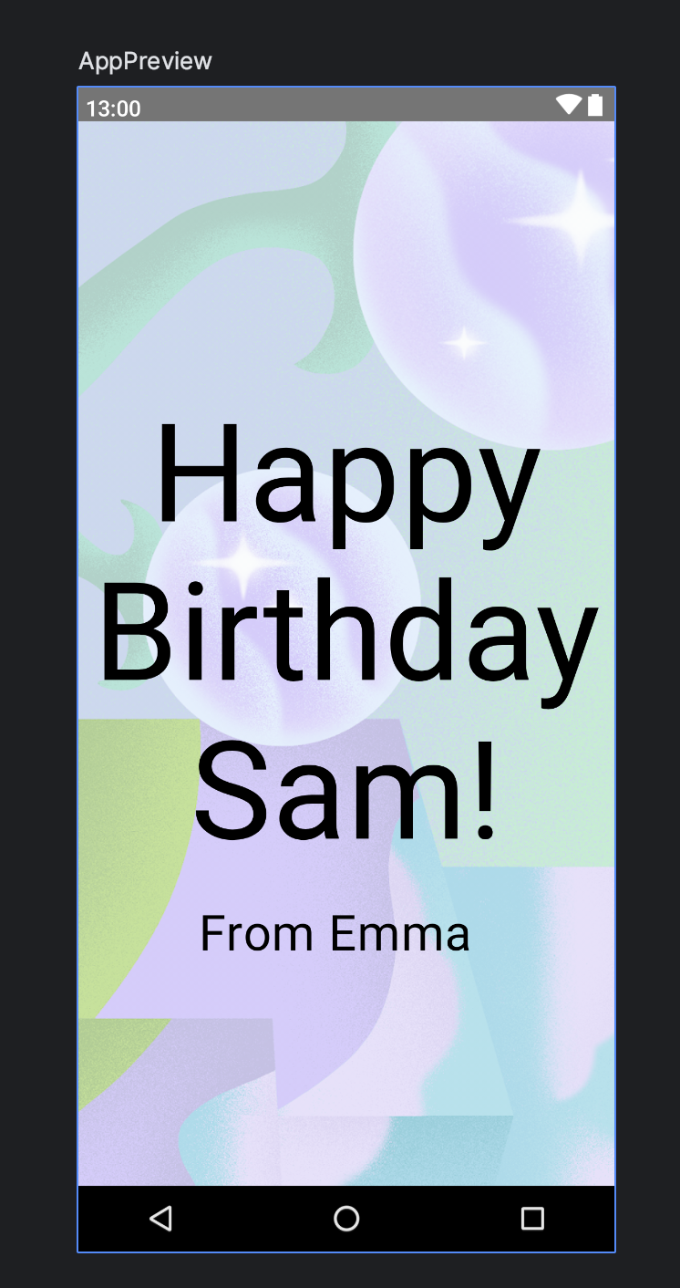
이미지 추가
Image()사용paintResource를 이용해 drawable에 있는 이미지를 불러와서 사용contentDescription의 경우 시각장애 사용자를 위한 접근성관련 문구 텍스트를 넣어주기 위한 파라미터 (필수)
Image(
	painter = painterResource(id = R.drawable.androidparty),
    contentDescription = null,
    contentScale = ContentScale.Crop, // 이미지 크기 조정
    alpha = 0.5F // 투명도 조절
)
간단한 생일 카드 앱 만들기
- 위의 모든 요소를 사용해 간단한 생일 카드 앱을 만들었다.
@Composable
fun GreetingText(message: String, from: String, modifier: Modifier = Modifier) {
    Column(
        // 화면 가운데 정렬
        modifier = modifier.fillMaxSize(),
        verticalArrangement = Arrangement.Center,
        horizontalAlignment = Alignment.CenterHorizontally
    ) {
        Text(
            text = message,
            fontSize = 100.sp,
            lineHeight = 116.sp,
            textAlign = TextAlign.Center,
            modifier = Modifier.padding(top = 16.dp)
        )

        Text(
            text = from,
            fontSize = 36.sp,
            modifier = Modifier
                .padding(top = 16.dp)
                .padding(end = 16.dp)
                .align(alignment = Alignment.CenterHorizontally)
        )
    }
}

@Composable
fun GreetingImage(message: String, from: String, modifier: Modifier = Modifier) {
    Box {
        Image(
            painter = painterResource(id = R.drawable.androidparty),
            contentDescription = null,
            contentScale = ContentScale.Crop,
            alpha = 0.5F
        )

        GreetingText(
            message = message,
            from = from,
            modifier = Modifier.padding(top = 8.dp)
        )
    }
}

@Preview(showSystemUi = true, showBackground = true)
@Composable
fun AppPreview() {
    AndroidComposeTheme {
        GreetingImage(
        	// strings.xml에 있는 문자를 가져와서 사용한 것
            stringResource(R.string.happy_birthday_text),
            stringResource(R.string.signature_text)
        )
    }
}
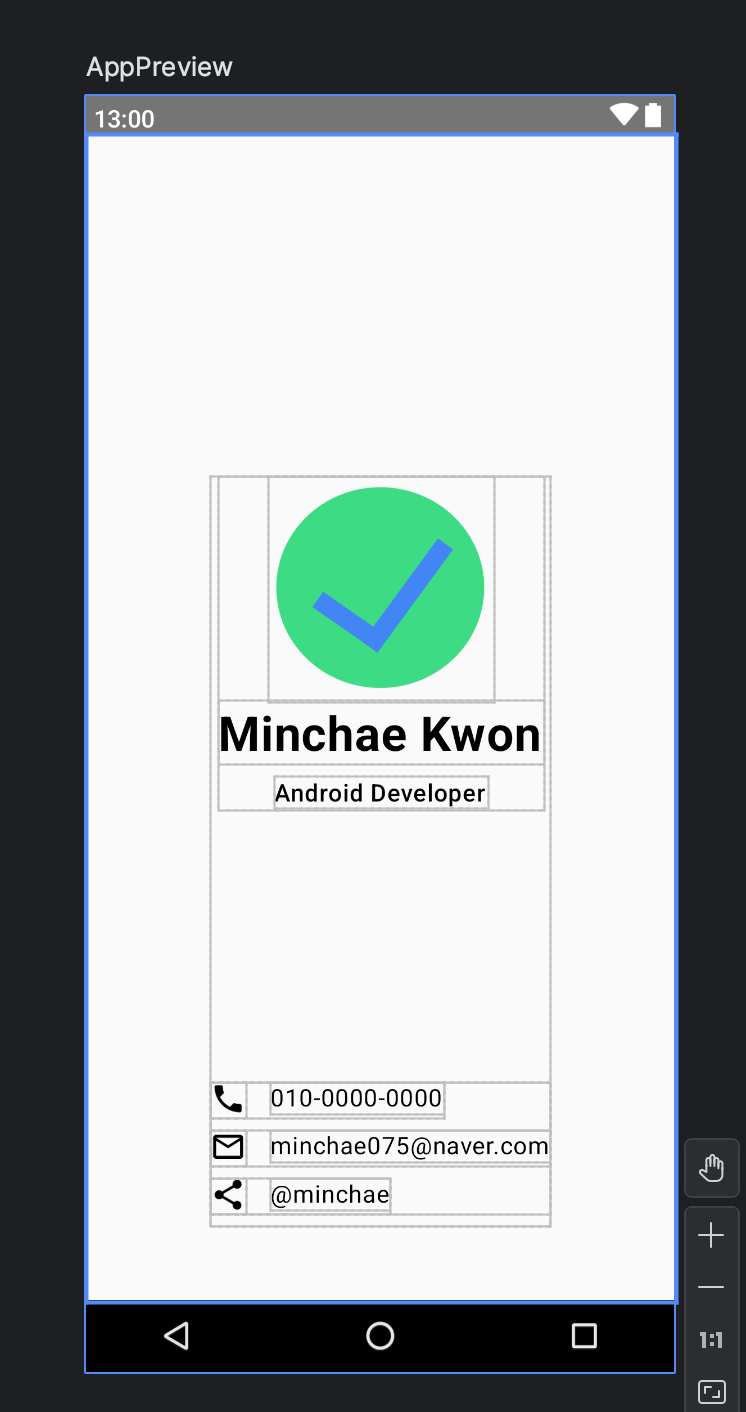
Business Card 앱 만들기
코드랩에서 진행하는 Compose 단원1의 마지막!
- 간단한 명함 UI
- 로고, 이름, 직함 부분이 있는 메인 정보와 연락처 정보가 있는 서브 정보 두 부분으로 나눔
@Composable
fun BusinessApp() {
    Box(
        Modifier.fillMaxSize(),
        contentAlignment = Alignment.Center
    ) {
        MainInfo(
            modifier = Modifier
                .align(Alignment.Center)
                .padding(bottom = 100.dp)
        )

        SubInfo(
            modifier = Modifier
                .align(Alignment.BottomCenter)
                .padding(bottom = 50.dp)
        )
    }
}

// 메인 정보
@Composable
fun MainInfo(modifier: Modifier = Modifier) {
    Column(
        modifier = modifier,
        horizontalAlignment = Alignment.CenterHorizontally
    ) {
        Image(
            painter = painterResource(id = R.drawable.ic_task_completed),
            contentDescription = null,
            // 이미지 크기 지정
            modifier = Modifier
                .width(150.dp)
                .height(150.dp)
        )

        Text(
            text = stringResource(R.string.card_name),
            fontWeight = FontWeight.Bold,
            fontSize = 32.sp,
            modifier = Modifier.padding(bottom = 8.dp)
        )

        Text(
            text = stringResource(R.string.card_title),
            fontWeight = FontWeight.Medium
        )
    }
}

// 서브 정보
@Composable
fun SubInfo(modifier: Modifier = Modifier) {
    Column(
        modifier = modifier
    ) {
        IconText(icon = Icons.Filled.Phone, content = stringResource(R.string.card_phone))
        IconText(icon = Icons.Filled.MailOutline, content = stringResource(R.string.card_email))
        IconText(icon = Icons.Filled.Share, content = stringResource(R.string.card_share))
    }
}

@Composable
fun IconText(icon: ImageVector, content: String, modifier: Modifier = Modifier) {
    Row(
        modifier = modifier.padding(bottom = 8.dp)
    ) {
        Icon(imageVector = icon, contentDescription = null, modifier.padding(end = 16.dp))
        Text(text = content,)
    }
}

@Preview(showSystemUi = true, showBackground = true)
@Composable
fun AppPreview() {
    AndroidComposeTheme {
          BusinessApp()
    }
}
참조
코딩계의 떠오르는 태양☀️