리액트 네이티브로 앱 개발을 하다보면, 아이폰의 경우 notch가 있어 body에 패딩을 주거나 하는 방식으로 처리를 해 줘야 할 때가 생긴다. 또한, 버튼 크기같은 경우도 만들고 나서 앱 빌드를 해보니, 안드로이드와 애플이 다른 것이 아닌가 😮...!
이럴 때 사용할 수 있는게, Platform과 styled-component의 css헬퍼 기능이다.
아래는 버튼의 세로 높이를 안드로이드 버전, ios버전 다르도록 설정해 준 예이다.
1. 다음과 같이 먼저 Platform을 import 해 준 후,
import {Platform} from 'react-native';
2. 아래와 같이 Platform과 css를 통해서 처리해준다.
const LoginText = styled.Text`
  ${Platform.select({
    ios: css`
      padding: 12px;
    `,
  })}
  color: ${({theme}) => theme.white};
  text-align: center;
  font-size: ${({theme}) => theme.fontRegular};
  font-family: 'NotoSansKR-Bold';
`;
3. 이렇게 버튼 크기 뿐만이 아니라, 하나의 컴포넌트를 만드는 데 스타일을 다르게 설정할 때에도 아주 유용하다!
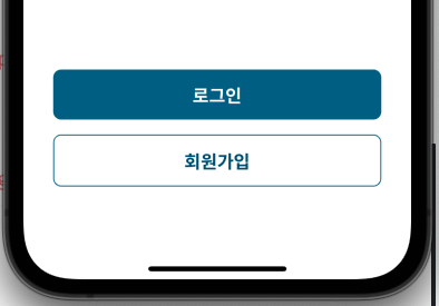
3-1 ) 부모 컴포넌트에서 두 개의 버튼(Login버튼, Signup버튼)을 만들고 싶었다. 따라서 id를 prop으로 전달한 후,
     <LoginSignupBtn
          id="login"
          navigate={() => {
            changeScreen('Login');
          }}>
          <LoginText>로그인</LoginText>
        </LoginSignupBtn>
        <LoginSignupBtn
          id="signup"
          navigate={() => {
            changeScreen('Signup');
          }}>
          <SignupText>회원가입</SignupText>
        </LoginSignupBtn>
3-2 ) 해당 id를 받아 styling하는 데에 사용해 주었다.
import React from 'react';
import {GestureResponderEvent} from 'react-native';
import styled, {css} from 'styled-components/native';

interface LoginSignupBtnProps {
  id: string;
  children: JSX.Element;
  navigate: (event: GestureResponderEvent) => void;
}

interface ButtonProps {
  id: string;
}

const LoginSignupBtn = ({navigate, children, id}: LoginSignupBtnProps) => {
  return (
    <Button id={id} onPress={navigate}>
      {children}
    </Button>
  );
};

export default LoginSignupBtn;

const LoginButton = css`
  background-color: ${({theme}) => theme.primary};
`;

const SignupButton = css`
  background-color: ${({theme}) => theme.white};
  border: 1px solid ${({theme}) => theme.primary};
`;

const Button = styled.TouchableOpacity<ButtonProps>`
  width: 100%;
  margin-bottom: 15px;
  border-radius: 8px;
  ${({id}) => (id === 'login' ? LoginButton : SignupButton)}
`;
아래와 같이 하나의 컴포넌트 인데, id에 따라 스타일이 다른 두 개의 버튼을 만들었다!
https://reactnative.dev/docs/platform
https://yumyumlog.tistory.com/244

⚓ A smooth sea never made a skillful mariner