1. 프로젝트 소개
1.1. 프로젝트 개요
이번 프로젝트는 자전거 대여 시스템 데이터를 분석하여, 대여 패턴을 파악하고 수요 예측 모델을 개발하는 것을 목표로 한다.
운영 담당자의 입장에서 데이터를 해석하고, 자전거 배치 및 운영 전략을 최적화하는 방안을 도출하는 것이 핵심이다.
1.2. 프로젝트 목표
- 자전거 대여 데이터의 다양한 패턴(시간대, 계절, 날씨 등) 분석
- 대여 수요에 영향을 미치는 주요 변수 탐색 및 시각화
- 머신러닝 회귀 모델을 활용한 수요 예측 및 성능 평가 (RMSLE 지표 사용)
- 분석 결과를 바탕으로 효율적인 자전거 운영 전략 제안
1.3. 평가 지표: RMSLE
- RMSLE(Root Mean Squared Logarithmic Error)는 예측 값과 실제 값의 차이를 로그 변환하여 계산하는 회귀 평가 지표이다.
- 예측 값이 실제 값보다 과대평가될 때 더 큰 패널티를 부과하여, 모델의 신뢰성을 높이는 데 효과적이다.
2. 데이터 탐색
2.1. 데이터 소개
- 데이터는 특정 도시의 자전거 대여 시스템 사용 기록으로, 날짜, 시간, 계절, 날씨, 온도, 습도, 풍속 등 다양한 변수를 포함합니다.
- 데이터 컬럼 및 설명은 아래와 같습니다.
| 컬럼명 | 데이터 타입 | 설명 |
|---|---|---|
datetime | datetime | 자전거 대여 기록의 날짜 및 시간 (예: 2011-01-01 00:00:00) |
season | int | 계절 (1: 봄, 2: 여름, 3: 가을, 4: 겨울) |
holiday | int | 공휴일 여부 (0: 평일, 1: 공휴일) |
workingday | int | 근무일 여부 (0: 주말/공휴일, 1: 근무일) |
weather | int | 날씨 상황 (1: 맑음, 2: 구름낌/안개, 3: 약간의 비/눈, 4: 폭우/폭설) |
temp | float | 실측 온도 (섭씨 ℃) |
atemp | float | 체감 온도 (섭씨 ℃) |
humidity | int | 습도 (%) |
windspeed | float | 풍속 (m/s) |
casual | int | 등록되지 않은 사용자의 대여 수 |
registered | int | 등록된 사용자의 대여 수 |
count | int | 총 대여 수 (종속 변수, Target 변수) |
2.2. 데이터셋 확인 및 정제(체크리스트)
- 데이터셋에 중복된 행이 없는지 확인한다.
- 결측치 또는 Null 값이 존재하는지 확인한다.
- 날짜(Date) 컬럼의 데이터 타입이 datetime 인지 확인(필요시 변환)한다.
- Date 컬럼에서 '월(month)'과 '요일(day of the week)' 컬럼을 생성한다.
- '요일(day of the week)' 컬럼에서 주말(weekend) 컬럼을 생성한다. (6, 7: 토요일, 일요일)
- 월, 요일, 주말 등 범주형 정보를 나타내는 컬럼의 데이터 타입을 범주형(categorical)으로 변환한다.
# 주요 라이브러리 import
import pandas as pd
import matplotlib.pyplot as plt
import seaborn as sns
import numpy as np
# 한글 폰트 설정
# Windows
plt.rc('font', family='Malgun Gothic')
# 음수 부호 하이픈 처리
plt.rcParams['axes.unicode_minus'] = False# 데이터 불러오기
train = pd.read_csv('data/train.csv')
test = pd.read_csv('data/test.csv')print(train.shape)
train.head()(10886, 12)| datetime | season | holiday | workingday | weather | temp | atemp | humidity | windspeed | casual | registered | count | |
|---|---|---|---|---|---|---|---|---|---|---|---|---|
| 0 | 2011-01-01 00:00:00 | 1 | 0 | 0 | 1 | 9.84 | 14.395 | 81 | 0.0 | 3 | 13 | 16 |
| 1 | 2011-01-01 01:00:00 | 1 | 0 | 0 | 1 | 9.02 | 13.635 | 80 | 0.0 | 8 | 32 | 40 |
| 2 | 2011-01-01 02:00:00 | 1 | 0 | 0 | 1 | 9.02 | 13.635 | 80 | 0.0 | 5 | 27 | 32 |
| 3 | 2011-01-01 03:00:00 | 1 | 0 | 0 | 1 | 9.84 | 14.395 | 75 | 0.0 | 3 | 10 | 13 |
| 4 | 2011-01-01 04:00:00 | 1 | 0 | 0 | 1 | 9.84 | 14.395 | 75 | 0.0 | 0 | 1 | 1 |
train.info()<class 'pandas.core.frame.DataFrame'>
RangeIndex: 10886 entries, 0 to 10885
Data columns (total 12 columns):
# Column Non-Null Count Dtype
--- ------ -------------- -----
0 datetime 10886 non-null object
1 season 10886 non-null int64
2 holiday 10886 non-null int64
3 workingday 10886 non-null int64
4 weather 10886 non-null int64
5 temp 10886 non-null float64
6 atemp 10886 non-null float64
7 humidity 10886 non-null int64
8 windspeed 10886 non-null float64
9 casual 10886 non-null int64
10 registered 10886 non-null int64
11 count 10886 non-null int64
dtypes: float64(3), int64(8), object(1)
memory usage: 1020.7+ KBprint(test.shape)
test.head()(6493, 9)| datetime | season | holiday | workingday | weather | temp | atemp | humidity | windspeed | |
|---|---|---|---|---|---|---|---|---|---|
| 0 | 2011-01-20 00:00:00 | 1 | 0 | 1 | 1 | 10.66 | 11.365 | 56 | 26.0027 |
| 1 | 2011-01-20 01:00:00 | 1 | 0 | 1 | 1 | 10.66 | 13.635 | 56 | 0.0000 |
| 2 | 2011-01-20 02:00:00 | 1 | 0 | 1 | 1 | 10.66 | 13.635 | 56 | 0.0000 |
| 3 | 2011-01-20 03:00:00 | 1 | 0 | 1 | 1 | 10.66 | 12.880 | 56 | 11.0014 |
| 4 | 2011-01-20 04:00:00 | 1 | 0 | 1 | 1 | 10.66 | 12.880 | 56 | 11.0014 |
test.info()<class 'pandas.core.frame.DataFrame'>
RangeIndex: 6493 entries, 0 to 6492
Data columns (total 9 columns):
# Column Non-Null Count Dtype
--- ------ -------------- -----
0 datetime 6493 non-null object
1 season 6493 non-null int64
2 holiday 6493 non-null int64
3 workingday 6493 non-null int64
4 weather 6493 non-null int64
5 temp 6493 non-null float64
6 atemp 6493 non-null float64
7 humidity 6493 non-null int64
8 windspeed 6493 non-null float64
dtypes: float64(3), int64(5), object(1)
memory usage: 456.7+ KB# 학습용 데이터 처리
# 1. 중복 행 확인
print("Train 중복 행 수:", train.duplicated().sum())
# 2. 결측치 확인
print("Train 결측치:\n", train.isnull().sum())
# 3. 날짜 컬럼 데이터 타입 변환
train['datetime'] = pd.to_datetime(train['datetime'])
# 4. 월(month), 요일(day of week), 시간(hour) 컬럼 생성
train['month'] = train['datetime'].dt.month
train['dayofweek'] = train['datetime'].dt.dayofweek
train['hour'] = train['datetime'].dt.hour # EDA를 위해 반드시 필요
# 5. 주말(weekend) 컬럼 생성 (토: 5, 일: 6)
train['weekend'] = train['dayofweek'].apply(lambda x: 1 if x >= 5 else 0)
# 6. 범주형 데이터 타입 변환
cat_cols = ['month', 'dayofweek', 'weekend', 'hour']
for col in cat_cols:
train[col] = train[col].astype('category')
# 결과 확인
print(train.head())Train 중복 행 수: 0
Train 결측치:
datetime 0
season 0
holiday 0
workingday 0
weather 0
temp 0
atemp 0
humidity 0
windspeed 0
casual 0
registered 0
count 0
dtype: int64
datetime season holiday workingday weather temp atemp \
0 2011-01-01 00:00:00 1 0 0 1 9.84 14.395
1 2011-01-01 01:00:00 1 0 0 1 9.02 13.635
2 2011-01-01 02:00:00 1 0 0 1 9.02 13.635
3 2011-01-01 03:00:00 1 0 0 1 9.84 14.395
4 2011-01-01 04:00:00 1 0 0 1 9.84 14.395
humidity windspeed casual registered count month dayofweek hour weekend
0 81 0.0 3 13 16 1 5 0 1
1 80 0.0 8 32 40 1 5 1 1
2 80 0.0 5 27 32 1 5 2 1
3 75 0.0 3 10 13 1 5 3 1
4 75 0.0 0 1 1 1 5 4 1 # 테스트 데이터 처리
# 1. 중복 행 확인
print("Test 중복 행 수:", test.duplicated().sum())
# 2. 결측치 확인
print("Test 결측치:\n", test.isnull().sum())
# 3. 날짜 컬럼 데이터 타입 변환
test['datetime'] = pd.to_datetime(test['datetime'])
# 4. 월(month), 요일(day of week), 시간(hour) 컬럼 생성
test['month'] = test['datetime'].dt.month
test['dayofweek'] = test['datetime'].dt.dayofweek
test['hour'] = test['datetime'].dt.hour # EDA/예측을 위해 반드시 필요
# 5. 주말(weekend) 컬럼 생성 (토: 5, 일: 6)
test['weekend'] = test['dayofweek'].apply(lambda x: 1 if x >= 5 else 0)
# 6. 범주형 데이터 타입 변환
cat_cols = ['month', 'dayofweek', 'weekend', 'hour']
for col in cat_cols:
test[col] = test[col].astype('category')
# 결과 확인
print(test.head())Test 중복 행 수: 0
Test 결측치:
datetime 0
season 0
holiday 0
workingday 0
weather 0
temp 0
atemp 0
humidity 0
windspeed 0
dtype: int64
datetime season holiday workingday weather temp atemp \
0 2011-01-20 00:00:00 1 0 1 1 10.66 11.365
1 2011-01-20 01:00:00 1 0 1 1 10.66 13.635
2 2011-01-20 02:00:00 1 0 1 1 10.66 13.635
3 2011-01-20 03:00:00 1 0 1 1 10.66 12.880
4 2011-01-20 04:00:00 1 0 1 1 10.66 12.880
humidity windspeed month dayofweek hour weekend
0 56 26.0027 1 3 0 0
1 56 0.0000 1 3 1 0
2 56 0.0000 1 3 2 0
3 56 11.0014 1 3 3 0
4 56 11.0014 1 3 4 0 2.3. 데이터셋 확인 및 정제 결과
- Train 데이터셋은 10886행 16열, Test 데이터셋은 6493행 13개열로 구성되어있다.
- Train, Test 데이터셋 모두 중복된 행이 0개다.
- Train, Test 데이터셋 모두 결측치 또는 Null 값이 존재하지 않는다.
- 날짜(datetime) 컬럼의 데이터 타입을 datetime으로 변환하였다.
- datetime 컬럼에서 '월(month)'과 '요일(dayofweek)' 컬럼을 생성하다.
- '요일(dayofweek)' 컬럼에서 주말(weekend) 컬럼을 생성하였다. (토요일, 일요일은 weekend=1)
- month, dayofweek, weekend 컬럼을 범주형(categorical) 데이터 타입으로 변환하였다.
3. 탐색적 데이터 분석(EDA) 및 시각화
- 탐색적 데이터 분석을 통해 데이터의 특성과 패턴을 파악하고, 어떤 변수(특징, 피처)가 예측에 중요한지 인사이트를 정리한다.
- 해당 결과를 바탕으로 모델 학습에 사용할 주요 변수(피처)를 선정, 불필요한 변수는 제외하고, 필요한 파생 변수(예: 피크 시간대 여부 등)를 추가한다.
3.1. 타겟 변수(대여 수요) 분포 확인
(1) 전체 대여량(count) 분포 시각화 (히스토그램, 박스플롯)
plt.figure(figsize=(12, 5))
plt.subplot(1, 2, 1)
sns.histplot(train['count'], bins=30, kde=True)
plt.title('대여량(count) 분포 - 히스토그램')

plt.subplot(1, 2, 2)
sns.boxplot(x=train['count'])
plt.title('대여량(count) 분포 - 박스플롯')
plt.show()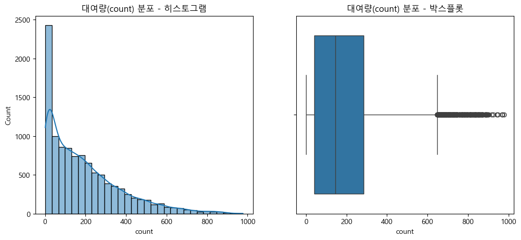
- 대여량(count) 분포는 정규분포가 아닌 한쪽으로 쏠린 비대칭 분포를 보임.
- 극단적으로 큰 값(이상치)이 다수 존재, 전처리나 모델링 과정에서 주의 필요
- 로그 변환 등 분포 완화 또는 이상치 처리 고려
(2) 로그 변환 필요성 및 이상치(아웃라이어) 확인
plt.figure(figsize=(12, 5))
plt.subplot(1, 2, 1)
sns.histplot(np.log1p(train['count']), bins=30, kde=True)
plt.title('로그 변환된 대여량 분포')

plt.subplot(1, 2, 2)
sns.boxplot(x=np.log1p(train['count']))
plt.title('로그 변환된 대여량 박스플롯')
plt.show()

# 로그 변환을 하면 데이터가 더 "정규분포"에 가까워지고, 모델이 다양한 값을 더 잘 학습할 수 있음
# 이상치 확인: 박스플롯이나 히스토그램을 통해 대여량(count) 데이터에 극단적으로 큰 값(아웃라이어)이 있는지 확인함.
# 이상치가 많으면 모델이 그 값에 지나치게 영향을 받을 수 있음. 로그 변환을 하면 이런 극단값의 영향이 줄어듦.
# 자전거 수요 예측[1/4] 캐글 머신러닝 탐색적 데이터 분석 16분 30초 참조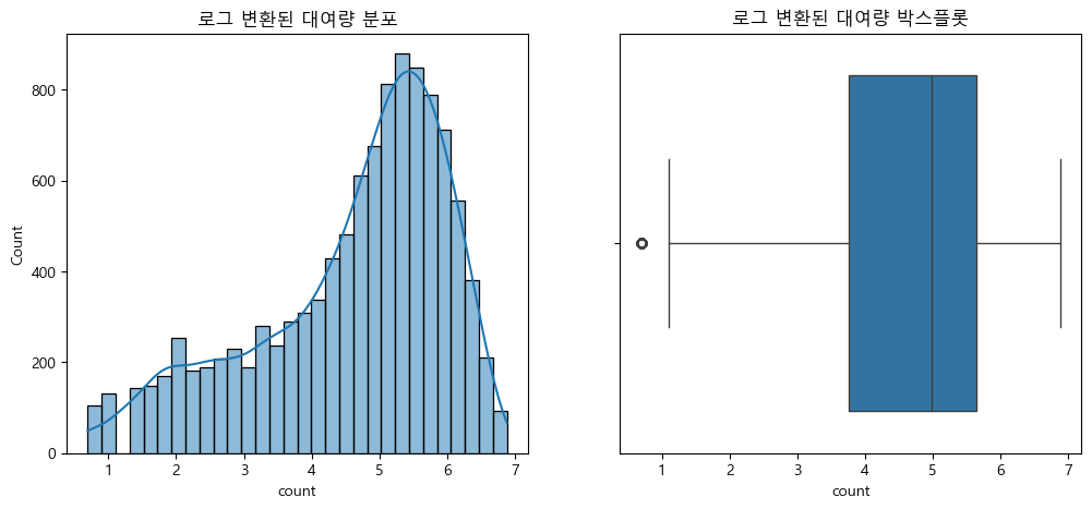
3.2. 시간대별 자전거 대여 패턴 분석
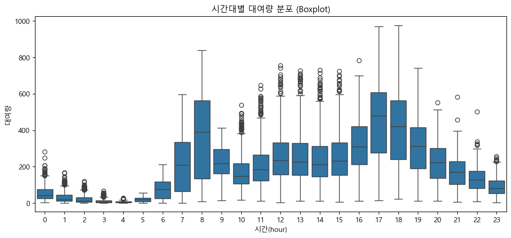
(1) 시간(hour)별 대여량 변화 (라인플롯, 박스플롯)
# 시간(hour) 컬럼 생성: 데이터 정제 단계에서 처리하였음.
# train['hour'] = train['datetime'].dt.hour

# 그룹별 평균 계산
hourly_mean = train.groupby('hour', observed=False)['count'].mean().reset_index()

# 시간대별 평균 라인플롯
plt.figure(figsize=(12, 5))
sns.lineplot(x='hour', y='count', data=hourly_mean, marker='o')
plt.title('시간대별 평균 대여량 (lineplot)')
plt.xlabel('시간(hour)')
plt.ylabel('평균 대여량')
plt.xticks(range(0, 24))  # 0~23 1시간 단위 라벨
plt.grid(True, axis='x', alpha=0.3)
plt.show()

# 시간대별 대여량 분포 박스플롯
plt.figure(figsize=(12, 5))
sns.boxplot(x='hour', y='count', data=train)
plt.title('시간대별 대여량 분포 (Boxplot)')
plt.xlabel('시간(hour)')
plt.ylabel('대여량')
plt.xticks(range(0, 24))  # 0~23 1시간 단위 라벨
plt.show()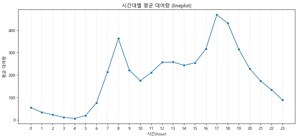
-
출퇴근 시간대에 대여량이 급등, 새벽과 심야에는 대여량이 매우 낮음
-
시간대별 자전거 대여 패턴: 출근 시간(7~8시), 퇴근 시간(17~18시)에 대여량이 집중적으로 증가
-
나머지 시간대(특히 새벽·심야와 낮 시간)에는 수요가 낮게 유지되는 '피크 타임 중심'의 형태를 보임
-
대여소 운영과 자전거 배치에서 피크 시간 집중 관리가 필요함을 시사
(2) 요일, 월, 계절별 대여량 시각화
# 요일별 평균 대여량 (바플롯 + 오차막대)
plt.figure(figsize=(12, 5))
sns.barplot(x='dayofweek', y='count', data=train, palette='Pastel1', hue='dayofweek', legend=False)
plt.title('요일별 평균 대여량 (Barplot + error bar)')
plt.xlabel('요일(0=월, 6=일)')
plt.ylabel('평균 대여량')
plt.show()
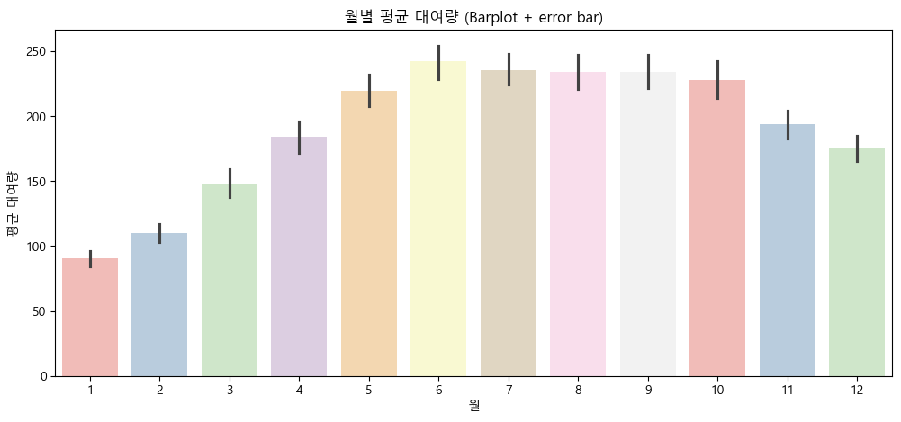
# 월별 평균 대여량 (바플롯 + 오차막대)
plt.figure(figsize=(12, 5))
sns.barplot(x='month', y='count', data=train, palette='Pastel1', hue='month', legend=False)
plt.title('월별 평균 대여량 (Barplot + error bar)')
plt.xlabel('월')
plt.ylabel('평균 대여량')
plt.show()
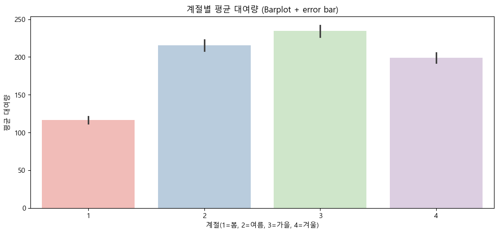
# 계절별 평균 대여량 (바플롯 + 오차막대)
plt.figure(figsize=(12, 5))
sns.barplot(x='season', y='count', data=train, palette='Pastel1', hue='season', legend=False)
plt.title('계절별 평균 대여량 (Barplot + error bar)')
plt.xlabel('계절(1=봄, 2=여름, 3=가을, 4=겨울)')
plt.ylabel('평균 대여량')
plt.show()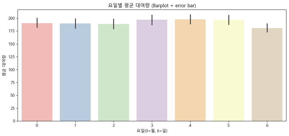
- 요일별 평균 대여량
- 요일별 대여 수요 패턴이 뚜렷하게 차이나지 않으며, 주중과 주말 모두 고르게 대여가 이루어짐.
- 특별히 특정 요일에 수요가 급격히 증가·감소하는 현상은 관찰되지 않음.
- 월별 평균 대여량
- 자전거 대여는 봄부터 추석 시즌까지(4~10월)가 가장 활발하며, 겨울(11~3월)에는 대여가 크게 감소하는 뚜렷한 월별 변화가 있음.
- 계절별 평균 대여량
- 자전거 대여는 여름과 가을에 집중되고, 겨울과 봄에는 상대적으로 수요가 감소하는 계절적 패턴이 뚜렷하게 확인됨.
3.3. 날씨와 자전거 대여 수요 간의 상관 관계
(1) 온도, 체감온도, 습도, 풍속, 날씨별 대여량 시각화
# 실측 온도, 체감온도, 습도, 풍속의 최댓값/최소값을 확인하여, 구간을 어떻게 나눌지 확인한다.
print(f"실측온도 최댓값: {train['temp'].max()}, 최솟값: {train['temp'].min()}")
print(f"체감온도 최댓값: {train['atemp'].max()}, 최솟값: {train['atemp'].min()}")
print(f"습도 최댓값: {train['humidity'].max()}, 최솟값: {train['humidity'].min()}")
print(f"풍속 최댓값: {train['windspeed'].max()}, 최솟값: {train['windspeed'].min()}")
실측온도 최댓값: 41.0, 최솟값: 0.82
체감온도 최댓값: 45.455, 최솟값: 0.76
습도 최댓값: 100, 최솟값: 0
풍속 최댓값: 56.9969, 최솟값: 0.0# 1. 온도 구간으로 나누기 (0.82 ~ 41.0 → 5도 단위, 40도 초과 데이터는 1개이므로 시각화 미포함)
train['temp_bin'] = pd.cut(train['temp'], bins=[0, 5, 10, 15, 20, 25, 30, 35, 40])
# 2. 체감온도 구간으로 나누기 (0.76 ~ 45.455 → 5도 단위, 45도 초과 데이터는 1개이므로 시각화 미포함)
train['atemp_bin'] = pd.cut(train['atemp'], bins=[0, 5, 10, 15, 20, 25, 30, 35, 40, 45])
# 3. 습도 구간으로 나누기 (0 ~ 100 → 20% 단위)
train['humidity_bin'] = pd.cut(train['humidity'], bins=[0, 20, 40, 60, 80, 100])
# 4. 풍속 구간으로 나누기 (0 ~ 56.9969 → 10 단위)
train['windspeed_bin'] = pd.cut(train['windspeed'], bins=[0, 10, 20, 30, 40, 50, 60])
# 시각화
fig, axes = plt.subplots(2, 2, figsize=(16, 12))
# 온도 vs 대여량 (바플롯 + 오차막대)
sns.barplot(x='temp_bin', y='count', hue='temp_bin', data=train, ax=axes[0,0], palette='Pastel1', legend=False)
axes[0,0].set_title('실측 온도 구간별 평균 대여량 (Barplot + Error Bar)', fontsize=14)
axes[0,0].set_xlabel('실측 온도 구간', fontsize=12)
axes[0,0].set_ylabel('평균 대여량', fontsize=12)
axes[0,0].tick_params(axis='x', rotation=45)
# 체감온도 vs 대여량 (바플롯 + 오차막대)
sns.barplot(x='atemp_bin', y='count', hue='atemp_bin', data=train, ax=axes[0,1], palette='Pastel1', legend=False)
axes[0,1].set_title('체감 온도 구간별 평균 대여량 (Barplot + Error Bar)', fontsize=14)
axes[0,1].set_xlabel('체감 온도 구간', fontsize=12)
axes[0,1].set_ylabel('평균 대여량', fontsize=12)
axes[0,1].tick_params(axis='x', rotation=45)
# 습도 vs 대여량 (바플롯 + 오차막대)
sns.barplot(x='humidity_bin', y='count', hue='humidity_bin', data=train, ax=axes[1,0], palette='Pastel1', legend=False)
axes[1,0].set_title('습도 구간별 평균 대여량 (Barplot + Error Bar)', fontsize=14)
axes[1,0].set_xlabel('습도 구간', fontsize=12)
axes[1,0].set_ylabel('평균 대여량', fontsize=12)
axes[1,0].tick_params(axis='x', rotation=45)
# 풍속 vs 대여량 (바플롯 + 오차막대)
sns.barplot(x='windspeed_bin', y='count', hue='windspeed_bin', data=train, ax=axes[1,1], palette='Pastel1', legend=False)
axes[1,1].set_title('풍속 구간별 평균 대여량 (Barplot + Error Bar)', fontsize=14)
axes[1,1].set_xlabel('풍속 구간', fontsize=12)
axes[1,1].set_ylabel('평균 대여량', fontsize=12)
axes[1,1].tick_params(axis='x', rotation=45)
plt.tight_layout()
plt.show()
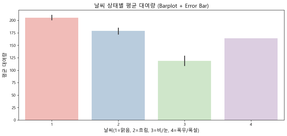
# 날씨 상태별 대여량 (바플롯 + 오차막대)
plt.figure(figsize=(12, 5))
sns.barplot(x='weather', y='count', hue='weather', data=train, palette='Pastel1', legend=False)
plt.title('날씨 상태별 평균 대여량 (Barplot + Error Bar)', fontsize=14)
plt.xlabel('날씨(1=맑음, 2=흐림, 3=비/눈, 4=폭우/폭설)', fontsize=12)
plt.ylabel('평균 대여량', fontsize=12)
plt.show()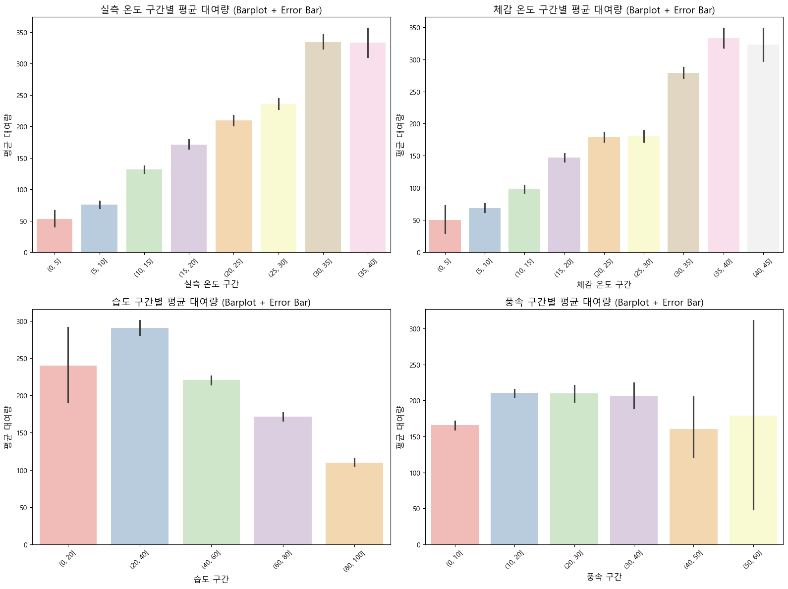
# 온도 구간별 데이터 개수
print("온도 구간별 데이터 개수:")
print(train['temp_bin'].value_counts().sort_index())
print("\n")

# 체감온도 구간별 데이터 개수
print("체감온도 구간별 데이터 개수:")
print(train['atemp_bin'].value_counts().sort_index())
print("\n")

# 습도 구간별 데이터 개수
print("습도 구간별 데이터 개수:")
print(train['humidity_bin'].value_counts().sort_index())
print("\n")

# 풍속 구간별 데이터 개수
print("풍속 구간별 데이터 개수:")
print(train['windspeed_bin'].value_counts().sort_index())
온도 구간별 데이터 개수:
temp_bin
(0, 5] 129
(5, 10] 1130
(10, 15] 2134
(15, 20] 1915
(20, 25] 2080
(25, 30] 2254
(30, 35] 1051
(35, 40] 192
Name: count, dtype: int64
체감온도 구간별 데이터 개수:
atemp_bin
(0, 5] 44
(5, 10] 533
(10, 15] 1385
(15, 20] 1710
(20, 25] 2352
(25, 30] 1612
(30, 35] 2463
(35, 40] 638
(40, 45] 148
Name: count, dtype: int64
습도 구간별 데이터 개수:
humidity_bin
(0, 20] 56
(20, 40] 1560
(40, 60] 3564
(60, 80] 3382
(80, 100] 2302
Name: count, dtype: int64
풍속 구간별 데이터 개수:
windspeed_bin
(0, 10] 3026
(10, 20] 5052
(20, 30] 1068
(30, 40] 387
(40, 50] 36
(50, 60] 4
Name: count, dtype: int64(1), (2) 온도/체감온도 구간별 평균 대여량
- 온도와 체감온도 모두 25~40도 구간에서 평균 대여량이 가장 높음(약 300~350건).
- 기온이 낮을수록(0~15도) 대여량이 급격히 감소하며, 극저온 구간(0~5도)에서는 매우 낮은 수요를 보임.
- 온도가 높을수록 대여량이 증가하는 뚜렷한 양의 상관관계가 확인됨.
(3) 습도 구간별 평균 대여량
- 습도가 낮을수록(0~40%) 대여량이 높고, 습도가 증가할수록 대여량이 점진적으로 감소함.
- 습도 80~100% 구간에서는 평균 대여량이 가장 낮아(약 110건), 높은 습도가 자전거 대여에 부정적 영향을 미침.
(4) 풍속 구간별 평균 대여량
- 풍속 0~30 구간에서는 비슷한 수준(약 200~210건)을 유지하지만, 40 이상 구간부터 급격히 감소함.
- 50~60 구간(4건)에서는 데이터 수가 매우 적어 평균값의 신뢰도가 낮으며, 큰 오차 막대가 나타남. *강풍 시 데이터 불충분해 해석에 주의 필요
(5) 날씨 상태별 평균 대여량
- 맑음(1): 평균 대여량이 가장 높으며(약 200건 이상), 오차 막대도 짧아 안정적인 수요를 보임.
- 흐림(2): 맑음보다 소폭 낮지만 여전히 높은 수준(약 180건)을 유지함.
- 비/눈(3): 평균 대여량이 크게 감소하며(약 120건), 악천후가 대여에 부정적 영향을 미침.
- 폭우/폭설(4): 전체 데이터 중 단 1건만 존재하여 통계적으로 의미가 없음.
*날씨가 나쁠수록 대여량이 감소하는 패턴이 확인되므로, 이 구간은 분석에서 제외하거나 해석 시 주의가 필요
(2) 상관계수(heatmap)로 주요 변수와 count의 관계 확인
corr = train[['count', 'temp', 'atemp', 'humidity', 'windspeed']].corr()
plt.figure(figsize=(8, 6))
sns.heatmap(corr, annot=True, cmap='coolwarm')
plt.title('날씨 관련 변수와 자전거 대여량 상관 관계')
plt.show()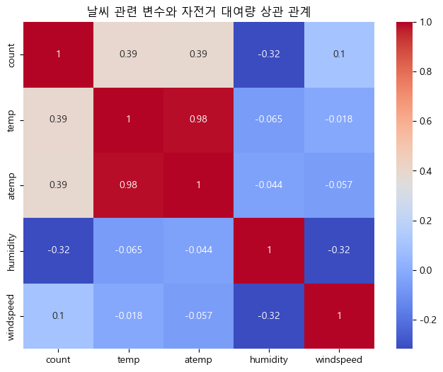
날씨 변수와 자전거 대여량 상관관계 히트맵 분석
-
피어슨 상관계수는 -1에서 1 사이의 값을 가지며, 1에 가까울수록 강한 양의 선형 상관관계, -1에 가까울수록 강한 음의 선형 상관관계를 의미한다.
-
그러나 count 변수와 상관계수가 0.5의 절대값을 넘는 변수는 없으므로, 변수 간 선형 관계는 뚜렷하지 않다.
-
실측 온도(temp), 체감온도(atemp)는 자전거 대여량과 모두 양의 상관관계()를 보인다.
-
온도가 높을수록 대여가 증가하는 경향이 있기는 하나, 주요 결정요인으로 단정하기는 어렵다.
-
습도(humidity) 또한 대여량과 약한 음의 상관관계()를 보여, 습도가 높아질수록 대여량이 다소 줄기는 하나, 역시 강한 영향으로 보기는 어렵다.
-
풍속(windspeed)는 대여량과의 상관계수가 매우 낮아(), 유의미한 선형 관계를 찾기 어렵다.
3.4. 평일과 주말, 근무일과 휴일의 자전거 대여 수요 차이
(1) 평일 vs 주말 대여량 비교
plt.figure(figsize=(8, 5))
sns.boxplot(x='weekend', y='count', data=train)
plt.title('평일 vs 주말 대여량 분포')
plt.xlabel('0=평일, 1=주말')
plt.ylabel('대여량')
plt.show()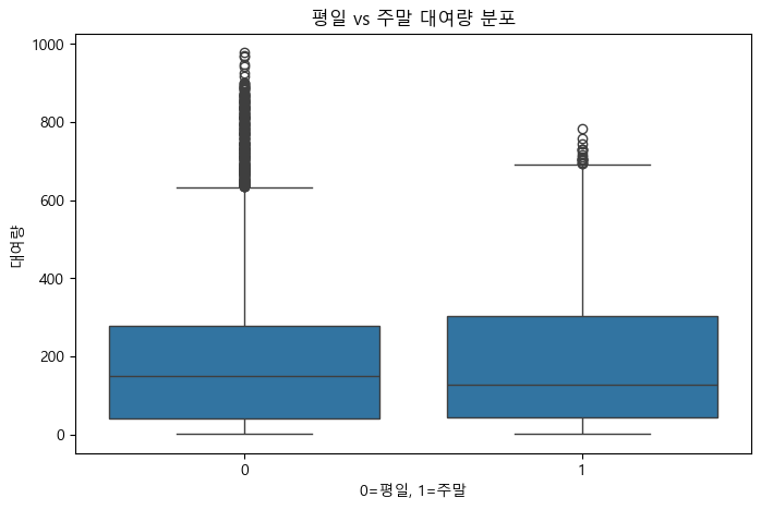
(2) 근무일 vs 휴일 대여량 비교
plt.figure(figsize=(8, 5))
sns.boxplot(x='holiday', y='count', data=train)
plt.title('근무일 vs 휴일 대여량 분포')
plt.xlabel('0=근무일, 1=휴일')
plt.ylabel('대여량')
plt.show()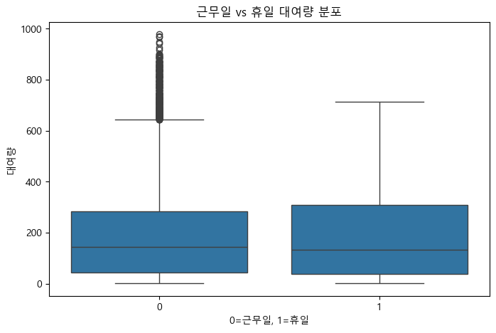
평일과 주말, 근무일과 휴일의 자전거 대여량 분포 분석
- 근무일과 휴일, 평일과 주말 구분만으로는 자전거 대여량의 뚜렷한 변화나 패턴을 발견하기는 어렵다.
- 중앙값과 분포의 크기가 유사하여, 추가적인 변수(날씨, 월, 계절 등)에 따른 추가 분석이 필요하다.
*근무일과 평일 그룹에서 상대적으로 더 많은 이상치가 확인됨(특정일 대여량이 비정상적으로 많았던 경우로 추정)
3.5. 평일과 주말, 근무일과 휴일의 시간대별 자전거 대여 분포
(1) 평일, 근무일인 경우 시간대별 자전거 대여량 분포
fig, axes = plt.subplots(2, 1, figsize=(12, 10))

# 평일 (weekend==0)
weekday = train[train['weekend'] == 0]
weekday_hour = weekday.groupby('hour', observed=True)['count'].mean().reindex(np.arange(0,24), fill_value=0).reset_index()
sns.lineplot(x='hour', y='count', data=weekday_hour, ax=axes[0], marker='o')
axes[0].set_title('평일 시간대별 평균 대여량')
axes[0].set_xlabel('시간대')
axes[0].set_ylabel('평균 대여량')
axes[0].set_xticks(np.arange(0,24))

# 근무일 (holiday==0)
workday = train[train['holiday'] == 0]
workday_hour = workday.groupby('hour', observed=True)['count'].mean().reindex(np.arange(0,24), fill_value=0).reset_index()
sns.lineplot(x='hour', y='count', data=workday_hour, ax=axes[1], marker='o')
axes[1].set_title('근무일 시간대별 평균 대여량')
axes[1].set_xlabel('시간대')
axes[1].set_ylabel('평균 대여량')
axes[1].set_xticks(np.arange(0,24))

plt.tight_layout()
plt.show()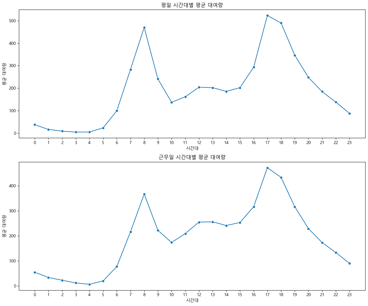
- 평일과 근무일에는 시간대별 자전거 대여량 패턴이 매우 유사하게 나타난다.
- 두 경우 모두 오전 7~9시와 오후 5~7시에 뚜렷한 두 개의 대여량 피크가 나타나며, 이는 출근·통학 및 퇴근 시간대에 이용이 집중됨을 시사한다.
- 새벽~이른 아침(0~5시)과 낮 시간(10~16시)에는 대여량이 낮고, 저녁 이후로 대여량이 점차 감소하는 직장(학교) 중심 곡선이 드러난다.
- 즉, 평일 및 근무일에는 자전거가 주로 통근·통학 등 목적에 맞춰 시간대별로 집중적으로 활용된다고 볼 수 있다.
(2) 주말, 공휴일인 경우 시간대별 자전거 대여량 분포
fig, axes = plt.subplots(2, 1, figsize=(12, 10))

# 주말 (weekend==1)
weekend = train[train['weekend'] == 1]
weekend_hour = weekend.groupby('hour', observed=True)['count'].mean().reindex(np.arange(0,24), fill_value=0).reset_index()
sns.lineplot(x='hour', y='count', data=weekend_hour, ax=axes[0], marker='o')
axes[0].set_title('주말 시간대별 평균 대여량')
axes[0].set_xlabel('시간대')
axes[0].set_ylabel('평균 대여량')
axes[0].set_xticks(np.arange(0,24))

# 공휴일 (holiday==1)
holiday = train[train['holiday'] == 1]
holiday_hour = holiday.groupby('hour', observed=True)['count'].mean().reindex(np.arange(0,24), fill_value=0).reset_index()
sns.lineplot(x='hour', y='count', data=holiday_hour, ax=axes[1], marker='o')
axes[1].set_title('공휴일 시간대별 평균 대여량')
axes[1].set_xlabel('시간대')
axes[1].set_ylabel('평균 대여량')
axes[1].set_xticks(np.arange(0,24))

plt.tight_layout()
plt.show()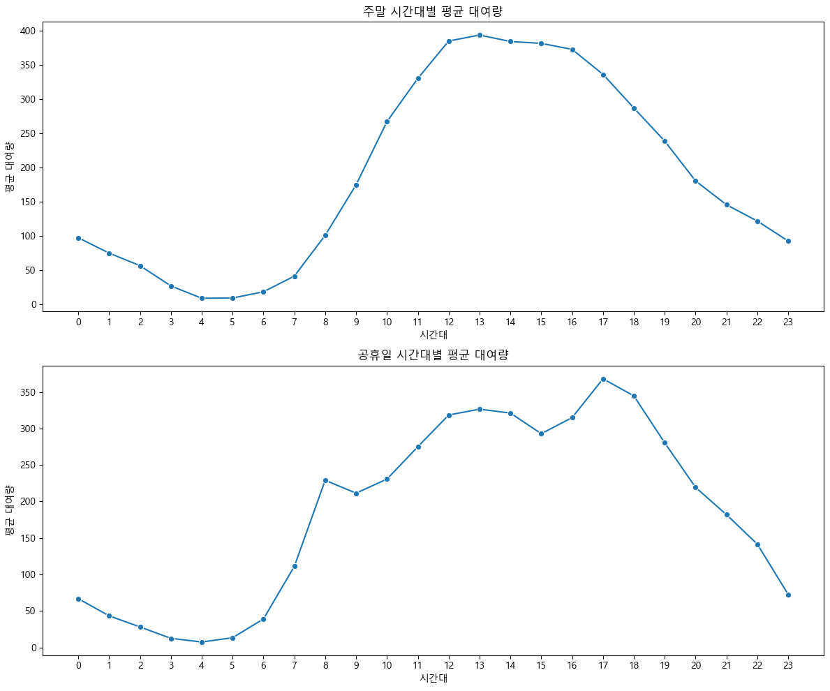
- 주말과 공휴일 모두 오전 시간대(0~7시)에는 대여량이 낮다가, 오전 8시 이후부터 빠르게 증가해 오전 11시~오후 1시에 최고치를 기록한다.
- 정오부터 오후 4~5시까지 높은 대여량이 유지되며, 활동시간대 전반에 걸쳐 자전거 이용이 활발하게 이어진다.
- 오후 5시 이후부터 대여량이 서서히 감소하는데, 저녁 시간대에도 대여가 꾸준히 이루어진다.
- 평일과 다르게 출근·퇴근 시간에 뚜렷한 2개의 피크가 나타나지 않고, 하루 중 낮~오후 내내 높은 이용이 이어지는 것이 특징이다.
- 이러한 패턴은 주말·공휴일에 자전거가 여가, 레저, 외출 등 다양한 목적으로 시간 제약 없이 널리 활용된다는 점을 보여준다.
3.6. 종합 인사이트 모델 구현 방안
(1) 종합 인사이트
-
자전거 대여량은 비정규, 비대칭 분포로 나타나며 이상치가 많아 로그 변환 또는 이상치 처리가 필요하다.
이는 RMSLE와 같은 로그 기반 손실 함수와도 일치하는 특징이다. 로그 변환을 적용하면 모델의 예측 안정성이 높아진다. -
출퇴근 피크 타임(7~9시, 17~19시)에 대여 수요가 집중되고, 낮 시간에는 수요가 낮게 유지된다.
주말/공휴일에는 오전~오후 전반에 걸쳐 고른 이용이 나타난다.
이는 자전거가 평일에는 통근·통학 중심, 휴일에는 여가·레저 중심으로 고객층과 활용 목적이 달라진다는 점을 시사한다. -
월별로 수요량을 비교해보았을 때, 4~10월이 성수기이며, 겨울에는 수요가 급감한다.
계절, 온도, 습도 등 기상요인은 대여량에 영향이 있긴 하나, 변수 간 단순 관계만으로는 완전한 수요 예측이 어렵다.
따라서 다양한 변수의 조합으로 접근이 필요하다. -
요일별, 근무일/휴일 구분만으로는 대여 패턴 차이가 크지 않지만, 시간대와 결합한 분석에서는 명확한 패턴이 드러난다.
따라서 시간, 기상, 휴일/주말 등 복합적 상황을 모두 고려해야 운영 전략을 최적화할 수 있다. -
대여량 분포의 이상치와 변동성 탓에 단일 평균 값이나 선형 회귀만으로는 현실적인 예측력이 부족할 수 있다.
하지만, 다중선형회귀 등 여러 변수를 함께 고려하는 모델을 활용하면 실무적으로도 충분히 예측이 가능하다.
(2) 모델 구현 방안
-
모델 선택
지금까지 배운 선형회귀, 다중선형회귀를 활용해 자전거 대여 수요 예측 모델을 구현할 수 있다.
다중선형회귀는 시간대, 요일, 월, 계절, 온도, 체감온도, 습도, 풍속, 날씨, 근무일/휴일/주말 등 다양한 변수를 입력(feature)로 활용해 대여량을 예측한다. -
타겟 변수 전처리
대여량(count)은 비정규·비대칭 분포이므로, 로그 변환을 적용해 모델을 학습한다.
예측값을 제출할 때는 다시 지수 변환(np.exp)으로 원래 스케일로 복원한다. -
모델 학습 및 평가
학습 데이터로 선형/다중선형회귀 모델을 학습하고, 예측 결과는 RMSLE(Root Mean Squared Logarithmic Error)로 평가한다.
RMSLE는 예측값과 실제값의 로그 차이를 기반으로 하므로, 로그 변환된 타겟에 적합한 평가 지표다. -
특징 엔지니어링
시간, 요일, 월, 계절, 날씨 등 범주형 변수는 원-핫 인코딩 등으로 변환해 모델에 입력한다.
필요에 따라 파생변수(예: 시간대×날씨, 온도×습도 등)도 추가해 예측력을 높일 수 있다. -
이상치 처리
이상치가 많은 데이터 특성을 고려해, 로그 변환 외에도 박스플롯 등으로 극단값을 확인하고 필요시 제거하거나 별도 관리한다. -
모델 학습 및 성능 평가
선형/다중선형회귀로 자전거 수요 예측 모델을 구현하여, RMSLE로 성능을 평가한다.
추후 더 복잡한 모델(랜덤포레스트, 앙상블 등)을 배우면 추가적으로 적용해볼 수 있다.
4. 예측 모델 구현 및 평가
- 주요 변수와 전처리 방안을 바탕으로 선형/다중선형회귀 모델을 학습하고 RMSLE로 성능을 평가한다.
- 예측 결과와 실제값을 비교해 모델의 적합성과 한계를 해석한다.
4.1. 데이터 전처리 및 특징 엔지니어링
(1) 데이터 전처리 및 특징 엔지니어링
train = pd.read_csv('data/train.csv')
test = pd.read_csv('data/test.csv')

# datetime 파생 변수 생성
for df in [train, test]:
    df['datetime'] = pd.to_datetime(df['datetime'])
    df['hour'] = df['datetime'].dt.hour
    df['month'] = df['datetime'].dt.month
    df['dayofweek'] = df['datetime'].dt.dayofweek
    df['weekend'] = (df['dayofweek'] >= 5).astype(int)

# 결측치 확인 및 처리
print(train.isnull().sum())
train = train.dropna()
datetime 0
season 0
holiday 0
workingday 0
weather 0
temp 0
atemp 0
humidity 0
windspeed 0
casual 0
registered 0
count 0
hour 0
month 0
dayofweek 0
weekend 0
dtype: int64(2) 범주형 변수 인코딩(원-핫 인코딩 등)
cat_cols = ['season', 'weather', 'holiday', 'workingday', 'month', 'hour', 'dayofweek', 'weekend']
train = pd.get_dummies(train, columns=cat_cols)
test = pd.get_dummies(test, columns=cat_cols)

# train/test 컬럼 맞추기
missing_cols = set(train.columns) - set(test.columns)
for col in missing_cols:
    test[col] = 0
test = test[train.columns.drop(['count', 'casual', 'registered'])]
(3) 이상치 탐지 및 처리
plt.figure(figsize=(8,5))
plt.boxplot(train['count'])
plt.title('대여량 이상치 확인')
plt.show()
# 필요시 이상치 제거 (예시: IQR 방식)
Q1 = train['count'].quantile(0.25)
Q3 = train['count'].quantile(0.75)
IQR = Q3 - Q1
train = train[(train['count'] >= Q1 - 1.5*IQR) & (train['count'] <= Q3 + 1.5*IQR)]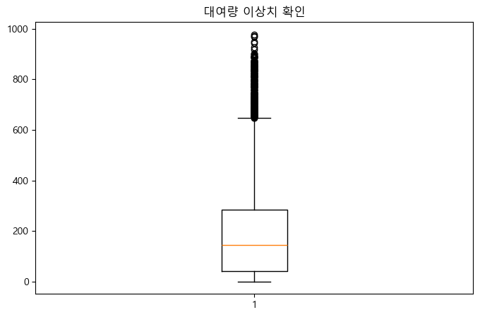
(4) 타겟 변수 로그 변환
train['count_log'] = np.log1p(train['count'])4.2. 데이터 분할
(1) 학습/평가 데이터셋 분리
X_train = train.drop(['count', 'count_log', 'datetime', 'casual', 'registered'], axis=1)
y_train = train['count_log']
X_test = test.drop(['datetime'], axis=1)
# 이미 위에서 컬럼 맞춤 처리함
4.3. 선형/다중선형회귀 모델 학습
(1) 선형/다중선형회귀 모델 학습
from sklearn.linear_model import LinearRegression
model = LinearRegression()
model.fit(X_train, y_train)LinearRegression()In a Jupyter environment, please rerun this cell to show the HTML representation or trust the notebook.
On GitHub, the HTML representation is unable to render, please try loading this page with nbviewer.org.
(2) 예측 및 타겟 역변환
y_pred_log = model.predict(X_test)
y_pred = np.expm1(y_pred_log)  # 예측값 역변환
4.4. 모델 성능 평가
(1) RMSLE 계산 및 해석
test 데이터에는 실제 count 값이 없으므로, RMSLE 평가는 train 데이터 내에서 교차검증 또는 검증셋 분할로 진행해야 한다.
from sklearn.model_selection import train_test_split
X_tr, X_val, y_tr, y_val = train_test_split(X_train, y_train, test_size=0.2, random_state=42)
model.fit(X_tr, y_tr)
y_val_pred_log = model.predict(X_val)
y_val_pred = np.expm1(y_val_pred_log)
y_val_true = np.expm1(y_val)
from sklearn.metrics import mean_squared_log_error
rmsle = np.sqrt(mean_squared_log_error(y_val_true, y_val_pred))
print('RMSLE:', rmsle)
RMSLE: 0.633910357148923(2) 예측 결과 시각화 및 실제값 비교
plt.figure(figsize=(8,5))
plt.scatter(y_val_true, y_val_pred, alpha=0.5)
plt.xlabel('실제 대여량')
plt.ylabel('예측 대여량')
plt.title('실제값 vs 예측값')
plt.plot([y_val_true.min(), y_val_true.max()], [y_val_true.min(), y_val_true.max()], 'r--')
plt.show()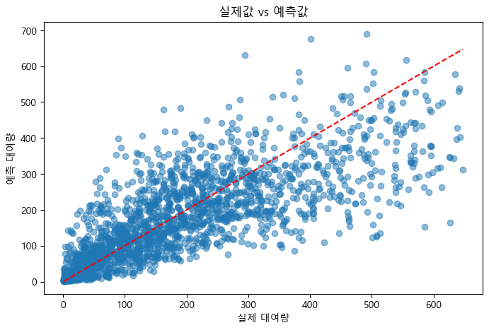
4.5. 피처 중요도 해석 및 운영 전략 제안
(1) 회귀계수 해석
feature_importance = pd.Series(model.coef_, index=X_train.columns).sort_values(ascending=False)
print(feature_importance)
hour_17 1.213681
hour_18 1.131867
hour_8 1.002064
hour_19 0.970833
hour_16 0.892340
...
hour_1 -1.395602
hour_5 -1.661600
hour_2 -1.863352
hour_3 -2.338659
hour_4 -2.608619
Length: 61, dtype: float64(2) 주요 변수 기반 운영 전략 제안
- 회귀계수가 큰 변수(예: 시간대, 온도, 날씨 등)를 중심으로 자전거 배치 및 운영 전략을 수립한다.
- 예를 들어, 출퇴근 시간대와 성수기(봄~가을)에 자전거를 집중 배치하는 방안을 제안할 수 있다.
4.6. 결론 및 향후 개선 방향
(1) 모델 한계 및 추가 개선 아이디어
- 선형/다중선형회귀 모델은 변수 간 선형 관계만 반영하므로, 비선형적 패턴이나 복잡한 상호작용은 충분히 반영하지 못한다.
- 파생변수(예: 변수의 곱, 제곱 등)를 추가하거나, 더 복잡한 모델을 적용하면 예측력이 향상될 수 있다.
(2) 추후 적용 가능한 고도화 모델(랜덤포레스트, 앙상블 등) 소개
- 랜덤포레스트, 그레디언트 부스팅, 앙상블 등 비선형 모델을 활용하면 변수 간 복잡한 관계를 더 잘 반영할 수 있다.
- 추후 해당 모델을 학습해 성능을 비교하고, 운영 전략에 반영할 수 있다.