
📖Today I Learned
✅ flex
- 컨텐츠를 정렬, 공간을 나눌 수 있다.
-
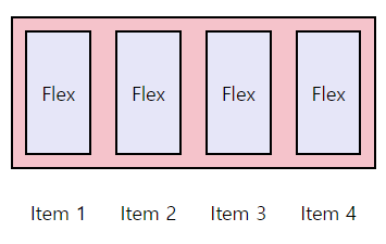
div.container: Flex Container (Flex의 영향을 받는 전체 공간)
-
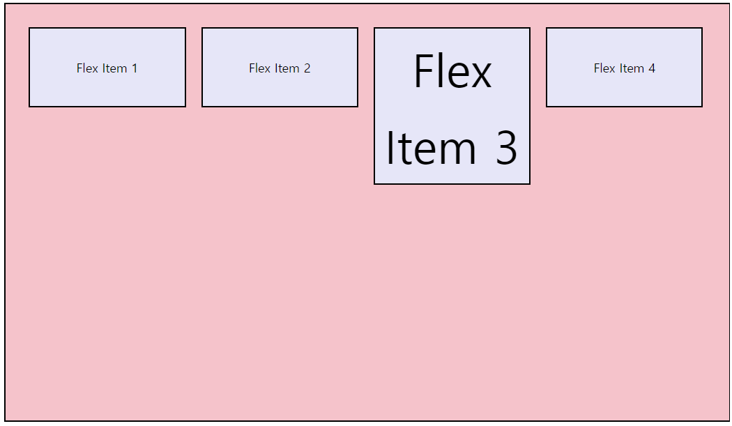
div.item: Flex Item
-
메인축(Main Axis) : Flex Item들이 배치된 방향의 축
-
교차축, 수직축(Cross Axis) : 메인축과 수직인 축
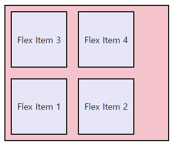
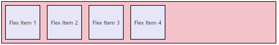
✔ flex-direction
- 정렬 방향을 결정 (메인축의 방향을 가로로 할 것인지 세로로 할 것인지 정한다.)
❕Flex Container에 적용!
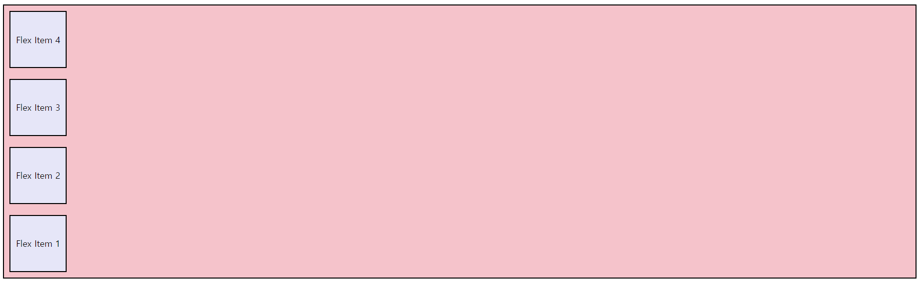
1. row
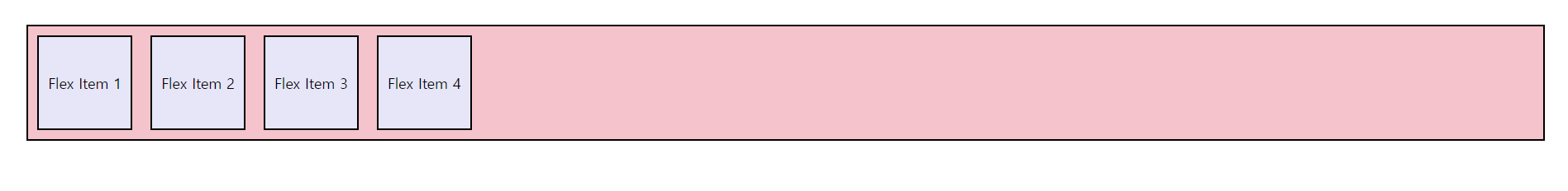
2. row-reverse

3. column
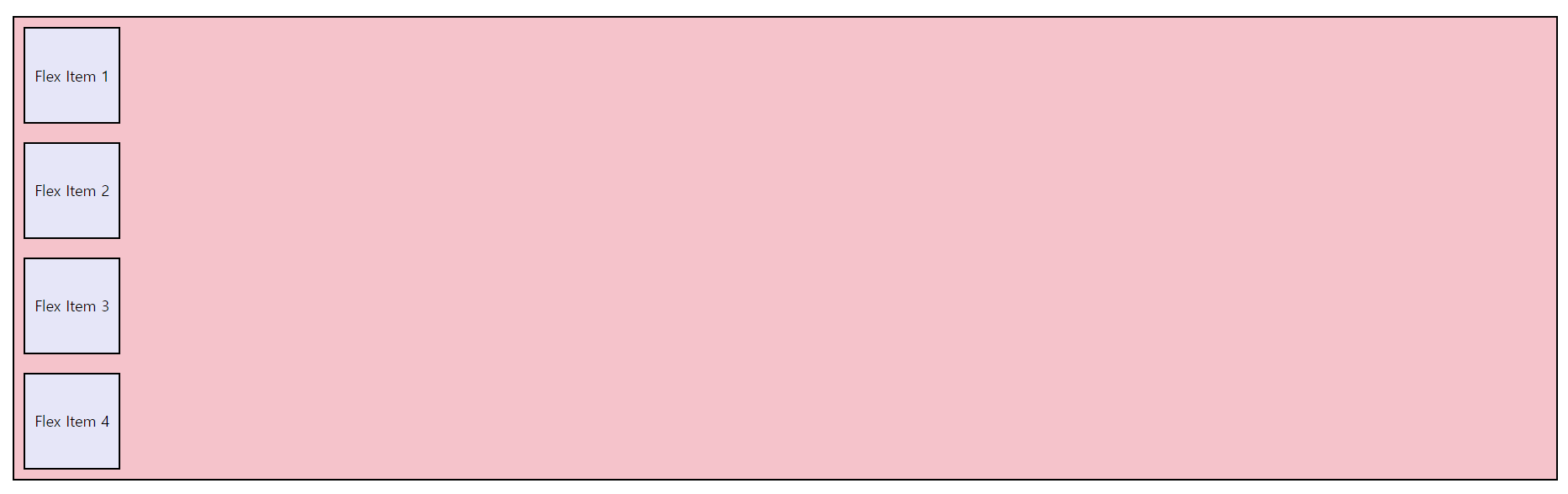
4. column-reverse
✔ flex-wrap
- Flex Item의 줄바꿈을 결정
❕Flex Container에 적용!
1. wrap
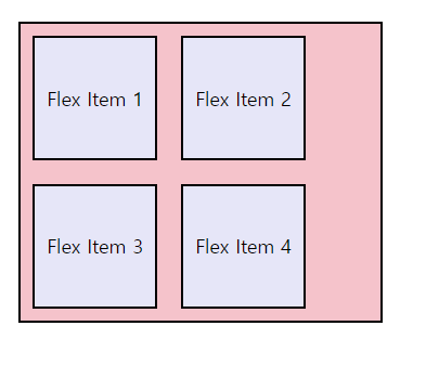
2. nowrap
3. wrap-reverse
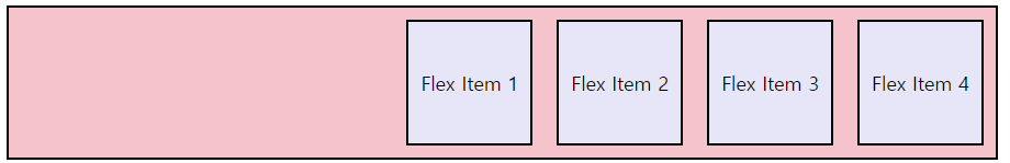
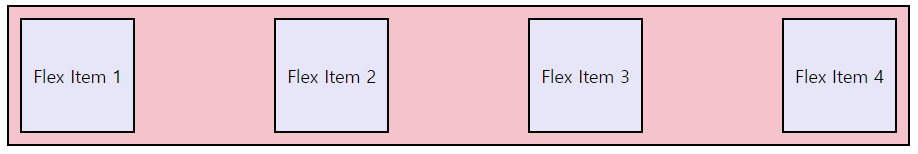
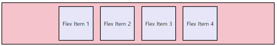
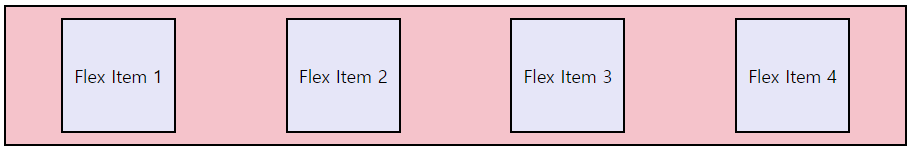
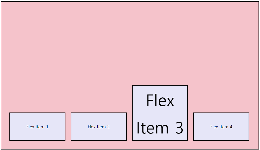
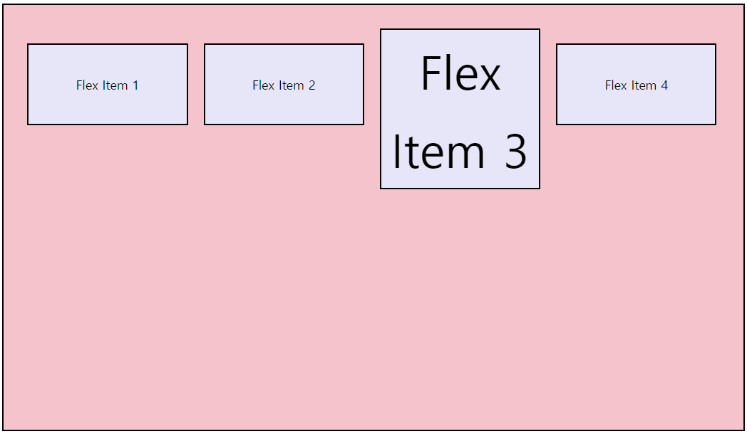
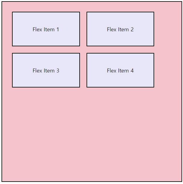
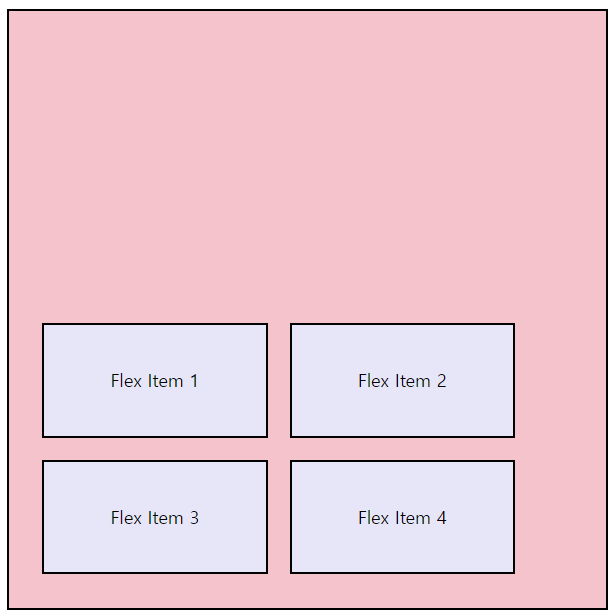
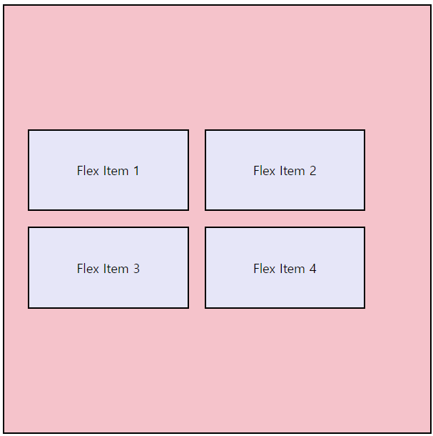
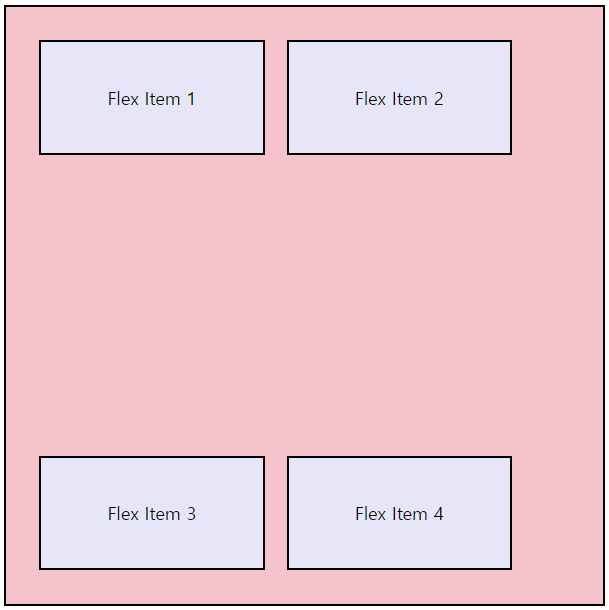
✔ justify-content
- 축을 기준으로 배열의 위치, Flex Item 간의 간격 설정
❕Flex Container에 적용!
1. flex-start
2. flex-end
3. space-between
4. center
5. space-around
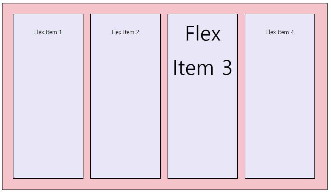
✔ align-items
- 교차축을 기준으로 이동
❕Flex Container에 적용!
1. flex-start
2. flex-end
3. center
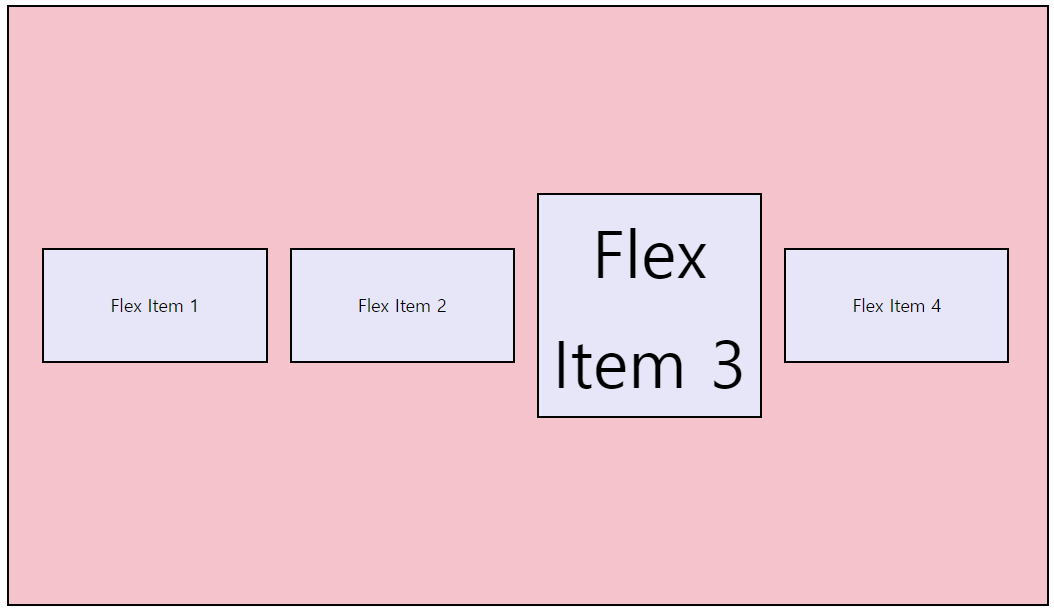
4. baseline
5. strech (기본값)
✔ align-content
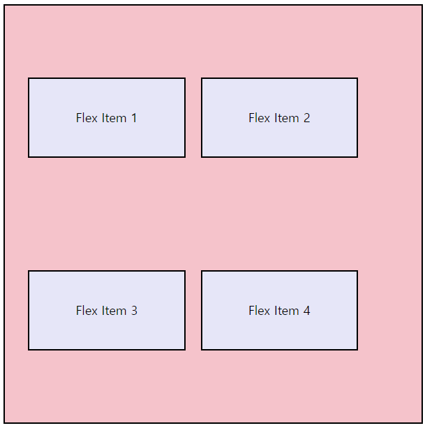
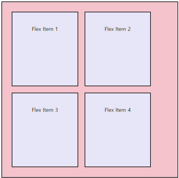
flex-wrap: wrap;이 설정 되었을 때,
Flex Container의 교차축 아이템이 여러 줄일 때
❕Flex Container에 적용!
1. flex-start
2. flex-end
3. center
4. space-between
5. space-around
6. stretch
⭐ 중앙정렬
display: flex;
justify-content: center;
aling-items: center;