4. Matplotlib
차트(chart)나 플롯(plot)으로 시각화하는 패키지
pip install matplotlib
%matplotlib inline : jupyter notebook 내부에 그림을 표시하는 명령어
Matplotlib 예제사이트 : http://matplotlib.org/gallery.html
- Matplotlib 설치방법
import matplotlib
import matplotlib.pyplot as plt

%matplotlin inline- Matplotlib 한글 사용법
( http://hangeul.naver.com/2017/nanum 설치 )
import os
if os.name == 'posix' :
	plt.rc('font', family = 'NanumBarunGothic')
else :
	plt.rc('font', family = 'NanumGothic')
한글 깨질때 설치코드
!sudo apt-get install -y fonts-nanum
!sudo fc-cache -fv
!rm ~/.cache/matplotlib -rf
실행 후 런타임 재 실행
- line plot : 선 그래프
plt.title("Line plot")
plt.plot([2,7,3,1])
plt.show()
- xtick 설정
plt.title('선그래프')
plt.plot([5,10,15,20],[1,3,7,9])
plt.show()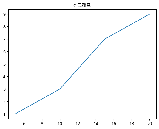
- line plot : 선그래프
plt.title("Line plot")
plt.plot([2,7,3,1])
plt.show()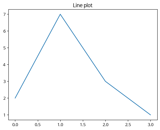
- xlabel : xtick 이름 ylabel : ytick 이름
plt.title("사용자현황'(
plt.plot([1,2,3,4],[1,3,7,9])
plt.xlabel("주")
plt.ylabel("명")
plt.show()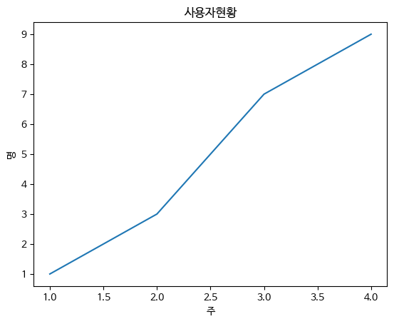
Style
plt.title("사용자현황")
plt.plot([1,2,3,4],[1,3,7,9]),c="r",
		lw = 2, ls = "--", marker = "o", ms = 3, mec = "b",
        mew = 3, mfc = "r")
plt.xlabel("주")
plt.ylabel("명")
plt.show()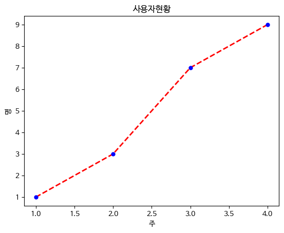
c = 선 색깔
lw = 선 굵기
ls = 선 스타일
ms = 마커 크기
mec = 마커 선 색
mew = 마커 선 굵기
mfc - 마커 내부 색깔
- xticks 이름변경
plt.title("Line plot")
plt.plot([2,7,3,1])
plt.xticks([0,1,2,3],['가','나','다','라'])
plt.show()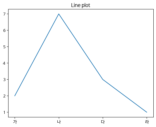
- grid : 격자, legend : 범례 (선이 무슨 의미인지 포기)
plt.title("Line plot")
plt.plot([2,7,3,1], c = 'r', label = '별다방')
plt.plot([1,3,5,7], c = 'g', label = '콩다방')
plt.grid(True)
plt.legend()
plt.show()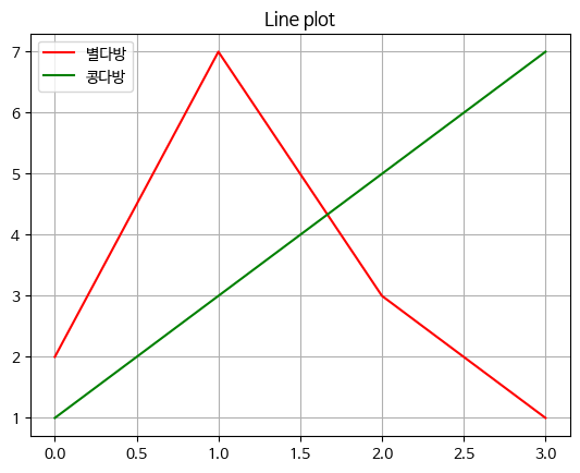
Figure
그래프가 그려지는 영역
plt.figure(fizsize = (가로사이즈, 세로사이즈))
plt.figure(figsize=(3,2))
plt.plot([2,7,3,1])
plt.show()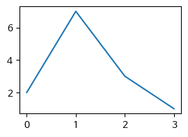
- subplot : figure 안에 여러개의 그래프를 그릴때 사용
plot.subplot(행, 열 순서)
plot.figure(figsize = (5,6))
plt.subplot(2,1,1)
plt.plot([2,7,3,1],c='r')
plt.subplot(2,1,2)
plt.plot([1,3,5,6],c='g')
plt.shoW()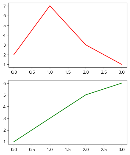
bar chart
plt.title("매장별 매출데이터")
plt.bar([0,1,2],[10,5,15])
plt.xticks([0,1,2],['강남구','관악구','영등포구']])
plt.xlabel("지역명")
plt.ylabel("매출")
plt.show()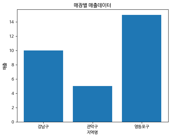
- barh : 가로차트
- alpha : 투명도
plt.title("매장별 매출데이터")
city = ['서울','부산','광주','인천']
y_pos = [0,1,2,3]
data = [15,3,8,2]
plt.barh(y_pos, data, aplha=0.5)
plt.yticks(y_pos,city)
plt.show()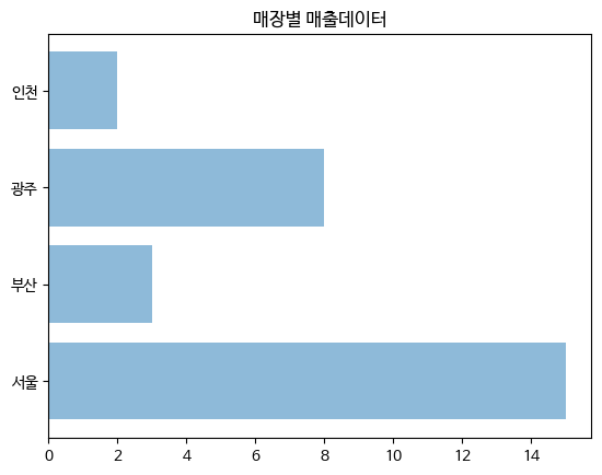
다양한 그래프
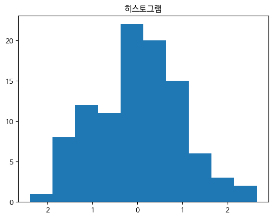
- hist : 히스토그램(bins:집계구간)
x = np.random.randn(100)
plt.title("히스토그램")
plt.hist(x,bins=10)
plt.show()

x = np.random.randn(100): NumPy의 randn 함수를 사용하여 평균이 0이고 표준 편차가 1인 표준 정규 분포에서 100개의 난수를 생성하여 x에 저장합니다.

plt.hist(x, bins=10): x에 저장된 데이터를 이용하여 히스토그램을 그립니다. bins=10은 히스토그램의 구간(bin)을 10개로 나누라는 의미입니다.
- stem : stem plot(bar 차트에 넓이가 없는 차트)
matplotlib.rcParams['axes.unicode_minus'] = False

plt.title("STEMP PLOT")
plt.stem([0,1,2,3,4],[10,-5,2,9,-7],'-o')
plt.show()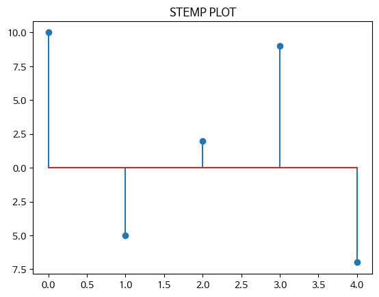
- 파이차트 : autopct(퍼센티지 자동계산), shadow(그림자)
lbels = ['서울','부산','광주','인천']
sizes = [10,50,20,60]
colors = ['y','c','b','g']
explode = (0,0.2,0,0)
plt.pie(sizes, explode=explode, labels=labels, colors=colors,
		autopct = '%1.1f%%', shadow = True, startangle = 45)
plt.show()

explode = (0,0.2,0,0): 원 그래프에서 특정 부분을 강조하기 위해 해당 부분을 얼마나 떼어내어 표시할지를 결정하는 값입니다. 여기서는 '부산' 부분을 20% 정도 떼어내어 표시하도록 설정했습니다.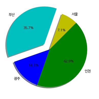
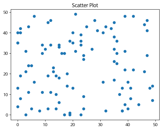
- scatter : 두 데이터간의 상관관계 확인
np.random.seed(0)
X = np.random.randint(0,50,100)
Y = np.random.randint(0,50,100)
plt.title('Scatter Plot')
plt.scatter(X,Y)
plt.show()

np.random.seed(0): 난수 발생을 위한 시드(seed)를 설정합니다. 시드를 설정하면 같은 시드를 사용할 때마다 항상 같은 난수가 생성됩니다. 이것은 재현성을 위해 사용됩니다.

X = np.random.randint(0, 50, 100): 0부터 49까지의 범위에서 무작위로 선택된 100개의 정수로 이루어진 배열을 생성하여 X에 저장합니다.

Y = np.random.randint(0, 50, 100): 또 다른 0부터 49까지의 범위에서 무작위로 선택된 100개의 정수로 이루어진 배열을 생성하여 Y에 저장합니다.
5. Seaborn
Matplotlib을 기반으로 다양한 테마와 통계용 차트 등의 기능으 추가한 시각화 패키지
- 데이터 불러오기
iris = sns.load_dataset("iris")
titanic = sns.load_dataset("titanic")
tips = sns.load_dataset("tips")
flights = sns.load_dataset("flights")- rugplot : 데이터 위치를 x축에 표현
x = iris.petal_length.values

plt.figure(figsize = (5,3))
sns.rugplot(x)
plt.title("Rug plot")
plt.show()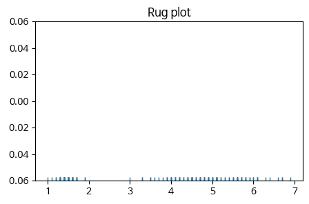
- countplot : 카테고리별 데이터갯수
범주형 변수의 각 카테고리별로 데이터가 몇 개씩 있는지를 시각화하는 데 사용되는 그래프입니다. 각 카테고리의 값들을 막대로 나타내어 각 값의 빈도수를 쉽게 비교할 수 있습니다.
sns.countplot(x="class", data=titanic)
plt.title("타이타닉호의 각 클래스별 승객수")
plt.show()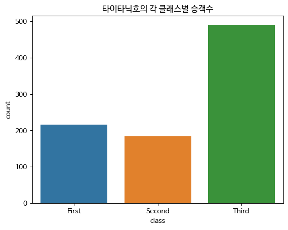
- jointplot : 카데고리별 데이터 개수
산점도를 기본으로 표시하고 x,y축에 변수에 대한 히스토그램 표시
두 변수의 관계와 데이터가 분산되어 있는 정도 파악
두 개의 수치형 변수 사이의 관계를 시각화하는데 사용되는 그래프입니다.
두 변수 간의 산점도와 각 변수의 히스토그램을 함께 보여주어 두 변수 간의 관계를 쉽게 파악할 수 있습니다.
sns.jointplot(x="sepal_length", y="sepal_width", data=iris)
plt.show()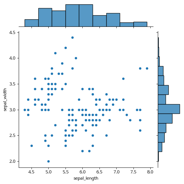
- pairplot : 3차원 이상의 데이터 비교 분석
데이터셋의 모든 수치형 변수 쌍에 대한 산점도와, 각 변수의 히스토그램을 한번에 그려주는 그래프입니다. 이 그래프를 통해 변수간의 관계를 한 눈에 파악할 수 있습니다.
데이터셋 내 수치형 변수들의 관계를 시각화하는데 매우 유용합니다. 예를 들어, 데이터셋에서 특정 변수가 다른 변수와 어떤 관계를 가지는지, 변수 간의 상관관계가 있는지, 이상치가 존재하는지 등을 파악할 수 있습니다.
plt.figure(figsize=(5,5))
sns.pairplot(iris)
plt.show()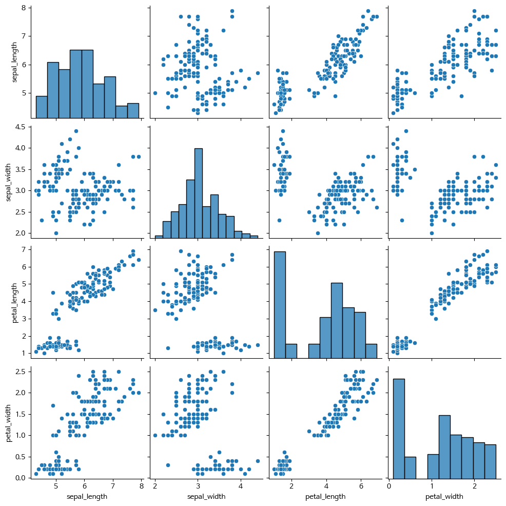
- barplot
카데고리 값에 따른 실수 값의 평균과 편차를 표시
평균은 막대의 높이로, 편차는 에러바로 표시
범주형 변수의 각 카테고리별로 값을 시각화하는데 사용되는 그래프입니다.
각 카테고리의 값들을 막대로 나타내어 각 값의 크기를 쉽게 비교할 수 있습니다.
sns.barplot(x="day",y="total_bill",data=tips)
plt.title("요일 별, 전체 팁")
plt.show()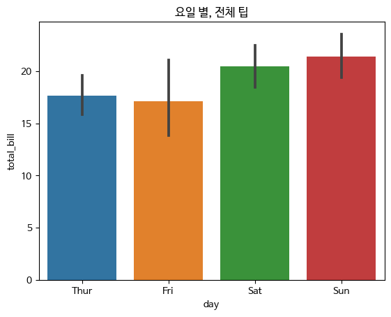
- heatmap
데이터의 값을 컬러로 변환시켜 시각적인 분석
데이터셋의 각 변수 간 상관관계를 시각화하는데 매우 유용한 그래프입니다. 변수 간의 상관관계를 색상으로 표현하여 한 눈에 쉽게 파악할 수 있습니다.
df = flights.pivot('month','year','passengers')
sns.heatmap(df)
plt.title('Heatmap')
plt.show()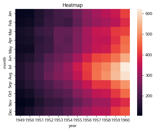
- pointplot
점 추정치 및 신뢰구간을 표시
범주형 변수와 수치형 변수 사이의 관계를 시각화하는데 사용되는 그래프입니다. 각 카테고리의 값들의 평균값을 점으로 나타내어 각 카테고리의 값들이 수치형 변수에 미치는 영향을 시각적으로 보여줍니다.
sns.pointplot(x="day",y="total_bill",data=tips)
plt.title("요일 별 전체 팁의 Box Plot")
plt.show()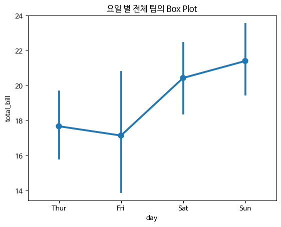
- boxplot
박스-휘스커 플롯 혹은 간단히 박스 플롯이라 부르는 차트
박스와 박스 바깥의 선으로 이루어짐
수치형 변수의 분포와 이상치를 시각화하는데 사용되는 그래프입니다.
데이터의 중앙값, 사분위수, 최소값, 최대값 등을 박스와 선으로 나타내어 데이터의 분포를 쉽게 파악할 수 있습니다.
sns.boxplot(x="day",y="total_bill",data=tips)
plt.title("요일 별 전체 팁의 Box Plot")
plt.show()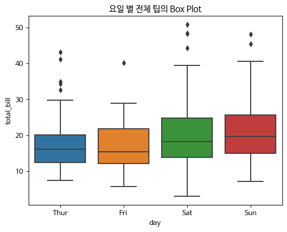
- vilointplot
Boxplot과 유사하게 수치형 변수의 분포를 시각화하는 그래프입니다.
Boxplot과 달리 분포의 밀도를 곡선 형태로 나타내어 데이터의 분포를 더 자세하게 파악할 수 있습니다.
sns.viloinplot(x="day",y="total_bill", data=tips)
plt.title("요일 별 전체 팁의 Violin Plot")
plt.show()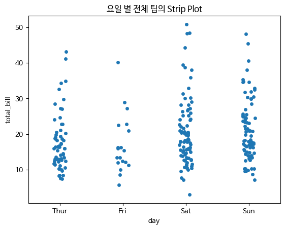
- stripplot
범주형 변수에 들어 있는 각 볌주별 데이터의 분포 확인
범주형 변수와 수치형 변수 사이의 관계를 시각화하는 데 사용되는 그래프입니다. 각 카테고리의 값들을 점으로 나타내어 각 카테고리별 데이터의 분포를 시각적으로 보여줍니다.
np.random.seed(0)
sns.stripplot(x="day",y="total_bill",data=tips,jitter=True)
plt.title("요일 별 전체 팁의 Strip Plot")
plt.show()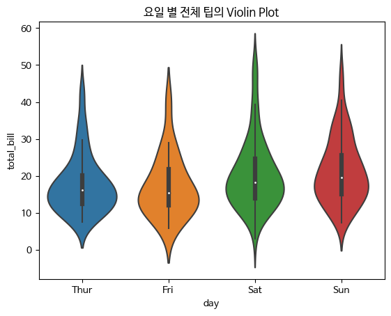
- swarmplot
stripplot과 비슷하지만 데이터를 나타내는 점이 겹치지 않도록 옆으로 이동
범주형 변수와 수치형 변수 사이의 관계를 시각화하는 데 사용되는 그래프입니다. 각 카테고리의 값들을 점으로 나타내되, 각 카테고리별 데이터의 겹침을 최소화하여 데이터의 분포를 더 자세하게 보여줍니다.
sns.swarmplot(x="day",y="total_bill",data=tips)
plt.title("요일 별 전체 팁의 Swarm Plot")
plt.show()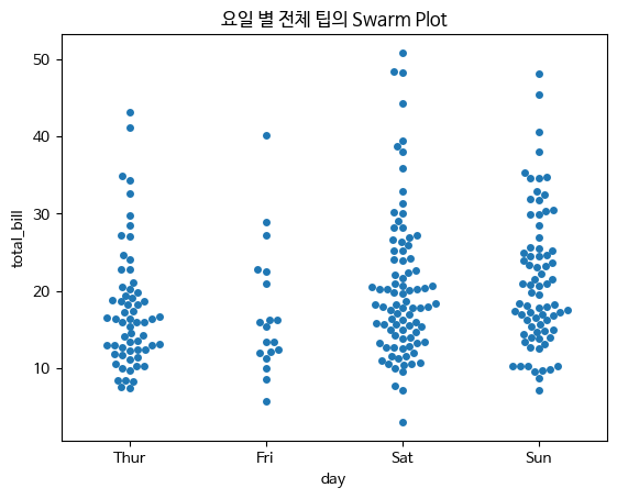
colab 실습
https://colab.research.google.com/drive/1bojsrgv2IV33E7BejTka63tPf0tDdVw4?usp=sharing

지지 않기