matplotlib 기초 예제
모듈 불러오기 및 한글 설정
# 모듈 불러오기 pyplot : MATLAB 프로그램에서 사용하는 시각화 기능을 담아놓은 기능
import matplotlib.pyplot as plt

# 한글 환경설정
from matplotlib import rc
rc("font", family="Malgun Gothic")
plt.rcParams['axes.unicode_minus'] = False # 마이너스 깨짐

# jupyter note북 안에 그래프가 나타나게 하는 설정
# %matplotlib inline
get_ipython().run_line_magic("matplotlib", "inline")
matplotlib 그래프 기본 형태
- plt.figure(figsize=(10, 6)) # 배경
plt.plot(x, y)
plt.show - 구글에 matplotlib 쳐서 사이트 들어가면 Examples에 어떤 그래프 그릴 수 있는지 참고자료, 소스코드 많음.
plt.figure(figsize=(10, 6)) # 배경
plt.plot([0, 1, 2, 3, 4, 5, 6, 7, 8, 9], [1, 1, 2, 3, 4, 2, 3, 5, -1, 3])
plt.show()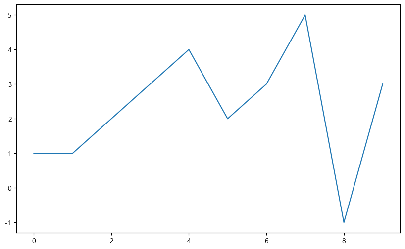
예제1. 그래프 기초
- 삼각함수 그리기
np.arrange(a, b, s):a부터 b까지 s의 간격
np.sin(value)
import numpy as np

t = np.arange(0, 12, 0.01)
y = np.sin(t)

plt.figure(figsize=(10, 6))
plt.plot(t, np.sin(t))
plt.plot(t, np.cos(t))
plt.show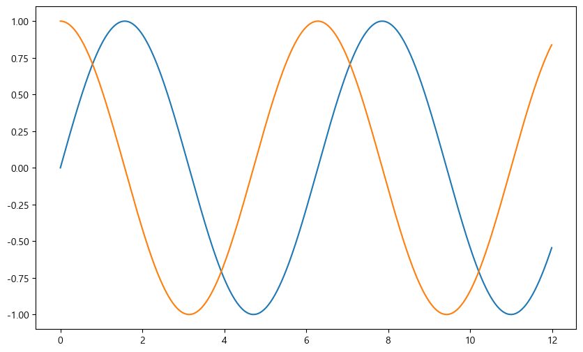
- 격자무늬 추가
그래프의 제목 추가
x축, y축 제목 추가
주황색, 파란색 선 데이터 의미 구분
def drawGraph():

    plt.figure(figsize=(10, 6))
    plt.plot(t, np.sin(t), label="sin")
    plt.plot(t, np.cos(t), label="cos")
    plt.grid(True)
    plt.legend(loc="lower left") # 범례
    plt.title("Example of sinewave")
    plt.xlabel("time")
    plt.ylabel("Amplitude")
    plt.show

drawGraph()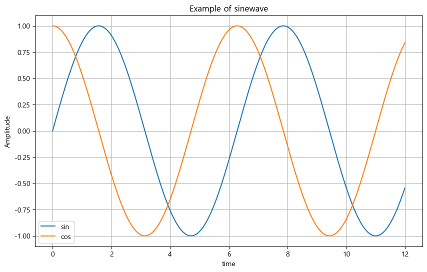
예제2. 그래프 커스텀
t = np.arange(0, 5, 0.5)

plt.figure(figsize=(10, 6))
plt.plot(t, t, "r--") # red ---
plt.plot(t, t ** 2, "bs")
plt.plot(t, t ** 3, "g^")
plt.show()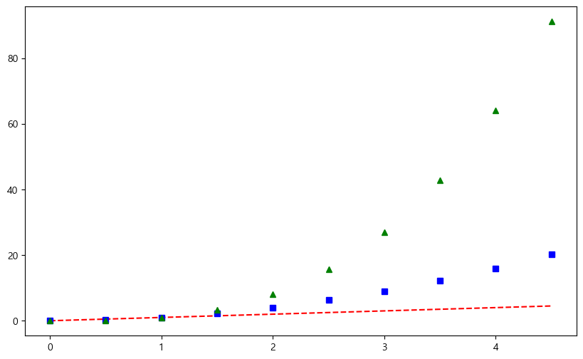
# t = [0, 1, 2, 3, 4, 5, 6]
t = list(range(0, 7))
y = [1, 4, 5, 8, 9, 5, 3]

def drawGraph():

    plt.figure(figsize=(10, 6))
    plt.plot(
        t, y,
        color = "green",
        linestyle = "dashed", # 점선 : "--", 실선 : "-"
        marker = "o",
        markerfacecolor = "blue",
        markersize = 15
    )
    plt.xlim([-0.5, 6.5]) # 축 범위
    plt.ylim([0.5, 9.5])
    plt.show()

drawGraph()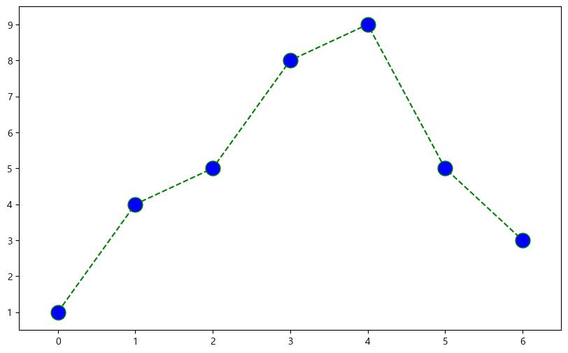
예제3. scatter plot
t = np.array(range(0, 10))
y = np.array([9, 8, 7, 9, 8, 3, 2, 4, 3, 4])

# colormap 추가
colormap = t

def drawGraph():

    plt.figure(figsize=(20, 6))
    plt.scatter(t, y, s=50, c=colormap, marker=">") # s : size
    plt.colorbar()
    plt.show()

drawGraph()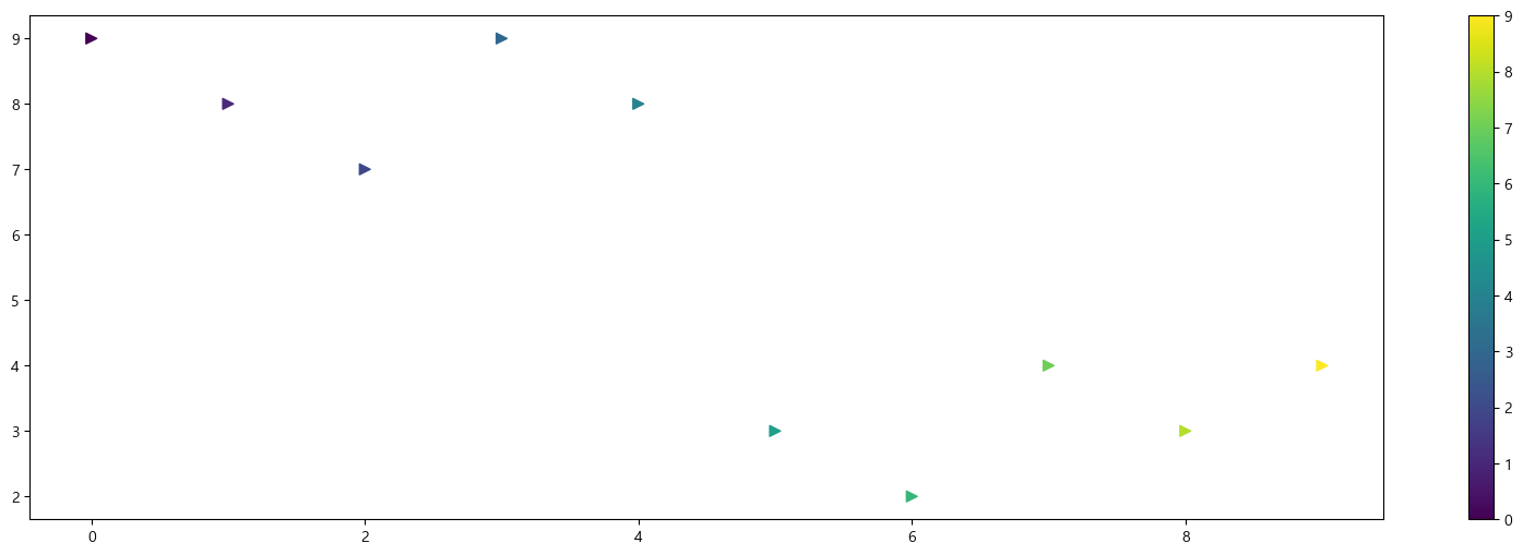
예제4. plot
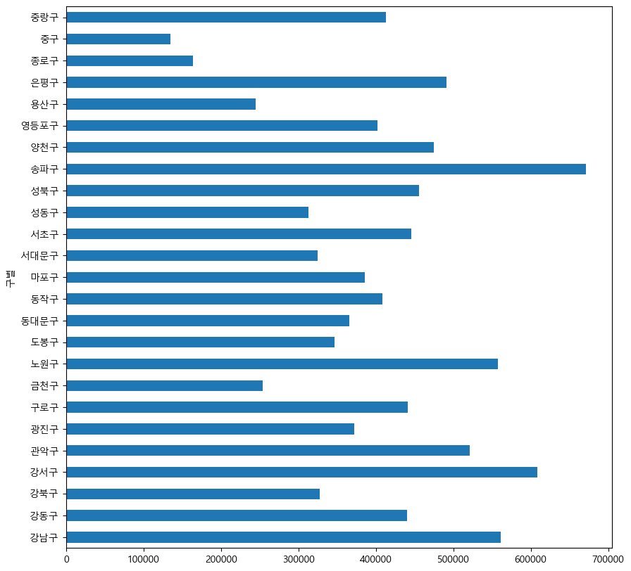
data_result.head()>>
소계 최근증가율 인구수 한국인 외국인 고령자 외국인비율 고령자비율 CCTV비율
구별
강남구 3238 150.619195 561052 556164 4888 65060 0.871220 11.596073 0.577130
강동구 1010 166.490765 440359 436223 4136 56161 0.939234 12.753458 0.229358
강북구 831 125.203252 328002 324479 3523 56530 1.074079 17.234651 0.253352
강서구 911 134.793814 608255 601691 6564 76032 1.079153 12.500021 0.149773
관악구 2109 149.290780 520929 503297 17632 70046 3.384722 13.446362 0.404854
data_result["인구수"].plot(kind="bar", figsize=(10, 10))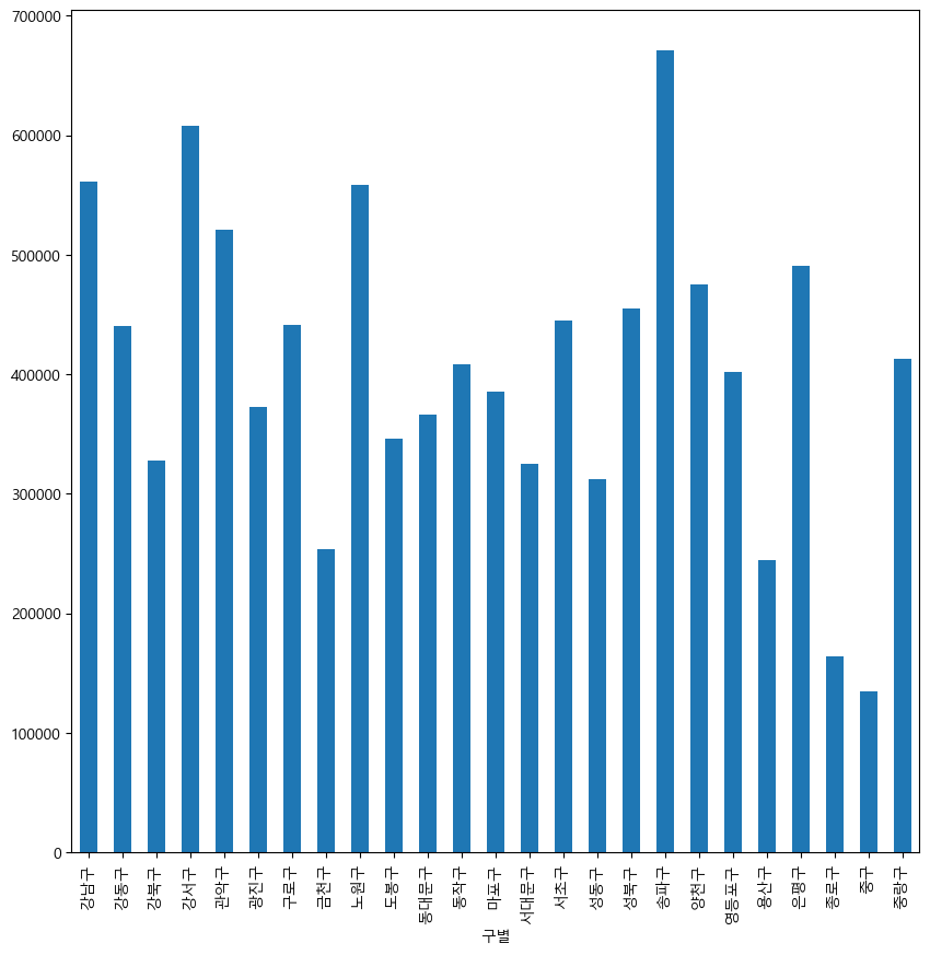
data_result["인구수"].plot(kind="barh", figsize=(10, 10)) # bar horizon