
HTML
<div id="app">
<button @click="showModal = true" class="button">모달 버튼~!</button>
<transition name="fade" appear>
<div class="modal-overlay"
v-if="showModal"
@click="showModal = false"></div>
</transition>
<transition name="pop" appear>
<div class="modal"
role="dialog"
v-if="showModal"
>
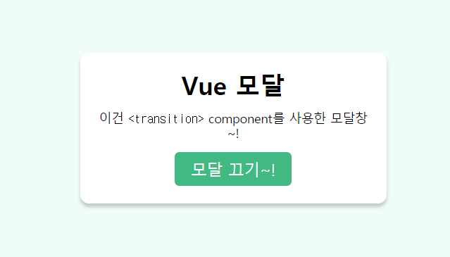
<h1>Vue 모달</h1>
<p>이건 <code><transition></code> component를 사용한 모달창~!</p>
<button @click="showModal = false" class="button">모달 끄기~!</button>
</div>
</transition>
</div>CSS(SCSS)
html {
  height: 100%;
  background: #FFF;
  color: #000;
  font-size: 62.5%;
}

body {
  min-height: 100%;
  margin: 0;
  display: grid;
  place-items: center;
  font-size: 1.4rem;
}

.button {
  border: none;
  color: #FFF;
  background: #42b983;
  appearance: none;
  font: inherit;
  font-size: 1.8rem;
  padding: .5em 1em;
  border-radius: .3em;
  cursor: pointer;
}

.modal {
  position: absolute;
  position: fixed;
  top: 0;
  right: 0;
  bottom: 0;
  left: 0;
  margin: auto;
  text-align: center;
  width: fit-content;
  height: fit-content;
  max-width: 22em;
  padding: 2rem;
  border-radius: 1rem;
  box-shadow: 0 5px 5px rgba(0, 0, 0, 0.2);
  background: #FFF;
  z-index: 999;
  transform: none;
}
.modal h1 {
  margin: 0 0 1rem;
}

.modal-overlay {
  content: '';
  position: absolute;
  position: fixed;
  top: 0;
  right: 0;
  bottom: 0;
  left: 0;
  z-index: 998;
  background: #e5faf5;
  opacity: 0.6;
  cursor: pointer;
}

.fade-enter-active,
.fade-leave-active {
  transition: opacity .4s linear;
}

.fade-enter,
.fade-leave-to {
  opacity: 0;
}

.pop-enter-active,
.pop-leave-active {
  transition: transform 0.4s cubic-bezier(0.5, 0, 0.5, 1), opacity 0.4s linear;
}

.pop-enter,
.pop-leave-to {
  opacity: 0;
  transform: scale(0.3) translateY(-50%);
}
JS(VUE)
new Vue({
  el: '#app',

  Methods
  data() {
    return {
      showModal: true
    }
  }
});
Frontend Developer