Tailwind CSS
- Utility-First CSS 프레임워크
- 작은 class 이름들로 가득한 엄청나게 큰 CSS 파일이라는 뜻
- 기본적인 크기와 색상을 제공하는 굉장히 유용한 class 이름을 많이 갖고 있음
- tailwind CSS는 mobile first! 모든 class들은 소형 기기에 적용된다는 뜻! 더 큰 화면에 적용시키는 modifier들이 존재
- 예:
sm:bg-red-100
/* 640px이상부터 배경색은 빨간색으로 하겠다는 의미 */ @media (min-width: 640px) { .sm\:bg-red-100 { --tw-bg-opacity: 1; background-color: rgb(254 226 226 / var(--tw-bg-opacity)); } } - 예:
- tailwind CSS에선 모바일 디자인을 먼저 구현하고 그 뒤에 화면을 키워감
- 모든 class들이 기본적으로 작은화면에 적용됨. 그래서 디자인을 큰 화면에 맞게 조정하는 작업을 개발자가 하면 됨
modifier 중첩예시
/* invalid이면서 focus일 때 ring 색깔을 변경 */
<input className="invalid:focus:ring-red-500" />
sibling 엘리먼트의 상태에 따라서
<form>
  <label class="block">
    <span class="block text-sm font-medium text-slate-700">Email</span>
    <input type="email" class="peer ..."/>
    <p class="mt-2 invisible peer-invalid:visible text-pink-600 text-sm">
      Please provide a valid email address.
    </p>
  </label>
</form>
styling direct children
- https://tailwindcss.com/docs/hover-focus-and-other-states#styling-direct-children
- 입력값이 invalid하면 로그인 버튼 disabled 만들기
export default function Home() {
return (
<main className=" bg-gray-100 sm:bg-red-100 md:bg-green-100 h-screen flex items-center justify-center p-5">
<div className="bg-white shadow-lg p-5 rounded-3xl w-full max-w-screen-sm flex flex-col md:flex-row gap-2 *:outline-none">
<input
className="peer w-full rounded-full py-3 bg-gray-200 px-5 ring ring-transparent focus:ring-green-500 focus:ring-offset-2 transition-shadow placeholder:drop-shadow invalid:ring-red-500"
type="text"
required
placeholder="Email address"
/>
<span className="text-red-500 font-medium hidden peer-invalid:block">
Email is required.
</span>
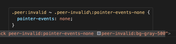
<button className="text-white py-2 rounded-full active:scale-90 transition-transform font-medium md:px-10 bg-black peer-invalid:pointer-events-none peer-invalid:bg-gray-500">
Log in
</button>
</div>
</main>
);
} has-*
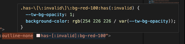
<label class="has-[:checked]:bg-indigo-50 has-[:checked]:text-indigo-900 has-[:checked]:ring-indigo-200 ..">
  <svg fill="currentColor">
    <!-- ... -->
  </svg>
  Google Pay
  <input type="radio" class="checked:border-indigo-500 ..." />
</label>- 예제2
group-*
- https://tailwindcss.com/docs/hover-focus-and-other-states#styling-based-on-parent-state
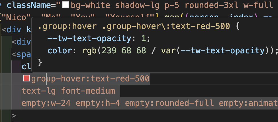
- 부모 요소(group 클래스)의 상태(
group-hover:text-red-500)에 따라서 자식 요소의 CSS를 바꾸는 것
JIT(Just-in-time) Engine
directives
Reference

#의식의흐름 #순간순간 #생각의스냅샷