
9/13 4, ,5, 6, 7세션
A. 데이터프레임 집계
대부분
- 집계 대상 열 ==> 숫자 열 ==> 연속값 (연속형 데이터)
- 집계 기준 열 ==> 문자 열 ==> 범주값 (범주형 데이터)
A-1. 합 구하기
A-1-1) 기본 집계
> tip['total_bill'].sum()
> tip['total_bill'].sum(axis=0) #둘은 동일
A-2. 집계 함수 groupby()
df.groupby(by='집계 기준 열', as_index=)['집계 대상 열'].sum()as_index=True: 집계 기준이 되는 열이 인덱스 열이 됨(기본값)as_index=False: 집계 기준이 되는 열이 인덱스가 아님 -> 데이터프레임으로 반환
# day별 tip 합계 --> 시리즈
> tip.groupby(by='day', as_index=False)['tip'].sum()
A-3. 집계 결과 시각화
matplotlib.pyplot사용
A-3-1) 막대 그래프 bar()
plt.bar(x=df[x열], height=df[y열])(x, height 는 생략 가능)- 가로형 막대에서는 bar -> hbar, x -> y로, height -> width로
# 라이브러리 불러오기
> import matplotlib.pyplot as plt
> %config InlineBackend.figure_format='retina'

# day 별 tip 비교 시각화
> plt.figure(figsize=(5, 3)) #,color='tab:blue'
> plt.bar(tip_sum['day'], tip_sum['tip'])
> plt.title('Tip by Day', size=15, pad=10) # ,fontweight='bold'
> plt.xlabel('Day')
> plt.ylabel('Tip')
> plt.show()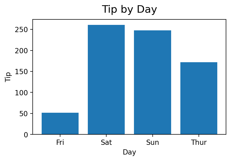
A-3-2) 선 그래프 plot()
plt.plot(df[열 이름])
# tip, total_bill 변경 추이 시각화
> plt.figure(figsize=(5, 3))
> plt.plot(tip[['tip', 'total_bill']])
> plt.legend(['tip', 'total_bill']) #범례
> plt.show()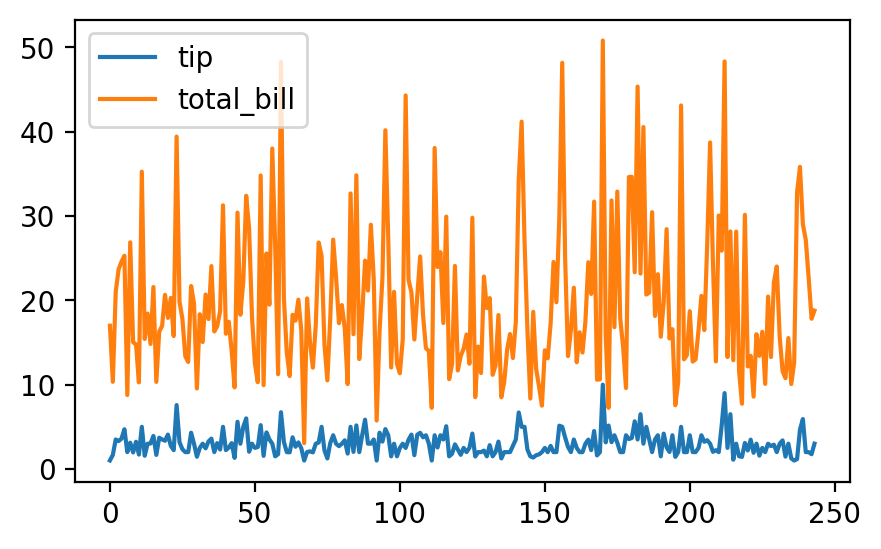
A-3-3) 히스토그램 hist()
plt.hist(df['열 이름'], bins=20)- bins로 얼마나 상세하게 나타낼 지 정함
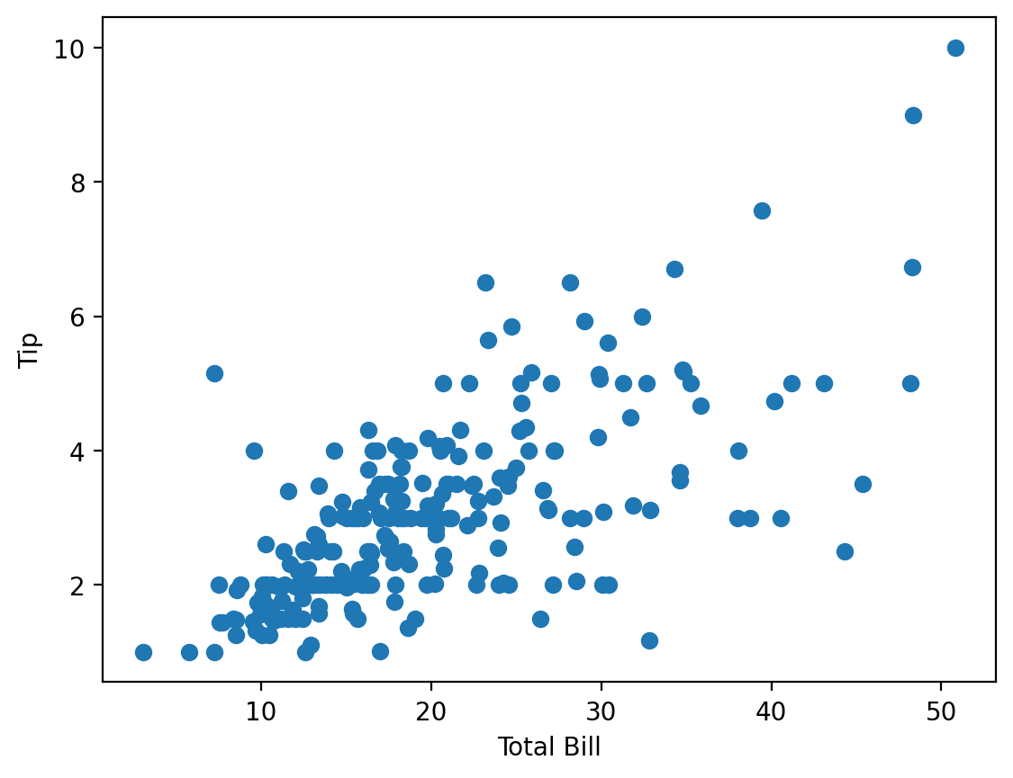
A-3-4) 산점도 scatter()
plt.scatter(df['x열'], df['y열'])- 두 열 사이의 상관관계 확인
A-3-5) 기타 매개변수 & 함수
alpha=: 투명도 (.5, .7 등)ec=: 테두리 (r, b, k, w 등)color=: 색깔axvline(): 수직 선 긋기숫자 열.astype(str): 숫자 열을 영구적으로 문자 열로 바꿈. (rank 등 평균이 필요 없는 숫자의 경우 문자로 변경)
# total_bill 분포 시각화
> total_mean = tip['total_bill'].mean()
> total_mid = tip['total_bill'].median()

> plt.hist(tip['total_bill'], bins=20, alpha=.7, ec='w')
> plt.axvline(total_mean, color='r')
> plt.axvline(total_mid, color='b')
> plt.show()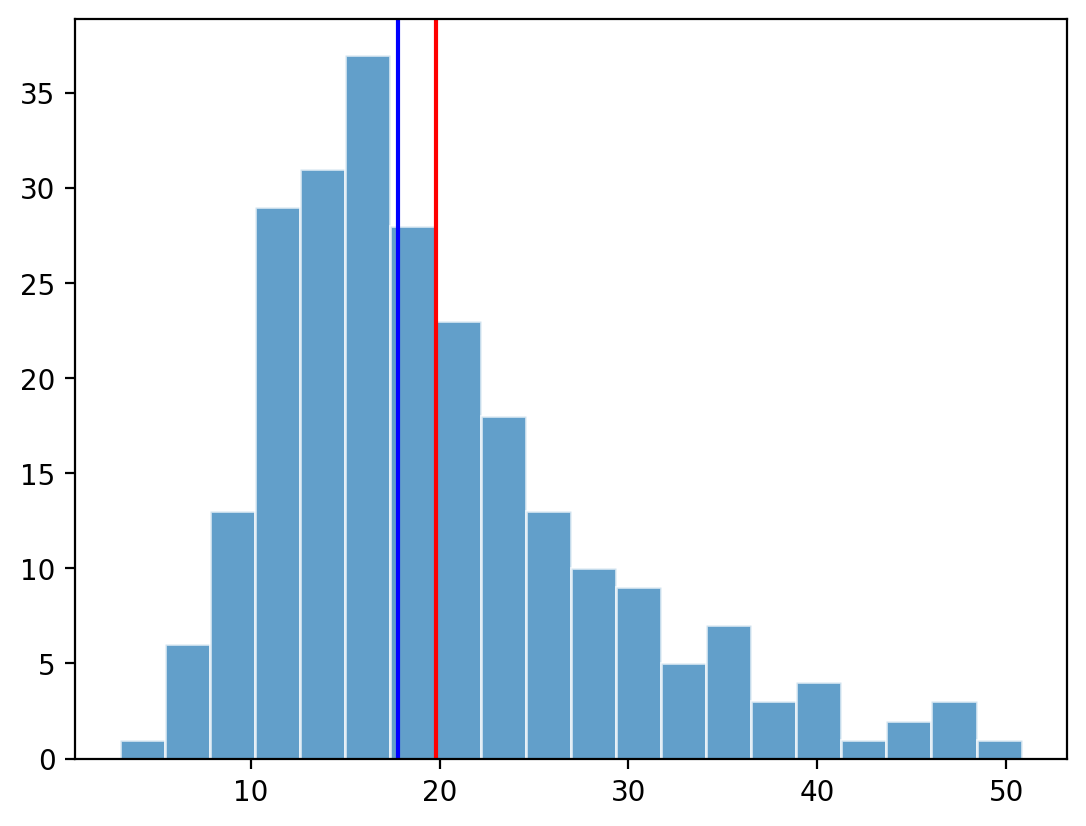
A-4. 여러 열 집계
df.groupby('기준 열', as_index=False)[['대상 열1', '대상 열2']].sum().sum(numeric_only=True): 숫자 열에 대해서만 합함
B. 평균, 최대값, 최소값, 개수 구하기
mean(): 평균max(): 최대값min(): 최소값count(): 개수