✍🏻 요구사항 분석
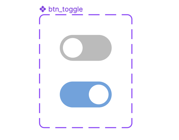
만들고자 하는 토글 버튼은 위와 같았다.
iOS 기본 버튼이랑 비슷한 느낌이어서 라이브러리를 가장 먼저 찾아봤지만, 토글 여부에 따른 값을 받아오는 것이 내 생각대로 안 됐던 거 같다. 그래서 결국 직접 구현하고자 했다.
💻 코드 작성
1️⃣ drawable에 토글의 배경과 thumb를 만들어준다
style_toggle_btn
select일 때와 아닐 때의 색을 다르게 해준다.
<?xml version="1.0" encoding="utf-8"?>
<selector xmlns:android="http://schemas.android.com/apk/res/android">
    <item android:state_checked="true">
        <shape android:shape="rectangle">
            <size android:height="25dp" android:width="50dp"/>
            <solid android:color="#63A4E0"/>
            <corners android:radius="46dp"/>
        </shape>
    </item>
    <item android:state_checked="false">
        <shape android:shape="rectangle">
            <size android:height="25dp" android:width="50dp"/>
            <solid android:color="@color/editTextGray"/>
            <corners android:radius="46dp"/>
        </shape>
    </item>
</selector>
style_toggle_thumb
<?xml version="1.0" encoding="utf-8"?>
<shape xmlns:android="http://schemas.android.com/apk/res/android"
    android:shape="oval">
    <size android:width="25dp" android:height="25dp"/>
    <solid android:color="@color/white"/>
    <stroke android:width="5dp"
        android:color="@color/transparent"/>
</shape>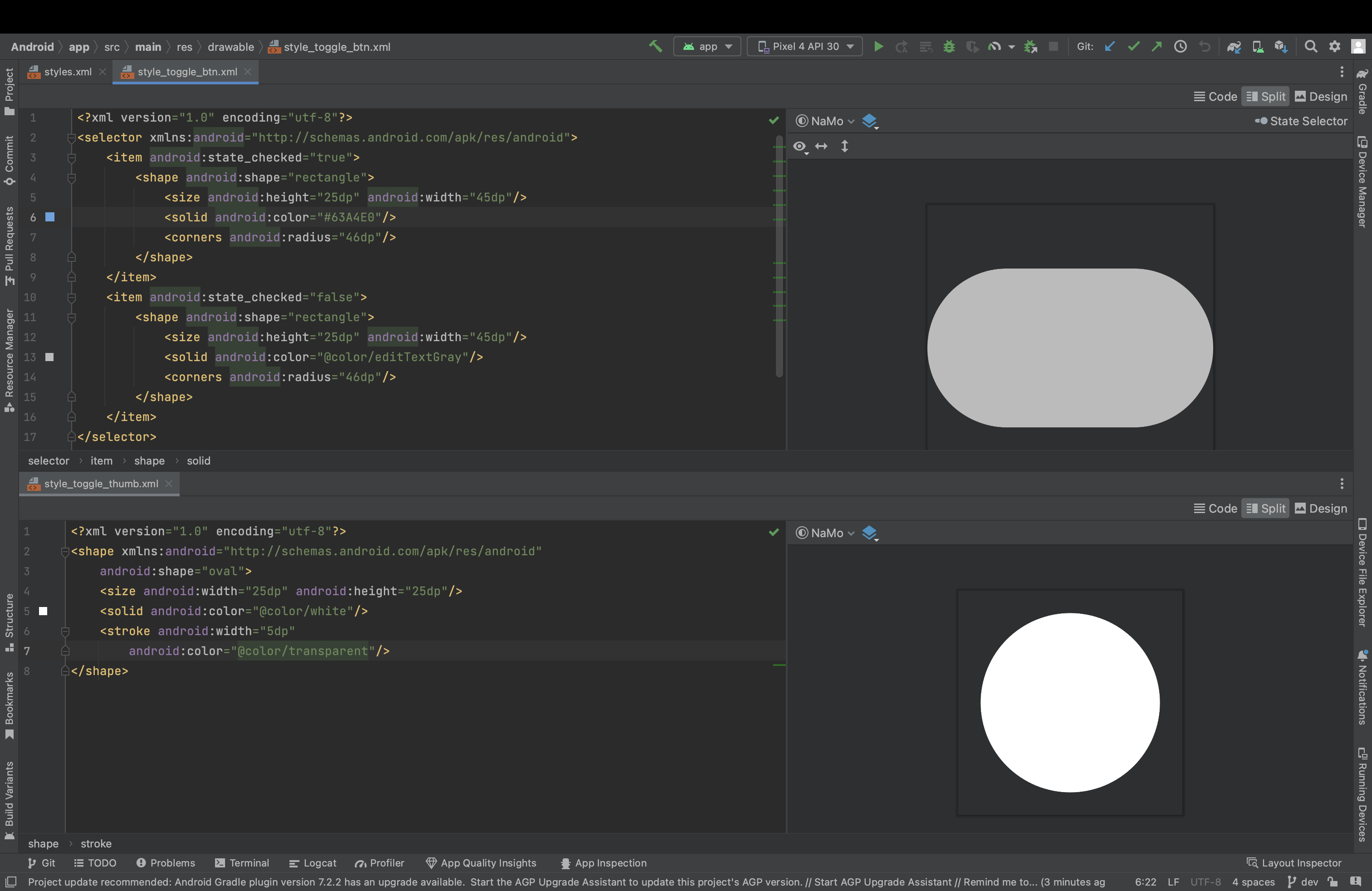
그럼 각각 이런 모습으로 보이게 된다.
2️⃣ 토글의 스타일을 작성
values > styles.xml 안에 적으면 된다. 앞서 만든 두 drawable을 합치는 느낌이다.
<style name="category_toggle">
	<item name="thumbTint">@color/white</item>
	<item name="track">@drawable/style_toggle_btn</item>
	<item name="android:thumb">@drawable/style_toggle_thumb</item>
	<item name="android:enabled">true</item>
</style>
3️⃣ xml에서의 사용
스타일을 만들어줬으니, 스위치에 스타일을 넣어주면 된다! 전환 효과를 주고 싶지 않다면 밑의 코드처럼 background를 @null로 주면 된다.
<androidx.appcompat.widget.SwitchCompat
        android:id="@+id/category_toggle_iv"
        android:layout_width="50dp"
        android:layout_height="wrap_content"
        android:background="@null"
        app:layout_constraintTop_toTopOf="@id/category_share_tv"
        app:layout_constraintBottom_toBottomOf="@id/category_share_tv"
        app:layout_constraintEnd_toEndOf="parent"
        style="@style/category_toggle"/>
4️⃣ kt에서의 사용
private fun switchToggle() {
        val toggle = binding.categoryToggleIv
        // 첫 진입 시 토글 이미지 세팅
        toggle.isChecked = share
        // 토글 클릭 시 이미지 세팅
        toggle.setOnClickListener {
            toggle.isChecked = !share
            share = !share
        }
    }
이런 식으로 toggle.isChecked를 boolean 값으로 변경해주면 변경이 된다!

안드로이드 개발자를 꿈꾸는 학생입니다