✍🏻 요구사항 분석
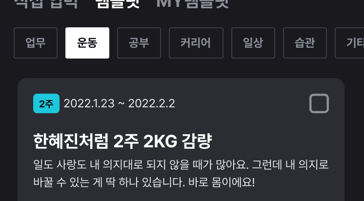
프로젝트 디자인 중, 카테고리 이름을 탭으로 보여주는 부분이 있었다.
위의 사진처럼
선택되지 않은 탭 아이템: 회색 테두리 + 회색 글씨
선택된 탭 아이템: 흰색 배경 + 검정색 글씨
로 표시해주어야 했다. 또한, 탭 아이템의 텍스트들은 앱에서 쓰는 카테고리 이름을 넣어주어야 했다.
평소 했던 기본 디자인이 아니라 프로젝트의 디자인대로 커스텀 해야하는 상황을 만났기에, 오늘은 탭 레이아웃의 아이템을 커스텀하는 방법에 대해 적어보도록 하겠다.
💻 코드 작성
1️⃣ 탭 선택에 따른 스타일 지정
<?xml version="1.0" encoding="utf-8"?>
<selector xmlns:android="http://schemas.android.com/apk/res/android">
    <item android:drawable="@drawable/style_template_tab_selected" android:state_selected="true"/>
    <item android:drawable="@drawable/style_template_tab_unselected" android:state_selected="false"/>
</selector>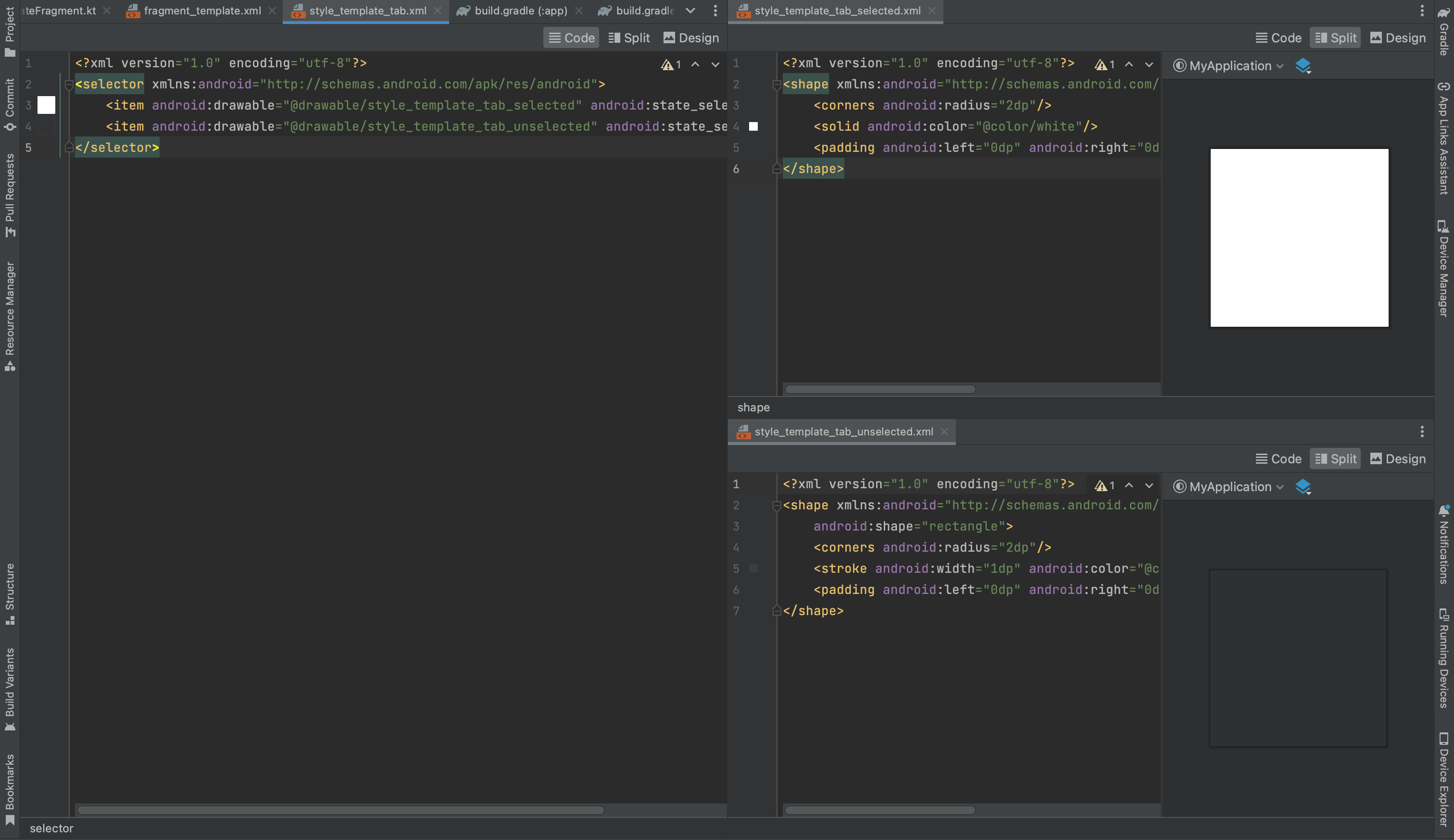
기본 탭은 투명 배경 + 회색 테두리고, 선택된 탭은 흰색 배경으로 표현해야 한다.
각 경우에 대한 drawable를 만들어서 seletor 안에 넣어주었다.
2️⃣ 탭 레이아웃 + 뷰페이저 코드
<?xml version="1.0" encoding="utf-8"?>
<androidx.constraintlayout.widget.ConstraintLayout xmlns:android="http://schemas.android.com/apk/res/android"
    android:layout_width="match_parent"
    android:layout_height="match_parent"
    xmlns:app="http://schemas.android.com/apk/res-auto"
    android:background="@color/bottom_nav_bg">


    <com.google.android.material.tabs.TabLayout
        android:id="@+id/template_select_category_tl"
        android:layout_width="match_parent"
        android:layout_height="35dp"
        android:layout_marginTop="10dp"
        android:layout_marginHorizontal="@dimen/default_spacing"
        android:overScrollMode="never"
        android:background="@color/bottom_nav_bg"
        app:tabBackground="@drawable/style_template_tab"
        app:tabPadding="0dp"
        app:tabTextAppearance="@style/template_tab_text"
        app:tabTextColor="@color/text_03"
        app:tabSelectedTextColor="@color/fragment_bg"
        app:tabIndicatorColor="@color/transparent"
        app:tabMaxWidth="65dp"
        app:tabMinWidth="50dp"
        app:tabMode="scrollable"
        app:tabGravity="fill"
        app:tabRippleColor="@color/transparent"
        app:layout_constraintStart_toStartOf="parent"
        app:layout_constraintEnd_toEndOf="parent"
        app:layout_constraintTop_toTopOf="parent"/>

    <androidx.viewpager2.widget.ViewPager2
        android:id="@+id/template_category_vp"
        android:layout_width="match_parent"
        android:layout_height="0dp"
        android:layout_marginTop="20dp"
        android:layout_marginHorizontal="@dimen/default_spacing"
        android:background="@color/transparent"
        android:overScrollMode="never"
        app:layout_constraintStart_toStartOf="parent"
        app:layout_constraintTop_toBottomOf="@id/template_select_category_tl"
        app:layout_constraintBottom_toTopOf="@+id/add_btn_hold_cl" />
//...
</androidx.constraintlayout.widget.ConstraintLayout>
탭 기본 텍스트(크기, 사이즈 등)에 대해서는 styles.xml에서 적용할 수 있다.
- styles.xml
<style name="template_tab_text" parent="TextAppearance.Design.Tab">
        <item name="android:textSize">12sp</item>
        <item name="android:textStyle">bold</item>
</style>
여기서 저장한 스타일을 탭 레이아웃 안에서
app:tabTextAppearance="@style/template_tab_text"
이렇게 지정해줄 수 있다.
3️⃣ 탭 아이템에 텍스트 넣어주기
class TemplateFragment : BaseFragment<FragmentTemplateBinding>(FragmentTemplateBinding::bind, R.layout.fragment_template), NewGoalView, DataListener {

    override fun onViewCreated(view: View, savedInstanceState: Bundle?) {
        super.onViewCreated(view, savedInstanceState)

        val category : Array<String> = resources.getStringArray(R.array.CATEGORY)

        val adapter = TemplateCategoryVPAdapter(this, this)
        binding.templateCategoryVp.adapter = adapter

        TabLayoutMediator(binding.templateSelectCategoryTl, binding.templateCategoryVp){
                tab, position->
            tab.text= category[position]  //포지션에 따른 텍스트
        }.attach()  //탭레이아웃과 뷰페이저를 붙여주는 기능

        tabItemMargin(binding.templateSelectCategoryTl)

    }

    private fun tabItemMargin(mTabLayout : TabLayout){
        for (i in 0 until mTabLayout.getTabCount()) {
            val tab = (mTabLayout.getChildAt(0) as ViewGroup).getChildAt(i)
            val p = tab.layoutParams as MarginLayoutParams
            p.setMargins(0, 0, dpToPx(8), 0)
            tab.requestLayout()
        }
    }
}
탭 아이템에 카테고리 탭 아이템마다의 이름을 넣어준다.
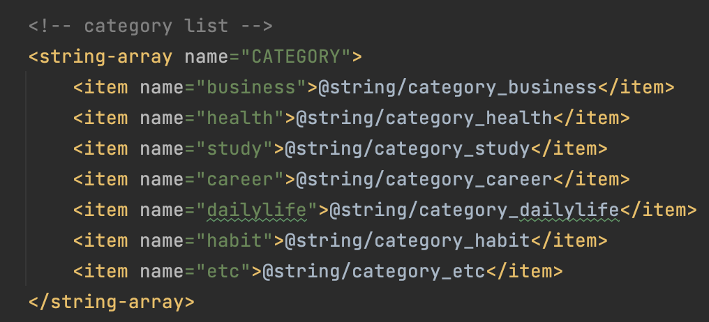
앱 내에 strings.xml에 저장된 카테고리 이름 배열이다. "업무", "건강", "공부" 등의 텍스트가 쭉 들어간다.
탭 아이템 간의 간격은 tabItemMargin 코드로 따로 지정해준다.
4️⃣ 뷰페이저 어댑터 만들기
class TemplateCategoryVPAdapter(listener: DataListener, fragment: Fragment) : FragmentStateAdapter(fragment) {
    private val listener = listener
    private val categories = (2..8).toList()

    override fun getItemCount(): Int = categories.size

    override fun createFragment(position: Int): Fragment {
        val categoryId = categories.getOrNull(position) ?: return TemplateCategoryFragment.newInstance(listener, 2)
        return TemplateCategoryFragment.newInstance(listener, categoryId)
    }
}
프로젝트의 카테고리 id는 2부터 시작하고, 마지막 카테고리의 id가 8이기에 2부터 8을 리스트로 만들어 주었다. 이 부분은 변동하지 않을 거라면 상수 처리를 하는 것이 더 좋을 것 같다.
탭 레이아웃이 위치한 TemplateFragment에서는 선택된 탭의 categoryId를 통해 API 통신을 하고, 필요한 데이터를 불러와야하기 때문에 TemplateCategoryFragment의 생성자에 categoryId를 넣어주었다.
📱 완성 화면
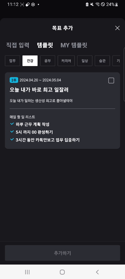
이처럼 탭 전환에 따른 화면 이동 및 API 통신이 잘 이루어지고 있는 모습을 볼 수 있다!