리액트 내비게이션
리액트 네이티브 애플리케이션의 내비게이션을 쉽게 관리할 수 있게 해준다
- 스택 내비게이션
- 탭 내비게이션
- 드로어 내비게이션
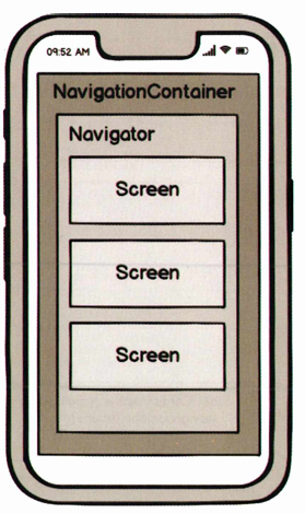
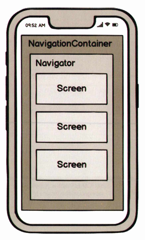
내비게이션 구조
Screen 컴포넌트
- name과 component 속성 필수
- name은 화면 이름으로 사용
- component에는 화면으로 사용될 컴포넌트를 전달 & 화면으로 사용될 컴포넌트에는 navigation와 route가 props로 전달
Navigation 컴포넌트
- 화면을 관리하는 중간 관리자 역할
- 여러 개의 Screen 컴포넌트를 자식 컴포넌트로 가짐
NavigationContainer 컴포넌트
- 내비게이션의 계층 구조와 상태를 관리하는 컨테이너 역할
- 모든 내비게이션 구성 요소를 감싼 최상위 컴포넌트
설정 우선 순위
- Navigator 컴포넌트: 모든 화면에 공통적으로 적용할 때
- Screen 컴포넌트, 화면으로 사용되는 컴포넌트: 개별 화면에만 적용할 때
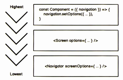
작은 범위의 설정일수록 우선순위가 높다
라이브러리 설치
리액트 내비게이션 라이브러리 설치
npm install --save @react-navigation/native종속성 설치
expo install react-native-gesture-handler react-native-reanimated react-native-
screens react-native-safe-area-context @react-native-community/masked-view
스택 내비게이션
npm install @react-navigation/stack화면 간의 이동과 이전 화면으로의 이동을 스택을 기반으로 해서 내비게이션을 구현한다
새로운 화면을 쌓으면서(push) 이동하므로 이전 화면을 유지하고, 가장 위의 화면을 들어내면(pop) 이전 화면으로 돌아간다
// Home.js
import React from 'react'
import { Button } from 'react-native'
import styled from 'styled-components/native'

const Container = styled.View`
    align-items: center;
`

const StyledText = styled.Text`
    font-size: 30px;
    margin-bottom: 10px;
`

const Home = () => {
    return (
        <Container>
            <StyledText>Home</StyledText>
            <Button title="go to the list screen"/>
        </Container>
    )
}

export default Home
// Item.js
import React from 'react'
import styled from 'styled-components/native'

const Container = styled.View`
    flex: 1;
    justify-content: center;
    align-items: center;
`

const StyledText = styled.Text`
    font-size: 30px;
    margin-bottom: 10px;
`

const Item = () => {
    return (
        <Container>
            <StyledText>Item</StyledText>
        </Container>
    )
}

export default Item
// List.js
import React from 'react'
import { Button } from 'react-native'
import styled from 'styled-components/native'

const Container = styled.View`
    flex: 1;
    justify-content: center;
    align-items: center;
`

const StyledText = styled.Text`
    font-size: 30px;
    margin-bottom: 10px;
`

const items = [
    {_id: 1, name: 'React Native'},
    {_id: 2, name: 'React Navigation'},
    {_id: 3, name: 'Hanbit'},
];

const _onPress = item => {};

const List = () => {
    return (
        <Container>
            <StyledText>List</StyledText>
            {items.map(item => (
                <Button
                    key={item._id}
                    title={item.name}
                    onPress={() => _onPress(item)}
                />
            ))}
        </Container>
    )
}

export default List
// Stack.js
import React from 'react'
import { createStackNavigator } from '@react-navigation/stack'
import Home from '../screens/Home'
import List from '../screens/List'
import Item from '../screens/Item';

const Stack = createStackNavigator();

const StackNavigator = () => {
    return (
        <Stack.Navigator initialRouteName='Home'> // 첫 번째 화면 지정 가능
            <Stack.Screen name="Home" component={Home} />
            <Stack.Screen name="List" component={List} />
            <Stack.Screen name="Item" component={Item} />
        </Stack.Navigator>
    )
}

export default StackNavigator
// App.js
import React from 'react'
import styled from 'styled-components/native'
import { NavigationContainer } from '@react-navigation/native'
import StackNavigator from './navigations/Stack'

const Container = styled.View`
    flex: 1;
    background-color: #ffffff;
    justify-content: center;
    align-items: center;
`

const App = () => {
    return (
        <NavigationContainer>
            <StackNavigator />
        </NavigationContainer>
    )
}

export default App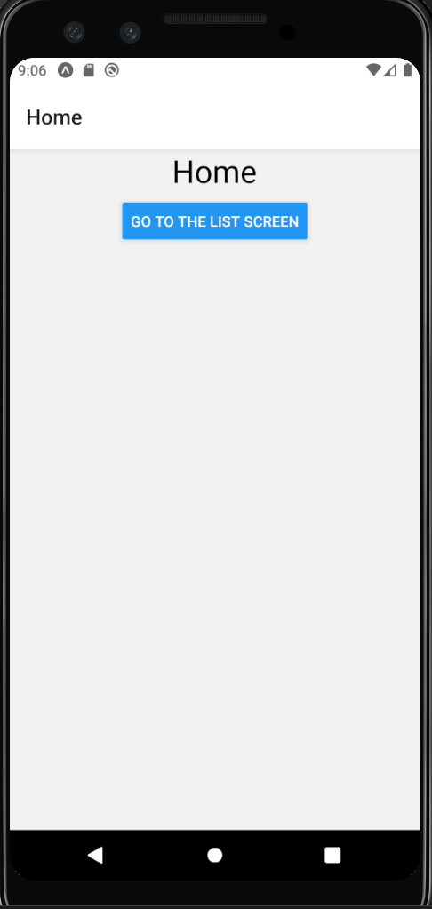
화면 이동
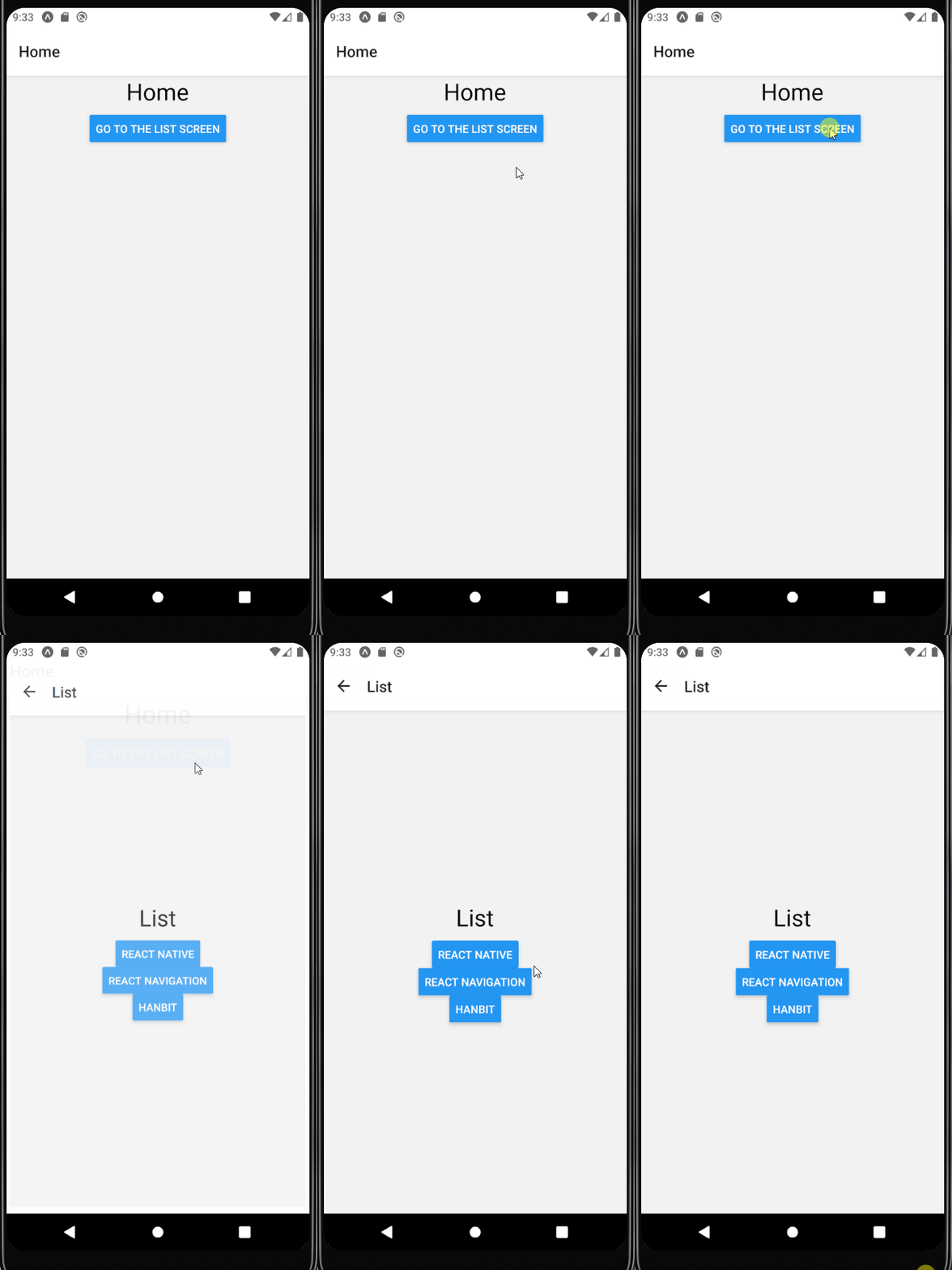
navigation의 navigate 함수: 원하는 화면으로 이동
// Home.js
const Home = ({ navigation }) => {
    return (
        <Container>
            <StyledText>Home</StyledText>
            <Button
                title="go to the list screen"
                onPress={() => navigation.navigate('List')}
            />
        </Container>
    )
}
// List.js
const List = ({ navigation }) => {
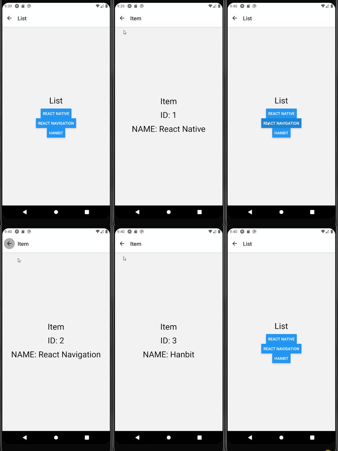
  	// navigate할 때 정보를 같이 넘긴다
    const _onPress = item => {
        navigation.navigate('Item', {id: item._id, name: item.name});
    }

    return (
        <Container>
            <StyledText>List</StyledText>
            {items.map(item => (
                <Button
                    key={item._id}
                    title={item.name}
                    onPress={() => _onPress(item)}
                />
            ))}
        </Container>
    )
}
전달된 내용은 route의 params로 확인 가능
// Item.js
const Item = ({ route }) => {
    return (
        <Container>
            <StyledText>Item</StyledText>
            <StyledText>ID: {route.params.id}</StyledText>
            <StyledText>NAME: {route.params.name}</StyledText>
        </Container>
    )
}
화면 배경색 수정하기
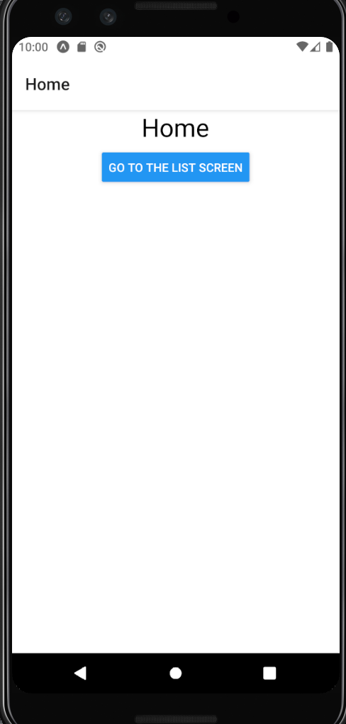
- cardstyle을 이용하면 화면마다 배경색을 설정하지 않아도 된다
- Navigator 컴포넌트의 screenOptions에 설정하면 화면 전체에 적용
return (
    <Stack.Navigator
        initialRouteName='Home'
        screenOptions={{cardStyle: {backgroundColor: '#ffffff'}}}
    >
    ...

    </Stack.Navigator>
)
헤더 수정하기
타이틀 수정하기
-
Screen 컴포넌트의 name 속성을 기본값으로 사용하므로 name값 변경하기
-
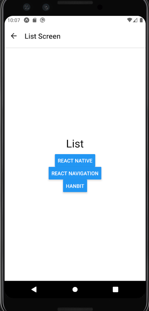
headerTitle 이용하기
<Stack.Screen
    name="List"
    component={List}
    options={{headerTitle: 'List Screen'}}
/>
스타일 수정하기
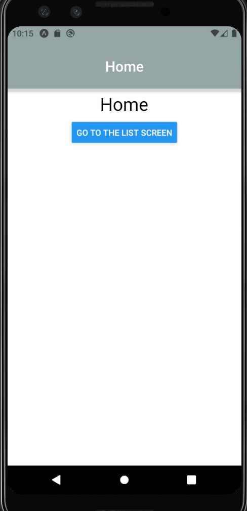
headerStyle: 헤더 속성 수정 (배경색, 높이, 그림자 효과, 하단 경계선 등)headerTitleStyle: 헤더의 타이틀 컴포넌트 스타일 수정headerTitleAlign: left (안드로이드 기본값), center (iOS 기본값)
<Stack.Navigator
    initialRouteName='Home'
    screenOptions={{
        cardStyle: {backgroundColor: '#ffffff'},
        headerStyle: {
            height: 110,
            backgroundColor: '#95a5a6',
            borderBottomWidth: 5,
            borderBottomEndRadius: '#34495e',
        },
        headerTitleStyle: {color: '#ffffff', fontSize: 24},
        headerTitleAlign: 'center',
    }}
>
타이틀 컴포넌트 변경
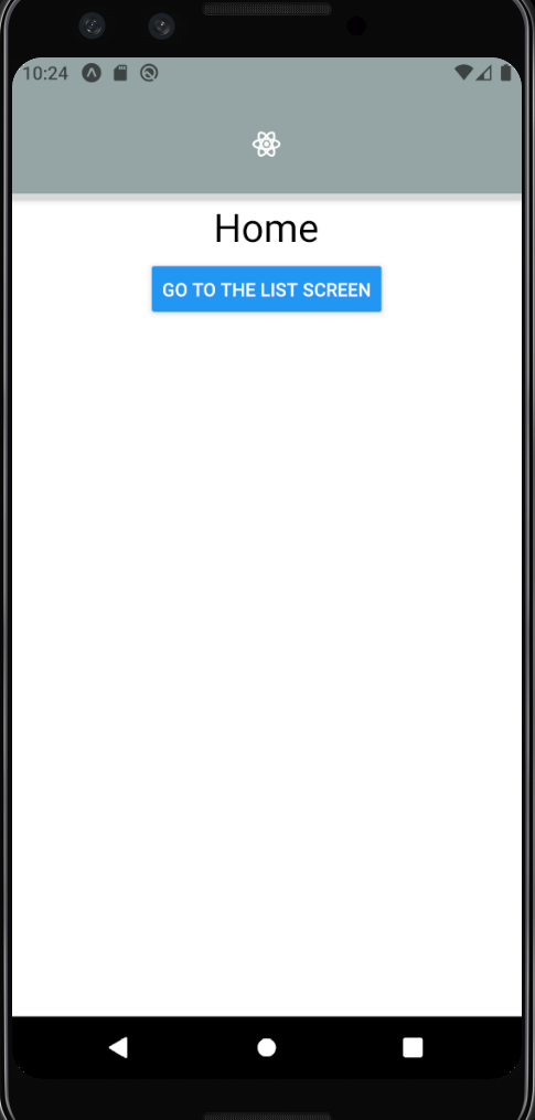
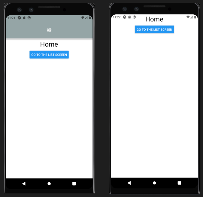
headerTitle에 컴포넌트를 반환하는 함수를 사용하면 타이틀 컴포넌트 변경 가능
style 매개변수에는 headerTitleStyle에서 지정한 스타일을 포함한다
import { MaterialCommunityIcons } from '@expo/vector-icons';headerTitleStyle: {color: '#ffffff', fontSize: 24},
headerTitleAlign: 'center',
headerTitle: ({style}) => (
<MaterialCommunityIcons name="react" style={style} />
)
버튼 수정하기
안드로이드: 뒤로 가기 버튼에 타이틀 x
iOS: 뒤로 가기 버튼에 타이틀 o
options={{
    headerTitle: 'List Screen',
    headerBackTitleVisible: true, // 뒤로 가기 버튼 제목 유무
    headerBackTitle: 'Prev', // 뒤로 가기 버튼 값
}}
버튼 스타일 수정하기
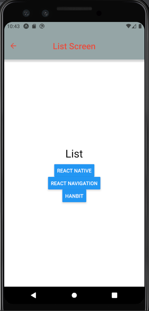
우선순위: headerTitleStyle, headerBackTitleStyle > headerTintClor
headerTitleStyle: 버튼뿐만 아니라 헤더 타이틀에도 적용
options={{
    headerTitle: 'List Screen',
    headerBackTitleVisible: true,
    headerBackTitle: 'Prev',
    headerTitleStyle: {fontSize: 24},
    headerTintColor: '#e74c3c',
}}
버튼 컴포넌트 변경
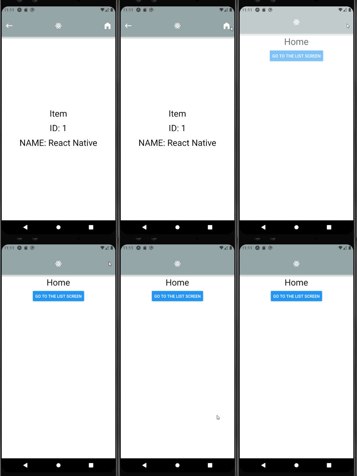
headerRight와 headerLeft에 원하는 버튼 컴포넌트를 렌더링 가능
useLayoutEffect Hook은 useEffect Hook과 거의 비슷하지만 업데이트된 직후 화면이 렌더링되기 전에 실행된다
popToTop : 쌓인 stack을 치우고 맨 처음 스택으로 이동
useLayoutEffect(() => {
    navigation.setOptions({
        headerBackTitleVisible: false,
        headerTintColor: '#ffffff',
        headerLeft: ({onPress, tintColor}) => {
            return (
                <MaterialCommunityIcons
                    name="keyboard-backspace"
                    size={30}
                    style={{marginLeft: 11}}
                    color={tintColor}
                    onPress={onPress}
                />
            )
        },
        headerRight: ({tintColor}) => (
            <MaterialCommunityIcons
                name="home-variant"
                size={30}
                style={{marginRight: 11}}
                color={tintColor}
                onPress={() => {navigation.popToTop()}}
            />
        )
    })
}, []);
헤더 감추기
-
headerMode: Navigator 컴포넌트 속성- float: 헤더가 상단에 유지되며 하나의 헤더 사용 (iOS)
- screen: 각 화면마다 헤더를 가지고 화면 변경과 함께 나타나거나 사라진다 (안드로이드)
- none: 헤더 렌더링 x
-
headerShown: 화면 옵션, Navigator 컴포넌트의 screenOptions에 설정하면 전체 헤더 보이지 않는다
<Stack.Screen
    name="Home"
    component={Home}
    options={{headerShown: false}}
/>
탭 내비게이션
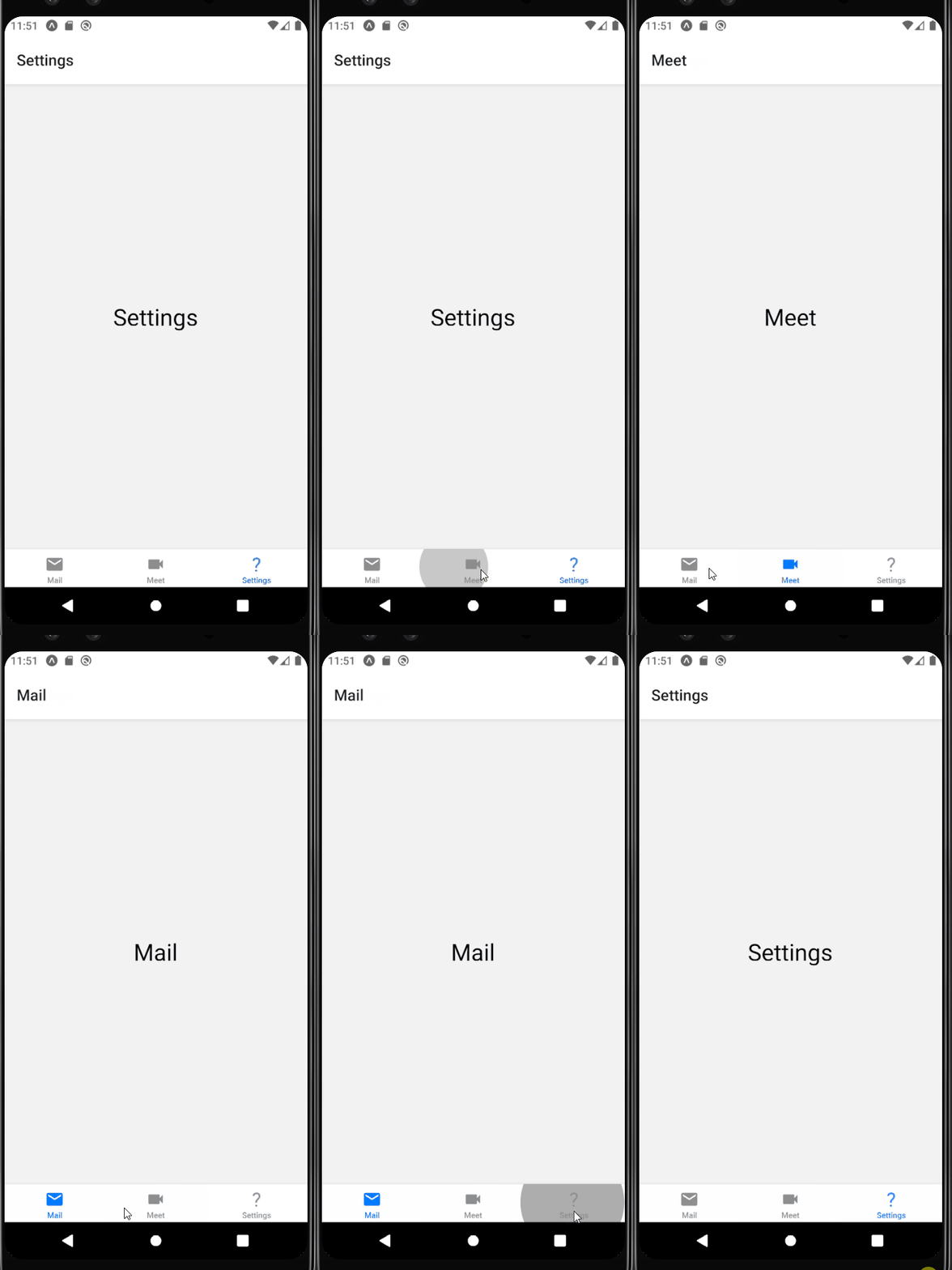
npm install @react-navigation/bottom-tabs탭 바 수정하기
버튼 아이콘 설정하기
import React from 'react'
import { createBottomTabNavigator } from '@react-navigation/bottom-tabs'
import { Mail, Meet, Settings } from '../screens/TabScreens'
import { MaterialCommunityIcons } from '@expo/vector-icons';

const TabIcon = ({name, size, color}) => {
    return <MaterialCommunityIcons name={name} size={size} color={color} />
}

const Tab = createBottomTabNavigator();

const TabNavigation = () => {
    return (
        <Tab.Navigator
            initialRouteName='Settings'
            screenOptions={({route}) => ({
                tabIcon: props => {
                    let name = '';
                    if (route.name === 'Mail') name='email';
                    else if (route.name === 'Meet') name='video';
                    else name='settings';
                    return TabIcon({...props, name});
                }
            })}
        >
            <Tab.Screen
                name="Mail"
                component={Mail}
                options={{
                    tabBarIcon: props => TabIcon({...props, name: 'email'})
                }}
            />
            <Tab.Screen
                name="Meet"
                component={Meet}
                options={{
                    tabBarIcon: props => TabIcon({...props, name: 'video'})
                }}
            />
            <Tab.Screen
                name="Settings"
                component={Settings}
                options={{
                    tabBarIcon: props => TabIcon({...props, name: 'settings'})
                }}
            />
        </Tab.Navigator>
    )
}

export default TabNavigation
라벨 수정하기
<Tab.Screen
    name="Mail"
    component={Mail}
    options={{
        tabBarLabel: 'Inbox', // 라벨 변경
        tabBarIcon: props => TabIcon({...props, name: 'email'})
    }}
/>
tabBarOptions은 React Navigation v6 이상에서 더 이상 작동 x , screenOptions의 tabBar 속성으로 대체되었다
<Tab.Navigator
    initialRouteName='Settings'
    screenOptions={({route}) => ({
        tabBarLabelPosition: 'beside-icon',
        tabIcon: props => {
            let name = '';
            if (route.name === 'Mail') name='email';
            else if (route.name === 'Meet') name='video';
            else name='settings';
            return TabIcon({...props, name});
        }
    })}
> 
<Tab.Navigator
    initialRouteName='Settings'
    screenOptions={() => ({
        tabBarLabelPosition: 'beside-icon',
        tabBarShowLabel: false, // 라벨 숨기기
    })}
> 
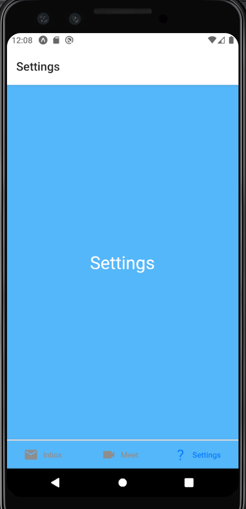
스타일 수정하기
<Tab.Navigator
    initialRouteName='Settings'
    screenOptions={() => ({
        tabBarLabelPosition: 'beside-icon',
        tabBarStyle: {
            backgroundColor: '#54b7f9',
            borderTopColor: '#ffffff',
            borderTopWidth: 2,
        },
        activeTintColor: '#ffffff',
        inactiveTintColot: '#0B92E9'
    })}
> 
버튼 활성화 상태에 따라 다른 아이콘 렌더링
<Tab.Screen
    name="Mail"
    component={Mail}
    options={{
        tabBarLabel: 'Inbox',
        tabBarIcon: props =>
            TabIcon({
                ...props,
                name: props.focused?'email':'email-outline'
            })
    }}
/>
참고
처음 배우는 리액트 네이티브