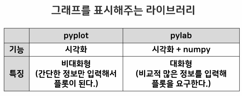
matplotlib 라이브러리
- 그래프를 표시해주는 라이브러리
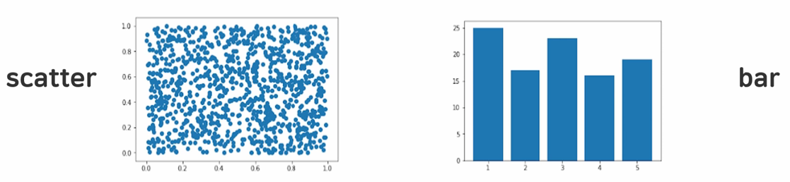
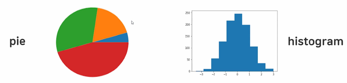
그래프 종류
.plot() : 선 그래프
.bar() : 막대 그래프
matplotlib 라이브러리 임포트
matplotlib 라이브러리의 pyplot을 plt라는 이름으로 사용
import matplotlib.pyplot as plt.plot() 함수
.plot(축1, 축2, 축...) : 일직선으로 된 line plot을 그린다.
x = [1, 2, 3]
y = [6, 3, 9]
plt.plot(x)
.show() 함수
.plot()으로 그린 그래프를 보여준다.
한 도화지 당 한 그래프를 그린다.
plt.show()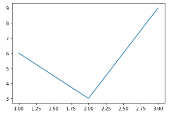
.lim() 함수
.xlim(시작범위, 끝범위) : 그래프의 영역(범위) 지정
x = [1, 2, 3]
y = [6, 3, 9]
plt.plot(x, y)plt.xlim(-2, 8) #x축 범위 지정
plt.ylim(-4, 12) #y축 범위 지정
plt.show()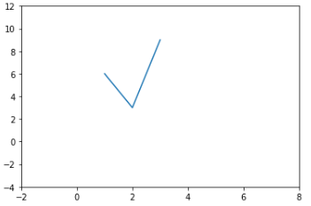
.xticks() 함수
.xtics([n1, n2, n3, ...]) : x축에 표시할 숫자 지정
plt.xticks([0, 3, 6])
plt.yticks([1, 5, 9])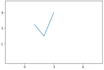
.grid() 함수
.grid() : 그래프에 격자 표시
plt.grid()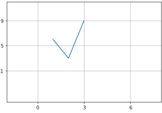
폰트 설정
.legend() 로 범례 표시 전에 설정해야 한다.
from matplotlib import rc
rc('font', family = 'D2Coding')
.legend() 함수, label 속성
.legend() : 범례 표시
label = '이름' : 해당 line의 이름 지정
x = [1, 3, 5]
y = [5, 15, 20]plt.plot(x, y, label = 'A') #이름을 A로 지정
plt.plot(y, x, label = 'B') #이름을 B로 지정plt.legend() #지정한 이름을 범례로 표현
plt.show()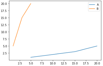
.xlabel(), .title() 함수
.xlabel('이름') : x축 이름 지정
.title('이름') : 그래프 이름 지정
plt.xlabel('x축')
plt.ylabel('y축')
plt.title('민지의 그래프')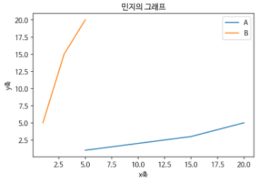
.figure() 함수
.figure ( figsize=())
plt.figure( figsize=(10, 15) )그래프 속성
-
lintsylels: line의 속성 지정----,: -
linewidthlw: line의 두께 지정 -
colorc: line의 색상 지정 -
marker: 점에 표시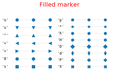
-
markersizems: 마커의 두께 지정 -
markeredgewidthmew: 마커의 선 두께 지정 -
markeredgecolormec: 마커의 외부색상 지정 -
markerfacecolormfc: 마커의 내부색상 지정
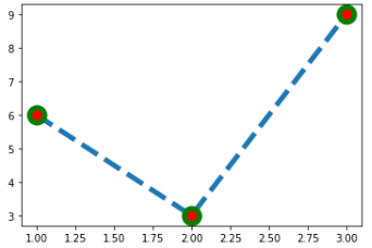
plt.plot(x, y, ls='--', linewidth=5,
marker='o', ms=15, mew=5, mec='green', mfc='red')
# 라인: 속성 --, 굵기 5
# 마커: 속성 o, 크기 15, 굵기 5, 외부색상 green, 내부색상 red