
style-components
React 애플리케이션에서 컴포넌트 스타일링을 위해 사용되는 CSS-in-JS 라이브러리이다.
이 라이브러리를 사용하면 React 컴포넌트와 관련된 스타일을 선언적인 방식으로 작성할 수 있다.
설치법
npm install --save styled-components
사용법
기본
import styled from "styled-components";

const Title = styled.h1`
  font-size: 1.5em;
  text-align: center;
  color: #BF4F74;
`;
미디어 쿼리 사용
import styled from "styled-components";

const Title = styled.h1`
  font-size: 1.5em;
  text-align: center;
  color: #BF4F74;

  미디어 쿼리 사용
  @media (max-width: 768px) {
   	color: red;
  }
`;
가상 선택자 사용
import styled from "styled-components";

const Title = styled.h1`
  font-size: 1.5em;
  text-align: center;
  color: #BF4F74;

  가상 선택자 사용
  &:hover {
	color: red
  }
`;
상속
const Button = styled.button`
  color: #BF4F74;
  font-size: 1em;
  margin: 1em;
  padding: 0.25em 1em;
  border: 2px solid #BF4F74;
  border-radius: 3px;
`;

// Button 스타일을 상속받는다.
const TomatoButton = styled(Button)`
  color: tomato;
  border-color: tomato;
`;

render(
  <div>
    <Button>Normal Button</Button>
    <TomatoButton>Tomato Button</TomatoButton> 상속받은 styled-component 사용
  </div>
);
컴포넌트에서 styled-components로 변수 전달
<{ $primary?: boolean; }>는 버튼 컴포넌트에 적용될 스타일 속성 중 하나인
$primary속성이 선택적으로(boolean 타입의 값) 존재할 수 있다는 의미이다.
즉, 버튼 컴포넌트의 속성으로 $primary을 받을 수 있으며,
해당 속성이 지정되면 해당 속성에 맞는 스타일이 적용됩니다.
const Button = styled.button<{ $primary?: boolean; }>`
/* Adapt the colors based on primary prop */
background: ${props => props.$primary ? "#BF4F74" : "white"};
color: ${props => props.$primary ? "white" : "#BF4F74"};
font-size: 1em;
margin: 1em;
padding: 0.25em 1em;
border: 2px solid #BF4F74;
border-radius: 3px;
`;
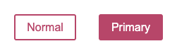
render(
<div>
<Button>Normal</Button>
<Button $primary>Primary</Button> $primary 라는 식별자
</div>
);
열정, 끈기, 집념의 Frontend Developer
<{ $primary?: boolean; }>
boolean 뒤의 세미콜론에서 계속 오류가 나는데 이유가 뭘까요...?