CSS 3
레이아웃 구성과 기능
그리드 레이아웃
<!DOCTYPE html>
<html>
<head>
    <meta charset='utf-8'>
    <meta http-equiv='X-UA-Compatible' content='IE=edge'>
    <title>그리드 레이아웃3</title>
    <meta name='viewport' content='width=device-width, initial-scale=1'>
    <style>
        #wrap {
            width: 800px;
            display: grid;
            grid-template-columns: repeat(3, 1fr);
            grid-template-rows: repeat(4, 100px);
            grid-template-areas:
                "box1 box1 box1"
                "box2 box3 box3"
                "box2 box3 box3"
                "box4 box4 box4"; /* 미리 배열로 선언 */
        }

        .box {
            padding: 35px;
            color: white;
            font-weight: bold;
            text-align: center;

        }
        .box1 {
            background-color: #3689ff;
            /* grid-column: 1/4; */
            grid-area: box1;
        }
        .box2 {
            background-color: #00cf12;
            /* grid-row: 2/4; */
            grid-area: box2;
        }
        .box3 {
            background-color: #ff9019;
            /* grid-column: 2/4;
            grid-row: 2/4; */
            border: 0px solid #333333;
            grid-area: box3;
        }
        .box4 {
            background-color: #ffd000;
            /* grid-column: 4/5;
            grid-column: 1/4; */
            grid-area: box4;
        }
    </style>
</head>
<body>
    <div id="wrap">
        <div class="box box1">box1</div>
        <div class="box box2">box2</div>
        <div class="box box3">box3</div>
        <div class="box box4">box4</div>
    </div>
</body>
</html>
fe43_grid_layout.html
#wrap에 grid-template-areas를 적용시키고 각 box에 grid-area도 적용시켰다.
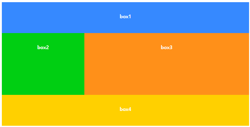
#wrap의 grid-template-areas에 적용한 대로 각 박스의 위치가 적용된다.
<head>
<meta charset='utf-8'>
<meta http-equiv='X-UA-Compatible' content='IE=edge'>
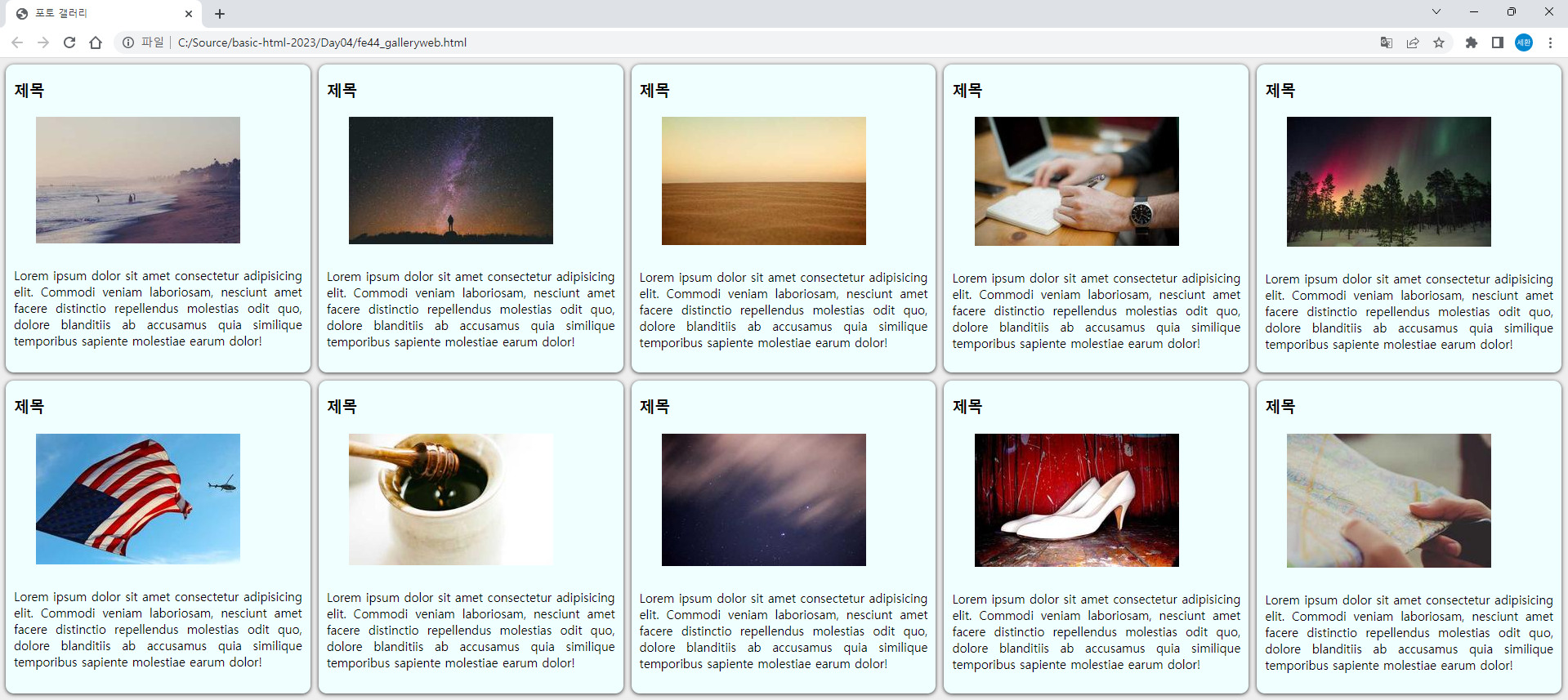
<title>포토 갤러리</title>
<meta name='viewport' content='width=device-width, initial-scale=1'>
<link rel='stylesheet' type='text/css' media='screen' href='gallery.css'>
<!-- 외부 스타일 설정 -->
</head>
<body>
<div id="wrap">
<div class="card">
<div class="header">
<h3>제목</h3>
</div>
<div>
<img src="https://picsum.photos/250/160">
</div>
<p>Lorem ipsum dolor sit amet consectetur adipisicing elit. Commodi veniam laboriosam, nesciunt amet facere distinctio repellendus molestias odit quo, dolore blanditiis ab accusamus quia similique temporibus sapiente molestiae earum dolor!</p>
</div>
x10
</div>
</body> fe44_galleryweb.html이다.
* {
    box-sizing: border-box;
}

body {
    background-color: #eeeeee;
    font-size: 15px;
}

#wrap {
    display: grid;
    grid-template-columns: repeat(auto-fit, minmax(320px, 1fr));
    row-gap: 10px;
    column-gap: 10px;
}

.card {
    background-color: azure;
    box-shadow: 0px 1px 5px #333333;
    border-radius: 10px;
}

.card > .header {
    font-size: 16px;
    padding: 1px 10px;
}

.card > p {
    padding: 10px;
    text-align: justify;
}

.card img {
    max-width: 100%;
    padding: 0 10% ;
}
gallery.css이다.
Style대신 gallery.css에서 가져와서 스타일을 적용한다. (외부스타일 적용)
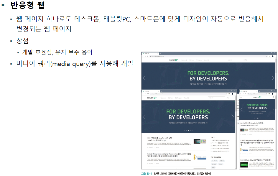
반응형 웹
반응형 웹 소개
반응형 웹을 위한 설정
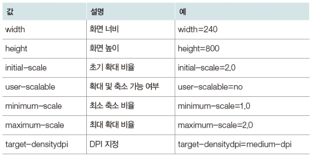
뷰포트 설정

<head>
    <meta charset='utf-8'>
    <meta http-equiv='X-UA-Compatible' content='IE=edge'>
    <title>반응형 웹</title>
    <meta name='viewport' content='width=device-width, initial-scale=1'>
</head>
<body>
    <h1>Lorem Ipsum dolor sit amet</h1>
    <p>Lorem ipsum dolor sit amet consectetur adipisicing elit. Magnam dolorum suscipit, dolorem temporibus odio quidem tempore ad facere voluptatibus fugiat officia labore aut architecto voluptatum facilis ratione eveniet. Voluptate, consequuntur?Lorem ipsum dolor sit amet consectetur, adipisicing elit. Porro ex, incidunt sed distinctio eaque rem veniam sapiente similique, obcaecati atque reprehenderit molestiae voluptatum quibusdam recusandae ad aspernatur quia itaque quas.</p>
</body>
fe45_responsiveweb.html이다. 뷰포트를 설정해놓으면
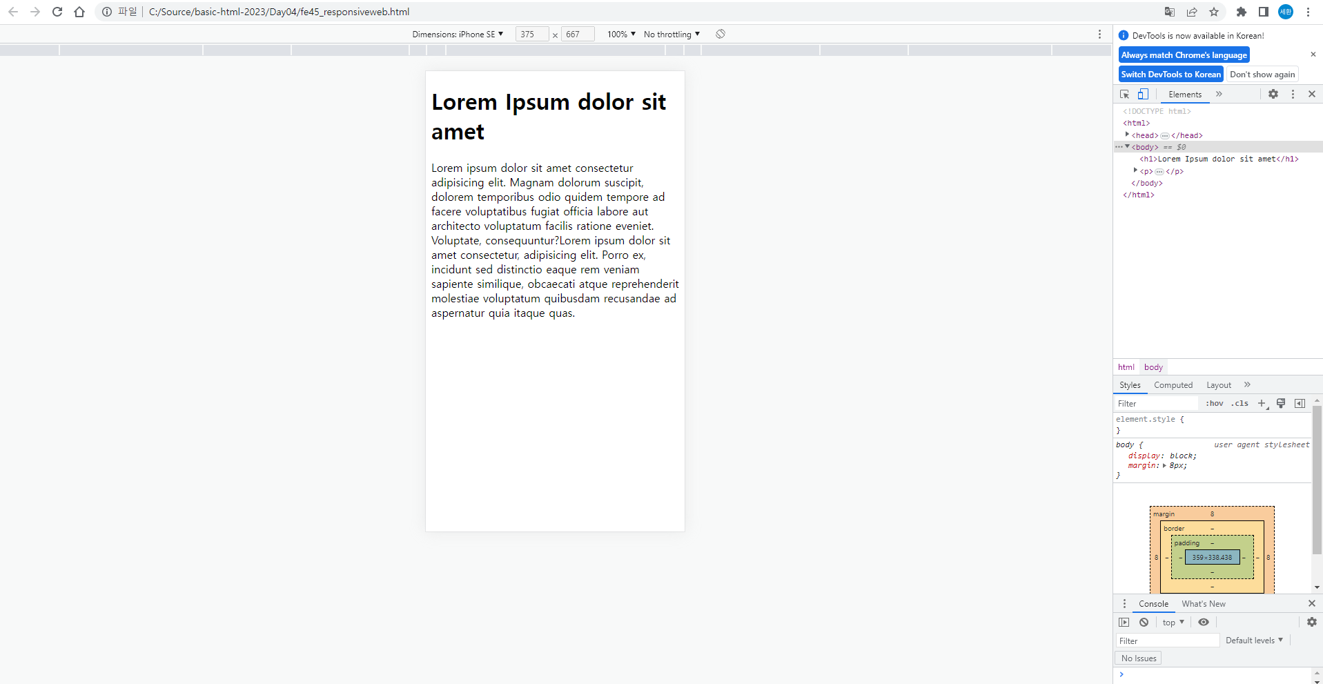
해상도가 바뀌면 글자도 커지게 된다.
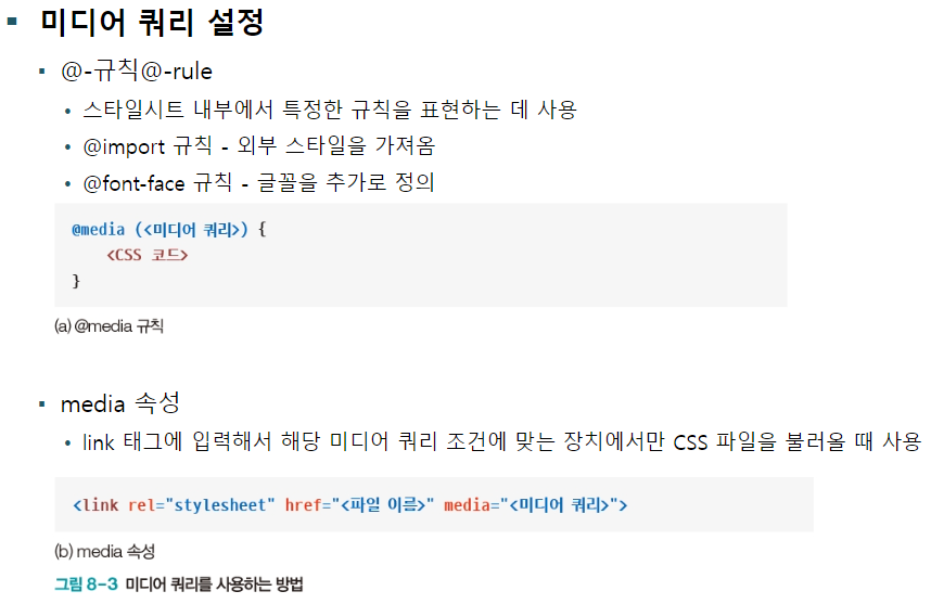
미디어 쿼리 설정
<head>
    <meta charset='utf-8'>
    <meta http-equiv='X-UA-Compatible' content='IE=edge'>
    <title>반응형 웹</title>
    <meta name='viewport' content='width=device-width, initial-scale=1'>
    <style>
        @media screen {
            body{
                background-color: aqua;
            }
        }

        @media print {
            h1{
                color: blue;
                font-size: 60px;
            }
            body{
                background-color: greenyellow;
            }
        }
    </style>
</head>
<body>
    <h1>Lorem Ipsum dolor sit amet</h1>
    <p>Lorem ipsum dolor sit amet consectetur adipisicing elit. Magnam dolorum suscipit, dolorem temporibus odio quidem tempore ad facere voluptatibus fugiat officia labore aut architecto voluptatum facilis ratione eveniet. Voluptate, consequuntur?Lorem ipsum dolor sit amet consectetur, adipisicing elit. Porro ex, incidunt sed distinctio eaque rem veniam sapiente similique, obcaecati atque reprehenderit molestiae voluptatum quibusdam recusandae ad aspernatur quia itaque quas.</p>
</body>
fe45에 스타일을 추가하였다.
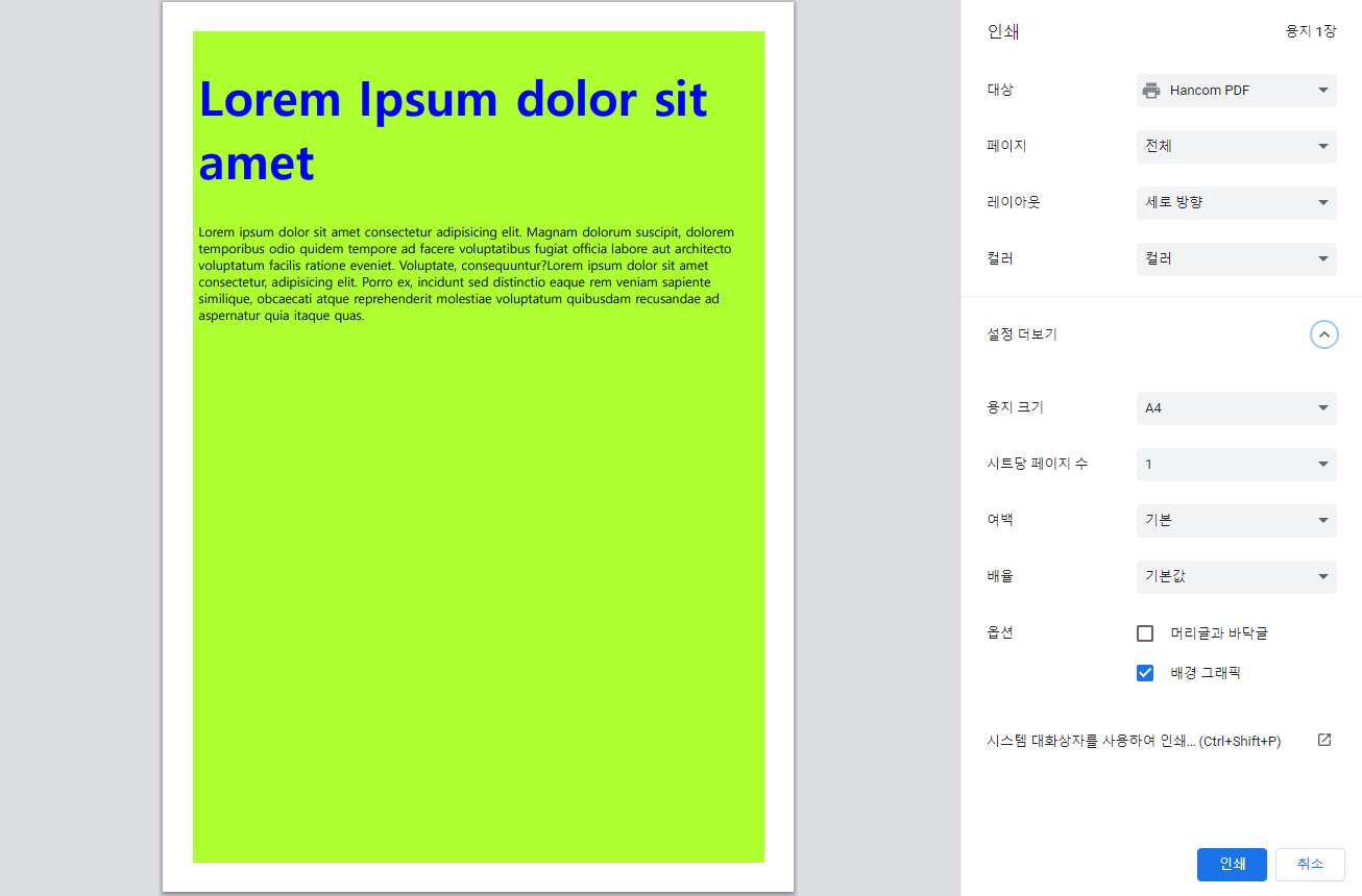
인쇄 - 배경 그래픽을 체크하면 활성화되는 것을 볼 수 있다.
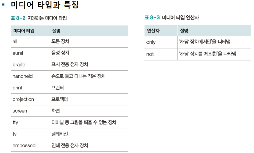
미디어 타입과 특징
        /* 스마트폰 */
        @media screen and (max-width: 450px) and (orientation: portrait) {
            body{
                background-color: aqua;
            }
        }

        /* 태블릿 */
        @media screen and (min-width: 450px) and (max-width: 960px) and (orientation: portrait) {
            body{
                background-color: burlywood;
            }
        }

        /* 데스크탑 */
        @media screen and (min-width: 960px) and (orientation: portrait) {
            body{
                background-color: cadetblue;
            }
        }

        @media screen and (orientation: landscape) {
            body {
                background-color: gray;
            }
        }
fe45의 style에 위를 추가하였다.

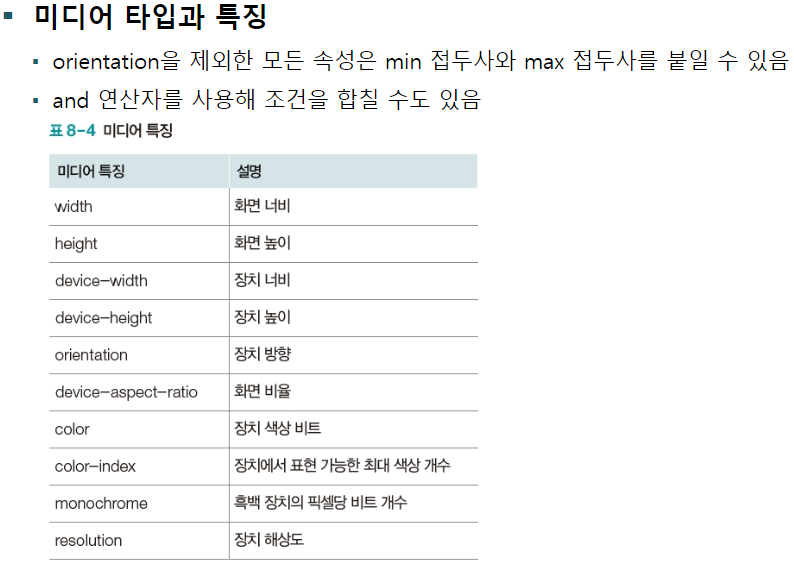
450까지 이 색
451부터 이 색
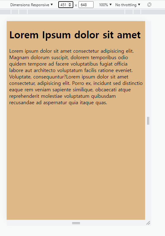
961부터 이 색이 나온다.
디바이스별 해상도가 다르므로 각각 색상을 바꿔보았다.
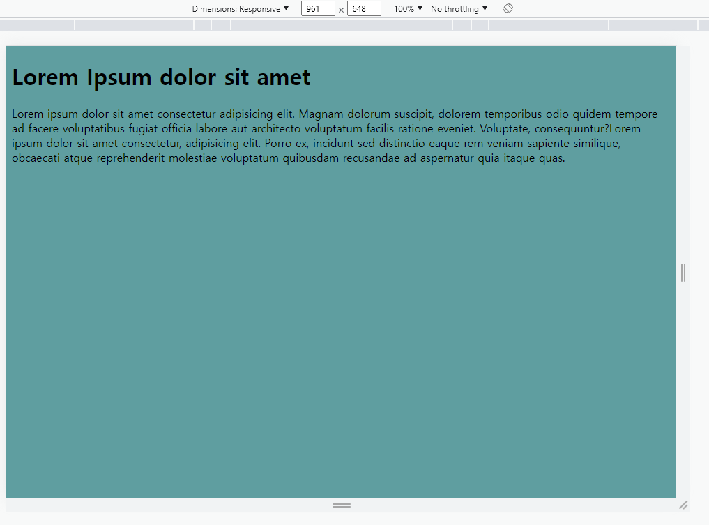
우측에 휴대폰 뒤집는 버튼은 옆으로 눕힌다는 뜻이다.
이렇게 옆으로 눕히면 회색으로 나오도록 지정하였다.
반응형 웹 패턴
    <style>
        *{ margin: 0; padding: 0;}

        #menu {
            width: 260px;
            float: left;
        }

        #section {
            width: 700px;
            float: left;
        }

        li {
            list-style: none;
        }

        /* 스마트폰 */
        @media screen and (max-width: 450px) and (orientation: portrait) {
            body{
                background-color: aqua;
                width: auto;
            }
            #menu { width: auto; float: none;}
            #section { width: auto; float: none;}
        }

        /* 태블릿 */
        @media screen and (min-width: 450px) and (max-width: 960px) and (orientation: portrait) {
            body{
                background-color: burlywood;
                width: auto;
            }
            #menu { width: auto; float: none;}
            #section { width: auto; float: none;}
        }

        /* 데스크탑 */
        @media screen and (min-width: 960px) and (orientation: portrait) {
            body{
                background-color: cadetblue;
                width: 960px;
                margin: 0 auto;
                overflow: hidden;
            }
        }

        @media screen and (orientation: landscape) {
            body {
                background-color: gray;
            }
        }

        @media print {
            h1{
                color: blue;
                font-size: 60px;
            }
            body{
                background-color: greenyellow;
            }
        }
    </style>

    ...

    <body>
    <div id="menu">
        <ul>
            <li>Home</li>
            <li>About</li>
            <li>Product</li>
        </ul>
    </div>
    <div id="section">
        <h1>Lorem Ipsum dolor sit amet</h1>
    <p>Lorem ipsum dolor sit amet consectetur adipisicing elit. Magnam dolorum suscipit, dolorem temporibus odio quidem tempore ad facere voluptatibus fugiat officia labore aut architecto voluptatum facilis ratione eveniet. Voluptate, consequuntur?Lorem ipsum dolor sit amet consectetur, adipisicing elit. Porro ex, incidunt sed distinctio eaque rem veniam sapiente similique, obcaecati atque reprehenderit molestiae voluptatum quibusdam recusandae ad aspernatur quia itaque quas.</p>
    </div>
</body>
style과 body를 이렇게 수정하였다.
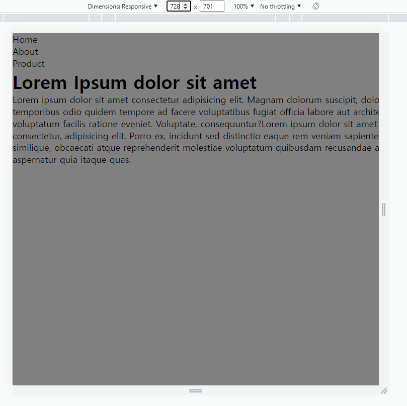
모바일, 태블릿은 이 화면이 고정이고,

pc에서도 960이 넘어가면 이렇게 위치가 변경된다.
Javascript
자바스크립트 기본 용어와 출력 방법
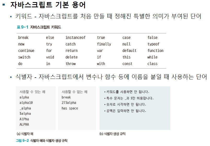
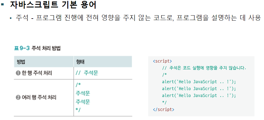
기본 용어


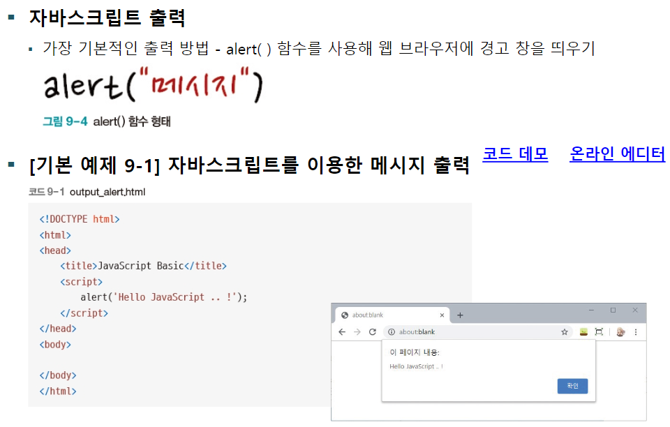
출력 방법
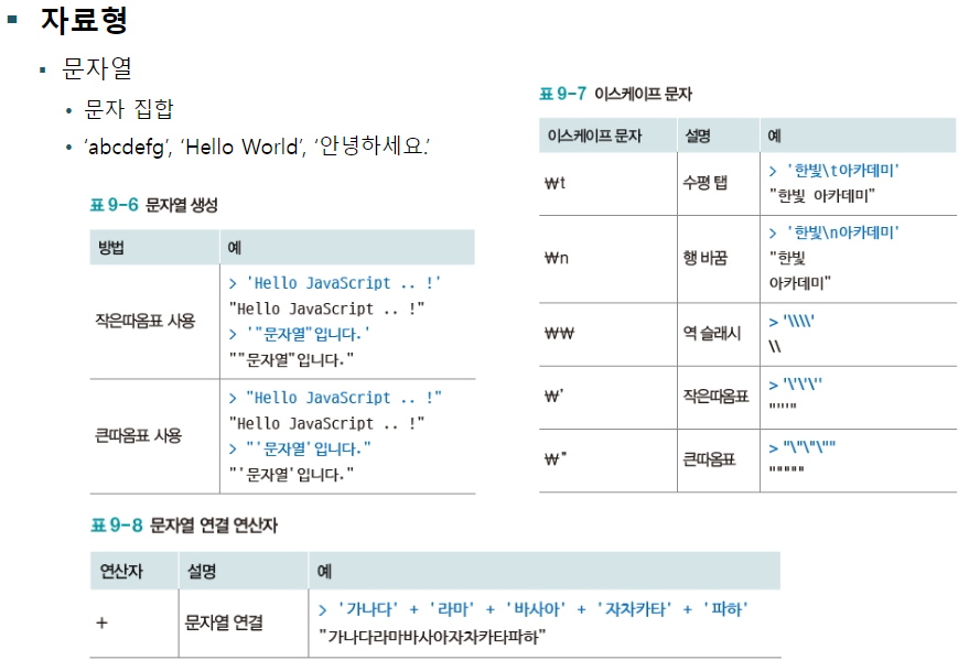
자료형과 변수
자료형
이외에는 Java에서 배운 것들이랑 같으므로 따로 적지 않음.
    <script>
        // 한 줄 주석
        /*
            여러줄 주석
        */

       // 모든 변수는 var로
       var radius = 10;
       var pi = 3.14159265;
       var greeting = 'Hello';

       // 출력
       alert(radius * radius * pi)
    </script>
fe46_javascript.html
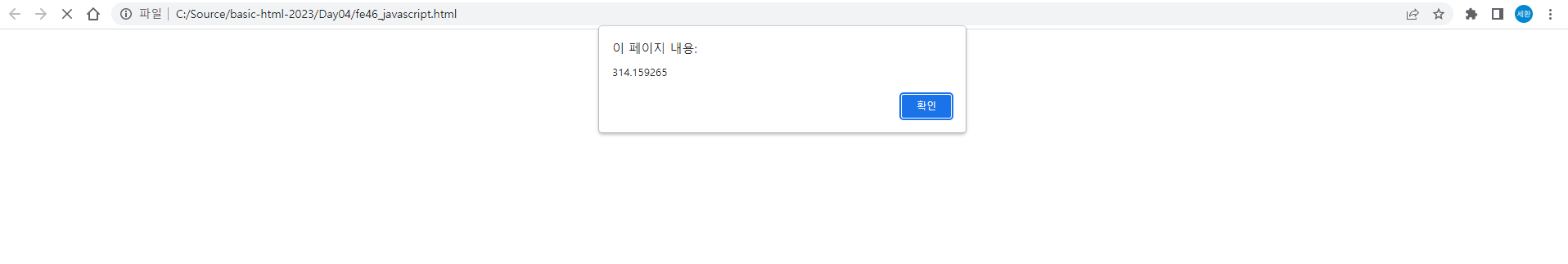
위 창이 뜬다. 확인을 누르면
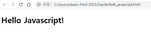
Hello Javascript!가 출력된다.
       var date = new Date();
       // 요소추출
       var year = date.getFullYear();
       var mon = date.getMonth() + 1;
       var day = date.getDate();
       // 등 hour, minute, seconds 다 가능

       alert(year + '년' + mon + '월' + day + '일')
날짜 추출
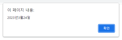
월은 +1을 해야 정상적으로 나온다.
함수

익명 함수
        // 익명함수
        var fnc = function () {
            alert('fnc1')
            console.log('fnc1 출력');
        }

        // alert(fnc);
        // fnc();
        // 일반함수
        function fnc2 () {
            alert('fnc2');
            console.log('fnc2 출력');
        }

        alert(fnc2);
        fnc2();
script에 작성한다
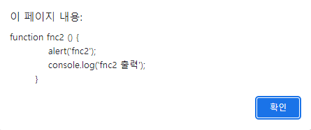
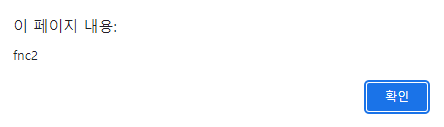
위 창이 순서대로 뜨고,

이후에 Console에 출력이 된다.
        var fnc = function() { alert('fncA'); }; // 이 부분 무시
        var fnc = function() { alert('fncB'); };

        fnc();

        var fnc = function() { alert('fncA'); };
        function fnc() { alert('fncB'); }; // 이 부분 무시

        fnc();
이 부분 무시라고 적힌 부분은 무시되고, 그렇지 않은 부분은 창에 출력된다.
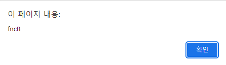
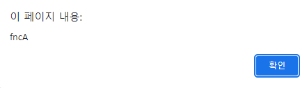
fncB, fncA 순서대로 출력됨.
매개변수와 반환값
        function square(x) {
            return x * x;
        }
        alert(square(4));

        function plus (x,y) {
            return x + y;
        }
        alert(plus(2,3));
16과 5가 순서대로 나온다.
콜백 함수
/* 함수를 매개변수로 */
        function procTentimes(func) {
            for(var i= 0; i < 3; i++){
                func(); // 매개변수로 가져온 함수를 실행!!
            }
        }

        var callback = function ()  {
            alert('호출!');
        }

        procTentimes(callback);
호출! 창이 3번 나온다.
객체
객체 개요
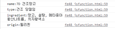
        /* 객체 json */
        var dried_mango = {
            name : '7D 건조망고',
            type : '건조 당절임',
            ingredient : '망고, 설탕, 메타중아황산나트륨, 치자황색소',
            origin : '필리핀'
        }
        console.log(dried_mango['name']);
        console.log(dried_mango['ingredient']);
        console.log(dried_mango.origin);
        console.log(dried_mango.type);

        for (var i in dried_mango) {
            console.log(i + ':' + dried_mango[i]);
        }
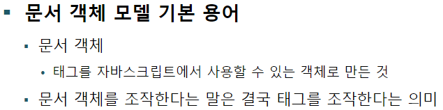
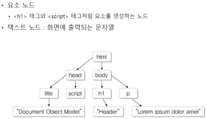
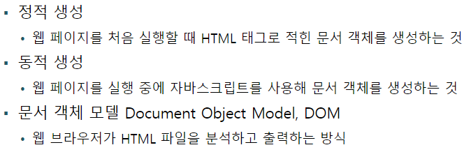
문서 객체 모델
문서 객체 모델의 기본 용어와 개념
문서 객체 모델의 기본 용어
웹 페이지 실행 순서
<body>
    <h1>Lorem ipsum dolor sit amet.</h1>
    <p>Lorem ipsum dolor sit amet.</p>

    <script>
        // style 변경은 body에 마지막에 위치해야함!!
        document.querySelector('h1').style.backgroundColor = 'red';
        document.querySelector('h1').style.color = 'white';
        document.querySelector('h1').style.fontSize = '50px';
        document.querySelector('h1').style.fontStyle = 'Italic';

        var h1Style = document.querySelector('h1').style;
        h1Style.backgroundColor = 'blue';
    </script>

</body>
이렇게 해야 적용됨.

    <script>
        // 2. 페이지가 랜더링이 완료되고 나면 실행
         window.onload = function(){
        // style 변경은 body에 마지막에 위치해야함!!
        document.querySelector('h1').style.backgroundColor = 'red';
        document.querySelector('h1').style.color = 'white';
        document.querySelector('h1').style.fontSize = '50px';
        document.querySelector('h1').style.fontStyle = 'Italic';
        };
    </script>
</head>
<body>
    <h1>Lorem ipsum dolor sit amet.</h1>
    <p>Lorem ipsum dolor sit amet.</p>

    <script>
        var h1Style = document.querySelector('h1').style;
        h1Style.backgroundColor = 'blue'; // 1. 페이지 랜더링 때 같이 실행되는 부분
    </script>
이렇게 하면

red가 나옴.
문서 객체 선택
객체 선택, 글자 조작
<script>
window.onload = function () {
var header = document.getElementById('header');
header.style.color = 'blue';
header.style.backgroundColor = 'yellow';
header.innerHTML = '자바스크립트에서 변경함!';
};
</script>
</head>
<body>
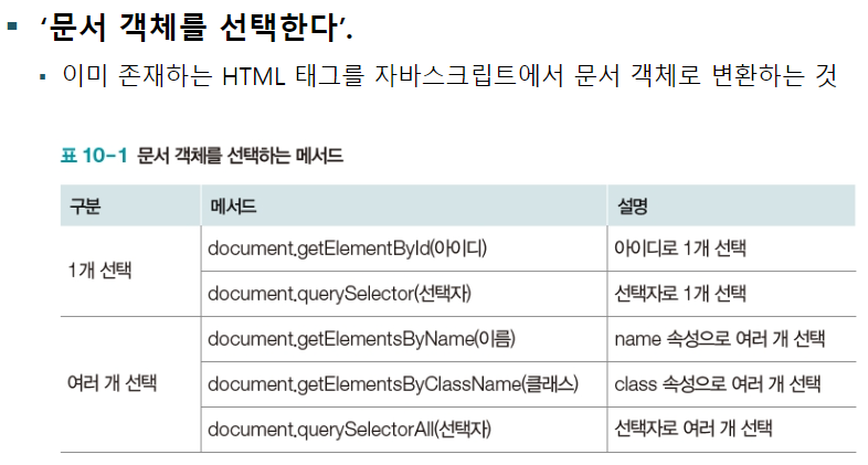
<h1 id="header">Lorem ipsum dolor sit amet</h1>
</body>fe50_dom.html

script의 '자바스크립트에서 변경함' 라인을 주석처리하면
로렘 입섬이 나옴.
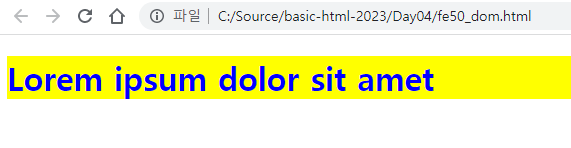
    <script>
        window.onload = function () {
            var header = document.getElementById('header');

            header.style.color = 'blue';
            header.style.backgroundColor = 'yellow';
            header.innerHTML = '자바스크립트에서 변경함!';

            var h1 = document.querySelector('h1'); // 같은 태그 중 하나만 가져옴
            h1.style.color = 'red';
            h1.style.backgroundColor = '#222222';
            h1.innerHTML = 'querySelector';
        };
    </script>
</head>
<body>
    <h1 id="header">Lorem ipsum dolor sit amet</h1>
    <h1>Lorem ipsum dolor sit amet</h1>
    <h1>Lorem ipsum dolor sit amet</h1>
</body>
이렇게 수정해보았다.
하나만 가져오는 모습을 볼 수 있다.
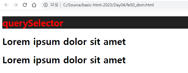
    <script>
        window.onload = function () {
            var header = document.getElementById('header');
            header.style.color = 'blue';
            header.style.backgroundColor = 'yellow';
            header.innerHTML = '자바스크립트에서 변경함!';

            var h1 = document.querySelector('h1'); // 같은 태그 중 하나만 가져옴
            h1.style.color = 'red';
            h1.style.backgroundColor = '#222222';
            h1.innerHTML = 'querySelector';

            var headings = document.querySelectorAll('h1');
            for ( var i = 1; i < headings.length; i++) {
                var heading = headings[i];
                heading.style.color = 'orange';
                heading.style.backgroundColor = '#ff0000';
                heading.innerHTML = 'querySelectorAll';
            }
        };
    </script>
스크립트에 querySelectorAll을 추가하였다.
해당하는 h1이 스크립트에서 정의한 것처럼 배경과 글자색이 바뀐 모습을 볼 수 있다.
스타일조작
    <script>
        window.onload = function () {
            var output = '';
            for (var i = 0; i< 256; i++) {
                output += '<div></div>';
            }

            document.body.innerHTML = output;

            var divs = document.querySelectorAll('div');
            for (var i=0; i< divs.length; i++) {
                var div = divs[i];

                div.style.height = '2px';
                div.style.backgroundColor = 'rgb('+i+','+i+', '+i+')';
            }
        }
    </script>
fe51_dom.html

이렇게 그라데이션이 생성된다.
<head>
    <meta charset='utf-8'>
    <meta http-equiv='X-UA-Compatible' content='IE=edge'>
    <title>js DOM</title>
    <meta name='viewport' content='width=device-width, initial-scale=1'>
    <script>
        window,onload = function () {
            var img = document.getElementById('img');

            img.width = 350;
            img.height = 600;
            img.src = 'https://picsum.photos/' + img.width + '/' + img.height;
        };
    </script>
</head>
<body>
    <img id="img">
</body>
fe52_dom.html
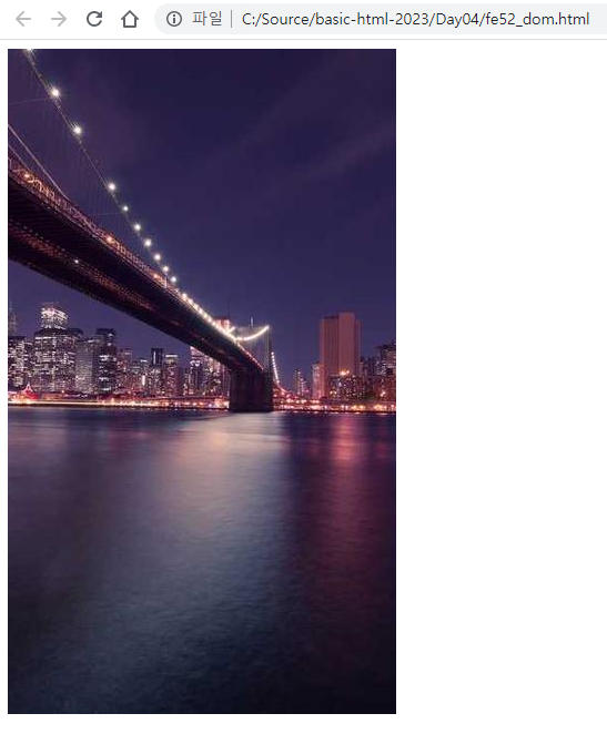
width, height에 해당하는 사진을 가져온다.
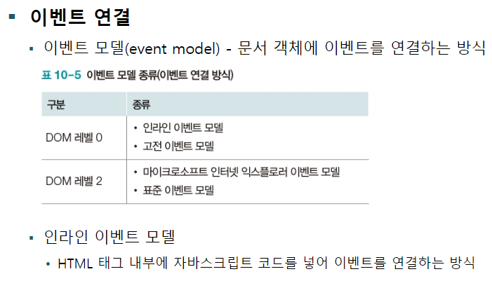
이벤트
이벤트 용어 정리

이벤트 연결
<button ondblclick="alert('더블클릭');" >더블클릭</button> fe53_event.html
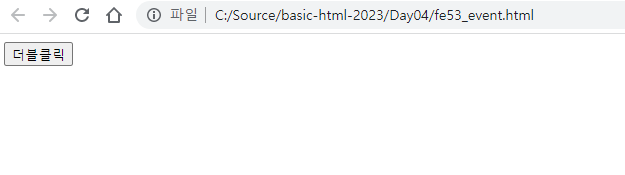
버튼을 더클블릭하면

알림창이 하나 생긴다.
    <script>
        function fnc() {
            alert('더블클릭');
        }
    </script>
</head>
<body>
    <button ondblclick="fnc();" >더블클릭</button>
</body>
이렇게 수정해도 동일하다.
    <script>
        window.onload = function () {
            var btnSave = document.getElementById('btnSave');

            btnSave.onclick = function() {
                alert('저장시작!!');
            }
        }
    </script>
</head>
<body>
    <button id="btnSave">클릭</button>
</body>
이렇게 수정한다.
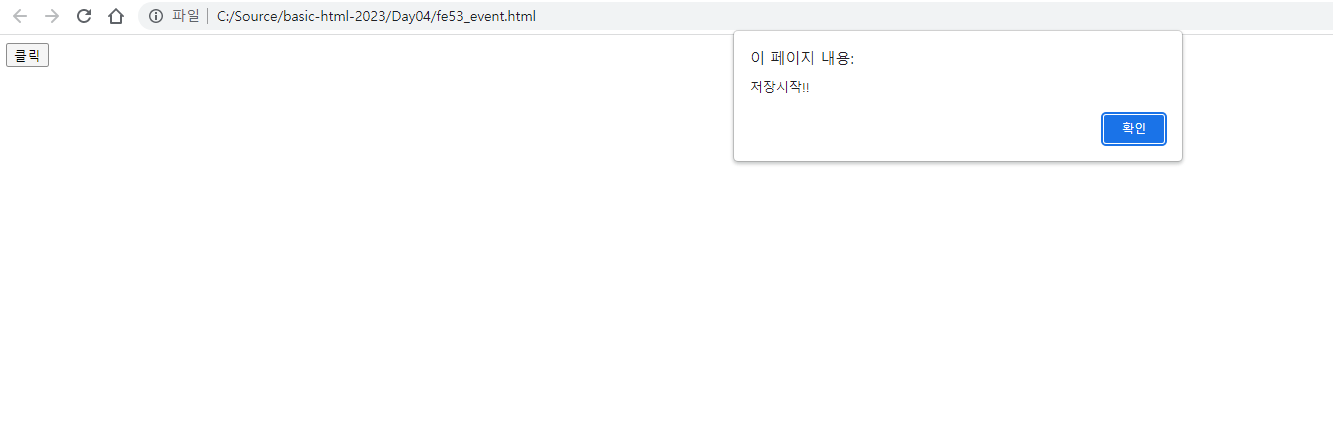
버튼 이름이 클릭으로 바뀌고 눌렀을 때 저장시작!! 이라는 문구가 나오게 된다.
    <script>
        // 이벤트 매개변수 사용. event.type 종류 확인
        window.onload = function (event) {
            alert(event.type); // lord
            var btnSave = document.getElementById('btnSave');

            btnSave.onclick = function(e) {
                alert(e.type); // click
            };
        };
    </script>
</head>
<body>
    <button id="btnSave">클릭</button>
</body>
이렇게 수정하면
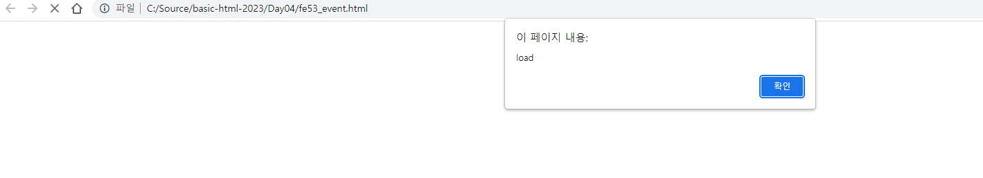
load창이 뜨고,
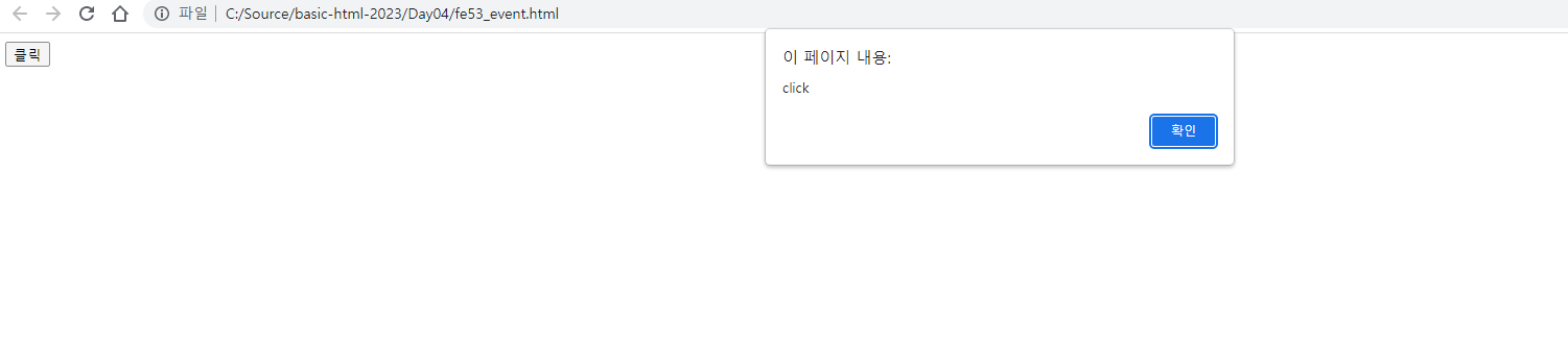
버튼을 누르면 click이 뜬다.
    javascript 특징은 쉽다. 변수 선언이 var 하나로 다 됨.
    java와 조건문, 반복문 동일
    DOM으로 HTML 태그를 전부 커트롤
    function () 익명함수 형태의 함수선언이 일반적
jQuery
jQuerry 라이브러리 사용 방법
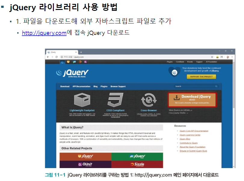
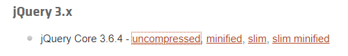
Download the compressed, production jQuery 3.6.4

폴더에 저장.
문서 객체 선택, 조작
문서 객체 선택 및 속성 조작
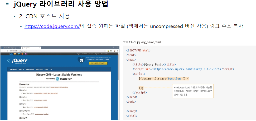
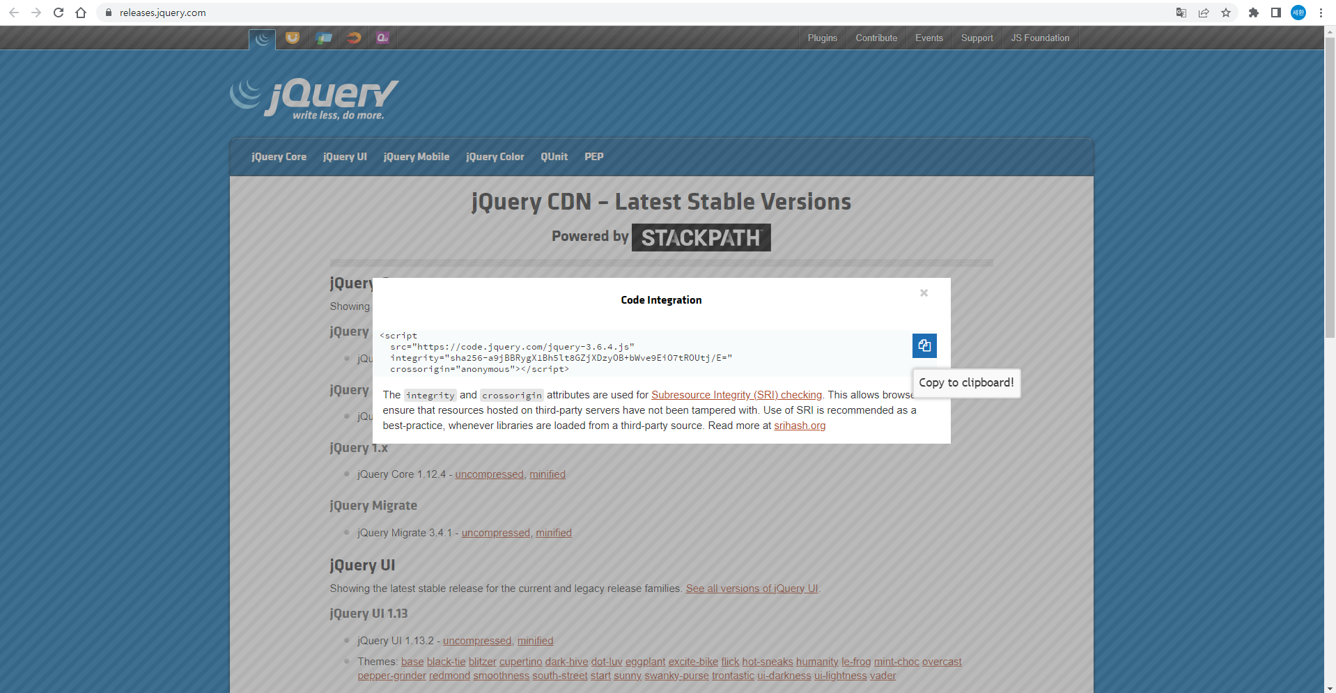
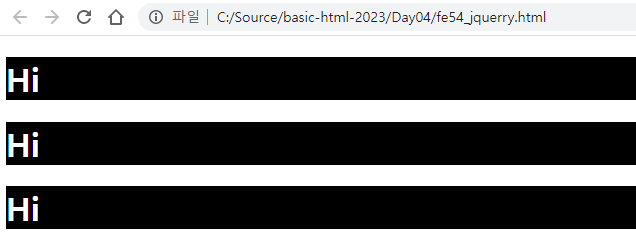
    <script src="https://code.jquery.com/jquery-3.6.4.js"
        integrity="sha256-a9jBBRygX1Bh5lt8GZjXDzyOB+bWve9EiO7tROUtj/E="
        crossorigin="anonymous"></script>
    <script>
        /* javascript 전통 이벤트*/
        // window.onload = function () {
        //     alert('Hello, javascript');
        // }
        /* jQuery 방식 이벤트 */
        $(document).ready(function () {
            // alert('Hello, jQuery!!')
            $('h1').css('background-color', 'black');
            $('h1').css('color','white')
            // fe50_dom.html 소스와 비교해보면 훨씬 소스가 간결, 쓰기도 편함

            alert( $('script').attr('integrity'));
        });
    </script>
</head>
<body>
    <h1>Hi</h1>
    <h1>Hi</h1>
    <h1>Hi</h1>
</body>
fe54_jQuery.html
문서 객체 스타일 조작
    <meta name='viewport' content='width=device-width, initial-scale=1'>
    <script src="https://code.jquery.com/jquery-3.6.4.min.js"
            integrity="sha256-oP6HI9z1XaZNBrJURtCoUT5SUnxFr8s3BzRl+cbzUq8="
            crossorigin="anonymous"></script>
    <script>
        $(document).ready(function () {
            $('#box').css({
                width: '100px',
                height: '100px',
                'background-color' : 'orange'

            }).on('click', function() {
                $(this).css('background-color', 'red');
            }).on('mouseenter', function() {
                $(this).css('background-color', 'blue');
                $(this).css('border-radius', '50%');
            }).on('mouseleave', function() {
                $(this).css('background-color', 'orange');
                $(this).css('border-radius', '0px');
        })})
    </script>
</head>
<body>
    <div id="box"></div>
</body>
fe55_jQuerry.html
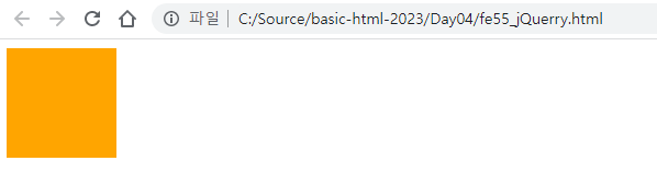
아무것도 안했을 때
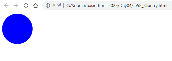
마우스 커서 올려놨을 때
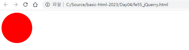
한 번 클릭했을 때
이벤트
이벤트 연결
 <script>
        $(document).ready(function () {
            $('#box').css({
                width: '100px',
                height: '100px',
                'background-color' : 'orange'

            }).on('click', function() {
                $(this).css('background-color', 'red');
                alert('안녕~');
            }).on('mouseenter', function() {
                $(this).css('background-color', 'blue');
                $(this).css('border-radius', '50%');
            }).on('mouseleave', function() {
                $(this).css('background-color', 'orange');
                $(this).css('border-radius', '0px');
        })})
    </script>
alert('안녕~');을 추가하였다.
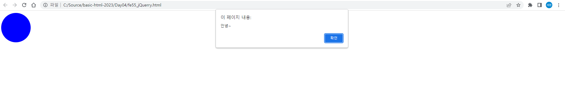
원을 클릭하면 안녕 창이 뜬다.
    <script>
        $(document).ready(function () {
            $('#box').css({
                width: '100px',
                height: '100px',
                'background-color' : 'orange'

            }).on('click', function() {
                $(this).css('background-color', 'red');
                alert('안녕~');
            }).on('mouseenter', function() {
                $(this).css('background-color', 'blue');
                $(this).css('border-radius', '50%');
            }).on('mouseleave', function() {
                $(this).css('background-color', 'orange');
                $(this).css('border-radius', '0px');
        });
            $('h1').on('mouseenter',function() {
                $(this).css({
                    'background-color':'red',
                    'color': 'white'
                });
            }).on('mouseleave',function () {
                $(this).css({
                    'background-color':'',
                    'color':''
                });
            });
        });
    </script>
</head>
<body>
    <div id="box"></div>
    <br>
    <h1>CLICK</h1>
</body>
스크립트를 , h1을 추가하였다.
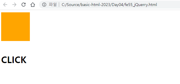
평상시
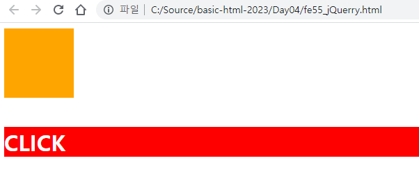
CLICK에 마우스 커서를 올렸을 때
이벤트 제거
            $('a').click(function (e) {
                alert('이동합니다.');

                e.preventDefault(); // 이벤트를 제거!
            })
스크립트에 위 코드를 추가하고
<a href="https://www.google.com" target="_blank">구글</a>body에 하나를 추가하였다.
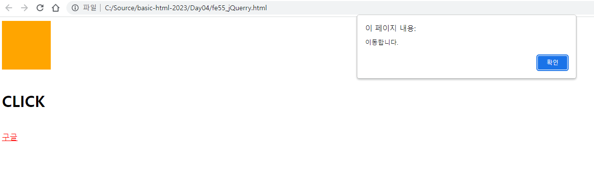
구글이 생기고 클릭을 하니 이동합니다 창까지 떴으나, 이벤트가 제거되어 구글창이 뜨지 않는다,
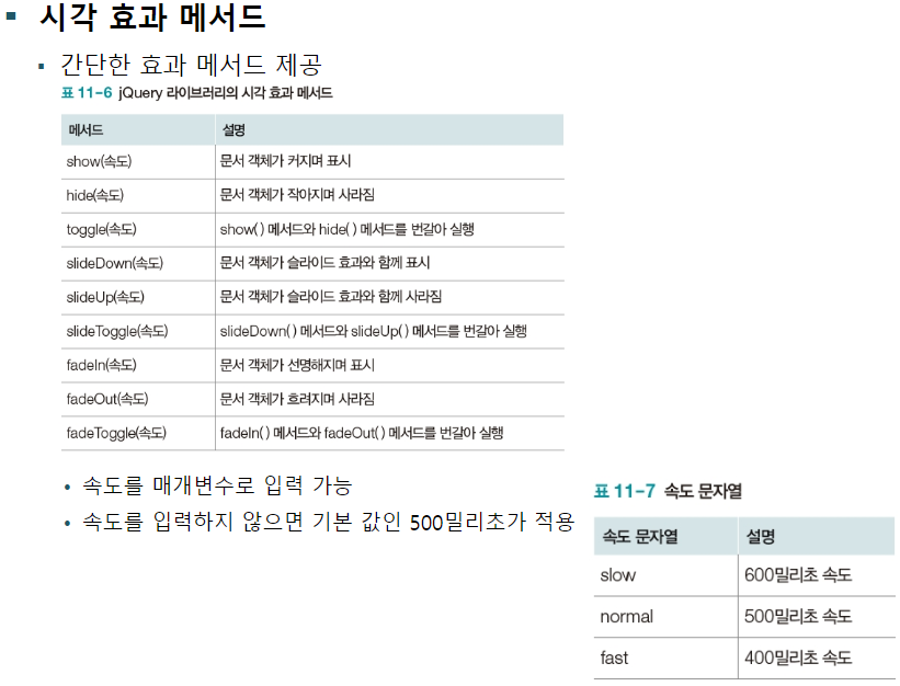
시각효과
시각 효과 메소드
            $('#btnToggle').click(function () {
                $('.page').fadeToggle('slow'); // toggle(), slideToggle()도 있다.
            });
스크립트에 추가
    <input type="button" value="show" id="btnToggle">
    <div class="page">
        <h1>Lorem, ipsum dolor sit amet</h1>
        <p>Lorem ipsum dolor sit amet consectetur adipisicing elit. Culpa repudiandae maxime eligendi, voluptate animi voluptatum consequatur. Ipsam illo neque iure quo ratione sit ut tenetur voluptas. Quod dolor commodi rerum.</p>
    </div>
body에 추가하였다.
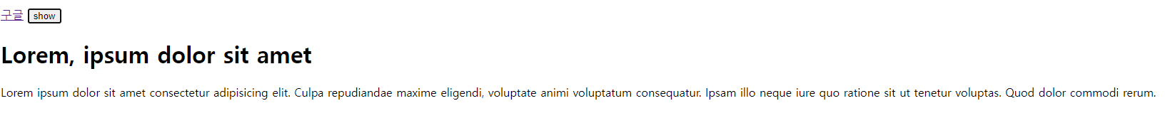
show를 누르면

서서히 사라진다.
애니메이션 효과
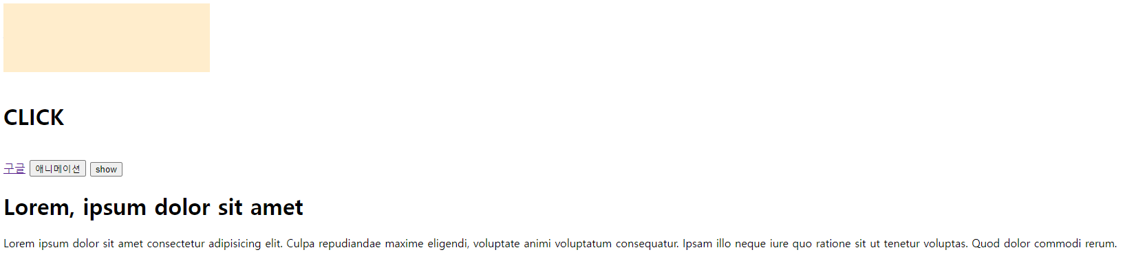
            $('#anim').click(function (e) {
                $('#box').animate({
                    width: '300px',
                    opacity: 0.2,
                }, 1000);
            }).dblclick(function (e){
                $('#box').animate({
                    width: '100px',
                    opacity: 1.0,
                }, 1000);
            });
스크립트에 추가하고
<button id="anim">애니메이션</button>애니메이션 버튼을 추가하였다.

애니메이션을 클릭하면
이렇게 늘어난다. 이제 더블클릭을 하면
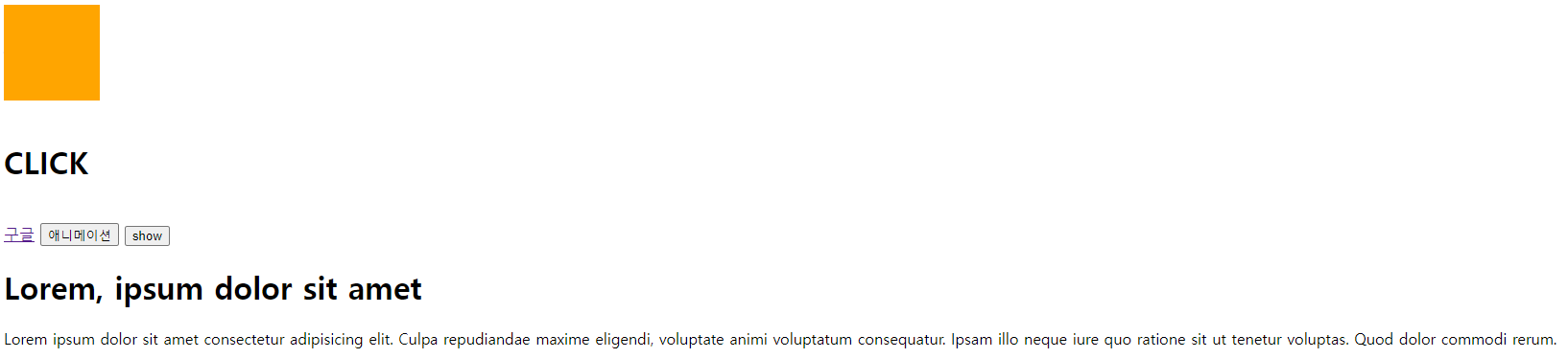
이렇게 다시 원상복구된다.