(본 글은 velopert님의 https://react.vlpt.us/styling/03-styled-components.html 를 참조합니다.)
styled-components
[ 설명 ]
: 순수 CSS로 스타일링 하는 문제점을 개선하기 위한 방법 중 하나로
JS 안에 CSS를 작성하는 여러 라이브러리 중 인기가 가장 많다
(자세한 설명 : https://blog.nerdfactory.ai/2019/10/25/react-styled-components.html)
[ 준비 ]
1) CRA 만들기
npx create-react-app styling-with-styled-components
2) styled-components 설치
yarn add styled-components
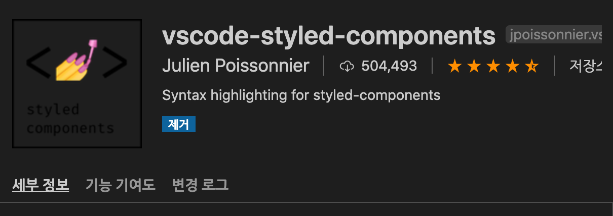
3) extenstion 설치
: styled-components 내부에서 css속성 자동완성을 하기 위한 확장툴
[ Template Literal 사용 & 조건 부 css 적용 ]
import React from 'react';
import styled, {css} from 'styled-components';

const Circle = styled.div`
  width: 5rem;
  height: 5rem;
  background: ${props => props.color || 'black'};
  border-radius: 50%;
  ${props =>
    props.huge &&
    css`
      width: 10rem;
      height: 10rem;
      `
  }
`;
function App() {
  return (
    <Circle color="red" huge/>
  );
}
[ & 사용 / lighten(), darken() 사용 ]
import React from 'react';
import styled from 'styled-components';
import { darken, lighten } from 'polished';

const StyledButton = styled.button`

  /* 색상 */
  background: #228be6;
  &:hover {
    background: ${lighten(0.1, '#228be6')};
  }
  &:active {
    background: ${darken(0.1, '#228be6')};
  }

  /* 기타 */
  & + & {
    margin-left: 1rem;
  }
`;

function Button({ children, ...rest }) {
  return <StyledButton {...rest}>{children}</StyledButton>;
}

export default Button;
&은 Sass 문법
1)styled.button
:<button>에 대한 스타일을 정의 하겠다.
2)&.hover==.button.hover
3)& + &==.button + .button
: button끼리 붙어 있을 때lighten과 darken은 polish 라이브러리로 사용
설치 :$ yarn add polished
4)lighten (0.1, '#228be6')
: 지정한 색에서 10% 밝아 진다
[ ThemeProvider 사용하여 전역 변수 사용 ]
: 여러번 사용되는 객체를 전역 선언하여 쓰는 방법
1) App.js에서 선언
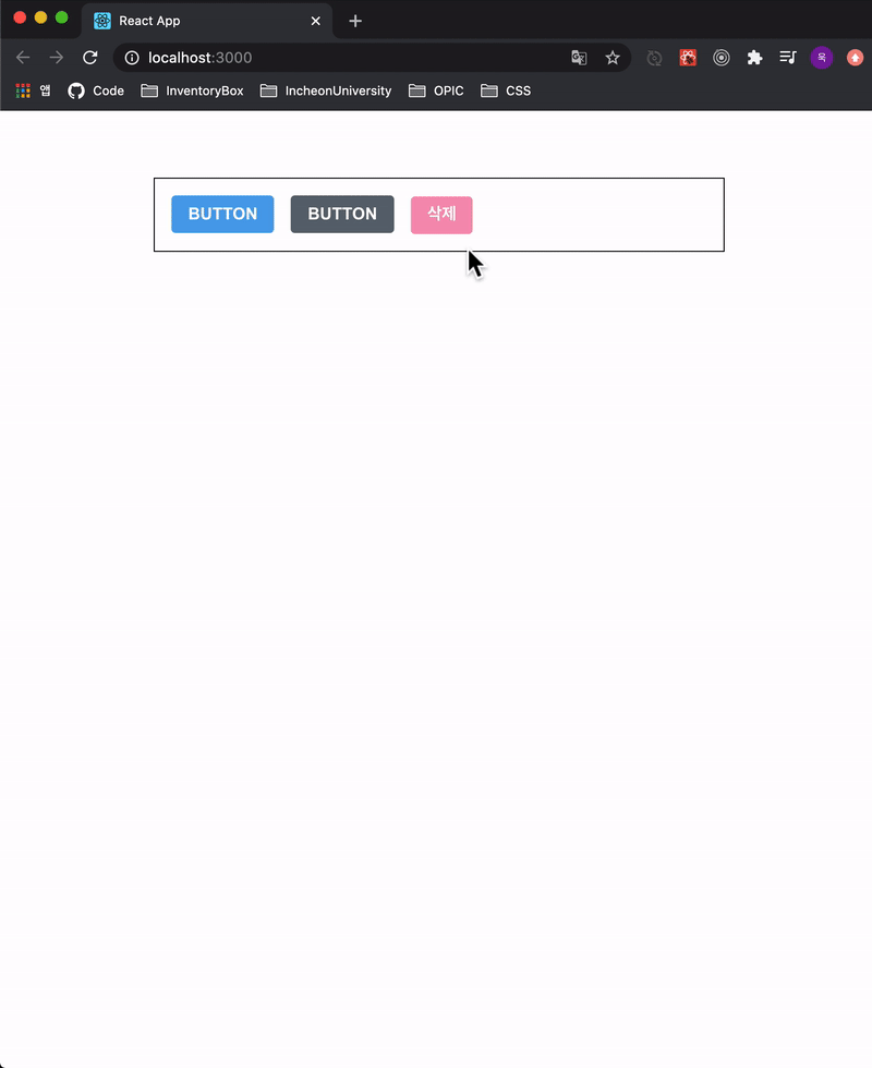
import styled, { ThemeProvider } from 'styled-components';

...

function App() {
  return (
    <ThemeProvider
      theme={{
        palette: {
          blue: '#228be6',
          gray: '#495057',
          pink: '#f06595'
        }
      }}

      <AppBlock>
        <Button>BUTTON</Button>
        <Button color="gray">BUTTON</Button>
        <Button color="pink">BUTTON</Button>
      </AppBlock>
    </ThemeProvider>
  );
}
: ThemeProvider를 styled-component에서 꺼내와서 감싸준다.
그리고 전역 변수로 지정할 값(ex) palette)을 선언한다.
2) Button.js에서 사용
const StyledButton = styled.button`
...
  /* 색상 */
  ${ ({thema, color}) => {
    const selected = theme.palette[color];
    return css`
      background: ${selected};
      &:hover {
        background: ${lighten(0.1, selected)};
      }
      &:active {
        background: ${darken(0.1, selected)};
      }
...
Button.defaultProps = {
    color: 'blue'
};
: prop.theme.palette로 전역 객체 접근
prop.color로 전달받은 색상 접근
따라서 !
구조분해 문법으로 props에서 thema와 color를 빼서 정리
({thema, color})
- styled-component 내부가 너무 길어지면
const 변수로 분리할 수 있음- props에 따라서 조건부 스타일링을 해주는 것이 가능하다.
- 자세한 내용은 아래 참조
(https://react.vlpt.us/styling/03-styled-components.html)
[ Dialog 만들기 ]
( 기능 구현 )
1) Dialog.js 작성
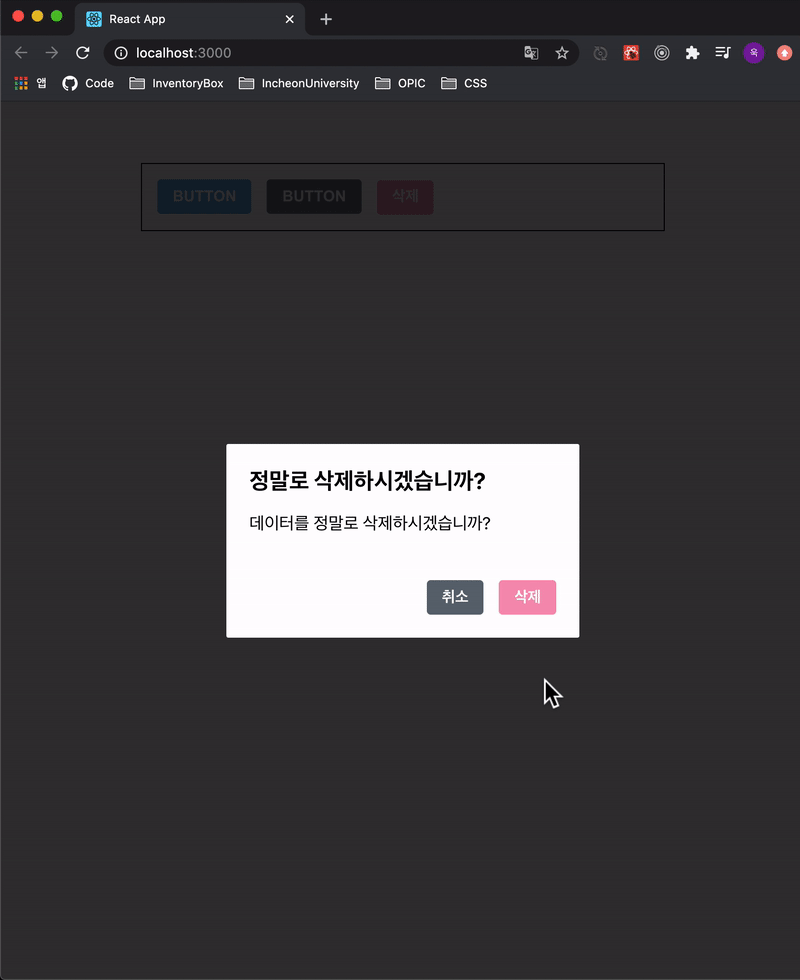
import React from 'react'
import styled from 'styled-components';
import Button from './Button';

  // 배경을 고정 + 색 변경 + Dialogblock을 중앙에 배치
const DarkBackground = styled.div`
    position: fixed;
    left: 0;
    top: 0;
    width: 100%;
    height: 100%;
    display: flex;
    align-items: center;
    justify-content: center;
    background: rgba(0,0,0,0.8);
`;
 // DialogBlock 작성
const DialogBlock = styled.div`
    width: 320px;
    padding: 1.5rem;
    background: white;
    border-radius: 2px;
    h3{ /* DialogBlock 밑에 있는 h3요소에 적용 */
        margin: 0;
        font-size: 1.5rem;
    }
    p{  /* DialogBlock 밑에 있는 p요소에 적용 */
        font-size: 1.125rem;
    }
`;
const ButtonGroup = styled.div`
    margin-top: 3rem;
    display: flex;
    justify-content: flex-end;
`;

function Dialog({ title, children, confirmText, cancelText, onConfirm, onCancel, visible}) {
    if(!visible) return null;
    return (
    <DarkBackground>
        <DialogBlock>
          <h3>{title}</h3>
          <p>{children}</p>
          <ButtonGroup>
            <Button color="gray" onClick={onCancel}>{cancelText}</Button>
            <Button color="pink" onClick={onConfirm}>{confirmText}</Button>
          </ButtonGroup>
        </DialogBlock>
      </DarkBackground>
    )
}
Dialog.defaultProps = {
    confirmText: '확인',
    cancelText: '취소'
}
export default Dialog
2) App.js 작성
...
    <Dialog
    title="정말로 삭제하시겠습니까?"
    confirmText="삭제"
    cancelText="취소"
    onConfirm={onConfirm}
    onCancel={onCancel}
    visible={dialog}

      데이터를 정말로 삭제하시겠습니까?
    </Dialog>
...
- Dialog.js에서 틀을 만든다.
- 재사용을 위해 title / confirmText / cancelText를 받는다.
- App.js에서 dialog라는 state를 통해 false/true로 관리한다.
- 각 버튼 클릭시 내용은 App.js에서 콜백 함수로 전달
(하위컴포넌트 -> 상위컴포넌트 는 콜백 함수를 통해 값 전달!)
( 트랜지션 구현 )
: Dialog가 나타나고 사라질때 생기는 트랜지션 효과를
styled-component에서 keyframe을 이용해서 구현한다
1) Dialog 등장할 때
1-1) DarkBackground 쪽에는 서서히 나타나는 fadeIn 효과
import styled, { keyframes } from 'styled-components';

const fadeIn = keyframes`
  from {
    opacity: 0
  }
  to {
    opacity: 1
  }
`;

const DarkBackground = styled.div`
 ...
  animation-duration: 0.25s;
  animation-timing-function: ease-out;
  animation-name: ${fadeIn};
  animation-fill-mode: forwards;
`;
...
1.2) DialogBlock는 아래에서부터 위로 올라오는 slideUp 효과
import styled, { keyframes } from 'styled-components';

const slideUp = keyframes`
  from {
    transform: translateY(200px);
  }
  to {
    transform: translateY(0px);
  }
`;

const DialogBlock = styled.div`
 ...
  animation-duration: 0.25s;
  animation-timing-function: ease-out;
  animation-name: ${slideUp};
  animation-fill-mode: forwards;
`;
...
[ 결과 확인 ]
2) Dialog 사라질 때
: 2개의 변수를 이용해 Dialog가 닫힐 때 setTimeout으로 잠시 지연시킨 뒤 애니메이션을 적용시켜야 한다.
'animate' : 현재 트랜지션 효과를 보여주고 있는 상태를 의미하는 변수
'localVisible' : 컴포넌트가 사라지는 시점을 지연시키기 위한 변수
2.1) animate / localVisible 변수 선언
  const [animate,setAnimate] = useState(false);
  const [localVisible, setLocalVisible] = useState(visible);
2.2) useEffect 작성
    useEffect(()=>{
        // visible 값이 true -> false 되는 시점에 수행!
        if(localVisible && !visible){
            setAnimate(true);
            setTimeout(()=>setAnimate(false),250);
        }
        setLocalVisible(visible);
    },[localVisible, visible])
2.3) return null 조건 수정
if(!animate && !localVisible) return null;
2.4) DarkBackground에 fadeOut 설정
import styled, { keyframes, css} from 'styled-components';

  const fadeOut = keyframes`
  from {
    opacity: 1
  }
  to {
    opacity: 0
  }
`;

  const DarkBackground = styled.div`
   ...
    ${props =>
        props.disappear &&
        css`
          animation-name: ${fadeOut};
        `}
`;
...

  <DarkBackground disappear={!visible}>
    ...
2.5) Dialog에 slideDown 설정
import styled, { keyframes, css} from 'styled-components';

const slideDown = keyframes`
  from {
    transform: translateY(0px);
  }
  to {
    transform: translateY(200px);
  }
`;

const DialogBlock = styled.div`
  ...
    ${props =>
        props.disappear &&
        css`
          animation-name: ${slideDown};
        `}
`;
...

  <DialogBlock disappear={!visible}>
    ...
[ 결과 확인 ]