jupyter notebook에 matplotlib 불러오기
import matplotlib.pyplot as plt
from matplotlib import rc

rc('font', family="Malgun Gothic")
%matplotlib inline
get_ipython().run_line_magic("matplotlib", "inline")

rc('axes', unicode_minus=False)- matplotlib 불러오기 & 한글, 마이너스 깨짐 방지
가장 기본적인 그래프 함수
plt.figure(figsize=(a,b))
plt.plot(x, y)
plt.show
예제 1
- 삼각함수 그리기
np.arrange(a, b, s) : a부터 b까지의 s의 간격
np.sin(value)
import numpy as np
t = np.arange(0, 12, 0.01)
y = np.sin(t)plt.figure(figsize=(10,6))
plt.plot(t, np.sin(t))
plt.plot(t, np.cos(t))
plt.show()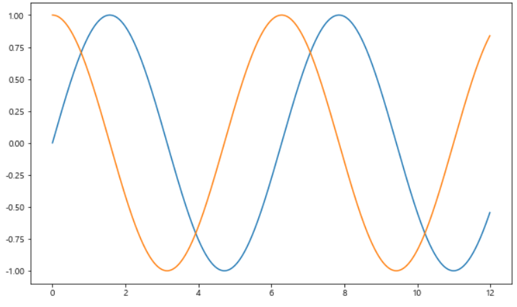
그래프 기능
- 격자무늬 추가
- 그래프 제목 추가
- x축, y축 제목 추가
- 주황색, 파란색 선 데이터 의미 구분
plt.figure(figsize=(10,6))
plt.plot(t, np.sin(t))
plt.plot(t, np.cos(t))
plt.grid(True) # 1. 격자무늬 (기본값 True)
plt.legend(labels=["sin","cos"]) # 4. 주황색, 파란색 선 데이터 의미 구분(범례)
plt.title("Example of sinwave") # 2. 그래프 제목
plt.xlabel("time") # 3. x축 제목 추가
plt.ylabel("Amplitude") # 3. y축 제목 추가
plt.show()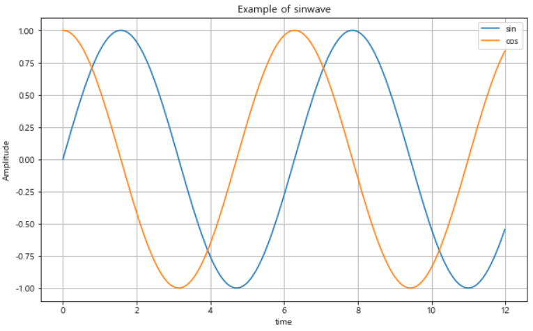
예제 1
- 예제 1 : 그래프 기능
t = np.arange(0, 5, 0.5)
t
plt.figure(figsize=(10,6))
plt.plot(t, t, "b--") # 그래프 커스텀
plt.plot(t, t ** 2, "gs") # 그래프 커스텀
plt.plot(t, t ** 3, "r^") # 그래프 커스텀
plt.legend(labels=["y=x", "y=x²", "y=x³"])
plt.grid(True)
plt.title("다항식 그래프")
plt.xlabel("x")
plt.ylabel("y")
plt.show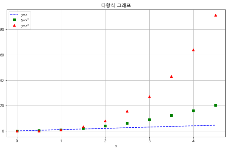
예제 2
- 예제 2 : 그래프 커스텀
t = [i for i in range(7)]
t
y = [1, 4, 5, 8, 9, 5, 3]
y
plt.figure(figsize=(10,6))
plt.plot(
t,
y,
color='green',
linestyle='dashed',
marker='o',
markerfacecolor='blue',
markersize=15
)
plt.xlim(-0.5, 6.5)
plt.ylim(0.5, 9.5)
plt.show()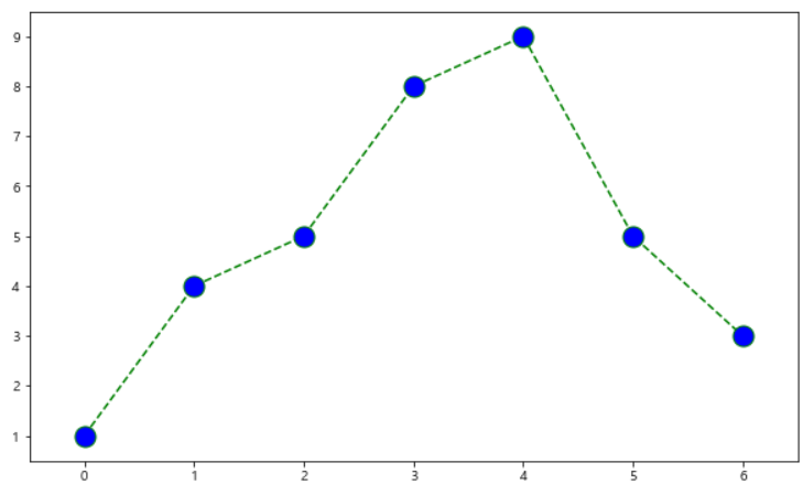
예제 3
- 예제 3 : scatter plot
t = np.array(range(0,10))
t
y = np.array([9, 8, 7, 9, 8, 3, 2, 4, 3, 4])
y
plt.figure(figsize=(10,6))
plt.scatter(t,y)
plt.show()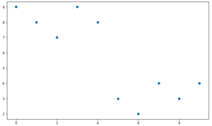
예제 4
- 예제 4 : color bar
colormap = t

def drawGraph() :
    plt.figure(figsize=(20,6))
    plt.scatter(t,y, s = 100, c=colormap, marker='>') # s: 마커사이즈
    plt.colorbar()
    plt.show()

drawGraph()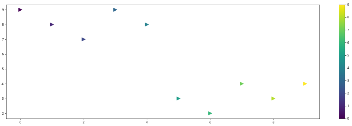
예제 5
- 예제 5 : pandas에서 plot 그리기
- matplot.lib 을 가져와서 사용
data_result.head()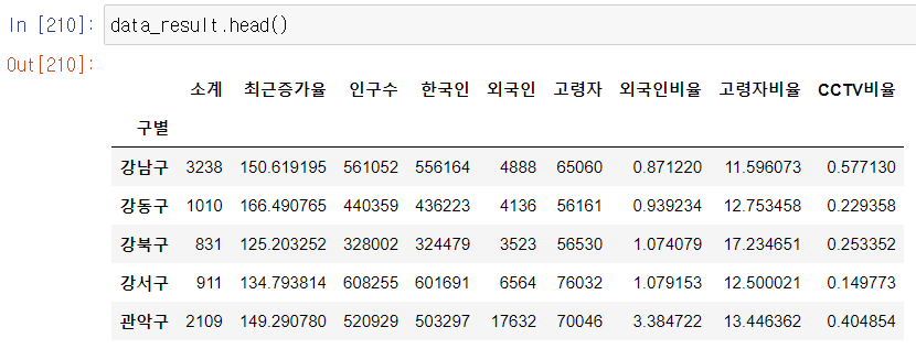
data_result['인구수'].plot(kind='bar', figsize=(10,10)) # plot 자동완성, 인구수데이터만, kind는 그래프형태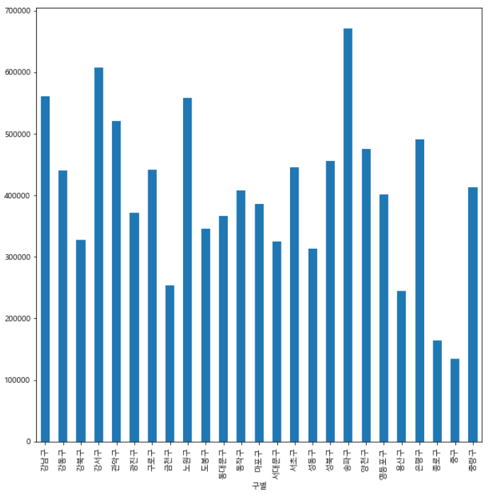
data_result['인구수'].plot(kind='barh', figsize=(10,10)) # barh 는 가로 막대그래프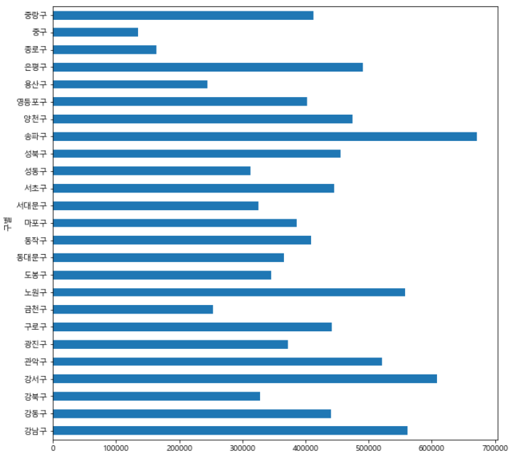

개발도상인 냄비짱