
📸 프로젝트 담당 업무
1. 상세 페이지
1) Styled component
Sass를 사용하다가 스타일드 컴포넌트를 처음 사용하게 되었다. 익숙해지면 sass보다 몇배는 편해질거란 말을 들었지만 모든 태그를 스타일에 맞게 컴포넌트화를 시킨다는 개념이 바로 와닿지는 않았다. 처음에는 레이아웃을 짜면서 sass와 섞어서 썼기에 css선택자, 태그 선택자를 많이 쓰게 되었는데 첫 번째 레이아웃 완성 후 컨펌을 받을 때 스타일드 컴포넌트만 사용하는 것이 좋다는 조언을 들었다. 그렇게 온 하루를 투자해 대공사를 마치게 되었고... 너무너무 힘들었지만 이 과정을 통해 스타일드 컴포넌트와 친해지게 되었다. 돌이켜보면 값진 경험이라 생각한다.
2) 레이아웃
-
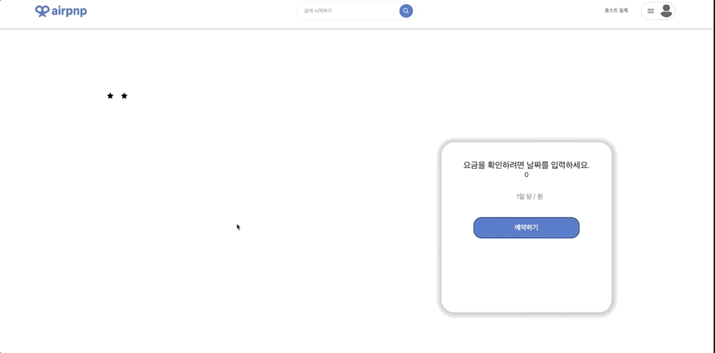
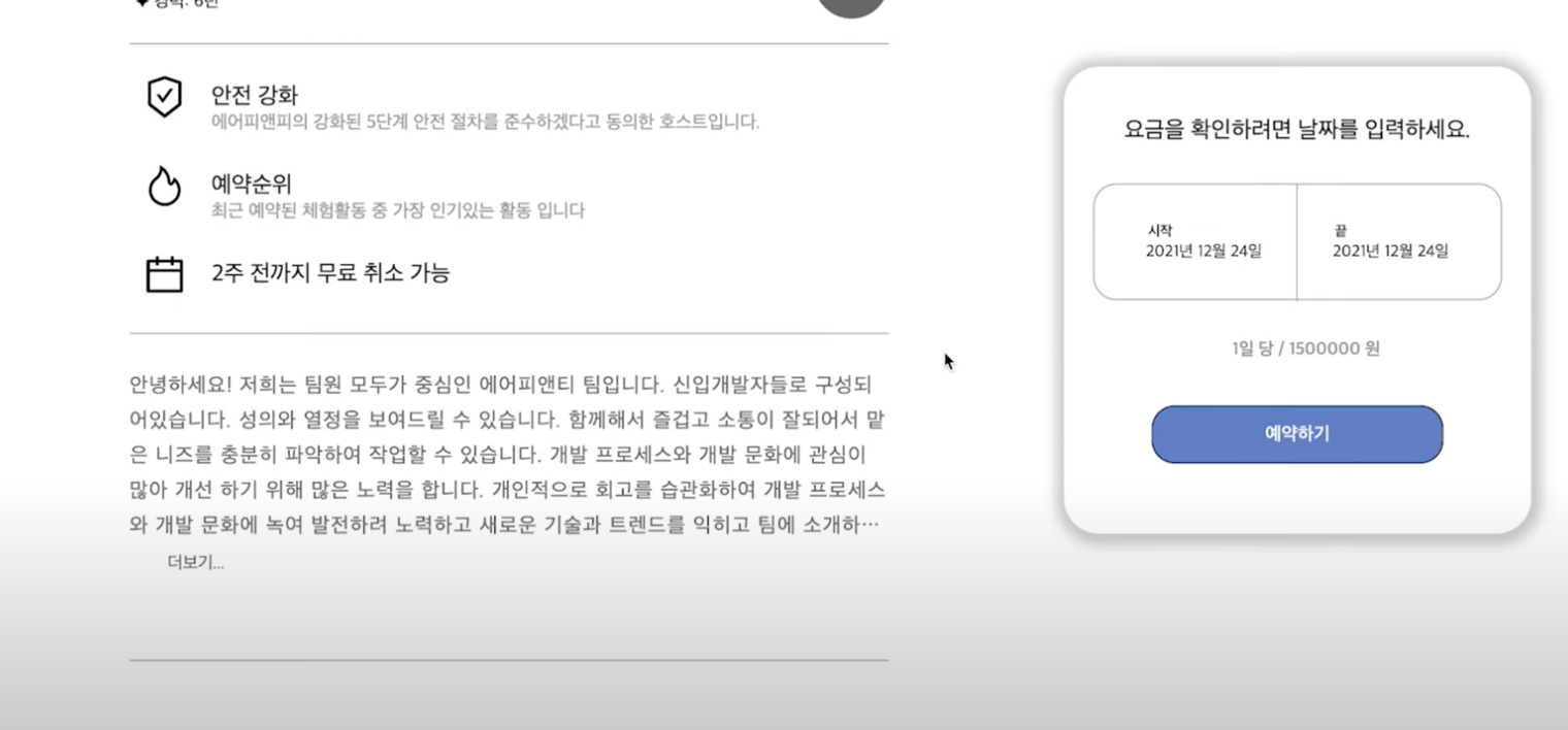
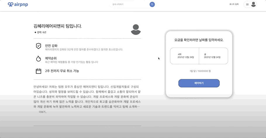
더보기 버튼 & 텍스트 자르기 구현
- description부분이 일정 줄 이상으로 넘어가면 말줄임표와 더보기 버튼으로 텍스트를 자르기. css처리 하는 것임.
-
모달창 구현
-
모달창을 구현하기 위해서 우선 useState를 만들어 기본 상태값을
false로 지정해준다. 기본 상태에서 더보기를 누르면<OpenModalBtn onclick={openModal}></OpenModalBtn>코드로 인해 상태가 true로 바뀌면서 모달창이 화면에 출력된다 -
x버튼을 누르면 모달창이 종료되는 이벤트도 함께 만들어주준다. openModal처럼 클릭 되었을때 함수를 만들어주고 x를 눌렀을때 실행되도록 적용시켜주면 된다.
<CloseIcon onClick={closeModal}></CloseModal>아래 코드는 더보기와 모달창을 함께 구현한 코드이다. (코드가 너무 길어 중간중간 내용과 관계없는 코드는 생략)
-
import React, { useState, useEffect, useRef } from 'react';
import { useNavigate, useParams } from 'react-router-dom';
import styled from 'styled-components';

const [showModal, setShowModal] = useState(false);

const openModal = () => {
    setShowModal(true);
  };

const closeModal = () => {
    setShowModal(false);
};

const contentRef = useRef(null);

return (
  (생략...)
  <Description>
              <DescriptionContent ref={contentRef}>
                {detail.description}
              </DescriptionContent>
              <OpenModalBtn onClick={openModal}>
                <h1>더보기...</h1>
              </OpenModalBtn>
            </Description>
            {showModal ? (
              <Background>
                <ModalContainer>
                  <ModalNav>
                    <BtnMessage>상세보기</BtnMessage>
                    <CloseIcon onClick={closeModal}>
                      <MdCancelPresentation />
                    </CloseIcon>
                  </ModalNav>
                  <ModalContent>{detail.description}</ModalContent>
                </ModalContainer>
              </Background>
            ) : null}
(생략...)
  );
};

// css
const DescriptionContent = styled.p`
  margin-top: 30px;
  color: ${props => props.theme.darkGray};
  font-size: 18px;
  letter-spacing: 1px;
  line-height: 30px;
  overflow: hidden;
  text-overflow: ellipsis;
  display: -webkit-box;
  -webkit-line-clamp: 5;
  -webkit-box-orient: vertical;
  &.show {
    display: block;
    max-height: none;
    overflow: auto;
    -webkit-line-clamp: unset;
  }
`;
const OpenModalBtn = styled.button`
  width: 100px;
  height: 30px;
  color: ${props => props.theme.darkGray};
  font-size: 15px;
  background: none;
  border: none;
  cursor: pointer;
  max-height: 2rem;
  line-height: 2rem;
  padding-left: 20px;
  background: rgb(2, 0, 36);
  background: linear-gradient(
    90deg,
    rgba(2, 0, 36, 1) 0%,
    rgba(255, 255, 255, 0) 0%,
    rgba(255, 255, 255, 1) 18%
  );
  &.hide {
    display: none;
  }
`;
const Background = styled.div`
  position: fixed;
  top: 0;
  left: 0;
  bottom: 0;
  right: 0;
  background-color: rgba(0, 0, 0, 0.5);
  z-index: 100;
`;
const ModalContainer = styled.div`
  display: flex;
  flex-direction: column;
  position: fixed;
  left: 50%;
  top: 50%;
  transform: translate(-50%, -50%);
  max-height: 80%;
  width: 500px;
  height: 80%;
  padding: 16px;
  background: white;
  border-radius: 10px;
  text-align: center;
`;
const ModalNav = styled.div`
  display: flex;
  justify-content: space-between;
  margin-top: 20px;
`;
const BtnMessage = styled.span`
  margin-left: 200px;
  font-size: 20px;
`;
const CloseIcon = styled.span`
  font-size: 20px;
`;
const ModalContent = styled.p`
  margin: 20px;
  font-size: 15px;
  line-height: 30px;
`;
2. 메인 페이지 / Footer

메인페이지와 Footer는 아무 기능없이 레이아웃만 구현한 페이지인데다가 그 레이아웃도 정말 간단해서 따로 어려운 코드는 없었지만 조원에게 배워 새로 알게된 속성이 있어 그 부분만 짧게 작성해보려고 한다.
1) object-fit
<img> 나 <video>같은 오브젝트의 사이즈를 컨테이너에 맞게 조절할 수 있다. object-fit의 속성과 효과는 아래와 같다.
| 값 | 설명 |
|---|---|
| object-fit: fill; | 주어진 너비와 높이에 맞게 사이즈를 조절한다. 기본값임. 요소의 크기에 맞게 꽉 채워 보여준다. |
| object-fit: contain; | 요소의 가로 세로 크기에 가능한 딱 맞게 크기가 조정되고 비율은 고정된다. 이미지와 컨테이너의 비율이 맞지 않는 경우엔 빈 공간이 생길 수도 있다. |
| object-fit: cover; | 가로세로 비율을 유치한 채 사이즈가 조절된다. 비율은 고정된 상태. 비율이 맞지 않더라도 확대되어 화면을 가득 채운다. |
| object-fit: none; | 크기가 조정되지 않고 원본사이즈로 처리된다. 이미지 가운데가 보여짐. 크면 잘리고 작으면 남게 된다. |
| object-fit: scale-down; | none과 contain중 이미지의 크기가 더 작아지는 값으로 이미지 사이즈를 조절한다. |