- Sometimes it is useful to display three-dimensional data in two dimensions using contours(윤곽, 등고선) or color-coded regions.
- There are three Matplotlib functions that can be helpful for this task:
plt.contourfor contour plots,plt.contourffor filled contour plots, andplt.imshowfor showing images.
# In[1]
%matplotlib inline
import matplotlib.pyplot as plt
plt.style.use('seaborn-white')
import numpy as np
Visualizing a Three-Dimensional Function
- First example demonstrates a contour plot using a function , using the following particular choice for .
# In[2]
def f(x,y):
return np.sin(x) ** 10 + np.cos(10 + y * x) * np.cos(x)- A contour plot can be created with the
plt.contourfunction. - It takes three arguments: a grid of
xvalues, a grid ofyvalues, and a grid ofzvalues. - The
xandyvalues represent positions on the plot, and thezvalues will be represented by the contour levels. - The most straightforward way to prepare such data is to use the
np.meshgridfunciton, which builds two-dimensional grids from one-dimensional arrays.
# In[3]
x=np.linspace(0,5,50)
y=np.linspace(0,5,40)
X,Y=np.meshgrid(x,y)
Z=f(X,Y)

plt.contour(X,Y,Z,colors='black');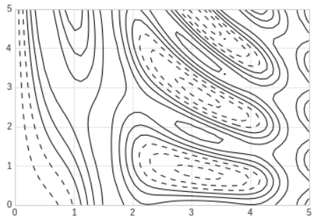
- When a single color is used, negative values are represented by dashed lines and positive values by solid lines.
- Alternatively, the lines can be color-coded by specifying a colormap with the
cmapargument.
# In[4]
plt.contour(X,Y,Z,20,cmap='RdGy');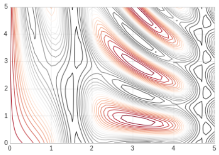
- We chose the
RdGy(short for Red-Gray) colormap, which is good choice for divergent data. - Matplotlib has a wide range of colormaps available, which you can easily browse in IPython by doing a tab completion on the
plt.cmmodule:plt.cm.<TAB> - We can change the spaces between the lines by switching to a filled contour plot using the
plt.contourffunction, which uses largely the same syntax asplt.contour. - Additionally, we'll add a
plt.colorbarcommand, which creates an additional axis with labeled color information for the plot.
# In[5]
plt.contourf(X,Y,Z,20,cmap='RdGy')
plt.colorbar();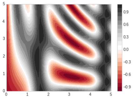
- The colorbar makes it clear that the black regions are "peaks", while the red regions are "valleys"
- One potential issue with this plot is that it is a bit splotchy(얼룩이 있는): the color steps are discrete rather than continuous, which is not always what is desired.
- This could be remedied(교정되다) by setting the number of contours to a very high number, but this results in a rather inefficient plot: Matplotlib must render a new polygon for each step in the level.
- A better way to generate a smooth representation is to use the
plt.imshowfunction, which offers theinterpolationargument to generate a smooth two-dimensional representation of the data.
# In[6]
plt.imshow(Z,extent=[0,5,0,5],origin='lower',cmap='RdGy',
interpolation='gaussian',aspect='equal')
plt.colorbar();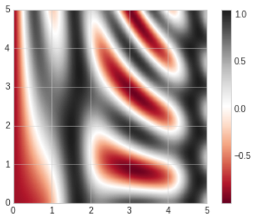
- There are a few potential gotchas with
plt.imshow
- It doesn't accept anxandygrid, so you must manually specify theextent[] of the image on the plot.
- By default it follows the standard image array definition where the origin is in the upper left, not in the lower left as in most contour plots. This must be changed when showing gridded data.
- It will automatically adjust the axis aspect ratio to match the input data; this can be changed with theaspectargument.
- Sometimes, it can be useful to combine contour plots and image plots.
- We'll use a partially transparent background image (with transparency set via the
alphaparameter) and overplot contours with labels on the contours themselves, using theplt.clabelfunction.
# In[7]
contours=plt.contour(X,Y,Z,3,colors='black')
plt.clabel(contours,inline=True,fontsize=8)

plt.imshow(Z,extent=[0,5,0,5],origin='lower',cmap='RdGy',alpha=0.5)
plt.colorbar();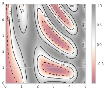
- The combination of these three functions -
plt.contour,plt.contourf, andplt.imshow- gives nearly limitless possibilities for displaying this sort of three-dimensional data within a two-dimensional plot.
For more information on this options available in these functions, refer to these url :
1. plt.contour documentation
2. plt.contourf documentation
3. plt.imshow documentation
Histograms, Binnings, and Density
# In[8]
rng=np.random.default_rng(1701)
data=rng.normal(size=1000)

plt.hist(data);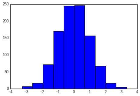
- The
histfunction has many options to tune both the calculation and the display; here's an example of a more customized histogram.
# In[9]
plt.hist(data,bins=30,density=True,alpha=0.5,
histtype='stepfilled',color='steelblue',
edgecolor='none');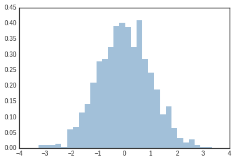
- The
binparameter specifies the number of horizontal axis sections of the histogram.
histtype='stepfilled'along with some transparencyalphato be helpful when comparing histograms of several distributions
# In[10]
x1=rng.normal(0,0.8,1000)
x2=rng.normal(-2,1,1000)
x3=rng.normal(3,2,1000)

kwargs=dict(histtype='stepfilled',alpha=0.3,density=True,bins=40)

plt.hist(x1,**kwargs)
plt.hist(x2,**kwargs)
plt.hist(x3,**kwargs);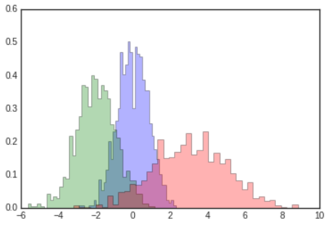
- If you are interested in computing, but not displaying, the histogram, you can use the
np.histogramfunction
# In[11]
counts,bin_edges=np.histogram(data,bins=5)
print(counts)
# Out[11]
[ 23 241 491 224 21]For more information about plt.hist other available customization options, refer to this url :
plt.hist documentation
Two-Dimensional Histograms and Binnings
- Just as we create histograms in one dimension by dividing the number line into bins, we can also create histograms in tow dimensions by dividing points among two-dimensional bins.
- We'll take a brief look at several ways to do this.
- We'll start by defining some data - an
xandyarray drawn from a multivariate Gaussian distribution
# In[12]
mean=[0,0]
cov=[[1,1],[1,2]]
x,y=rng.multivariate_normal(mean,cov,10000).T
For more about multivariate_normal, refer to this url :
numpy.random.Generator.multivariate_normal
plt.hist2d: Two-Dimensional Historgram
- One straightforward way to plot a two-dimensional histogram is to use Matplotlib's
plt.hist2dfunction.
# In[13]
plt.hist2d(x,y,bins=30)
cb=plt.colorbar()
cb.set_label('counts in bin')
- Just like
plt.hist,plt.hist2dhas a number of extra options to fine-tune the plot and the binning, which are nicely outlined in the function docstring. - Just as
plt.histhas a counterpart innp.histogram,plt.hist2dhas a counterpart innp.histogram2d
# In[14]
counts,xedges,yedges=np.histogram2d(x,y,bins=30)
print(counts.shape)
# Out[14]
(30, 30)- For the generalization of this histogram binning when there are more than two dimensions, see the
np.histogramddfunction.
plt.hexbin: Hexagonal Binning
- The two-dimensional histogram creates a tessellation(모자이크) of squares across the axes.
- Another natural shape for such a tessellation is the regualr hexagon. For this purpose, Matplotlib provides the
plt.hexbinroutine, which represents a two-dimensional dataset binned within a grid of hexagons.
# In[15]
plt.hexbin(x,y,gridsize=30)
cb=plt.colorbar(label='count in bin')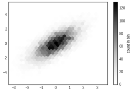
plt.hexbinhas a number of additional options, including the ability to specify weights for each point and to change the output in each bin to any Numpy aggregate.
Kernel Density Estimation
- Another common method for estimating and representing densities in multiple dimensions is kernel density estimation(KDE)
- KDE can be thought of as a way to "smear out" the points in space and add up the result to obtain a smooth function
- One extremely quick and simple KDE implementation exists in the
scipy.statspackage.
# In[16]
from scipy.stats import gaussian_kde

# fit an array of size [Ndim,Nsample]
data=np.vstack([x,y])
kde=gaussian_kde(data)

# evaluate on a regular grid
xgrid=np.linspace(-3.5,3.5,40)
ygrid=np.linspace(-6,6,40)
Xgrid,Ygrid=np.meshgrid(xgrid,ygrid)
Z=kde.evaluate(np.vstack([Xgrid.ravel(),Ygrid.ravel()]))

# plot the result as an image
plt.imshow(Z.reshape(Xgrid.shape),
origin='lower',aspect='auto',extent=[-3.5,3.5,-6,6])
cb=plt.colorbar()
cb.set_label('density')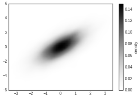
- KDE has a smoothing length that effectively slides the knob between detail and smoothness.
- The literature on choosing an appropriate smoothing length is vast;
gaussian_kdeuses a rule of thumb to attempt to find a nearly optimal smoothing length for the input data.