- Matplotlib has the concept of subplots: groups of smaller axes that can exist together within a single figure.
- These subplots might be insets, grids of plots, or other more complicated layouts.
# In[1]
%matplotlib inline
import matplotlib.pyplot as plt
plt.style.use('seaborn-white')
import numpy as np
plt.axes: Subplots by Hand
- The most basic method of creating an axes is to use the
plt.axes function.
- By default this creates a standard axes object that fills the entire figure.
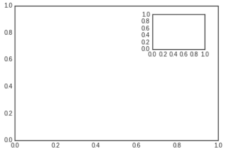
plt.axes also takes an optional argument that is a list of four numbers in the figure coodinate system ([left, bottom, width, height]), which ranges from 0 at the bottom left of the figure to 1 at the top right of the figure.
# In[2]
ax1=plt.axes()
ax2=plt.axes([0.65,0.65,0.2,0.2])

- The equivalent of this command within the object-oriented interface is
fig.add_axes.
# In[3]
fig=plt.figure()
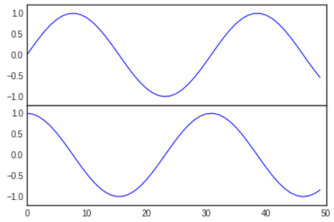
ax1=fig.add_axes([0.1,0.5,0.8,0.4],
xticklabels=[], ylim=(-1.2,1.2))
ax2=fig.add_axes([0.1,0.1,0.8,0.4],
ylim=(-1.2,1.2))

x=np.linspace(0,10)
ax1.plot(np.sin(x))
ax2.plot(np.cos(x));

xticklabels=[] means, we won't set the tick on the axis between np.sin(x) and np.cos(x)- We now have two axes (the top with no tick labels) that are just touching: the bottom of the upper panel (at position 0.5) matches the top of the lower panel (at the position 0.1 + 0.4)
plt.subplot: Simple Grids of Subplots
- Aligned columns or rows of subplots are a common enough need that Matplotlib has several convenience routines that make them easy to create.
- The lowest level of these is
plt.subplot, which creates a single subplot within a grid.
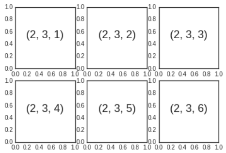
- This command takes three integer arguments - the number of rows, the number of columns, and the index of the plot to be created in this scheme, which runs from the upper left to the bottom right.
# In[4]
for i in range(1,7):
    plt.subplot(2,3,i)
    plt.text(0.5,0.5,str((2,3,i)),
    fontsize=18,ha='center')

- The command
plt.subplots_adjust can be used to adjust the spacing between these plots.
- The following code uses the equivalent object-oriented command,
fig.add_subplot.
# In[5]
fig=plt.figure()
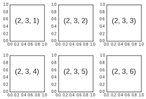
fig.subplots_adjust(hspace=0.4,wspace=0.4)
for i in range(1,7):
    ax=fig.add_subplot(2,3,i)
    ax.text(0.5,0.5,str((2,3,i)),
    fontsize=18,ha='center')

- We've used
hspace and wspace arguments of plt.subplots_adjust, which specify the spacing along the height and width of the figure, in units of the subplot size.
plt.subplots: The Whole Grid in One Go
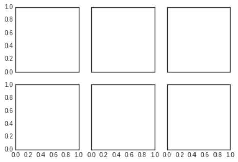
- If you'd like to hide the x- and y-axis labels on the inner plots,
plt.subplots is the easier tool to use.
- Rather than creating a single subplot, this function creates a full grid of subplots in a single line, returning them in a Numpy array.
- The arguments are the number of rows and number of columns, along with optional keywords
sharex and sharey, which allow you to specify the relationships between different axes.
# In[6]
fig,ax=plt.subplots(2,3,sharex='col',sharey='row')

- By specifying
sharex and sharey, we've automatically removed inner lables on the grid to make the plot cleaner.
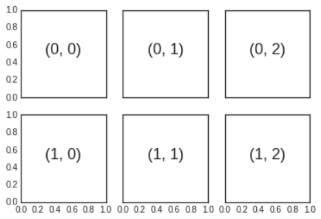
- The resulting grid of axes instances is returned within a Numpy array, allowing for convenient specification of the desired axes using standard array indexing notation.
# In[7]
# axes are in a two-dimensional array, indexed by [row,col]
for i in range(2):
    for j in range(3):
        ax[i,j].text(0.5,0.5,str((i,j)),
        fontsize=18,ha='center')
fig

- In comparison to
plt.subplot, plt.subplots is more consistent with Python's conventional zero-based indexing, whereas plt.subplot uses MATLAB-style one-based indexing.
plt.GridSpec: More Complicated Arrangement
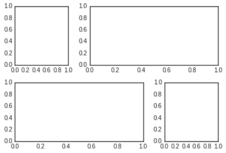
- To go beyond a regular grid to subplots that span multiple rows and columns,
plt.GridSpec is the best tool.
plt.GridSpec does not create a plot by itself; it is rather a convenient interface that is recognized by the plt.subplot command.
# In[8]
grid=plt.GridSpec(2,3,wspace=0.4,hspace=0.3)
- From this we can specify subplot locations and extents using the familiar Python slicing syntax.
# In[9]
plt.subplot(grid[0,0])
plt.subplot(grid[0,1:])
plt.subplot(grid[1,:2])
plt.subplot(grid[1,2]);

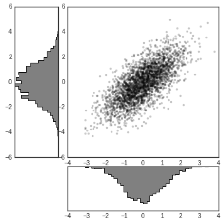
- This type of flexible grid alignment has a wide range of uses.
# In[10]
# create some normally distributed data
mean=[0,0]
cov=[[1,1],[1,2]]
rng=np.random.default_rng(1701)
x,y=rng.multivariate_normal(mean,cov,3000).T

# set up the axes with GridSpec
fig=plt.figure(figsize=(6,6))
grid=plt.GridSpec(4,4,hspace=0.2, wspace=0.2)
main_ax=fig.add_subplot(grid[:-1,1:])
y_hist=fig.add_subplot(grid[:-1,0], xticklabels=[], sharey=main_ax)
x_hist=fig.add_subplot(grid[-1,1:], yticklabels=[], sharex=main_ax)

# scatter points on the main axes
main_ax.plot(x,y,'ok',markersize=3,alpha=0.2)

# histogram on the attached axes
x_hist.hist(x,40,histtype='stepfilled',
orientation='vertical',color='gray')
x_hist.invert_yaxis()

y_hist.hist(y,40,histtype='stepfilled',
orientation='horizontal',color='gray')
y_hist.invert_xaxis()

- This type of distribution plotted alongside its margins is common enough that it has its own plotting API in the Seaborn package.
