- Plot legends identify discrete labels of discrete points.
- For continuous labels based on the color or points, lines, or regions, a labeled colorbar can be a great tool.
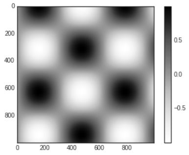
- In Matplotlib, a colorbar is drawn as a separate axes that can provide a key for the meaning of colors in a plot.
# In[1]
import matplotlib.pyplot as plt
plt.style.use('seaborn-white')

%matplotlib inline
import numpy as np
- The simplest colorbar can be created with the
plt.colorbar function.
# In[2]
x=np.linspace(0,10,1000)
I=np.sin(x) * np.cos(x[:,np.newaxis])

plt.imshow(I)
plt.colorbar();

Customizing Colorbars
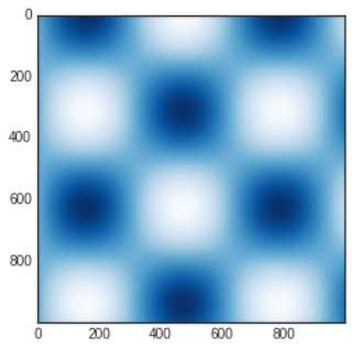
- The colormap can be specified using the
cmap argument to the plotting function that is creating the visualization.
# In[3]
plt.imshow(I,cmap='Blues');

- The names of available colormaps are in the
plt.cm namespace; using IPython's tab completion feature will give you a full list of built-in possibilities: plt.cm.<TAB>
Choosing the Colormap
- You should be aware of three different categories of colormaps
- Sequential colormaps
- These are made up of one continuous sequence of colors (e.g.,
binary or viridis)
- Divergent colormaps
- These usually contain two distinct colors, which show positive and negative deviations from a mean (e.g.,
RdBu or PuOr)
- Qualitative colormaps
- These mix colors with no particular sequence (e.g.,
rainbow or jet)
- The
jet colormap, which was the default in Matplotlib prior to version 2.0, is an example of a qualitative colormap.
- Its status as the default was quite unfortunate, because qualitative maps are often a poor choice for representing quantitative data.
- Among the problems is the fact that qualitative maps usually do not display any uniform progression in brightness as the scale increases.
- We can see this by converting the
jet colorbar into black and white.
# In[4]
from matplotlib.colors import LinearSegmentedColormap

def grayscale_cmap(cmap):
    """Return a grayscale version of the given colormap"""
    cmap=plt.cm.get_cmap(cmap)
    colors=cmap(np.arange(cmap.N))

    # convert RGBA to perceived grayscale luminance
    # cf. http://alienryderflex.com/hsp.html
    RGB_weight=[0.299,0.587,0.114]
    luminance=np.sqrt(np.dot(colors[:,:3]**2, RGB_weight))
    colors[:,:3]=luminance[:,np.newaxis]
    return LinearSegmentedColormap.from_list(
        cmap.name + "_gray", colors, cmap.N)

def view_colormap(cmap):
    """Plot a colormap with its grayscale equivalent"""
    cmap=plt.cm.get_cmap(cmap)
    colors=cmap(np.arange(cmap.N))

    cmap=grayscale_cmap(cmap)
    grayscale=cmap(np.arange(cmap.N))

    fig,ax=plt.subplots(2,figsize=(6,2),
    subplot_kw=dict(xticks=[],yticks=[]))
    ax[0].imshow([colors],extent=[0,10,0,1])
    ax[1].imshow([grayscale],extent=[0,10,0,1])
# In[5]
view_colormap('jet')

- The bright stripes in the grayscale image.
- Even in full color, this uneven brightness means that the eye will be drawn to certain portions of the color range, which will potentially emphasize unimportant parts of the dataset.
- It's better to use a colormap such as
viridis, which is specifically constructed to have an even brightness variation across the range.
# In[6]
view_colormap('viridis')

- For other situations, such as showing positive and negative deviations from some mean, dual-color colorbars such as
RdBu are helpful.
- However, as you can see, it's important to note that the positive/negative information will be lost upon translation to grayscale.
# In[7]
view_colormap('RdBu')

- There are large number of colormaps available in Matplotlib; to see a list of them, you can use IPython to explore the
plt.cm submodule.
Color Limits and Extensions
- The colorbar itself is simply an instance of
plt.Axes so all of the axes and tick formatting tricks we've seen so far are applicable.
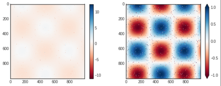
- We can narrow the color limits and indicate the out of bounds values with a triangular arrow at the top and bottom by setting the
extend property.
# In[8]
# make noise in 1% of the image pixels
speckles=(np.random.random(I.shape)<0.01)
I[speckles]=np.random.normal(0,3,np.count_nonzero(speckles))

plt.figure(figsize=(10,3.5))

plt.subplot(1,2,1)
plt.imshow(I,cmap='RdBu')
plt.colorbar()

plt.subplot(1,2,2)
plt.imshow(I,cmap='RdBu')
plt.colorbar(extend='both')
plt.clim(-1,1)

- In the left panel, the default color limits respond to the noisy pixels, and the range of noise completely washes out the pattern we are interested in.
- In the right panel, we manually set the color limits and add extensions to indicate values that are above or below those limits.
Discrete Colorbars
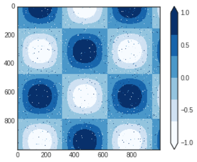
- Colormaps are by default continuous, but sometimes you'd like to represent discrete values.
- The easiest way to do this is to use the
plt.cm.get_cmap function and pass the name of a suitable colormap along with the number of desired bins.
# In[9]
plt.imshow(I,cmap=plt.cm.get_cmap('Blues',6))
plt.colorbar(extend='both')
plt.clim(-1,1);

- The discrete version of a colormap can be used just like any other colormap.
Example: Handwritten Digits
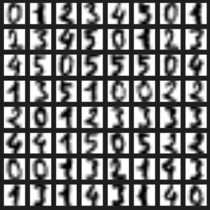
- Let's look at a visualization of some handwritten digits from the digits dataset, included in Scikit-Learn; it consists of nearly 2,000 8×8 thumbnails showing various handwritten digits.
- Start by downloading the digits dataset and visualizing several of the example images with
plt.imshow
# In[10]
# load images of the digits 0 through 5 and visualize several of them
from sklearn.datasets import load_digits
digits=load_digits(n_class=6)

fig,ax=plt.subplots(8,8,figsize=(6,6))
for i,axi in enumerate(ax.flat): # reference the next section about ax.flat
    axi.imshow(digits.images[i],cmap='binary')
    axi.set(xticks=[],yticks=[])

- Because each digit is defined by the hue of its 64 pixels, we can consider each digit to be a point lying in 64-dimensional space: each dimension represents the brightness of one pixel.
- Visualizing such high-dimensional data can be difficult, but one way to approach this task is to use a dimensionality reduction technique such as manifold learning to reduce the dimensionality of the data while maintaining the relationships of interest.
# In[11]
# project the digits into 2 dimensions using Isomap
from sklearn.manifold import Isomap
iso=Isomap(n_components=2,n_neighbors=15)
projection=iso.fit_transform(digits.data)
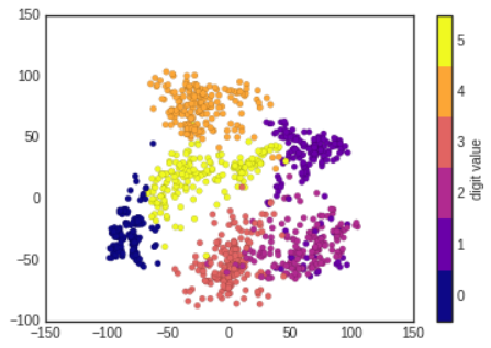
- We'll use our discrete colormap to view the results, setting the
ticks and clim to improve the aesthetics of the resulting colorbar.
# In[12]
# plot the result
plt.scatter(projection[:,0],projection[:,1],lw=0.1,
c=digits.target,cmap=plt.cm.get_cmap('plasma',6))
plt.colorbar(ticks=range(6),label='digit value')
plt.clim(-0.5,5.5)

- The projection also gives us some insights on the relationships within the dataset: the ranges of 2 and 3 nearly overlap in this projection, indicating that some handwritten 2s and 3s are difficult to distinguish, and may be more likely to be confused by an automated classification algorithm.
- Other values, like 0 and 1, are more distantly separated, and may be less likely to be confused.
cf) About ax.flat
- In here,
ax.flat allows you to access subplots in a multi-dimensional subplot grid as a flattened one-dimensional array.
- When you create multiple subplots using
plt.subplots(), it returns a multi-dimensional array of subplots.
ax.flat flattens this array, enabling easy access to each individual subplot
- If you don't use the
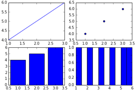
flat, you will typically use indexing on the ax array, like this.
# In[13]
fig,ax=plt.subplots(2,2)

ax[0,0].plot([1,2,3],[4,5,6])
ax[0,1].scatter([1,2,3],[4,5,6])
ax[1,0].bar([1,2,3],[4,5,6])
ax[1,1].hist([1,2,3,4,5,6])

plt.show()

- However, using
flat, you can access the subplots in a one-dimensional manner, like this.
# In[14]
fig,ax=plt.subplots(2,2)

ax.flat[0].plot([1,2,3],[4,5,6])
ax.flat[1].scatter([1,2,3],[4,5,6])
ax.flat[2].bar([1,2,3],[4,5,6])
ax.flat[3].hist([1,2,3,4,5,6])

plt.show()

- Using
ax.flat, you can conveniently access each subplot using a one-dimensional index, making it particularly useful when iterating over multiple subplots for repetitive operations.
