Dev Diary. Day 2 | Creating a Chat Interface
한 일 | What I did
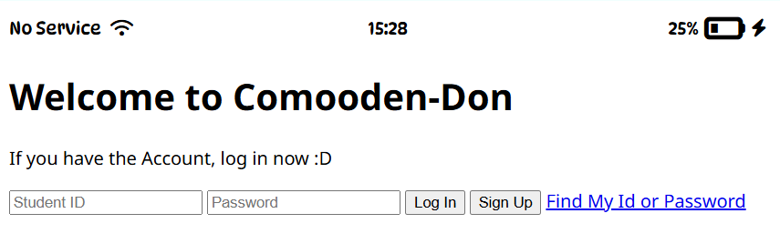
[ index.html ] → LogIn page's html part
-
Added a Wifi, Battary, and lightening Icon
(= Completed the to-do list)
1. Used heroicons.com and .svg file [📌commit]
2. Changed to using FontAwesome and<i>tag [📌commit] -
Made welcome header, and login form [📌commit]
(= Completed the .html of welcome-login page) -
Named elements following
BEMconventions as closely as possible
[ styles.css ] → LogIn page's css part
- Made css folder and .css file
- Completed status-bar CSS [📌commit]
- imported font with google font and
font-familyproperty - positioned the 2nd column of the status-bar at the actual center of the screen.
- Set appropriate margins(5px) between multiple items within a box
- imported font with google font and
배운 것 | What I learned
- Code convention
BEM - Multi cursors :
alt + click - Move a line :
alt + ↕ - CSS Link Autocompletion command :
link.css + enter
→<link rel="stylesheet" href="style.css"> - CSS hack about positioning a center item at the real center.
🐣 I will continue the explanation in the Challenge-Solving section. - Change the last commit
git commit --amend -m "message" - Change the Icon size by modifying the class name
e.g.

<i class="fa-solid fa-battery-quarter fa"></i>
<i class="fa-solid fa-battery-quarter fa-lg"></i>
<i class="fa-solid fa-battery-quarter fa-2x"></i>
문제해결 | Challenge-Solving
Status-bar has 3 div columns.
The first and last div columns should be aligned to each corner.
and the second div column should be in the center.
so, I write display: flex; justify-content: between; on status-bar CSS block.
❗but, the second div column wasn't in the center.❗
↓
The cause was that the widths of the columns were all different. I didn't declare those widths.
🔅 so, I set width: 33% for each three div columns. 🔅
회고 | Reflection
I spent much more time learning and searching than actually coding, again.
Thanks to CSS, my result has improved a bit.
I always think the substance is important.
But, It seems that appearance is important as well.
I started to think that someone who produces beautiful and aesthetically pleasing results might be chosen in the frontend job market, instead of clean code maker.
This led me to consider that people majoring in visual design might have an advantage over computer science majors.
Someone who knows what is beautiful.
🐣🐣🐣
참고한 것 | Reference