

- 악필 양해 바랍니다...ㅎ
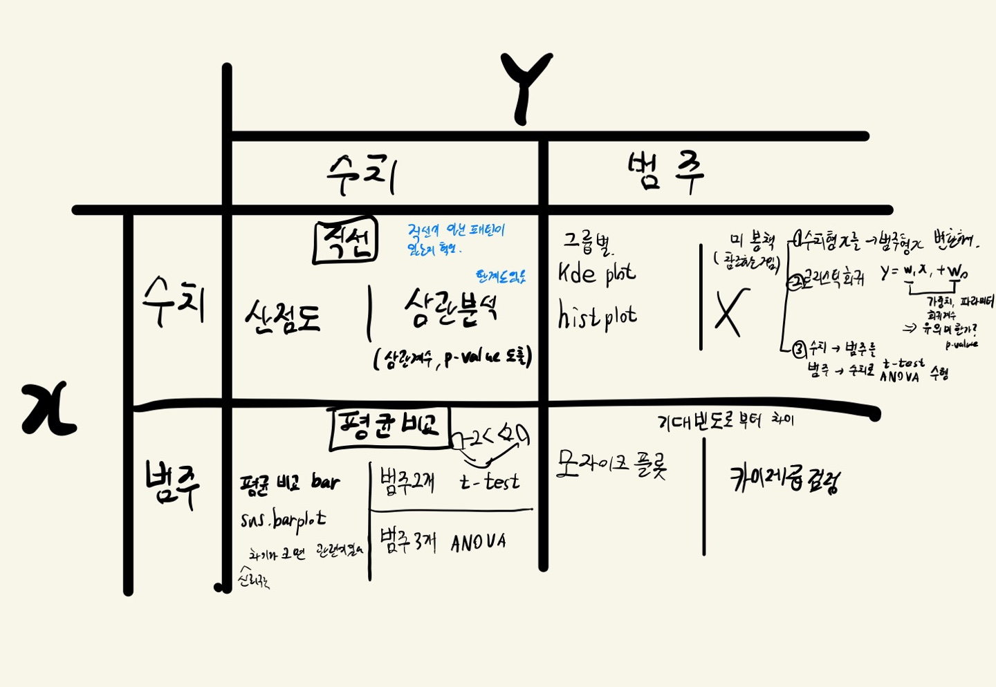
이변량 분석3 (범주->범주)
- 교차표(crosstab)로 집계한다.
- 교차표를 통해 시각화(mosaic plot)
- 교차표를 통해 수치화(검정, 카이제곱 검정)
(1) 교차표로 집계
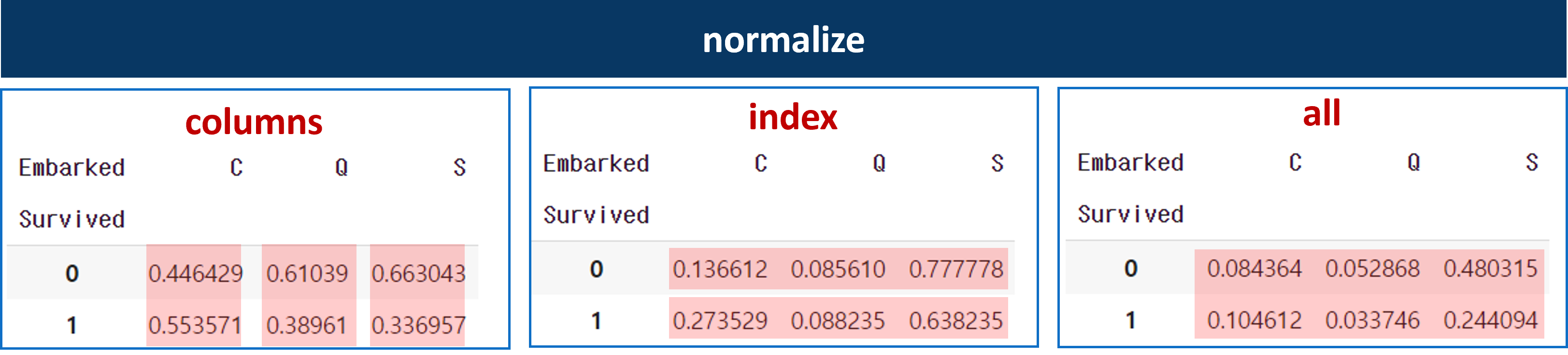
- pd.crosstab(행, 열, normalize= )
- normalize는 비율로 변환한다.
- columns: 열 기준으로 비율 변환
- index: 행 기준으로 비율 변환
- all: 전체를 기준으로 비율 변환
pd.crosstab(titanic['Survived'], titanic['Sex'], normalize: 'columns')- 각 normalize별 도출 값
(2) 시각화 (mosaic, Stacked Bar)
- 시각화는 교차표를 모자이크 플롯과
mosaic
'객실등급(Pclass)이 생존여부(Survived)에 관련이 있다' 라는 가설을 세운다.
# Pclass별 생존여부를 mosaic plot 으로
mosaic(titanic, [ 'Pclass','Survived'])

plt.axhline(1- titanic['Survived'].mean(), color = 'r') # 전체 평균선

plt.show()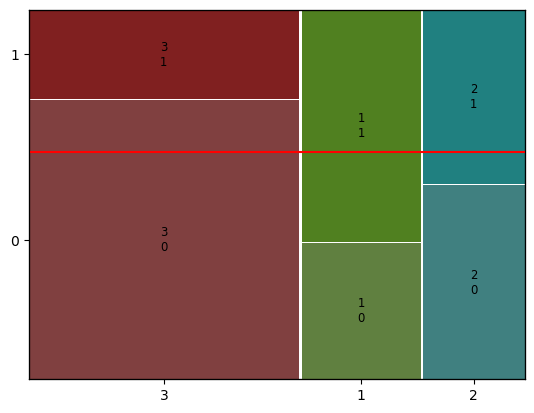
- 모자이크 플롯이 나온다.
- x축: Pclass, y축: Survived
- 평균선에 1 - itanic['Survived'].mean()를 하는 이유는
- itanic['Survived'].mean() : 생존율
- 1 - itanic['Survived'].mean() : 사망율 이기 때문
만약, 생존 비율이 모두 평균선에 있는 것은 귀무가설이 참인 경우이다. (=대립가설이 차이가 없다)
근데 모자이크플롯을 보면 평균선과 차이가 있다. 그 말은 객실등급별 생존여부는 관련이 있는 데이터가 된다.
100% Stacked Bar
# stacked Bar
temp = pd.crosstab(titanic['Pclass'],
					titanic['Survived'],
                    normalize = 'index')
print(temp)

temp.plot.bar(stacked=True)

plt.axhline(1-titanic['Survived'].mean(), color = 'r') # 전체 평균선
plt.show()

>
Survived         0         1
Pclass
1         0.370370  0.629630
2         0.527174  0.472826
3         0.757637  0.242363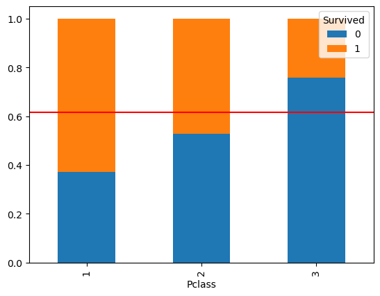
- 모자이크플롯과 비슷하게 나온다.
- 강의에서는 stacked bar보다 mosaic plot을 더 많이 쓴다고 하셨다.
(3) 수치화 (카이제곱검정)
- 카이제곱검정은 기대빈도 로 부터 실제빈도 가 얼마나 차이가 있는지 알 수 있는 검정 방법이다.
- 기대빈도: 아무련 관련이 없을 때 나올 수 있는 빈도 수(귀무가설)
- 실제빈도: 관측된 값들
- 여기서 발생하는 차이 값을 error 라고 한다.
- error의 크기는 항상 + 로 나온다.
- 카이제곱 통계량은 클수록 기대빈도로부터 실제값에 차이가 크다.
- 범주의 수가 늘어날 수록 값은 커지게 되어 있다.
- 자유도(dof)의 약 2배 보다 크면 차이가 있다고 본다.
성별과 생존 여부와 어떤 관련이 있을까?
- 귀무가설: 성별에 따라 생존여부에 아무런 관련이 없다.
- 대립가설: 성별에 따라 생존여부에 차이가 있다.
pd.crosstab(행, 열)
spst.chi2_contingency()
# 1) 먼저 교차표 집계
# normalize 옵션을 사용하면 안됨
table = pd.crosstab(titanic['Survived'], titanic['Pclass'])

print(table)
print('-' * 50)

# 2) 카이제곱검정
spst.chi2_contingency(table)

>
Pclass      1   2    3
Survived
0          80  97  372
1         136  87  119
--------------------------------------------------
Chi2ContingencyResult(statistic=102.88898875696056, # 카이제곱통계량
					pvalue=4.549251711298793e-23, # p-value
					dof=2, # 자유도
					expected_freq=array([[133.09090909, 113.37373737, 302.53535354], # 기대빈도: 계산된 값
										[ 82.90909091,  70.62626263, 188.46464646]]))
이변량분석4 (숫자->범주)
- 연속형데이터(수치형)를 통해 범주형데이터를 검증하는 건 시각화 하는 방법 밖에 없다.
- 만약 수치화하여 보고싶다면 미봉책이 있다.
- 수치형 x를 범주형 x으로 변환
- 로지스틱 회귀분석 사용
- x(연속)->y(범주) 형태를 y(범주)->x(수치)로 생각하여 t통계량이나 anova 수행한다.
(1) 시각화 kdeplot
- 그래프가 비슷할수록(겹칠수록) 차이가(관련이) 없다.
- 즉, 가설이 틀렸다는게 된다.
1) common_norm=True
sns.kdeplot(x='Age', data = titanic, hue ='Survived')
	# 생존자 사망자 합쳐서 100%
plt.show()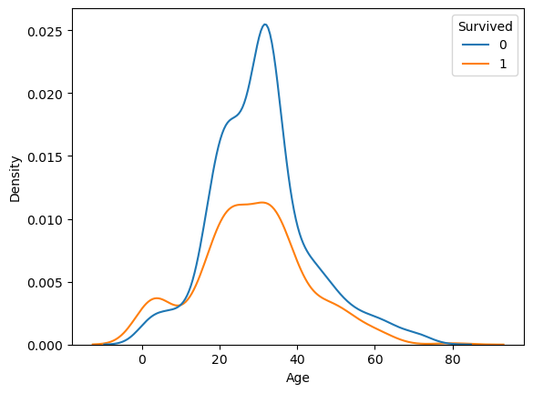
2) common_norm=False
- 각각 kde plot으로 그리기
sns.kdeplot(x='Age', data = titanic, hue ='Survived',
            common_norm = False)  # 생존자 사망자 모두 1임
plt.show()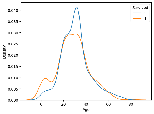
3) multiple = 'fill'
- 모든 구간에 대한 100% 비율로 kdeplot 그리기
sns.kdeplot(x='Age', data = titanic, hue ='Survived'
            , multiple = 'fill')
plt.axhline(titanic['Survived'].mean(), color = 'r')
plt.show()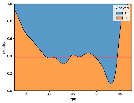
(2) 시각화 histplot
- multiple = 'fill', common_norm=False
sns.histplot(x='Age', data = titanic, bins = 16
             , hue ='Survived', multiple = 'fill')
plt.axhline(titanic['Survived'].mean(), color = 'r')
plt.show()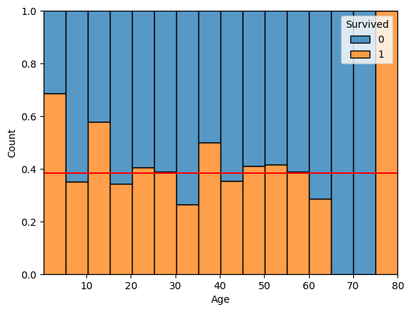
sns.histplot(x='Age', data = titanic, hue = 'Survived')
				# hue: Age에 대한 Survived를 겹쳐서 그려줘
plt.show()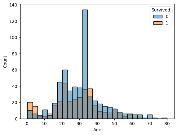
이제 이 그림을 보고 변수를 구변하여 데이터를 분석하면 된다.

뒤늦게 프로그래밍을 시작한 응애