Keep-alive
<template>
  <transition name="fade" mode="out-in">
<!--
Dynamic component를 사용하여 다른 컴포넌트로 전환하면 기존 컴포넌트는 destroy.
Keep-alive를 사용하면 destroy되지 않음
-->
    <keep-alive include="DocumentNumberList">
      <router-view />
    </keep-alive>
  </transition>
</template>
webpackChunkName
vue는 single page application으로 자원을 한번에 렌더링하여 가져오게 되는데 webpackChunkName으로 이 자원을 분리하여 처음에 렌더링시간을 줄여줌. 너무 촘촘하게 구분하면 화면이동시마다 자원을 받아와서 SPA의 장점을 살리기 어려움 이 청크단위로 자원을 새로 받게 되므로 적절한 업무단위로 분리
component: () => import(/* webpackChunkName: 'documentNumber' */ '../views/DocumentNumberList.vue'),vue-property-decorator
@prop
부모컴포넌트 -> 자식컴포넌트에 데이터 전달
@Prop({type:Boolean, required:true)
private isReg?:boolean; // @Prop 변수는 초기값이 없고 !나 ? 를 해줌
@emit
자식컴포넌트 -> 부모컴포넌트에 데이터 전달
@Emit()
public setData()...
@watch
첫번째 인자는 감시할 변수, 두번째는 옵션
@Watch("Name", {immediate: true, deep: true})
public setData()...
getter, setter
get getterSetter() { // computed 대응
  return 'getter';
}
set getterSetter(value) {
  this.setterExample = value;
}
@component
@Component
export default class DocumentNumberCardsDetail extends Vue{}...
@PropSync
@Ref
@model
@Provide
@Inject
@ProvideReactive
@ProvideInject
attribute를 동적으로 적용
attirbute 를 동적으로 적용할 수 있다.
:attribute명="조건"
<!-- width가 600이하일 경우만 fullscreen -->
<v-dialog
  :fullscreen="windowSize.x < 600"
>
축약
v-slot
<template v-slot:activator=...
=>
<template #activator=...
v-bind
<v-dialog v-bind:fullscreen=...
=>
<v-dialog :fullscreen=...
v-on
<input v-on:focus=...
=>
<input @focus=...
material design breakpoints
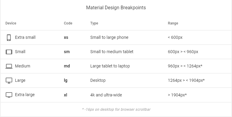
breakpoint 값 구하기
폭이 xs인지 여부 this.$vuetify.breakpoint.xs
xs인 경우만 컴포넌트 보여주기 this.$vuetify.breakpoint.xsOnly
모바일 사이즈인지 여부 this.$vuetify.breakpoint.mobile
모바일 사이즈 기준변경하기
export default new Vuetify({
    breakpoint: {
        mobileBreakpoint : 'xs' -- xs기준으로 모바일 기준 변경
    }
})
v-slot
컴포넌트의 일부 문구를 특정 화면에서만 변경하고 싶을 경우 사용
'사용자 조회'란 버튼이 있는 컴포넌트가 있는 경우 특정화면에서 는 'Buyer 조회'라고 쓰고 싶은 경우
<!-- 사용자 조회 컴포넌트-->
<v-data-table
...
<slot>
    <v-btn>사용자 조회</v-btn>
</slot>
<!-- 사용 컴포넌트-->
<사용자조회 컴포넌트>Buyer 조회</사용자조회 컴포넌트>변경하려는 버튼이 2개이상이면 slot에 이름을 지어준다
< v-data-table
...
<slot name="search">
    <v-btn>사용자 조회</v-btn>
</slot>
<slot name="modify">
    <v-btn>사용자 변경</v-btn>
</slot><사용자조회 컴포넌트>
<template v-slot:search>
Buyer 조회
</template>
<template v-slot:modify>
Buyer 변경
</template>
</사용자조회 컴포넌트>V-DATA-TABLE
헤더와 아이템 별도로 CSS 먹이기
헤더는 v-data-table의 class에, item은 header배열에 키를 class로 넣어줌
public headers= [
  {
    class: 'blue-grey darken-3', text: '문서번호', align: 'start', sortable: false, value: 'documentNumberCd',
  },
meterial design breakpoint에 따른 컬럼 보이기/숨기기
//header
{
  class: 'blue-grey darken-3', text: 'Use Y/N', value: 'useYN', align: ' d-none d-xs-table-cell',  // align에서 한칸 띄우지 않으면 적용이 안되네
},
위의 align은 모바일 디자인은 적용이 안된다. (stacked list)
모바일을 별도 디자인이나 컬럼 숨김을 하려면 templet slot="item" 으로 각각 작성.
<template slot="items" slot-scope="props">
<tr v-if="!isMobile">
...
<tr v-else>
...
Material Icons
https://materialdesignicons.com/icon/dots-vertical
Material Design
https://material.io/design/layout/responsive-layout-grid.html#columns-gutters-and-margins
Vue의 Grid System
12개의 컬럼으로 화면을 분할하여 관리
v-layout 대신 v-row와 v-col을 활용.
cols
속성은 컴포넌트의 width를 의미하며 최대 12까지 입력할 수 있다.
12를 입력하면 전체 폭으로 설정하겠다는 의미이고 따라서 컴포넌트 당 1줄씩 차지한다
cols를 6으로 입력하면 화면의 절반씩 차지하며 한 row에 컴포넌트가 2개씩 차지한다
숫자대신 auto입하면 컨텐츠 사이즈만큼 폭이 정렬
sm="6" md="4" lg="3"
태블릿 사이즈에서는 한줄에 2개씩, 노트북사이즈에서는 한줄에 3개씩, 데스크탑 사이즈에서는 한줄에 4개씩 보여줌
Material Color
https://material.io/design/color/the-color-system.html#color-theme-creation
https://vuetifyjs.com/en/features/presets/#default-preset
배경 적용
class="primary"
class="secondary"
class="error"

글자 적용
class="primary--text"
class="secondary--text"
class="error--text"

컬러를 진하게
class="primary darken-1" -- 숫자 변경시 진하기 변경
컬러를 옅게
class="primary lighten-1"

컬러테마 변경하기(vuetify.vue)
theme: {
 themes: {
 light: {
  primary: #123456,
  secondary: #123456
  }
 }
}
css helper class
가급적 style을 사용하지 말자. 모든 helper class는 breakpoint를 제공한다
- pa-1
padding all 4px
숫자에 4를 곱하면 px - pb-2
** padding botton 8px - ma-1
** margin all 4px - d-none
** display none. 안보이기 - flex
flex wrap – 브라우저 크기가 줄어들면 컴포넌트가 아래로 내려감
flex shirnk --브러우저 크기가 줄어들때 어떤 비율로 줄어들게 할때
vee validate
form의 정합성체크
https://vee-validate.logaretm.com/v4/
Toggle Button
npm install vue-js-toggle-button --savevuetify.ts 수정
import ToggleButton from 'vue-js-toggle-button';
Vue.use(ToggleButton);
사용
<toggle-button
  v-model="docno.isUse"
  :width="90"
  :height="40"
  :labels="{checked: '사용중', unchecked: '미사용'}"
  :font-size="13"
  class="mr-2"
  color="#4677c1"
  style="z-index: 0"
  @change="onChangeUse(docno)"