Front-end 국비지원 #009일
CSS
Background fixed (백그라운드 고정)
background-attachment: scroll , fixed | local , initial , inherit
scroll : 선택한 요소와 같이 움직임
fixed : 고정
local : 선택한 요소와 같이 움직이며. 스크롤하면 배경 이미지도 스크롤
initial : 기본값
inherit : 부모 요소의 속성값을 상속
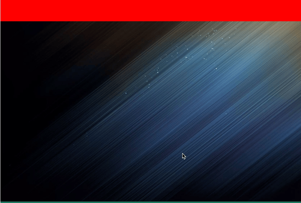
fixed 예제
#box1{
		width: 100%;
        height: 500px;
        background: #f00;
        }
#box2{
		width: 100%;
        height: 500px;
        background: url(../ex07/images/wallpaper.jpg) no-repeat center center fixed;
		}
#box3{
		width: 100%;
        height: 500px;
        background: rgb(32, 122, 95);
		}
#box4{
		width: 100%;
        height: 500px;
        background: rgb(51, 51, 187);
        }
배경이미지는 최소 1920*960으로 제작해야 문제가 생기지 않는다.
- background-image: url( );
- background-repeat: no-repeat; 배경이미지반복X
- background-size: cover; 요소를 비율에 맞게 커버
- background-position: center; 이미지를 요소의 정가운데로 처리
- background-attachment: fixed; 스크롤바 움직일때 이미지가 따라다님
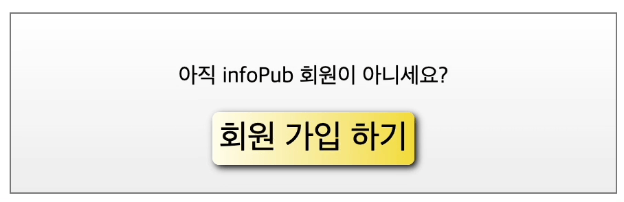
그라데이션 상자와 회원 가입 버튼 만들기
background: liner-gradient(위치, 컬러1 , 컬러2);
*크로스 브라우징 호환성을 위해 -webkit-(사파리,크롬),-moz-(파이어폭스),-o-(오페라)를 작성하고 지원하지 않는 브라우저도 있으니 일반 백그라운드 컬러를 넣어 호환성을 높인다.
body, button {
			font-family: "맑은 고딕", 돋움, sans-serif;
            }
#memberBox{
			border: solid 1px #777;
            width: 400px;
            margin: 50px auto;
            text-align: center;
            padding: 20px;
            background: #fff;
            background: -webkit-linear-gradient(top, #fff, #ededed);
            background: -moz-linear-gradient(top, #fff, #ededed);
            background: -o-linear-gradient(top, #fff, #ededed);
			}
#memberBox .btnOrange{
			cursor: pointer;
            font-size: 1.5em;
            padding: 5px;
            border: none;
            border-radius: 5px;
            box-shadow: 2px 2px 5px #000;
			background: rgb(254,252,234);
			background: -moz-linear gradient(left, rgba(254,252,234,1) 0%, rgba(241,218,54,1) 100%);
            background: -webkit-linear-gradient(left,  rgba(254,252,234,1) 0%,rgba(241,218,54,1) 100%);
            background: linear-gradient(to right,  rgba(254,252,234,1) 0%,rgba(241,218,54,1) 100%);
			}
#memberBox .btnOrange:hover{
			background: #fff;
            background: -webkit-linear-gradient(-45deg, rgb(251, 66, 66),rgb(35, 209, 117), #391fe1);
            background: -moz-linear-gradient(-45deg, rgb(251, 66, 66),rgb(35, 209, 117), #391fe1);
            background: -o-linear-gradient(-45deg, rgb(251, 66, 66),rgb(35, 209, 117), #391fe1);
			}
색상표 페이지
https://cssgradient.io/
https://www.colorzilla.com/gradient-editor
그라데이션 메뉴바 만들기
body {
	font:0.95em Arial,sans-serif;
    margin:50px 0px;
    }
h1 {
	text-shadow:0px 0px 5px #666;
    text-align:center;
    font-size:3em;
    letter-spacing:5px;
    color:#d81b21;
    text-transform:uppercase;
    }
nav{
	width: 100%;
    background: #980c10;
    background: -webkit-linear-gradient(top, #ed1c24, #aa1317);
    background: -moz-linear-gradient(top, #ed1c24, #aa1317);
    background: linear-gradient(top, #ed1c24, #aa1317);
    }
nav ul{
	list-style: none;
    overflow: hidden;
    width: 800px;
    margin: 0 auto;
    }
nav ul li{
	float: left;
	}
nav ul li a{
	padding: 10px;
    display: block;
    font-weight: bold;
    font-size: 1.5em;
    color: #fff;
    text-decoration: none;
    text-shadow: 0 0 5px #666;
    letter-spacing: 1px;
    }
nav ul li a::after{
	content: " /";
    position: absolute;
    font-size: 1.3em;
    }
nav ul li a:hover{
	background: #6e6e6e;
    background: -webkit-linear-gradient(top, #888, #575757);
    background: -moz-linear-gradient(top, #888, #575757);
    background: linear-gradient(top, #888, #575757);
    }
- overflow: hidden 대신 높이값 사용한다 자식요소를 띄우게 되면 부모요소의 높이가 사라짐
투명도를 이용한 롤오버 이미지 만들기
@charset "utf-8";

*{margin: 0; padding: 0;}
header h1{
    text-align: center;
    font-size: 40px;
    color: #f00;
    padding-top: 30px;
    text-transform: uppercase;
    text-shadow: 0 0 5px #666;
}
nav{
    margin-top: 20px;
}
nav #gallery{
    width: 638px;
    margin: 0 auto;
    height: 200px;
}
nav #gallery li{
    float: left;
    width: 200px;
    height: 200px;
    border: 3px solid #000;
    margin-right: 10px;
    list-style: none;
    position: relative;
    overflow: hidden;
}
nav #gallery li:last-child{
    margin-right: 0;
}
nav #gallery li a{
    width: 100%;
    display: block;
}
nav #gallery li a img{
    width: 100%;
    height: 200px;
    display: block;
    opacity: .3;
    transition: 0.5s;
}
nav #gallery li a img:hover{
    opacity: 1;
}
nav #gallery li a span{
    position: absolute;
    top: -50px;
    left: 0;
    background: rgba(0, 0, 0, .8);
    width: 100%;
    padding: 10px 0;
    text-align: center;
    color: #fff;
    transition: 0.5s;
}
nav #gallery li:hover a span{
    top:0;
}
- 마지막 li요소에는 margin-right를 li:last-child를 사용하여 빼준다.
- hover하여 내려오는 span요소는 li밖으로 overflow: hidden을 적용한다.
- 각자 span메뉴는 부모요소인 li에 position: absolute를 적용한다.
가로, 세로로 애니메이션되어 커지는 롤오버 이미지 만들기
@charset "utf-8";

body {
    font:0.95em Arial,sans-serif;
    margin:50px 0px;
    }
nav {
    width:334px;
    margin:0px auto;
    }
h1 {
    text-shadow:0px 0px 5px #666;
    text-align:center;
    font-size:3em;
    letter-spacing:5px;
    color:#d81b21;
    text-transform:uppercase;
    }
a {
    text-decoration:none;
    }
img {
    border:none;
    }
ul, li {
    margin:0px;
    padding:0px;
    }
.cf::after{
        content: "";
        display: block;
        clear: both;
    }
nav ul{
    list-style: none;
}
nav ul li{
    width: 100px;
    float: left;
    margin-right: 15px;
}
nav ul li:last-child{
    margin-right: 0;
}
nav ul li a img{
    width: 100px;
    height: 100px;
    border: 2px solid #000;
    transition-property: width, height;
    transition-duration: .3s;
    position: relative;
    z-index: 1;
}
nav ul li a img:hover{
    width: 300px;
    height: 300px;
    z-index: 2;
    box-shadow: 0 0 15px 2px #000 ;
}
- 이미지에 부드럽게 움직이게 transition을 사용하고 hover하여 width,height를 0.3초간 부드럽게 300px로 커지게 한다.
이미지 배치하고 롤오버시 블러 효과 적용하기
@charset "utf-8";

*{margin:0; padding: 0;}
body{margin-top: 30px;}
h1{
    text-align: center;
    font-size: 2em;
    color: #fff;
    font-style: italic;
    text-shadow: 0 0 10px #666;
    margin-bottom: 30px;
}
#bookList{
    background: url(../images/book_bg.png) no-repeat center;
    width: 498px;
    height: 246px;
    margin: 0 auto;
    border: 5px solid #dbdbdb;
    border-radius: 30px;
    box-shadow: 0 0 10px #666;
}
#bookList ul{
    list-style: none;
    padding: 25px 0 0 22px;
    overflow: hidden;
}
#bookList ul li{
    float: left;
    margin-right: 63px;
}
#bookList ul li:last-child{
    margin-right: 0;
}
#bookList ul li a>span img:hover{
    box-shadow:0px 0px 50px #009900;
}