개요
개발을 하다보면 자주 사용하는 UI 컴포넌트를 만들때가 가장 어려운 것 같다.
오늘은 그 중 모달 컴포넌트에 대해 어떻게 하면 효율적으로 사용할 수 있을까에 대한 고민과 개선 방법에 대해 적어보려고 한다.
기존 방법
모달의 모양은 가지각색이다.
따라서 필요에 따라 모달에 여러 props 를 주입하게 되면서 모달 컴포넌트의 몸집이 점점 커지는 문제가 있었다.
아래는 모달을 구현한 코드이다.
Modal 컴포넌트는 결국 화면에 모달을 띄어주는 스타일을 담당하는 컴포넌트이다.
Modal 컴포넌트로 감싸면 children 부분이 모달로 띄어진다.
이때 Modal 의 모양은 필요에 따라 변경 가능하도록 props 를 주입할 수 있도록 구현했다.
import { useEffect } from 'react';
import styled from 'styled-components';

type TProps = {
	children: React.ReactNode;
	closeModal: () => void;
	height?: string;
	$top?: string;
	$radius?: string;
	$padding?: string;
};

const Modal = ({ children, closeModal, height, $top, $radius, $padding }: TProps) => {
	useEffect(() => {
		document.body.style.overflow = 'hidden';
		return () => {
			document.body.style.overflow = 'auto';
		};
	}, []);

	return (
		<>
			<BackDropStyle onClick={() => closeModal()} />
			<ModalStyle $height={height} $top={$top} $radius={$radius} $padding={$padding}>
				{children}
			</ModalStyle>
		</>
	);
};

export default Modal;


// <!-- 아래는 스타일 컴포넌트 --!>

const BackDropStyle = styled.div`
	position: fixed;
	top: 0;
	left: 0;
	width: 100%;
	height: 100vh;
	z-index: 20;
	background-color: rgba(0, 0, 0, 0.75);
`;

const ModalStyle = styled.div<{
	$height?: string;
	$top?: string;
	$radius?: string;
	$padding?: string;
}>`
	position: fixed;
	bottom: 0;
	left: 0;
	right: 0;
	justify-content: center;
	align-items: center;
	left: calc(50% - 11rem);
	width: 26rem;
	box-shadow: 0 2px 8px rgba(0, 0, 0, 0.25);
	z-index: 30;
	animation: slide-down 300ms ease-out forwards;
	background-color: white;

	padding: ${({ $padding }) => ($padding ? $padding : '1.5rem')};
	height: ${({ $height }) => ($height ? $height : '19rem')};
	top: ${({ $top }) => ($top ? $top : '10%')};
	border-radius: ${({ $radius }) => ($radius ? $radius : '')};

	@media only screen and (max-width: ${(props) => props.theme.devise.tabletWidth}) {
		width: 26rem;
		left: calc(50% - 13rem);
	}

	@media only screen and (max-width: ${(props) => props.theme.devise.mobileWidth}) {
		width: 20rem;
		left: calc(50% - 10rem);
	}

	@keyframes slide-down {
		from {
			opacity: 0;
			transform: translateY(-3rem);
		}
		to {
			opacity: 1;
			transform: translateY(0);
		}
	}
`;
기존 방법의 문제점
위 방법으로 구현했을때 문제점은 구현하는 모달 디자인에 맞게 모달 컴포넌트를 수정해야 하다 보니 props 의 갯수가 늘어난다는 점이다.
현재는 4개의 옵션을 받고 있지만, 필요에 따라 props 을 주입하다 보면 Modal 컴포넌트의 몸집이 너무 커지고, 사용할때 주입해야 하는 props 가 많아지면 가독성도 떨어진다.
또한 사용하면서 Modal 컴포넌트를 굳이 분리할 필요가 있을까? 하는 생각이 들었다.
height?: string;
$top?: string;
$radius?: string;
$padding?: string;
        <Modal onClick={closeModal} height="22rem" $padding="2rem" $radius="15px">
		  <Self>
		    <ContentBoxStyle>
		      <Icon />
		      <TitleStyle>예약을 진행하시겠습니까?</TitleStyle>
		    </ContentBoxStyle>

		    <ButtonBoxStyle>
		      <Button onClick={() => closeModal()} $backgroundColor="whitesmoke">
		        취소하기
		      </Button>
		      <Button>{isLoading ? <LoadingBar /> : "예약하기"}</Button>
		    </ButtonBoxStyle>
		  </Self>
모달 기능별로 쪼개기
모달을 떠올리면 보통 header 부분, 내용을 담당하는 content 부분, 그리고 button 부분의 조합으로 이루어져 있다.
어떤 모달은 header 가 없기도 하고, content 에는 단순히 글자가 들어가거나 혹은 로그인, 달력과 같이 어떤 기능이 들어가기도 한다.
button 은 때로는 두개, 때로는 한개로 되어 있다.
| 모달(1) | 모달(2) | 모달(3) |
|---|---|---|
 | 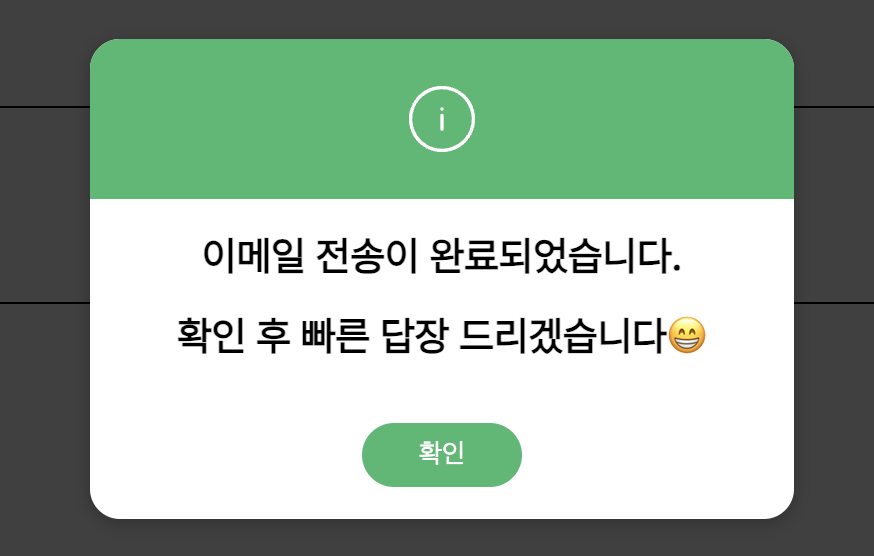 |  |
이처럼 모달의 모양은 정말 다양하지만 큰 틀을 벗어나지는 않는다.
따라서 모달의 기능별로 컴포넌트를 분리하고 필요한 곳에서 조합해서 사용하는 식으로 구현해보기로 했다.
ModalWrapper 컴포넌트
import { ReactNode, useEffect } from 'react';
import { Header } from './Modal.Header';
import { Content } from './Modal.Content';
import { Button } from './Modal.Button';

const ModalWrapper = ({ children, ...props }: { children: ReactNode }) => {
	useEffect(() => {
		document.body.style.overflow = 'hidden';
		return () => {
			document.body.style.overflow = 'auto';
		};
	}, []);

	return (
		<div style={{ height: '100%' }} {...props}>
			{children}
		</div>
	);
};

export { ModalWrapper, Header, Content, Button };
Modal.Header 컴포넌트
export const Header: React.FC<{ children: ReactNode }> = ({ children, ...props }) => {
	return <div {...props}>{children}</div>;
};
Modal.Button 컴포넌트
export const Button: React.FC<ButtonProps> = ({ onClick, children, ...props }) => {
	return (
		<button onClick={onClick} {...props}>
			{children}
		</button>
	);
};
Modal.Content 컴포넌트
export const Content: React.FC<{ children: ReactNode }> = ({ children, ...props }) => {
	return <div {...props}>{children}</div>;
};
- ModalWrapper 컴포넌트는 모달을 래핑하고 있는 컴포넌트이다.
모달이 띄어졌을때 뒤에가 움직이면 안되기 때문에 useEffect 를 사용해 구현했다.
- Header, content, Button 컴포넌트는 children 을 감싸는 단순한 컴포넌트이다.
기능별로 모달 로직을 따로 분리해서 관리함으로써 역할을 명시적으로 표시하고 가독성을 높이고자 했다.
수정 전👀
       <Modal onClick={closeModal} height="22rem" $padding="2rem" $radius="15px">
		  <Self>
		    <ContentBoxStyle>
		      <Icon />
		      <TitleStyle>예약을 진행하시겠습니까?</TitleStyle>
		    </ContentBoxStyle>
		    <ButtonBoxStyle>
		      <Button onClick={() => closeModal()} $backgroundColor="whitesmoke">
		        취소하기
		      </Button>
		      <Button
		        color="white"
		        $backgroundColor="#4CAF50"
		        $onHover={true}
		        onClick={bookMassageHandler}
		        disabled={isLoading}
		        $isLoading={isLoading}
		      >
		        {isLoading ? <LoadingBar /> : "예약하기"}
		      </Button>
		    </ButtonBoxStyle>
		  </Self>
수정 후😎
		<>
			<BackDropStyle onClick={() => closeModal()} />
			<ModalStyle>
				<ModalWrapper closeModal={closeModal}>
					<Header>
						<FcOk />
					</Header>
					<Content>예약을 진행하시겠습니까?</Content>
					<Button onClick={() => closeModal()}>취소하기</Button>
					<Button onClick={bookMassageHandler}>
						{isLoading ? <LoadingBar /> : '예약하기'}
					</Button>
				</ModalWrapper>
			</ModalStyle>
</>-
기존에는 Modal 컴포넌트 내부에 BackDropStyle 과 ModalStyle 이 함께 정의되어 있었는데, 이 부분을 필요한 곳에서 직접 스타일링 할 수 있도록 변경했다.
지금 보니 BackDropStyle 은 변경이 거의 없기 때문에 로직 뒤에 숨겨놔도 좋을 것 같다는 생각이 든다.
ModalStyle은 모달의 모양과 스타일에 따라 해당 컴포넌트에서 스타일을 주도록 변경했다. -
ModalWrapper 컴포넌트는 Header, Content, Button 등을 조합하여 사용할 수 있도록 설계했다. 이를 통해 모달 내의 각 요소를 더욱 명확하게 구분하고, 필요에 따라 컴포넌트를 조합하여 사용할 수 있다.
-
모달의 역할이 구분되어 있고, 필요에 따라 Header, Content, Button 등을 합성하여 사용할 수 있다.
-
만약 header, content, button 외에 다른 기능이 필요한 경우 새로운 컴포넌트를 추가하여 다양한 기능을 확장할 수 있다.
마무리
이번에 영상을 보고 어떻게 하면 변경에 유연한 컴포넌트를 만들 수 있을까에 대한 고민을 하게 됐는데, 그 시작이 모달 컴포넌트였다.
사용하면서 불편함이 컸고 모달 컴포넌트가 역할을 제대로 하지 못하고 있다는 생각이 커서 사용하면서도 불편했는데 모달을 기능별로 모듈화 하는 방법을 통해 코드의 가독성과 유지보수면에서는 향상된 것 같다.
다만, 스타일과 로직을 분리하는 부분에 있어서는 아쉬움이 있다.
혼자서 디자인, 기획, 개발까지 담당했기에 처음부터 전체적인 디자인을 고려하지 않고 시작해서 설계 부분에서 놓친 부분이 많다.
추후 리팩토링을 진행한다면 애플리케이션 전반에 쓰이는 버튼이나 모달 디자인을 정리하고 틀을 만들어 놓은 다음에 더 쉽고 간편하게 가져다 쓸 수 있도록 만들어보고 싶다.
어떻게 하면 스타일을 로직과 잘 분리할 수 있을지에 대해서는 더 고민이 필요하다.