CSS
문제 1.
flexbox_practice1.html
<!DOCTYPE html>
<html lang="en">
<head>
<meta charset="UTF-8">
<meta name="viewport" content="width=device-width, initial-scale=1.0">
<title>flexbox_practice1</title>
<link rel="stylesheet" href="css/flexbox_practice1.css">
</head>
<body>
<!-- 강사님 풀이 -->
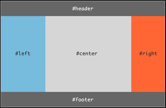
<div class="container1">
<div class="header1"></div>
<div class="body1">
<div class="left1"></div>
<div class="center1"></div>
<div class="right1"></div>
</div>
<div class="footer1"></div>
</div>
</body>
</html>flexbox_practice1.css
/* 강사님 풀이 */

.container1 {
    display: flex;
    flex-direction: column;

    width: 800px;
    height: 500px;
}

.header1, .footer1 {
    background-color: gray;
    flex-basis: 20%;
}

.body1 {
    flex-basis: 60%;

    display: flex;
}

.left1 {
    flex-basis: 30%;
    background-color: skyblue;
}

.center1 {
    flex-basis: 50%;
    background-color: darkgray;
}

.right1 {
    flex-basis: 20%;
    background-color: tomato;
}
문제 2.
flexbox_practice2.html
<!DOCTYPE html>
<html lang="en">
<head>
<meta charset="UTF-8">
<meta name="viewport" content="width='device-width', initial-scale=1.0">
<title>flexbox_practice2</title>
<link rel="stylesheet" href="css/flexbox_practice2.css">
</head>
<body>
<!-- 강사님 풀이 -->
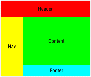
<div class="container2">
<div class="header2"></div>
<div class="body2">
<div class="nav2"></div>
<div class="content-body2">
<div class="content2"></div>
<div class="footer2"></div>
</div>
</div>
</div>
</body>
</html>flexbox_practice2.css
/* 강사님 풀이 */
.container2 {
    display: flex;
    flex-direction: column;

    width: 800px;
    height: 500px;
}

.header2 {
    flex-basis: 20%;
    background-color: red;
}

.body2 {
    flex-basis: 80%;

    display: flex;
}

.nav2 {
    flex-basis: 30%;
    background-color: yellow;
}

.content-body2 {
    flex-basis: 70%;

    display: flex;
    flex-direction: column;
}

.content2 {
    flex-basis: 80%;
    background-color: greenyellow;
}

.footer2 {
    flex-basis: 20%;
    background-color: skyblue;
}
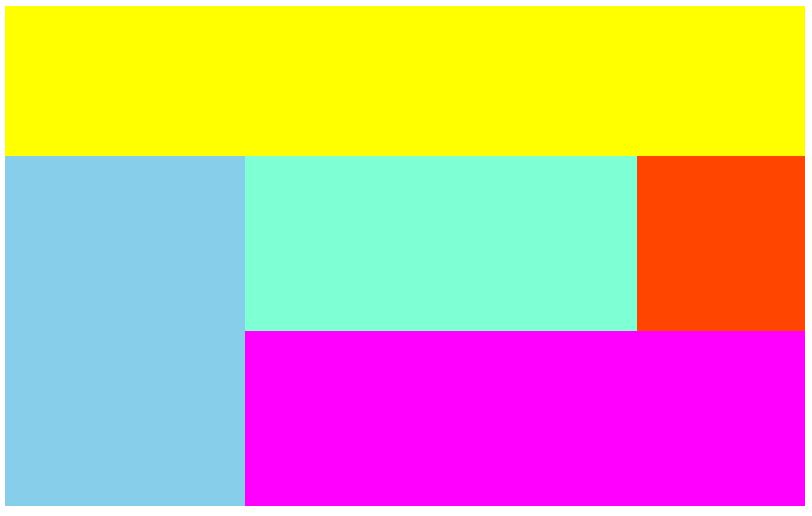
문제 3.
flexbox_practice3.html
<!DOCTYPE html>
<html lang="en">
<head>
<meta charset="UTF-8">
<meta name="viewport" content="width=device-width, initial-scale=1.0">
<title>flexbox_practice3</title>
<link rel="stylesheet" href="css/flexbox_practice3.css">
</head>
<body>
<!-- 강사님 풀이 -->
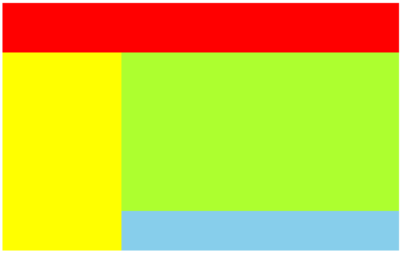
<div class="container3">
<div class="header3"></div>
<div class="body3">
<div class="left-sidebar3"></div>
<div class="content3">
<div class="top3">
<div class="main3"></div>
<div class="right-sidebar3"></div>
</div>
<div class="footer3"></div>
</div>
</div>
</div>
</body>
</html>flexbox_practice3.css
/* 강사님 풀이 */
.container3 {
    display: flex;
    flex-direction: column;

    width: 800px;
    height: 500px;
}

.header3 {
    background-color: yellow;
    flex-basis: 30%;
}

.body3 {
    flex-basis: 70%;

    display: flex;
}

.left-sidebar3 {
    flex-basis: 30%;
    background-color: skyblue;
}

.content3 {
    flex-basis: 70%;

    display: flex;
    flex-direction: column;
}

.top3 {
    flex-basis: 50%;

    display: flex;
}

.main3 {
    flex-basis: 70%;
    background-color: aquamarine;
}

.right-sidebar3 {
    flex-basis: 30%;
    background-color: orangered;
}

.footer3 {
    flex-basis: 50%;
    background-color: magenta;
}
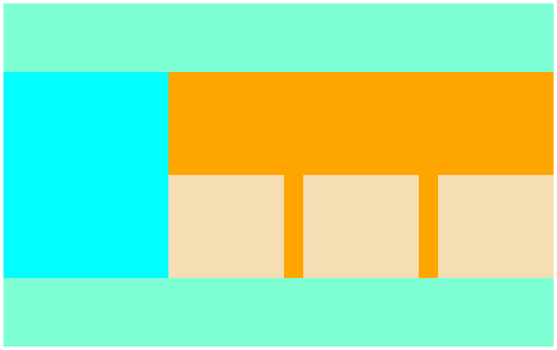
문제 4.
flexbox_practice4.html
<!DOCTYPE html>
<html lang="en">
<head>
    <meta charset="UTF-8">
    <meta name="viewport" content="width=device-width, initial-scale=1.0">
    <title>flexbox_practice4</title>

    <link rel="stylesheet" href="css/flexbox_practice4.css">
</head>
<body>

    <!-- 강사님 풀이 -->
    <div class="container4">
        <div class="header4"></div>
        <div class="body4">
            <div class="aside4"></div>
            <div class="article4">
                <div class="image4"></div>
                <div class="image4"></div>
                <div class="image4"></div>
            </div>
        </div>
        <div class="footer4"></div>
    </div>

</body>
</html>
flexbox_practice4.css
.container4 {
    display: flex;
    flex-direction: column;

    width: 800px;
    height: 500px;
}

.header4, .footer4 {
    flex-basis: 20%;
    background-color: aquamarine;
}

.body4 {
    flex-basis: 60%;

    display: flex;
}

.aside4 {
    flex-basis: 30%;
    background-color: aqua;
}

.article4 {
    flex-basis: 70%;
    background-color: orange;

    display: flex;
    justify-content: space-between;
    align-items: flex-end;
}

.image4 {
    width: 30%;
    height: 50%;

    background-color: wheat;
}
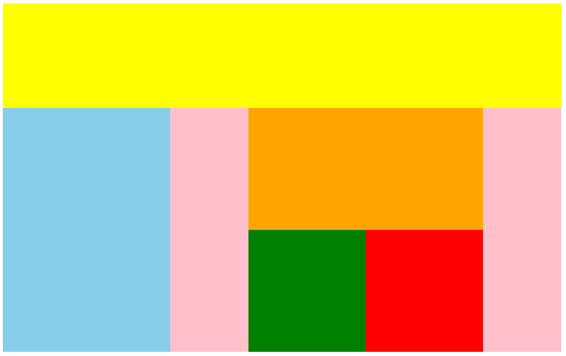
문제 5.
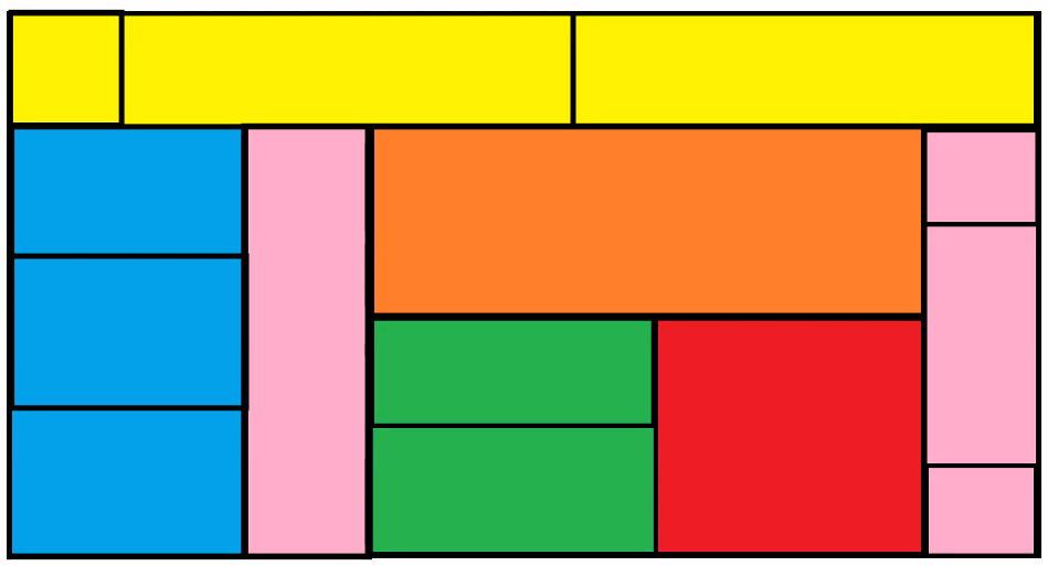
flexbox_practice5.html
<!DOCTYPE html>
<html lang="en">
<head>
    <meta charset="UTF-8">
    <meta name="viewport" content="width=device-width, initial-scale=1.0">
    <title>flexbox_practice5</title>

    <link rel="stylesheet" href="css/flexbox_practice5.css">
</head>
<body>

    <!-- 강사님 풀이 -->
    <div class="container5">
        <div class="header5">
            <div class="header5-1"></div>
            <div class="header5-2"></div>
            <div class="header5-3"></div>
        </div>
        <div class="body5">
            <div class="left5">
                <div class="left5-1"></div>
                <div class="left5-2"></div>
                <div class="left5-3"></div>
            </div>
            <div class="right5">
                <div class="right5-1"></div>
                <div class="right5-2">
                    <div class="right5-2-top"></div>
                    <div class="right5-2-bottom">
                        <div class="right5-2-bottom-left"></div>
                            <div class="right5-2-bottom-left-top"></div>
                            <div class="right5-2-bottom-left-bottom"></div>
                        <div class="right5-2-bottom-right"></div>
                    </div>
                </div>
                <div class="right5-3">
                    <div></div>
                    <div></div>
                    <div></div>
                </div>
            </div>
        </div>
    </div>

</body>
</html>
flexbox_practice5.css
/* 강사님 풀이 */

.container5 {
    display: flex;
    flex-direction: column;

    width: 800px;
    height: 500px;
}

.header5 {
    background-color: yellow;
    flex-basis: 30%; /* 자식역할 */

    display: flex; /* 부모역할 */
}

.header5-1 {
    flex-basis: 20%;
}

.header5-2, .header5-3 {
    flex-basis: 40%;
}

.body5 {
    flex-basis: 70%;

    display: flex;
}

.left5 {
    flex-basis: 30%;

    display: flex;
    flex-direction: column;
    background-color: skyblue;
}

.right5 {
    flex-basis: 70%;

    display: flex;
}

.left5-1, .left5-2, .left5-3 {
    flex-basis: calc(100%/3);
}

.right5-1, .right5-3 {
    flex-basis: 20%;
    background-color: pink;
}

.right5-2 {
    flex-basis: 60%;

    display: flex;
    flex-direction: column;
}

.right5-2-top {
    flex-basis: 50%;
    background-color: orange;
}

.right5-2-bottom {
    flex-basis: 50%;

    display: flex;
}

.right5-2-bottom-left {
    flex-basis: 50%;
    background-color: green;

    display: flex;
    flex-direction: column;
}

.right5-2-bottom-right {
    flex-basis: 50%;
    background-color: red;
}

/* .right5-2-bottom-left-top, .right5-2-bottom-left-bottom {
    flex-basis: 50%;
} 이 부분이 이상함.. border를 주고 다시 만들어봐야할듯 .. ? */

.right5-3 {
    display: flex;
    flex-direction: column;
}

.right5-3 > div:nth-of-type(1),
.right5-3 > div:nth-of-type(3) {
    flex-basis: 20%;
}

.right5-3 > div:nth-of-type(2) {
    flex-basis: 60%;
}
11_글자관련스타일
<!DOCTYPE html>
<html lang="en">
<head>
<meta charset="UTF-8">
<meta name="viewport" content="width=device-width, initial-scale=1.0">
<title>11_글자관련스타일</title>
<link rel="stylesheet" href="css/text-style.css">
</head>
<body>
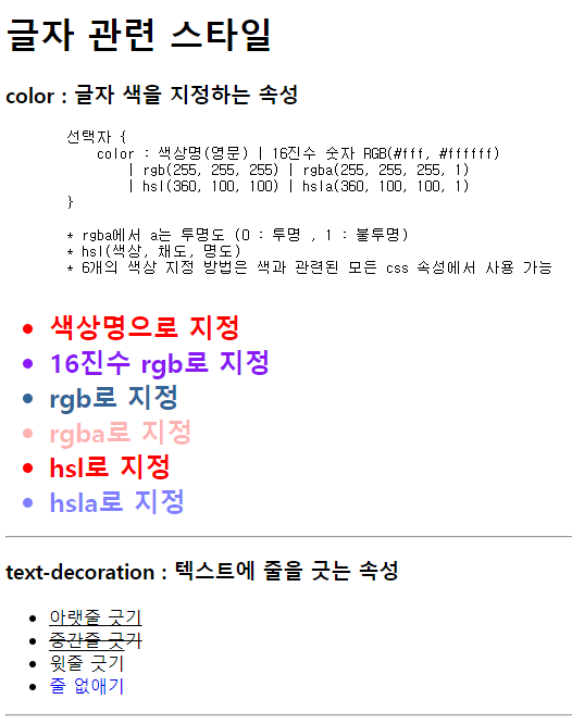
<h1>글자 관련 스타일</h1>
<h3>color : 글자 색을 지정하는 속성</h3>
<pre>
선택자 {
color : 색상명(영문) | 16진수 숫자 RGB(#fff, #ffffff)
| rgb(255, 255, 255) | rgba(255, 255, 255, 1)
| hsl(360, 100, 100) | hsla(360, 100, 100, 1)
}
* rgba에서 a는 투명도 (0 : 투명 , 1 : 불투명)
* hsl(색상, 채도, 명도)
* 6개의 색상 지정 방법은 색과 관련된 모든 css 속성에서 사용 가능
</pre>
<ul id="color-ul">
<li>색상명으로 지정</li>
<li>16진수 rgb로 지정</li>
<li>rgb로 지정</li>
<li>rgba로 지정</li>
<li>hsl로 지정</li>
<li>hsla로 지정</li>
</ul>
<hr>
<h3>text-decoration : 텍스트에 줄을 긋는 속성</h3>
<ul id="deco-ul">
<li>아랫줄 긋기</li>
<li>중간줄 긋기</li>
<li>윗줄 긋기</li>
<li> <a href="#">줄 없애기</a> </li>
</ul>
<hr>
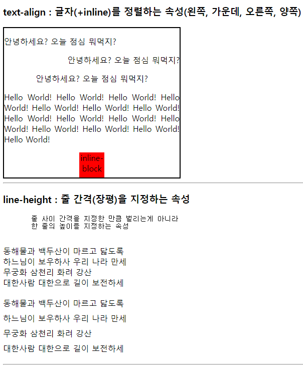
<h3>text-align : 글자(+inline)를 정렬하는 속성(왼쪽, 가운데, 오른쪽, 양쪽)</h3>
<div id="align-test">
<p>안녕하세요? 오늘 점심 뭐먹지?</p>
<p>안녕하세요? 오늘 점심 뭐먹지?</p>
<p>안녕하세요? 오늘 점심 뭐먹지?</p>
<p>Hello World! Hello World! Hello World! Hello World! Hello World!
Hello World! Hello World! Hello World! Hello World! Hello World!
Hello World! Hello World! Hello World! Hello World! Hello World!
</p>
<div id="div1">
<div>inline-block</div>
</div>
</div>
<hr>
<h3>line-height : 줄 간격(장평)을 지정하는 속성</h3>
<pre>
줄 사이 간격을 지정한 만큼 벌리는게 아니라
한 줄의 높이를 지정하는 속성
</pre>
<div id="line-test">
<p>
동해물과 백두산이 마르고 닳도록<br>
하느님이 보우하사 우리 나라 만세<br>
무궁화 삼천리 화려 강산<br>
대한사람 대한으로 길이 보전하세
</p>
<p>
동해물과 백두산이 마르고 닳도록<br>
하느님이 보우하사 우리 나라 만세<br>
무궁화 삼천리 화려 강산<br>
대한사람 대한으로 길이 보전하세
</p>
</div>
<hr>
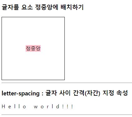
<h3>글자를 요소 정중앙에 배치하기</h3>
<div id="center-test">
<span>정중앙</span>
</div>
<hr>
<h3>letter-spacing : 글자 사이 간격(자간) 지정 속성</h3>
<p id="letter-test">
Hello world!!!
</p>
<hr>
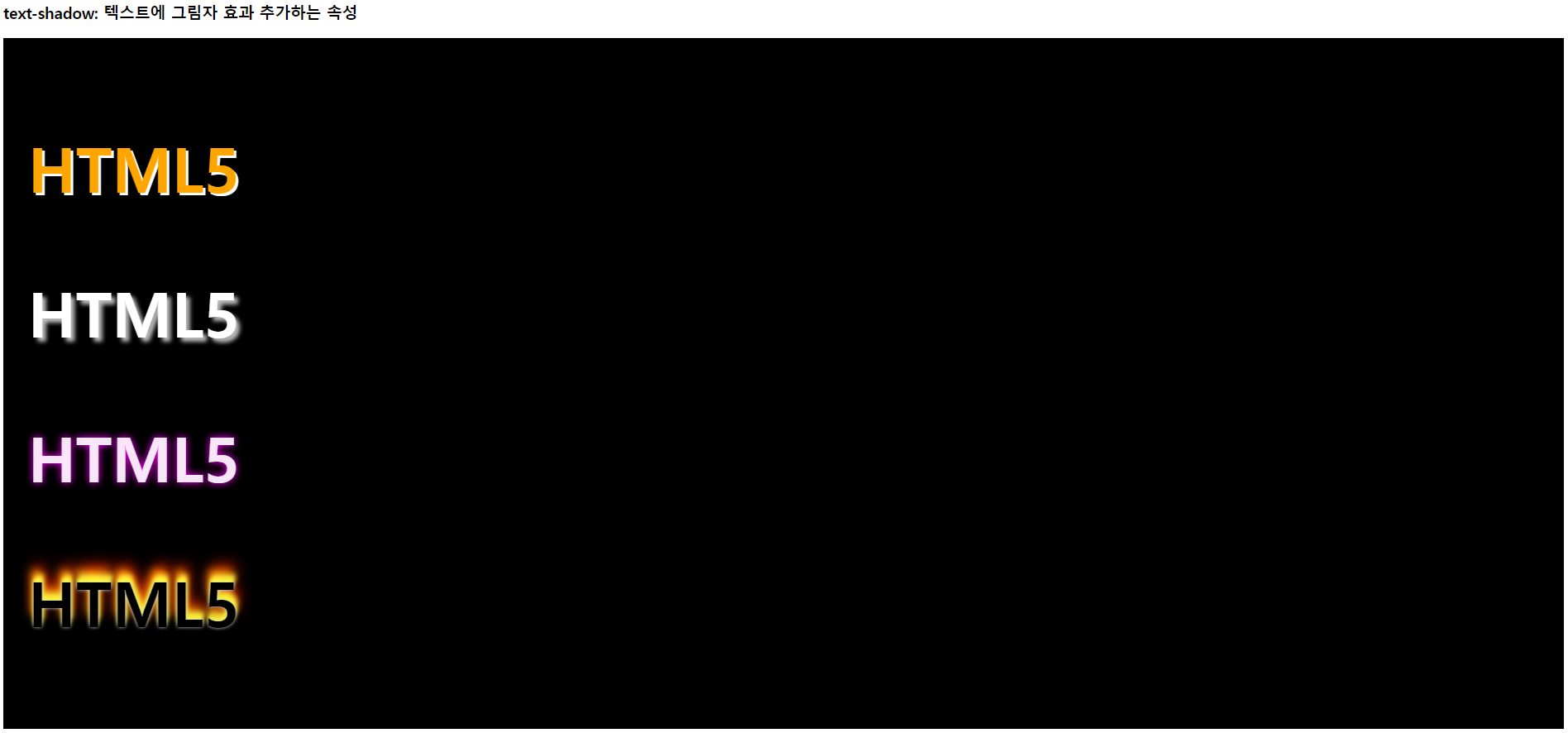
<h3>text-shadow: 텍스트에 그림자 효과 추가하는 속성</h3>
<div id="shadow-test">
<p>HTML5</p>
<p>HTML5</p>
<p>HTML5</p>
<p>HTML5</p>
</div>
</body>
</html>text-style.css
/* color 속성 */
#color-ul > li {
    font-size: 24px;
    font-weight: bold;
}

#color-ul > li:nth-child(1) {
    color: red;
}

#color-ul > li:nth-child(2) {
    color : #8918F5;
}

#color-ul > li:nth-child(3) {
    color: rgb(50, 100, 150); /* 0 ~ 255 */
    /* 구글에 #ffffff 검색시 나오는 코드 참고 */
}

#color-ul > li:nth-child(4) {
    color: rgba(255, 0, 0, 0.3);
}

#color-ul > li:nth-child(5) {
    color: hsl(360, 100%, 50%);
}

#color-ul > li:nth-child(6) {
    color: hsl(240, 100%, 50%, 0.5);
}

/* text-decoration */
#deco-ul > li:nth-child(1) {
    text-decoration: underline;
}

#deco-ul > li:nth-child(2) {
    text-decoration: line-through;
}

#deco-ul > li:nth-child(3) {
    text-decoration: overline;
}

#deco-ul > li:nth-child(4) > a{
    text-decoration: none;
}

/* text-align */
#align-test {
    width: 350px;
    border: 2px solid black;
}

#align-test > p:nth-child(1) {
    text-align: left; /* 기본값 */
}

#align-test > p:nth-child(2) {
    text-align: right;
}

#align-test > p:nth-child(3) {
    text-align: center;
}

#align-test > p:nth-child(4) {
    text-align: justify;
}

#div1 > div {
    width: 50px;
    height: 50px;
    background-color: red;
    display: inline-block;
    /* inline, inline-block은 정렬 가능하지만 block은 불가능 */
}

/* inline-block도 적용되는지 확인 */
#div1 {
    text-align: center;
}

#line-test > p:last-child {
    line-height: 30px;
    /* 기본 : 24px 24보다 적어지면 글자 찌부.. */
}

#center-test {
    width: 200px;
    height: 200px;
    border: 1px solid black;

    text-align: center;
}

#center-test > span {
    background-color: pink;
    line-height: 200px;
}

#letter-test {
    letter-spacing: 10px;
    /* 기본 : normal, 양수/음수로 변경 */
}


/* test-shadow */

#shadow-test {
    background-color: black;
    padding: 30px;
}

#shadow-test > p {
    font-size: 75px;
    font-weight: bold;
}

#shadow-test > p:nth-child(1) {
    color: orange;
    text-shadow: 3px 3px white;
    /* text-shadw: 가로 세로 번짐 색상 */
}

#shadow-test > p:nth-child(2) {
    color: white;
    text-shadow: 5px 5px 5px #bbb;
}

#shadow-test > p:nth-child(3) {
    color: rgba(255, 255, 255, 0.9);
    text-shadow: 0px 0px 10px magenta;
}

#shadow-test > p:nth-child(4) {
    text-shadow: 0px 0px 4px #ccc,
                0px -5px 4px #ff3,
                2px -10px 6px #fd3,
                -2px -15px 11px #f80,
                2px -20px 18px #f20;
                /* 세로가 마이너스여서 위로 번짐 */
}
Design Tool | Figma -> 웹개발자 포트폴리오 만들기
https://www.figma.com/files/recents-and-sharing/recently-viewed?fuid=1278586554654915438
