CSS
12_글꼴(폰트)관련스타일
<!DOCTYPE html>
<html lang="en">
<head>
<meta charset="UTF-8">
<meta name="viewport" content="width=device-width, initial-scale=1.0">
<title>12_글꼴(폰트)관련스타일</title>
<link rel="stylesheet" href="css/font-style.css">
<link rel="preconnect" href="https://fonts.googleapis.com">
<link rel="preconnect" href="https://fonts.gstatic.com" crossorigin>
<link href="https://fonts.googleapis.com/css2?family=Nanum+Gothic:wght@400;700;800&display=swap" rel="stylesheet">
</head>
<body>
<h1>글꼴(폰트) 관련 스타일</h1>
<h3>font-size: 글꼴의 크기를 지정하는 속성</h3>
<pre>
px : 픽셀(화면 해상도)
pt : 포인트(1pt = 0.72인치)
% : 상위 요소 크기에 대한 백분율
<!--
div에 대한 백분율.
<div>
<p style="font-size: 15%;"></p>
</div> -->
em : 1em == 100%
</pre>
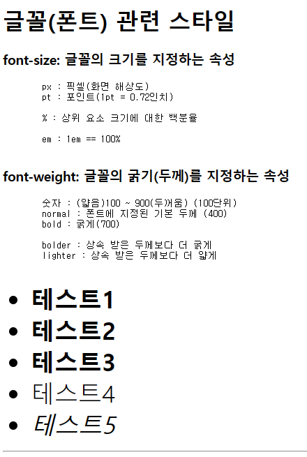
<h3>font-weight: 글꼴의 굵기(두께)를 지정하는 속성</h3>
<pre>
숫자 : (얇음)100 ~ 900(두꺼움) (100단위)
normal : 폰트에 지정된 기본 두께 (400)
bold : 굵게(700)
bolder : 상속 받은 두께보다 더 굵게
lighter : 상속 받은 두께보다 더 얇게
</pre>
<ul id="weight-test">
<li>테스트1</li>
<li>테스트2</li>
<li>테스트3</li>
<li>테스트4</li>
<li>테스트5</li>
</ul>
<hr>
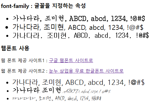
<h3>font-family : 글꼴을 지정하는 속성</h3>
<ul id="family-test1" class="cls">
<li>가나다라, 조미현, ABCD, abcd, 1234, !@#$</li>
<li>가나다라, 조미현, ABCD, abcd, 1234, !@#$</li>
<li>가나다라, 조미현, ABCD, abcd, 1234, !@#$</li>
</ul>
<h3>웹폰트 사용</h3>
<p>웹 폰트 제공 사이트1 : <a href="https://fonts.google.com/">구글 웹폰트 사이트로</a></p>
<p>웹 폰트 제공 사이트2 : <a href="https://noonnu.cc/">눈누 상업용 무료 한글폰트 사이트로</a></p>
<ul id="family-test2" class="cls">
<li>가나다라, 조미현, ABCD, abcd, 1234, !@#$</li>
<li>가나다라, 조미현, ABCD, abcd, 1234, !@#$</li>
<li>가나다라, 조미현, ABCD, abcd, 1234, !@#$</li>
</ul>
</body>
</html>font-style.css
@import url('https://fonts.googleapis.com/css2?family=Nanum+Gothic:wght@700;800&family=Qwitcher+Grypen:wght@400;700&display=swap');

#weight-test > li {
    font-size: 34px;
}

#weight-test > li:nth-child(1) { font-weight: 600; }
#weight-test > li:nth-child(2) { font-weight: bold; }
/* bold : 700이기 때문에 위글자보다 조금 더 굵음 */
#weight-test > li:nth-child(3) { font-weight: bolder; }
/* bolder : normal보다 굵음 */
#weight-test > li:nth-child(4) { font-weight: lighter; }
/* lighter : normal보다 얇음 */
#weight-test > li:nth-child(5) {
    font-weight: normal;

    /* 글꼴의 모양을 지정하는 속성 */
    font-style: italic;
}


.cls > li { font-size: 24px; }

#family-test1 > li:nth-child(1) {
    font-family: '궁서'; /* 설치된 폰트인 경우 */
}

#family-test1 > li:nth-child(2) {
    font-family: '배달의민족체';
    /* 없는 폰트인 경우 기본폰트로 설정됨 */
}

#family-test1 > li:nth-child(3) {
    font-family: '배달의민족체', '굴림체';
    /* 배달의민족체 없을 경우 굴림체 사용하겠다!
        여러 개 나열 가능
    */
}

/* 웹폰트 */
#family-test2 > li:nth-child(1) {
    font-family: 'Nanum Gothic', sans-serif;
}

/* @import는 css 파일 제일 상단에 작성해야 한다. */
#family-test2 > li:nth-child(2) {
    font-family: 'Qwitcher Grypen', cursive;
}

/* font-face는 최상단 아니여도 됨. */
@font-face {
    font-family: 'iceJaram-Rg'; /* 해당 문구 css에 작성 */
    src: url('https://cdn.jsdelivr.net/gh/projectnoonnu/noonfonts_2307-2@1.0/iceJaram-Rg.woff2') format('woff2');
    font-weight: normal;
    font-style: normal;
}

#family-test2 > li:nth-child(3) {
    font-family: 'iceJaram-Rg';
}
폰트 관련 참조할만한 Site
1. 구글 웹폰트
https://fonts.google.com/
2. 눈누 상업용 무료 한글폰트 사이트
https://noonnu.cc/
13_변형관련스타일
<!DOCTYPE html>
<html lang="en">
<head>
<meta charset="UTF-8">
<meta name="viewport" content="width=device-width, initial-scale=1.0">
<title>13_변형관련스타일</title>
<link rel="stylesheet" href="css/transform-style.css">
</head>
<body>
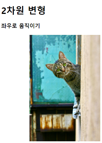
<h1>2차원 변형</h1>
<h3>좌우로 움직이기</h3>
<img src="../images/animals/cat1.jpg" class="trans-x-2d">
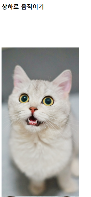
<h3>상하로 움직이기</h3>
<img src="../images/animals/cat2.jpg" class="trans-y-2d">
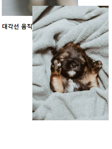
<h3>대각선 움직이기</h3>
<img src="../images/animals/dog1.jpg" class="trans-xy-2d">
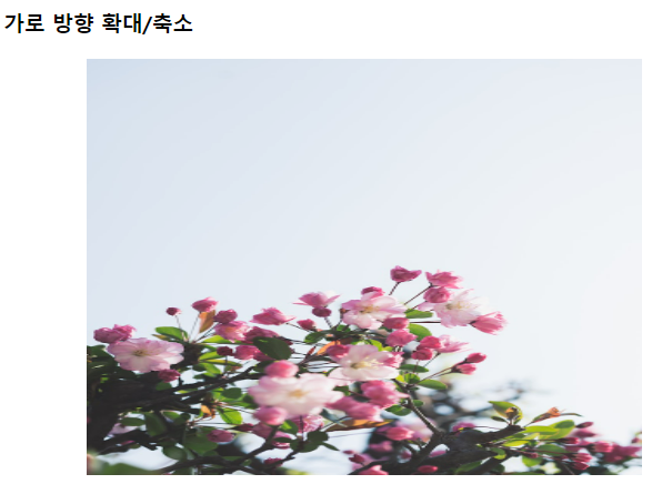
<h3>가로 방향 확대/축소</h3>
<img src="../images/flowers/flower1.jpg" class="trans-x-scale-2d">
<h3>세로 방향 확대/축소</h3>
<img src="../images/flowers/flower2.jpg" class="trans-y-scale-2d">
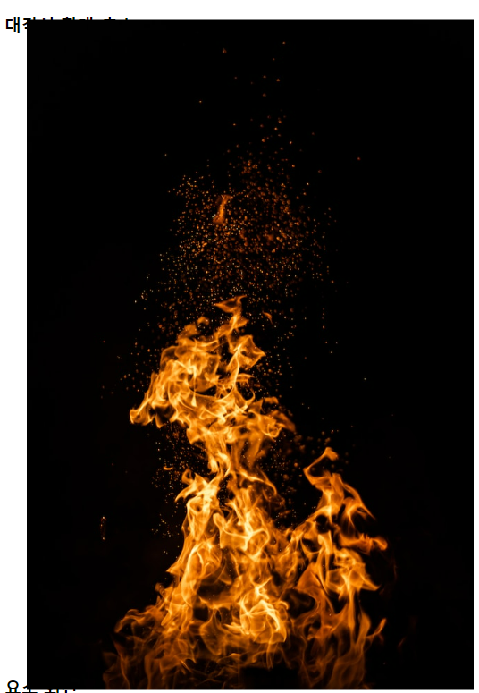
<h3>대각선 확대/축소</h3>
<img src="../images/things/fire.jpg" class="trans-scale-2d">
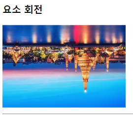
<h3>요소 회전</h3>
<img src="../images/travel/travel1.jpg" class="trans-rotate">
<hr>
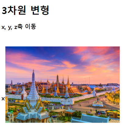
<h1>3차원 변형</h1>
<h3>x, y, z축 이동</h3>
<img src="../images/travel/travel2.jpg" class="trans-3d">
<h3>x축 회전</h3>
<img src="../images/travel/travel3.jpg" class="trans-rotate-x-3d">
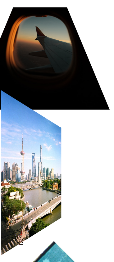
<h3>y축 회전</h3>
<img src="../images/travel/travel4.jpg" class="trans-rotate-y-3d">
<h3>z축 회전</h3>
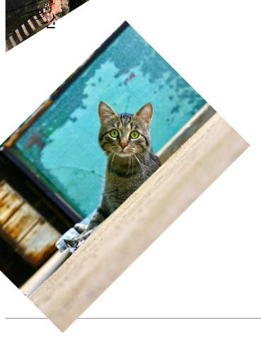
<img src="../images/animals/cat1.jpg" class="trans-rotate-z-3d">
<hr>
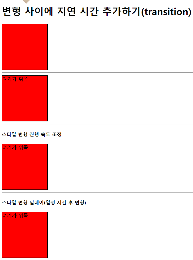
<h1>변형 사이에 지연 시간 추가하기(transition)</h1>
<div class="box test1"></div>
<hr>
<div class="box test2">여기가 위쪽</div>
<hr>
<h4>스타일 변형 진행 속도 조정</h4>
<div class="box test3">여기가 위쪽</div>
<hr>
<h4>스타일 변형 딜레이(일정 시간 후 변형)</h4>
<div class="box test4">여기가 위쪽</div>
</body>
</html>transform-style.css
img {
    width: 250px;
    height: auto;
}

/* transform : 변형과 관련된 속성 */

/* css 속성 작성시 크로스 브라우저(브라우저가 달라지는 경우) 처리방법
-ms- : 마이크로 소프트(익스플로어,엣지)
-webkit- : 크롬, 사파리
-o- : 오페라
-moz- : 파이어폭스

*/

/* 좌우 이동 */
.trans-x-2d:hover {
    /* 효과 안먹을 상황 대비해 미리 명시해줌 */
    -ms-transform: translateX(100px);
    -webkit-transform: translateX(100px);
    transform: translateX(100px);
}

/* 상하 이동 */
.trans-y-2d:hover {
    /* 양수는 아래, 음수는 위로 이동 */
    transform: translateY(100px);
}

/* 대각선 이동 */
.trans-xy-2d:hover {
    transform: translate(100px, -100px);
}

/* scale(배율) */
/* 가로방향 확대/축소 */
.trans-x-scale-2d:hover {
    transform: scaleX(2);
    margin-left: 200px;
}

/* 세로 방향 확대/축소 */
.trans-y-scale-2d:hover {
    transform: scaleY(2);
}

/* 요소 대각선 확대/축소 */
.trans-scale-2d:hover {
    transform: scale(2, 2);
    margin: 150px 150px;
}

/* 요소 회전 */
.trans-rotate:hover {
    transform: rotate(180deg);
}


/* x,y,z 축 이동 */

.trans-3d:hover {
    /* perspective(z축의 길이) : 원근법 적용 */
    transform: perspective(300px) translate3d(50px, 50px, 100px);
}

.trans-rotate-x-3d {
    transform: perspective(300px) rotateX(45deg);
}

.trans-rotate-y-3d {
    transform: perspective(300px) rotateY(45deg);
}

.trans-rotate-z-3d {
    transform: perspective(300px) rotateZ(45deg);
}


/* transition */

.box {
    width: 150px;
    height: 150px;
    border: 1px solid black;
    background-color: red;

    /* 스타일이 변경되는 시간 지정 */
    transition-duration: 1s;
}

.test1:hover {
    background-color: yellow;
}

.test2 {
    transition-duration: 3s;
}

.test2:hover {
    transform: rotate(360deg);
    background-color: skyblue;

    /* 테두리 모서리 곡률 속성 */
    border-radius: 50%;
}

.test3 {
    transition-duration: 3s;

    transition-timing-function: ease-in-out;
    /* ease(기본값) : 천천히-빨리-천천히 / ease-in / ease-out / linear: 등속 */
}

.test3:hover {
    background-color: springgreen;
    transform: rotate(720deg);
}

.test4 {
    transition-delay: 2s;
}

.test4:hover {
    transform: translateX(100px);
}
크로스 브라우저 처리 관련 참조할만한 Site
https://developer.mozilla.org/ko/docs/Web/CSS/transform
- 브라우저 호환성 확인할 수 있음 ( 하단 표 참고 )
SITE 제작하기
14_시맨틱태그
<!DOCTYPE html>
<html lang="en">
<head>
<meta charset="UTF-8">
<meta name="viewport" content="width=device-width, initial-scale=1.0">
<title>14_시맨틱태그</title>
<link rel="stylesheet" href="css/structure.css">
<!-- font awesome 사용할 준비가 되었다! (허가 받음) -->
<script src="https://kit.fontawesome.com/f821b57119.js" crossorigin="anonymous"></script>
</head>
<body>
<!--
시맨틱(Semantic, 의미) 태그 : 검색 엔진에 중요한 역할.
- 기존 영역 분할에 주로 사용되던 div, span 등의 태그는
태그 이름만 봤을 때 나눈다는 것 이외의 의미를 파악할 수 없음.
-> 태그만 봤을 때 태그의 목적을 알 수 없어
id 또는 class를 반드시 추가해야 했다.
이런 문제점을 해결하고자
태그 이름만으로 어느정도 어떤 역할을 하는지 알 수 있고,
웹 접근성(SEO)을 향상하는데 도움이 되는 시맨틱 태그가 추가됨.
[제공하는 태그]
header 태그 : 문서의 제목, 머리말 영역
footer 태그 : 문서의 하단 부분, 꼬리말, 정보 작성 영역
nav 태그 : 나침반 역할(다른페이지, 사이트 이동)의 링크 작성 영역
main 태그 : 현재 문서의 주된 콘텐츠 작성 영역
section 태그 : 구역 구문을 위한 영역
article 태그 : 본문과 독립된 콘텐츠를 작성하는 영역(배너, 광고)
aside 태그 : 사이드바(보통 양쪽), 광고 영역(article 포함하는 큰 영역)
-->
<main>
<header>
<!-- 클릭 시 메인페이지로 이동하는 로고 -->
<section>
<a href="#">
<img src="../images/logo.jpg" id="home-logo">
</a>
</section>
<!-- 검색창 부분 -->
<section>
<section class="search-area">
<!-- form 내부 input 태그 값을 서버 또는 페이지로 전달 -->
<form action="#" name="search-form">
<!-- fieldset : form 내부에서 input을 종류별로 묶는 용도로 자주 사용 -->
<fieldset>
<!-- search : 텍스트 타입과 기능적으로는 똑같으나,
브라우저에 의해 다르게 표현될 수 있음. -->
<!-- autocomplete : HTML 기본 자동완성 사용 X -->
<input type="search" id="query" name="query"
autocomplete="off" placeholder="검색어를 입력해주세요."
>
<button id="search-btn" class="fa-solid fa-magnifying-glass"></button>
</fieldset>
</form>
</section>
</section>
<section></section>
</header>
<!-- 보통은 header안에 작성하나 사이드에 nav가 있는 경우도 있기 때문에 따로 작성해본다! -->
<nav>
<ul>
<li><a href="#">공지사항</a></li>
<li><a href="#">자유게시판</a></li>
<li><a href="#">질문게시판</a></li>
<li><a href="#">FAQ</a></li>
<li><a href="#">1:1문의</a></li>
</ul>
</nav>
<section class="content">
<section class="content-1"></section>
<!-- 아이디/비밀번호/로그인버튼 영역 -->
<section class="content-2">
<form action="#" name="login-form">
<fieldset id="id-pw-area">
<section>
<input type="text" name="inputId" placeholder="아이디">
<input type="password" name="inputPw" placeholder="비밀번호">
</section>
<section>
<button>로그인</button>
</section>
</fieldset>
<label>
<input type="checkbox" name="saveId"> 아이디 저장
</label>
<!-- 회원가입/ Id/pw 찾기 영역 -->
<section id="signup-find-area">
<a href="#">회원가입</a>
<span>|</span>
<a href="#">ID/PW 찾기</a>
</section>
</form>
</section>
</section>
</main>
<!-- footer는 주요 콘텐츠가 아니라서 보통 main 태그 안에 작성하지 않음. -->
<footer>
<p>Copyright © KH Information Educational Institute E-Class</p>
<section>
<a href="#">프로젝트 소개</a>
<span>|</span>
<a href="#">이용약관</a>
<span>|</span>
<a href="#">개인정보처리방침</a>
<span>|</span>
<a href="#">고객센터</a>
</section>
</footer>
</body>
</html>structure.css
* {
    box-sizing: border-box;
    /* 콘텐츠 영역이 border까지 인식 */
}

body {
    margin: 0;
}

main {
    width: 1140px;
    margin: auto;
}

header {
    height: 200px;
    display: flex;
}

header > section:nth-of-type(1),
header > section:nth-of-type(3) {
    flex-basis: 15%;
}

header > section:nth-last-of-type(2) {
    flex-basis: 70%;
}

/* 로고 */
header > section:nth-of-type(1) {
    display: flex;
    justify-content: center;
    align-items: center;
}

#home-logo {
    width: 120px;
}

/* 검색 스타일 */
header > section:nth-of-type(2) {
    display: flex;
    justify-content: center;
    align-items: center;
}

.search-area {
    width: 500px;
}

.search-area fieldset {
    border: 2px solid #455ba8;
    border-radius: 5px;
    margin: 0;
    padding: 2px;

    display: flex;
}

#query {
    padding: 10px;
    font-size: 18px;
    font-weight: bold;
    border: none; /* 0 */
    outline: none; /* 0 도 가능 */
    /* outline : input 태그에 포커스가 맞춰졌을 때
        이를 표현하기 위한 바깥선
    */
    flex-basis: 92%;
}

#search-btn {
    flex-basis: 8%;
    cursor: pointer;
    /* 아이콘은 font-size로 크기 조정 */
    font-size: 1.2em;
    color: #455ba8;
    border: none;
    background-color: transparent; /* transparent : 투명 */
}

/* nav */
nav {
    height: 50px;
    border-bottom: 2px solid black;
    position: sticky;
    /* sticky : 스크롤이 임계점에 도달했을 때 화면에 스티커처럼 붙임
        - 평소에는 static (기본 position 상태)
        임계점 도달 시 fixed (화면 특정 위치 고정)

        * top, bottom, left, right 속성이 필수로 작성이 되어야 함.
        -> 임계점 도달 시 어느 위치에 부착할지 정해야하기 때문에
    */

    top: 0; /* 최상단에 붙임 */

    background-color: white;
}

/* nav > ul 스타일 */
nav > ul {
    list-style: none;
    display: flex;
    margin: 0;
    padding: 0;
    height: 100%;
}

nav a {
    text-decoration: none;
    font-size: 18px;
    font-weight: bold;
    color: black;
    height: 100%;
    display: block;

    text-align: center;
    line-height: 50px;

    border-radius: 5px;
    transition-duration: 0.2s;
}

nav li {
    flex-basis: 150px;
}

nav a:hover {
    background-color: #455ba8;
    color: white;
}

/* content */
.content {
    height: 800px;
    display: flex;
}

.content-1 { flex-basis: 70%; }
.content-2 { flex-basis: 30%; }

/* login 스타일 */

form[name="login-form"] {
    height: 150px;
    padding: 10px;
    margin-top: 10px;

    display: flex;

    flex-direction: column;

    justify-content: center;
}

form[name="login-form"] > label {
    margin-top: 5px;
    font-size: 14px;

    flex-basis: 20%;
}

#id-pw-area {
    margin: 0;
    padding: 0;
    display: flex;
    border: 1px solid #ddd;

    flex-basis: 60%;
}

#id-pw-area > section:first-child {
    flex-basis: 75%;
    display: flex;
    flex-direction: column;
}

#id-pw-area > section:last-child {
    flex-basis: 25%;
}

#id-pw-area input {
    border: 0;
    border-right: 1px solid #ddd;
    flex-basis: 50%;
    outline: none;
    padding: 5px;
}

#id-pw-area input:first-child {
    border-bottom: 1px solid #ddd;
}

#id-pw-area input:focus {
    border: 2px solid #455ba8;
}

/* 로그인 버튼 */
#id-pw-area button {
    width: 100%;
    height: 100%;
    border: 0;
    background-color: transparent;
    cursor: pointer;
}

#id-pw-area button:hover {
    background-color: #455ba8;
    color: white;
}

#signup-find-area {
    flex-basis: 20%;
    margin-top: 10px;
    padding-left: 5px;
}

#signup-find-area a {
    color: black;
    text-decoration: none;
    font-size: 14px;
}

#signup-find-area > span {
    padding: 0 10px;
            /* 상하 좌우 */
}

/* footer */
footer {
    height: 200px;
    background-color: #a3add342;
    display: flex;
    flex-direction: column;
    justify-content: center;
    align-items: center;
}

footer > p {
    font-weight: bold;
}

footer > section > * {
    font-size: 14px;
}

footer a {
    color: black;
    text-decoration: none;
}

footer span {
    padding: 0 10px;
}
< 화면 상단 >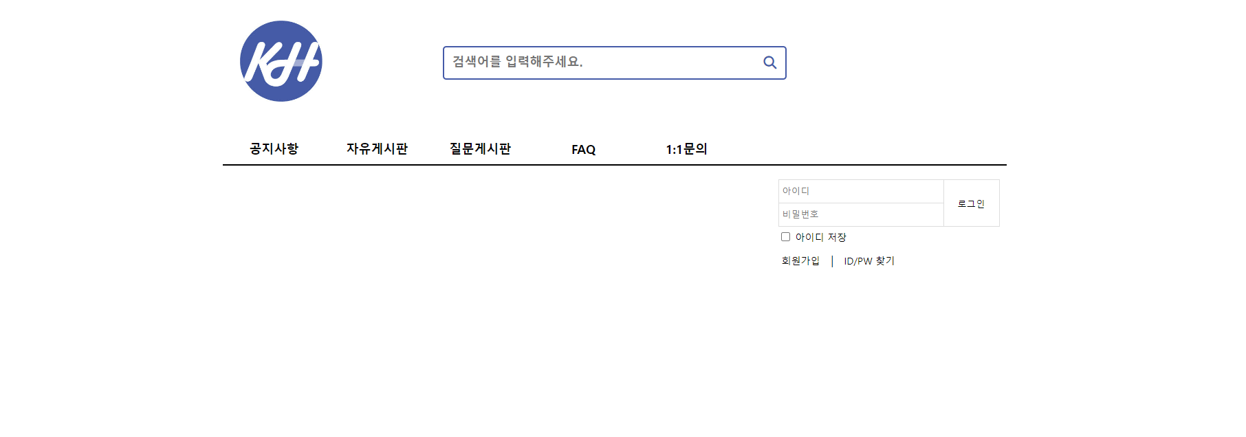
< 화면 하단 >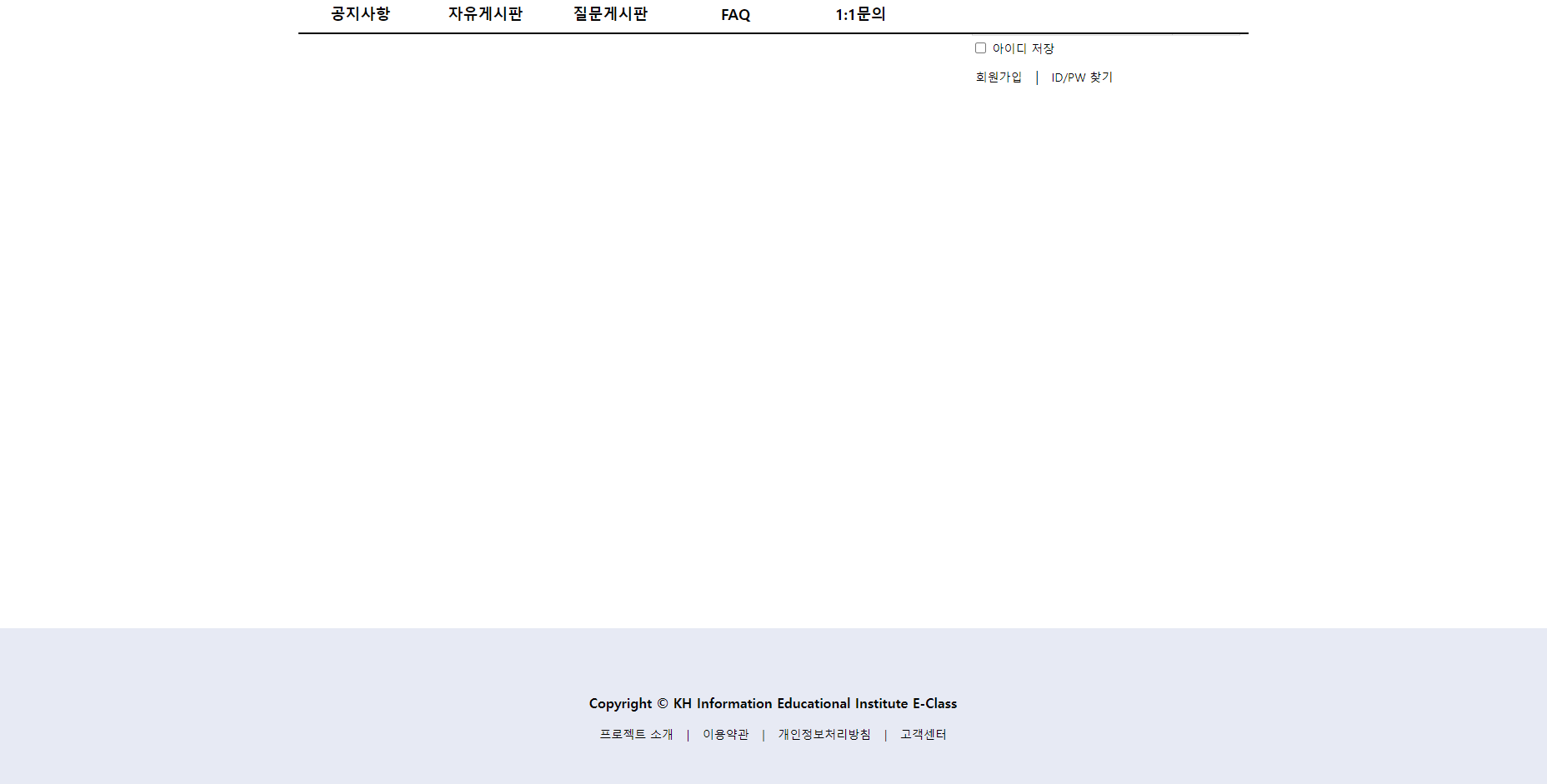
아이콘 관련 참조할만한 Site
- Font Awesome
https://fontawesome.com/- Your Kits 클릭 - # 버튼 클릭 - script 주소 복사 후 html <head> 태그 안에 붙여넣기 -> 위 과정 완료했다면? font awesome 사용할 준비 완료!
CLONE 코딩 과제 : Youtube 화면 구현하기
- CLONE 코딩 ? 코드로 예제를 똑같이 구현하는 것.
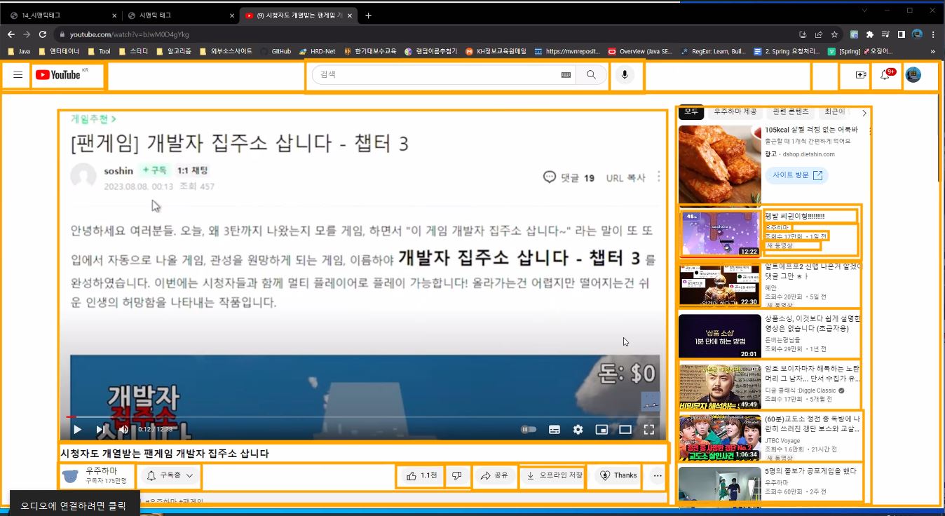
TIP ! : 하나하나 레이아웃 잡고 SECTION 나누어 제작하기
< 내가 구현해야할 화면 >
(( 로고 / 필요한 이미지 -> GOOGLE DRIVE 수업자료 WEBFRONT에 올려둠. ))
