9/7(목) UI 디자인 : HTML + CSS
구현 화면
Portfolio.html
<!DOCTYPE html>
<html lang="en">
<head>
<meta charset="UTF-8">
<meta name="viewport" content="width=device-width, initial-scale=1.0">
<title>Portfolio</title>
<link rel="stylesheet" href="Portfolio.css">
<script src="https://kit.fontawesome.com/f821b57119.js" crossorigin="anonymous"></script>
</head>
<body>
<section>
<!-- 1 -->
<section class="first">
<div>
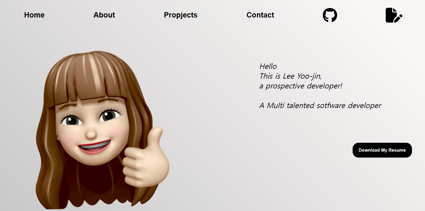
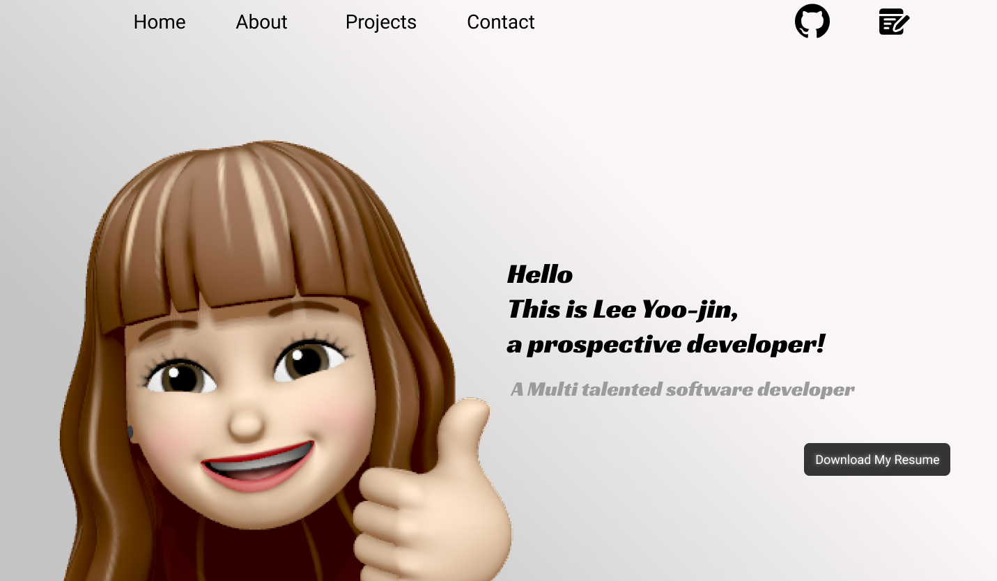
<div class="top-l">
<button>Home</button>
<button>About</button>
<button>Propjects</button>
<button>Contact</button>
</div>
<div class="top-r">
<button class="fa-brands fa-github"></button>
<button class="fa-solid fa-file-pen"></button>
</div>
</div>
<div>
<div class="bottom-l">
<img src="../images/portfolio/profile.png" id="profile">
</div>
<div class="bottom-r">
<div>
Hello <br>
This is Lee Yoo-jin, <br>
a prospective developer! <br><br>
A Multi talented sotfware developer
</div>
<div>
<button>Download My Resume</button>
</div>
</div>
</div>
</section>
<!-- 2 -->
<section class="second">
<div>
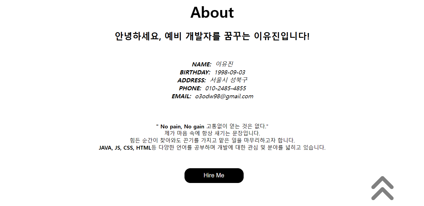
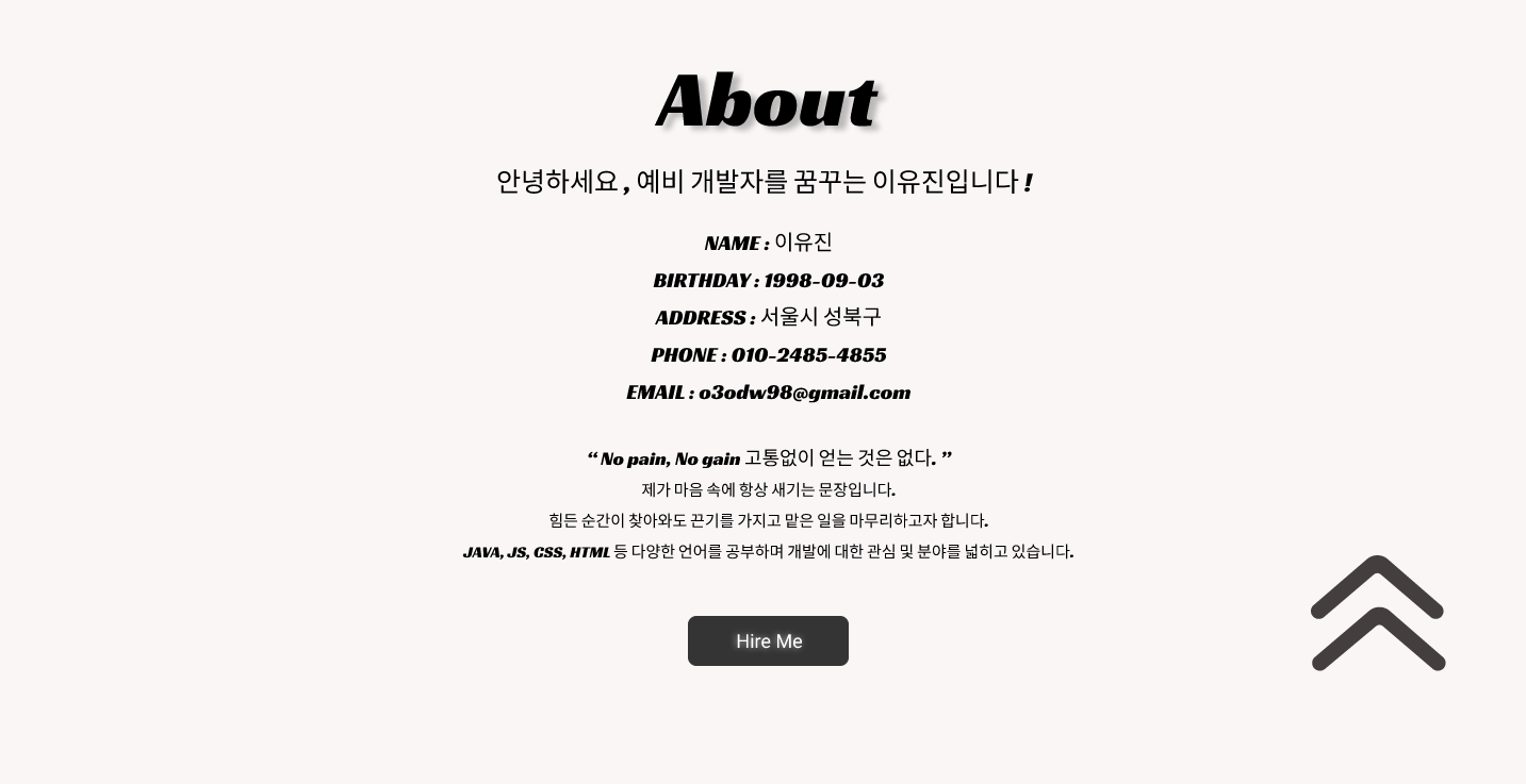
<div>About</div>
<div>안녕하세요, 예비 개발자를 꿈꾸는 이유진입니다!</div>
<div><b>NAME:</b> 이유진 <br>
<b>BIRTHDAY:</b> 1998-09-03 <br>
<b>ADDRESS:</b> 서울시 성북구 <br>
<b>PHONE:</b> 010-2485-4855 <br>
<b>EMAIL:</b> o3odw98@gmail.com <br><br></div>
<div><b>" No pain, No gain</b> 고통없이 얻는 것은 없다." <br>
제가 마음 속에 항상 새기는 문장입니다. <br>
힘든 순간이 찾아와도 끈기를 가지고 맡은 일을 마무리하고자 합니다. <br>
<b>JAVA, JS, CSS, HTML</b>등 다양한 언어를 공부하며 개발에 대한 관심 및 분야를 넓히고 있습니다.</div>
</div>
<div>
<div>
<button id="second-btn1">Hire Me</button>
</div>
<div>
<button id="second-btn2" class="fa-solid fa-angles-up"></button>
</div>
</div>
</section>
<!-- 3 -->
<section class="third">
<div>
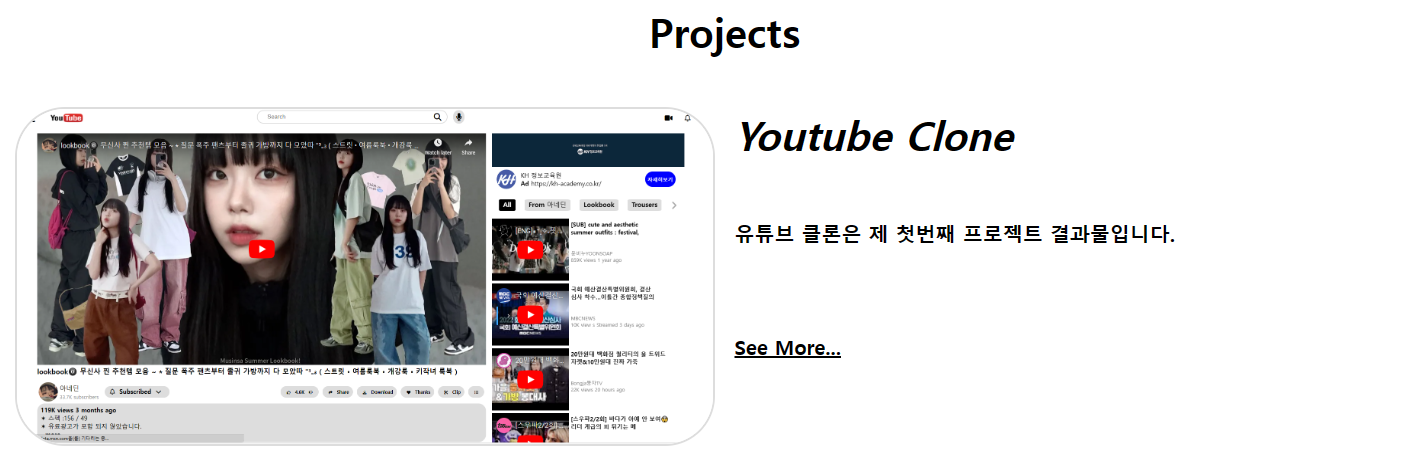
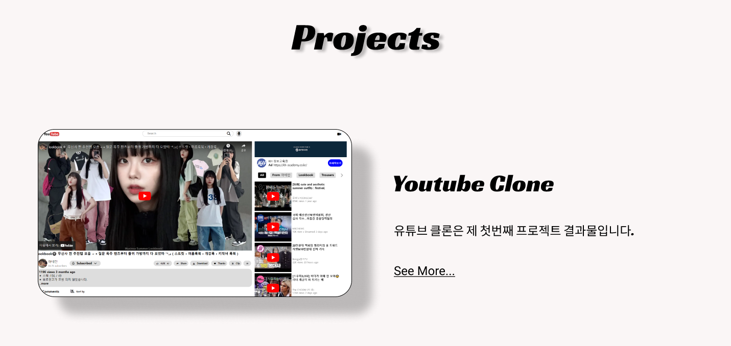
Projects
</div>
<div>
<div>
<img src="../images/portfolio/youtube_img.png" id="youtube">
</div>
<div class="third-2">
<div>
Youtube Clone
</div>
<div>
유튜브 클론은 제 첫번째 프로젝트 결과물입니다.
</div>
<div>
<u>See More...</u>
</div>
</div>
</div>
<div>
<div class="third-3">
<div>
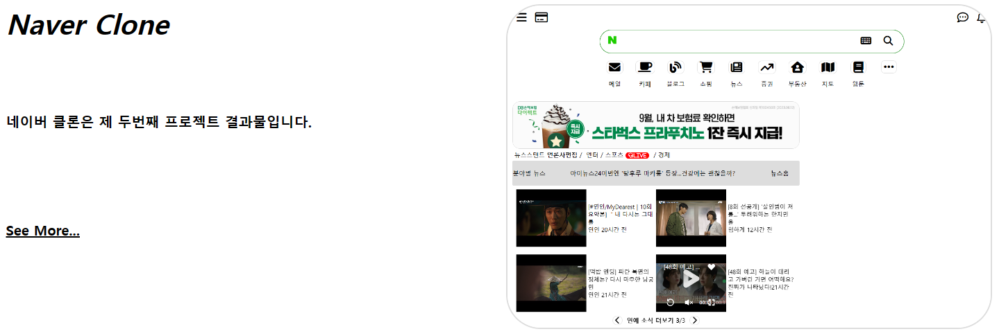
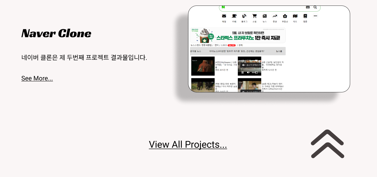
Naver Clone
</div>
<div>
네이버 클론은 제 두번째 프로젝트 결과물입니다.
</div>
<div>
<u>See More...</u>
</div>
</div>
<div>
<img src="../images/portfolio/naver_img.png" id="naver">
</div>
</div>
<div>
<div></div>
<div></div>
</div>
</section>
<!-- 4 -->
<section class="four"></section>
</section>
</body>
</html>Portfolio.css
* {
    box-sizing: border-box;
}

body {
    padding: 0;
    margin: 0;

    display: flex;
    justify-content: center;
}

/* div, section {
    border: 1px solid black;
} */

body > section {
    width: 1440px;
    height: 350vh;

    display: flex;
    flex-direction: column;
}

body > section > section:nth-child(1),
body > section > section:nth-child(2),
body > section > section:nth-child(4) {
    width: 100%;
    height: 22%;
}

body > section > section:nth-child(3) {
    width: 100%;
    height: 34%;
}

/* 1 */
.first {
    background-image: url("../images/portfolio/background.png");

    display: flex;
    flex-direction: column;
}

.first > div:nth-child(1) {
    flex-basis: 20%;

    display: flex;
}

.top-l {
    flex-basis: 70%;

    display: flex;
    align-items: center;
    justify-content: space-around;
}

.top-r {
    flex-basis: 30%;

    display: flex;
    align-items: center;
    justify-content: space-around;
}

.top-l > button {
    border: none;
    background-color: transparent;
    font-size: 25px;
    font-weight: bold;
}

.top-r > button {
    border: none;
    background-color: transparent;
    font-size: 50px;
}


.first > div:nth-child(2) {
    flex-basis: 80%;

    display: flex;
}

.bottom-l {
    flex-basis: 50%;

    display: flex;
    justify-content: center;
    align-items: flex-end;
}

.bottom-r {
    flex-basis: 50%;

    display: flex;
    flex-direction: column;
}

#profile {
    width: 600px;
    height: 600px;
    margin-bottom: 10px;
}

.bottom-r > div:nth-child(1) {
    flex-basis: 60%;

    display: flex;
    justify-content: center;
    align-items: center;

    font-size: 25px;
    font-style: italic;
}

.bottom-r > div:nth-child(2) {
    flex-basis: 40%;

    display: flex;
    justify-content: flex-end;
}

.bottom-r > div:nth-child(2) > button {
    border: 1px solid black;
    border-radius: 20px;
    background-color: black;
    color: white;
    width: 200px;
    height: 50px;
    margin: 10px 50px;
    font-size: 15px;
    font-weight: bold;
}

/* 2 */
.second {
    display: flex;
    flex-direction: column;
}

.second > div:nth-child(1) {
    flex-basis: 80%;

    display: flex;
    flex-direction: column;
}

.second > div:nth-child(1) > div:nth-child(1) {
    flex-basis: 20%;

    font-size: 50px;
    font-weight: bold;
    text-align: center;
    padding: 10px 0px;
}

.second > div:nth-child(1) > div:nth-child(2) {
    flex-basis: 10%;

    font-size: 30px;
    font-weight: bold;
    text-align: center;
}

.second > div:nth-child(1) > div:nth-child(3) {
    flex-basis: 40%;

    font-size: 20px;
    font-style: italic;
    text-align: center;
    padding: 50px 0px;
}

.second > div:nth-child(1) > div:nth-child(4) {
    flex-basis: 30%;

    font-size: 18px;
    text-align: center;
}

.second > div:nth-child(2) {
    flex-basis: 20%;

    display: flex;
}

.second > div:nth-child(2) > div:nth-child(1) {
    flex-basis: 80%;

    display: flex;
    justify-content: center;
    align-items: flex-start;
    padding-left: 300px;
}

#second-btn1 {
    border: 1px solid black;
    border-radius: 20px;
    background-color: black;
    color: white;
    width: 200px;
    height: 50px;
    font-size: 20px;
}

.second > div:nth-child(2) > div:nth-child(2) {
    flex-basis: 20%;

    display: flex;
    justify-content: center;
}

#second-btn2 {
    border: none;
    background-color: transparent;
    color: gray;
    font-size: 100px;
}

/* 3 */
.third {
    display: flex;
    flex-direction: column;
}

.third > div:nth-child(1) {
    flex-basis: 15%;

    display: flex;
    justify-content: center;
    align-items: center;

    font-size: 40px;
    font-weight: bold;
}

.third > div:nth-child(2),
.third > div:nth-child(3) {
    flex-basis: 35%;

    display: flex;
}

.third > div:nth-child(2) > div,
.third > div:nth-child(3) > div {
    flex-basis: 50%;
    padding: 10px;
}

#youtube {
    width: 100%;
    height: 100%;

    border: 2px solid #ddd;
    border-radius: 50px;
}

.third-2 {
    display: flex;
    flex-direction: column;
}

.third-2 > div {
    flex-basis: calc(100%/3);
}

.third-2 > div:nth-child(1) {
    font-size: 40px;
    font-weight: bold;
    font-style: italic;
}

.third-2 > div:nth-child(2) {
    font-size: 20px;
    font-weight: bold;
}

.third-2 > div:nth-child(3) {
    font-size: 20px;
    font-weight: bold;
}

.third-3 {
    display: flex;
    flex-direction: column;
}

.third-3 > div {
    flex-basis: calc(100%/3);
}

.third-3 > div:nth-child(1) {
    font-size: 40px;
    font-weight: bold;
    font-style: italic;
}

.third-3 > div:nth-child(2) {
    font-size: 20px;
    font-weight: bold;
}

.third-3 > div:nth-child(3) {
    font-size: 20px;
    font-weight: bold;
}

#naver {
    width: 100%;
    height: 100%;

    border: 2px solid #ddd;
    border-radius: 50px;
}

.third > div:nth-child(4) {
    flex-basis: 15%;
}
[ 결과 ]