
🧩 position
- 위치의 기준을 정함
top,bottom,left,right사용- 값이 모두 같으면
inset사용 양수 = 안쪽음수 = 바깥쪽
📍 static
- position 속성의 기본값
- 원래 있는 위치 배치
- 일반적인 글의 흐름
📍 relative
- 원래 위치를 기준으로 배치
- 원래 자리는 그대로 차지
📍 absolute
- 가장 가까운 포지셔닝이 된 조상 요소를 기준으로 위치 잡음
기본값(static)으로 되어 있으면 그걸 기준으로 안함- 원래 있던 자리 차지 안함
🔥 relative vs absolute
relative : 원래 배치에서 자리 차지
absolute : 원래 배치에서 자리 차지하지 않음
📍 fixed
- 브라우저 화면 기준
- 원래 있던 자리 차지 안함
📍 sticky
- 요소를 웹 브라우저에 달라 붙도록 배치
- 원래 위치에서 공간 차지
- 브라우저 화면 기준
- 지정한 위치에 닿기 전까지 static처럼 배치
display: block이면left, right값 필요 없음
🔥 sticky 특별한점
- 부모요소 안에 소속 되어 있음
- 부모가 사라지면, 같이 사라짐
📍 z-index
- 앞 뒤 순서를 정함
- 숫자가 높을수록 앞에 보임
- 같은 값일 경우, 코드가 아래쪽에 있는게 앞쪽으로 보인다.
- 양수, 음수 모두 사용 가능
📌 쌓임 맥락
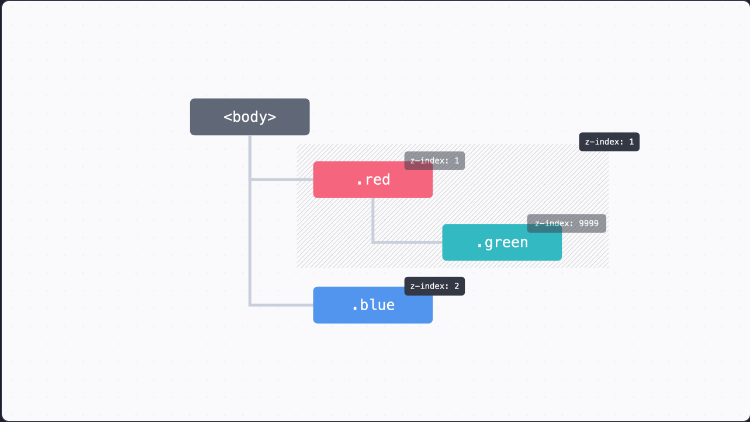
green 값을 9999를 줘도 적용이 되지 않는 이유는 바로 클래스 부모(.red)가 이미 z-index: 1이기 때문에 그 값이 적용되는 것
🧩 FlexBox (flex)
- 1차원으로 요소를 배치
- 가로, 세로
- 기본값 가로
display: flex;📌 flex-direction
- 배치할 방향
display: flex;
flex-direction: row;	 # 가로
flex-direction: column;	 # 세로
📌 정렬
기본 축 (Main Axis): 요소가 배치되는 방향교차 축 (Cross Axis): 기본 축의 수직이 되는 방향
🔥 기본축은 요소를 꽉 채운다.
📌 justify-content
- 기본축 정렬
display: flex;
justify-content: center;
📌 align-items
- 교차축 정렬
display: flex;
align-items: center;
📌 flex-wrap
- 줄 바꿈 하듯이 배치하는 방법
교차축 방향으로 넘어가서 배치됨
display: flex;
flex-wrap: wrap;
📌 gap
- 요소들 사이에 간격
- 세로, 가로 순서
display: flex;
gpa: 30px 50px;		# 세로, 가로
📌 flex-grow
- 요소를 늘려서 빈 공간을 꽉 채우고 싶을 때
- 숫자가 클수록, 더 많이 채움
flex-grow: 1;
flex-grow: 2;
📌 flex-shrink
- 요소를 줄여서 빈 공간을 채우고 싶을 때
- 숫자가 클수록, 더 많이 줄어듬
0으로 설정하면, 원래 너비로 고정
flex-shrink: 1;
flex-shrink: 2;
📌 flex-basis
- 플렉스박스에서 요소의 시작 크기 지정
- 플렉스박스에서 크기를 정하고 싶을 때 사용
- 기본값
auto
🔥 flex-basis 좋은점
flex-grow: 1;
flex-shrink: 0;
width: 300px;
flex-grow: 1;
flex-shrink: 0;
flex-basis: 300px;flex: 1 0 300px;3개 모두 같은 속성이다.
🔥 relative , sticky는 요소의 원래 자리를 차지하기 때문에 flexbox 영향 받음
🔥 absolute, fixed는 원래 자리에서 빠지기 때문에, flexbox 영향 받지 않음
🧩 Gird
📌 그리드 라인 (Grid Line)
- 각 칸을 나누는 줄
📌 그리드 셀 (Grid Cell)
- 요소를 배치할 수 있는 네모난 칸
📌 grid-template-columns
- 그리드 나누기 (가로)
display: grid
grid-template-columns: 100px 200px 100px;
📌 grid-template-rows
- 그리드 나누기 (세로)
display: grid
grid-template-rows: 100px 200px 100px;
🔥 grid-template : 하나로만 사용 가능하다
grid-template-columns: 100px 200px 100px / 100px 200px 100px;📌 유연한 크기
width: 100%;		# width 퍼센트일 때 동작
display: grid;
grid-template:
    1fr 1fr 1fr/
    1fr 1fr 1fr;
width: 100%; # width 퍼센트일 때 동작
display: grid;
grid-template:
1fr 1fr 1fr/
minmax(200px, 200px) minmax(200px, 200px) minmax(200px, 200px)
# 최소 최대 크기
# 이때 최대 크기만 fr단위 사용 가능📌 반복
width: 100%;
display: grid;
grid-template:
    repeat(3, 1fr)/
    repeat(3, minmax(200px, 200px));
repeat(반복횟수, 속성값);
📌 간격 넣기
width: 100%;
display: grid;
grid-template:
    repeat(3, 1fr)/
    repeat(3, minmax(200px, 200px));
gap: 20px 40px;
gap: 세로 가로;
📌 크기 미리 정해두기
- 그리드 템플릿에서 row값을 정해두지 않았을 때,
grid-auto-rows로 정해놓은 크기로 사용
width: 100%;
display: grid;
grid-template-columns: repeat(3, 1fr);
grid-auto-rows: 50px;
gap: 20px 40px;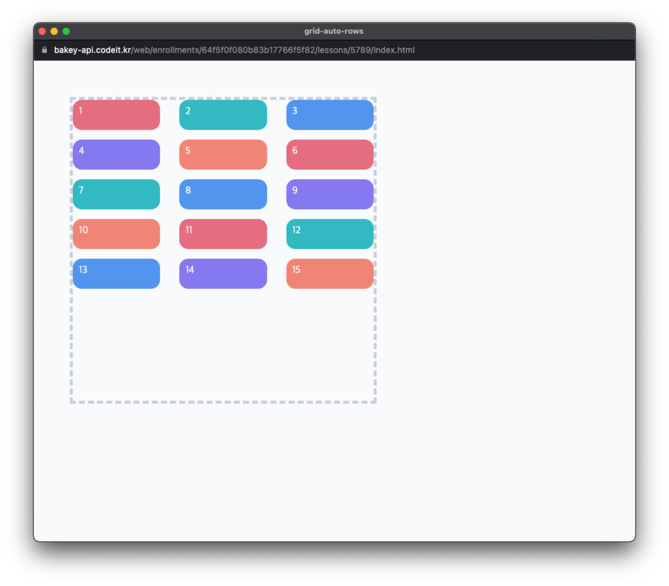
width: 100%;
display: grid;
grid-template-columns: repeat(3, 1fr);
grid-auto-rows: 50px 100px 200px;
gap: 20px 40px;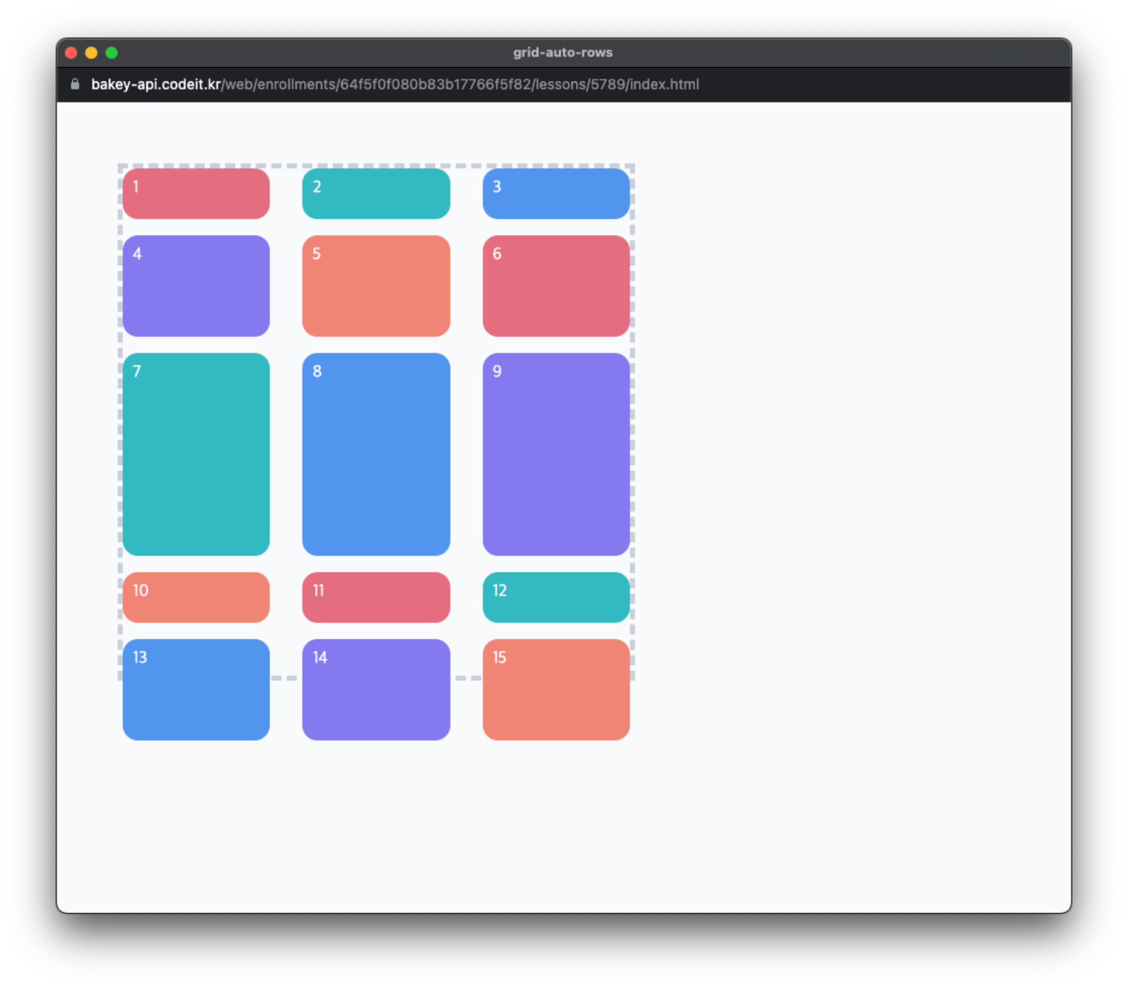
📌 원하는 위치에 요소 배치
grid-row: 3
grid-column: 2
grid-row: 3 / 5 # 3번 row ~ 5번 row
grid-column: 2 / -2 # 2번 column ~ -2번 column숫자 = 인덱스 번호
📌 이름으로 배치하기
grid-area: r;
...
grid-area: b;
...
grid-area: g;
grid-template-areas:
"r g"
"r b"; # 칸을 비우고 싶을땐, . 사용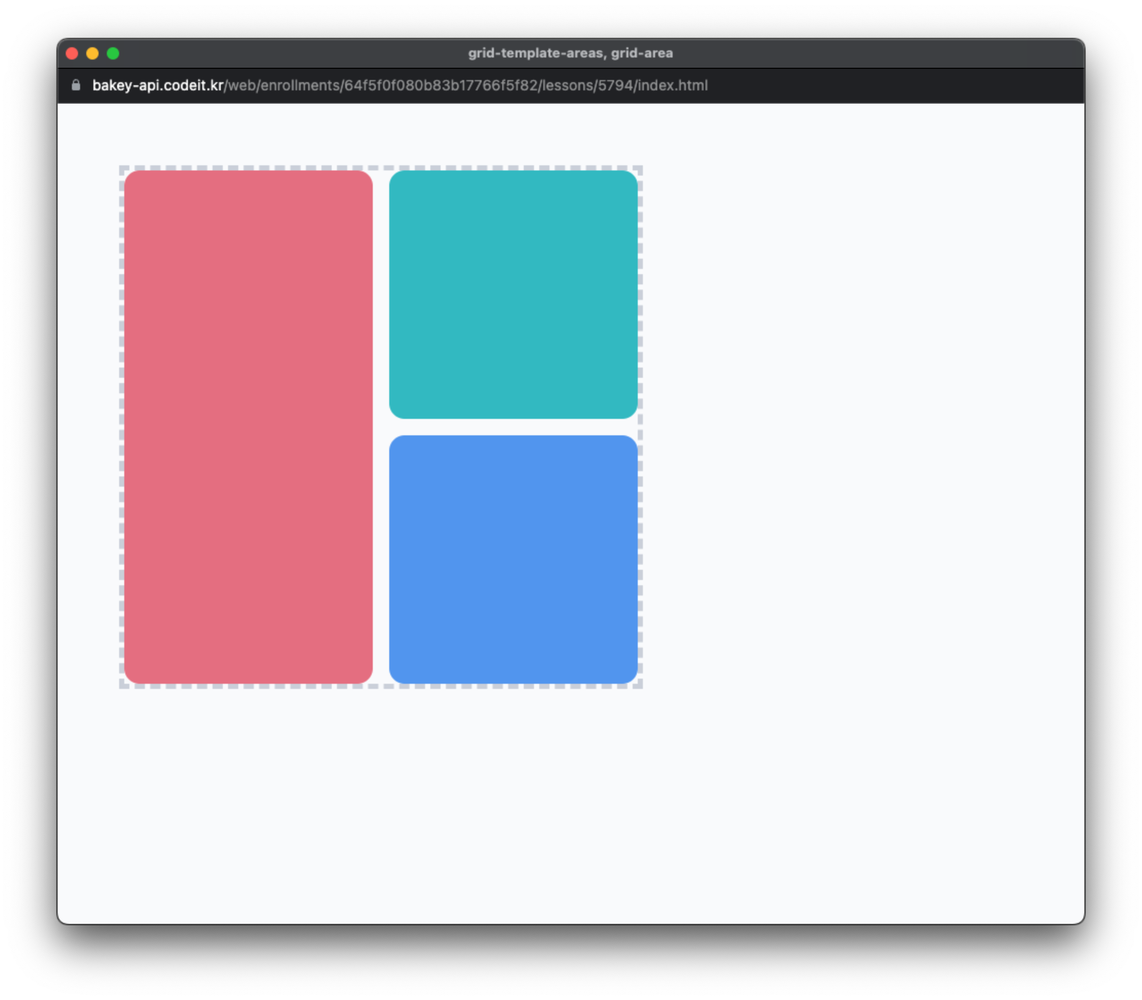
사진 출처 : 코드잇

해보고 싶은거 하기