background-color
- 배경색 지정
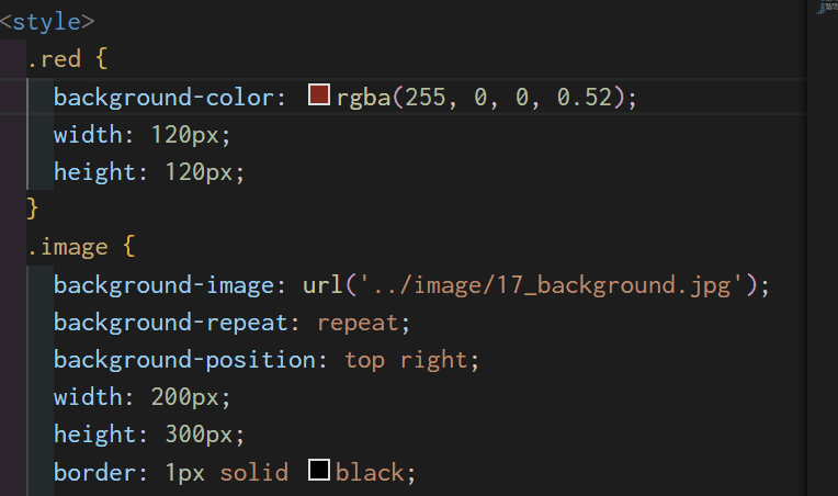
background-image
- 배경에 이미지 삽입
- 다양한 방법으로 이미지를 배경으로 사용할 수 있음
1. scroll
.attachment-scroll {
  background-attachment: scroll;
}
2. fixed
.attachment-fixed {
  background-attachment: fixed;
}
3. local
.attachment-local {
  background-attachment: local;
}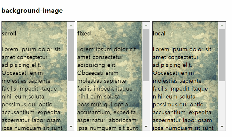
* background-repeat: repeat 빈 공간 없이 이미지 반복
scroll과 fixed는 같아보이지만 블록이 아닌 페이지 자체를 스크롤할 때 차이가 있다.
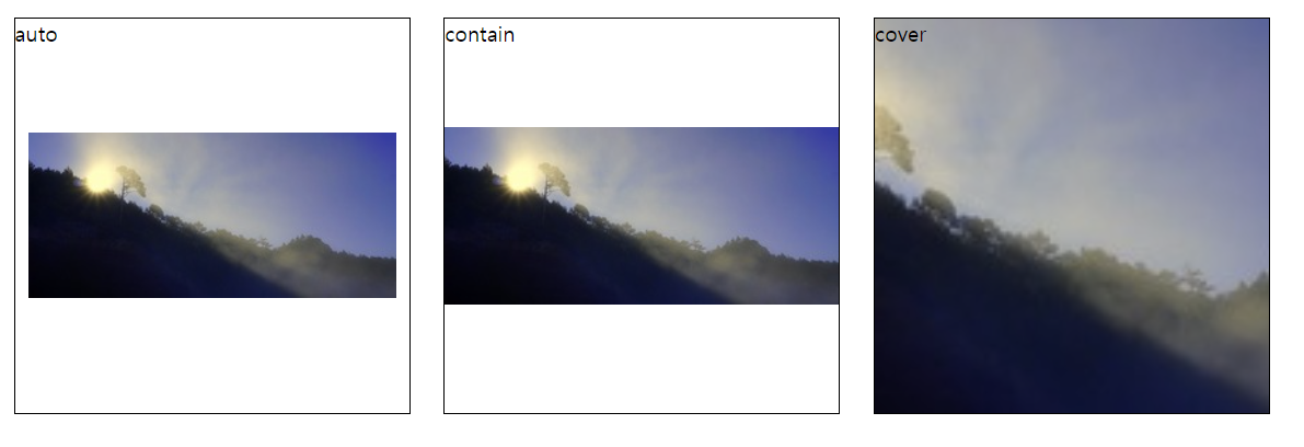
background-size
background-size: auto;원본 크기background-size: contain;잘리지 않는 한도 내에서 크게background-size: cover;빈공간 없이 채우기
밑의 코드에서 속성만 바꿔서 비교해 보기
.background-size {
  background-image: url('../image/17_background0.jpg');
  width: 300px;
  height: 300px;
  background-repeat: no-repeat;
  background-size: auto;
  background-position: center;
  border: 1px solid black;
  display: inline-block;
  margin: 10px;
}
* background-repeat: no-repeat 이미지 반복 X
background-gradient
- 그라데이션 효과를 줌
- 퍼센트 비율로 그라데이션 정도 조절 가능
선형 그라데이션,원형 그라데이션
✔️ linear-gradient
- 선형으로 그라데이션 표시
to방향deg각도- 각도랑 방향을 같이 설정하지는 못함
방향 설정
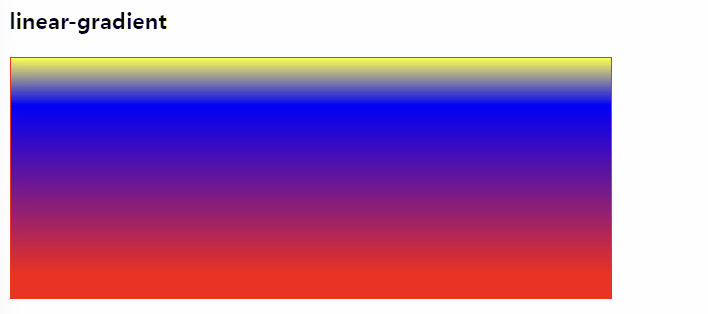
to top.linear-gradient { background: linear-gradient(to top, red 10%, blue 80%, yellow 100%); }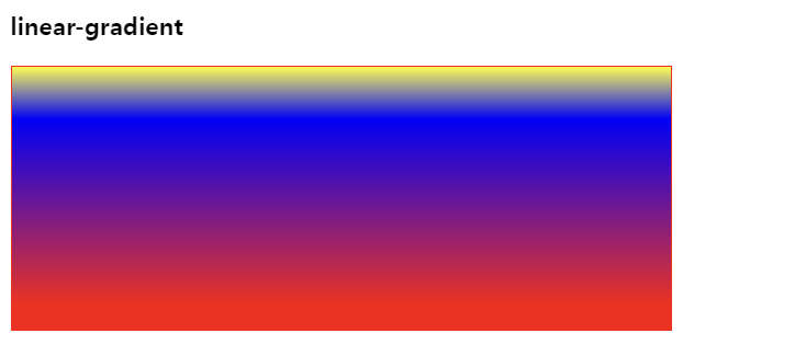
💡 색상 비율(%)의 의미?
이미지를 보면 알겠지만 각 색상이 나타나는 위치를 전체 그라데이션의 %로 표현한다.
예를 들어 이미지를 봤을 때 10%인 빨간색은 전체 중 10% 지점에서 빨간색(그라데이션할 색상이 없어서 10%까지 빨간색으로 설정된다)
80%인 파란색은 전체의 80% 지점에서 나타난다. 시작점을 %로 나타내고 그 색상들의 사이를 그라데이션으로 표현. ! !
-
각도 조절 45deg
.linear-gradient {
  background: linear-gradient(45deg, red 10%, blue 80%, yellow 100%);
}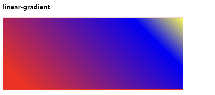
degree 각도의 의미로 45deg는 45도
-
10deg씩90deg까지 조정한 모습
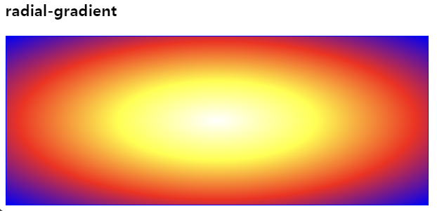
✔️ radial-gradient
- 원형 그라데이션
- 그라데이션을 표현하고 싶은 원의 위치를 %로 조절 가능
.radial-gradient {
  background: radial-gradient(
    white,
    yellow,
    red,
    blue
  );
}
원의 위치를 조정하고 싶으면 선형 그라데이션에서 한 것처럼 %를 부여하면 된다.
.radial-gradient {
  background: radial-gradient(
    circle at 10% 50%,
    white,
    yellow,
    red,
    blue
  );
}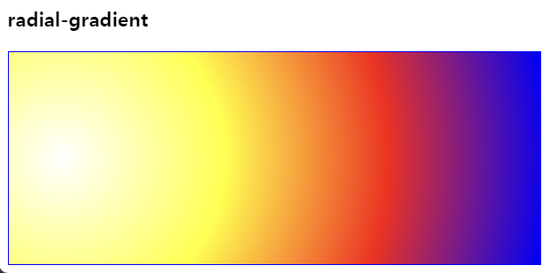
circle at 10% 50%
원 모양 가로 10% 위치와 세로 50% 위치로 설정된다.
흰색과 파란색이 시작과 끝이라고 생각하면 간단하다.