전편에 이어서 UI를 따라 만들어보자
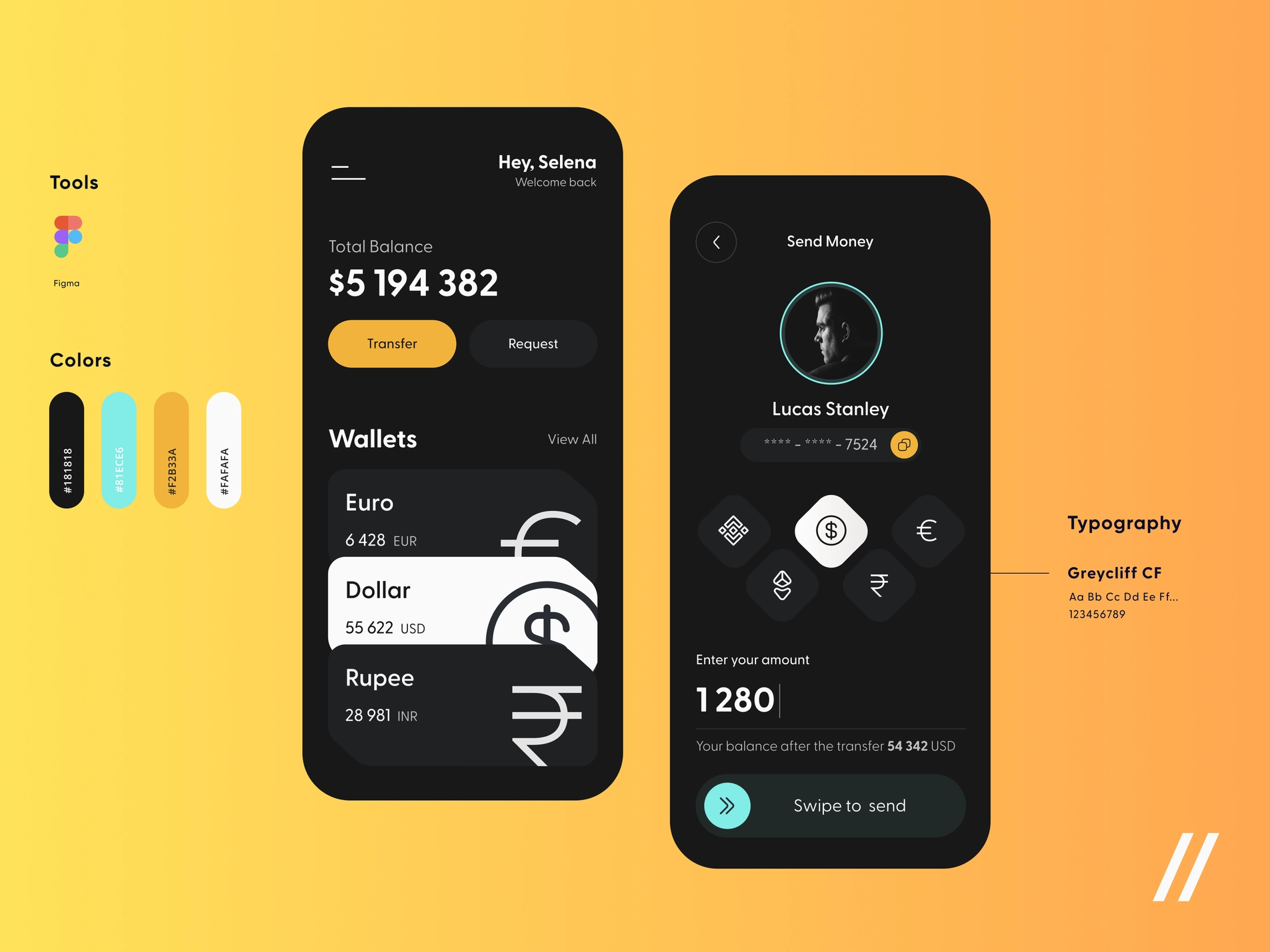
아래 Wallets에 있는 지갑들을 따라 만들 것이다.
간단하게 코드 작성하고 설명하고 넘어가겠다.
원 코드
class App extends StatelessWidget {
const App({super.key});
Widget build(BuildContext context) {
return MaterialApp(
home: Scaffold(
backgroundColor: const Color(0xFF181818),
body: Padding(
padding: const EdgeInsets.symmetric(
horizontal: 20,
),
child: Column(
crossAxisAlignment: CrossAxisAlignment.start,
children: [
const SizedBox(
height: 80,
),
Row(
mainAxisAlignment: MainAxisAlignment.end,
children: [
Column(
crossAxisAlignment: CrossAxisAlignment.end,
children: [
const Text(
"Hey, Rhino",
style: TextStyle(
color: Colors.white,
fontSize: 28,
fontWeight: FontWeight.w800,
),
),
Text(
"Welcome back",
style: TextStyle(
color: Colors.white.withOpacity(0.7),
fontSize: 18,
),
),
],
)
],
),
const SizedBox(
height: 120,
),
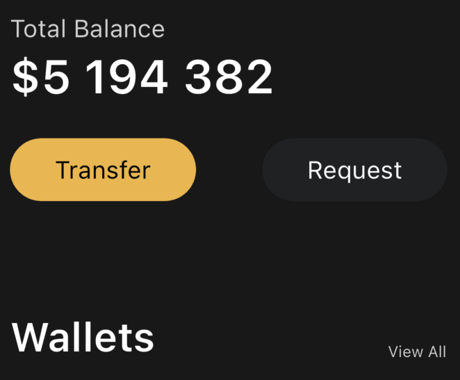
Text(
'Total Balance',
style: TextStyle(
fontSize: 22,
color: Colors.white.withOpacity(0.8),
),
),
const SizedBox(
height: 5,
),
const Text(
'\$5 194 382',
style: TextStyle(
fontSize: 42,
fontWeight: FontWeight.w600,
color: Colors.white,
),
),
const SizedBox(
height: 30,
),
const Row(
mainAxisAlignment: MainAxisAlignment.spaceBetween,
children: [
Button(
text: 'Transfer',
textColor: Colors.black,
bgColor: Color(0xFFF1B33B),
),
Button(
text: 'Request',
textColor: Colors.white,
bgColor: Color(0xFF1F2123)),
],
)
],
),
),
),
);
}
}
Wallets 제목 만들기
const SizedBox(height: 100),
Row(
  mainAxisAlignment: MainAxisAlignment.spaceBetween,
  crossAxisAlignment: CrossAxisAlignment.end,
  children: [
    const Text(
      'Wallets',
      style: TextStyle(
        color: Colors.white,
        fontSize: 36,
        fontWeight: FontWeight.w600,
      ),
    ),
    Text(
      'View All',
      style: TextStyle(
        color: Colors.white.withOpacity(0.8),
      ),
    ),
  ],
),
const SizedBox(height: 20),SizedBox제작Wallets와View All스타일Row로 횡 순으로 만든 다음 컬러 및 사이즈, 웨이트 설정TextStyle의Colors에withOpacity메소드가 있는데const를 부모에 썼다면 에러가 나올 것. 왜냐하면 Opacity 자체가 컴파일할 때 알기 힘든 값이라 상수로 받아들이기 힘들어서 Opacity에const를 적용 못한다. 그래서 부모 위젯 중에const를 삭제하고 다시 저장하면 된다!
mainAxisAlignment및crossAxisAlignment로 배치spaceBetween으로 멀리 떨어져 있으며,end를 사용해 열 방향으로 아래에 위치하도록 설정
짠!
Cards 상자 만들기
가장 먼저 하나의 구역과 Padding이 있는, 여러 개의 Box가 보이고 특이한 border를 가지고 있다. 저 오른쪽 위 border는 만드는데 시간이 걸리기에 나중에 한다.
진행 방향은 하나의 박스에 Row로 화폐 이름과 마크가 있고 화폐 이름과 함께 Column으로 잔고 금액이 있다. 잔고 금액도 또 Row로 액수, 단위가 있다.
...
const SizedBox(height: 20),
Container(
  decoration: BoxDecoration(
    color: const Color(0xFF1F2123),
    borderRadius: BorderRadius.circular(25),
  ),
  child: Padding(
    padding: const EdgeInsets.all(30),
    child: Row(
      children: [
        Column(
          crossAxisAlignment: CrossAxisAlignment.start,
          children: [
            const Text(
              "Euro",
              style: TextStyle(
                color: Colors.white,
                fontSize: 32,
                fontWeight: FontWeight.w600,
              ),
            ),
            const SizedBox(height: 10),
            Row(
              children: [
                const Text(
                  "6 428",
                  style: TextStyle(
                    color: Colors.white,
                    fontSize: 20,
                  ),
                ),
                const SizedBox(width: 5),
                Text(
                  "EUR",
                  style: TextStyle(
                    color: Colors.white.withOpacity(0.8),
                    fontSize: 20,
                  ),
                ),
              ],
            )
          ],
        ),
      ],
    ),
  ),
),
...Container로 하나의 구역 선언 및 스타일- 배경색
1F2123로 지정 borderRadius로 깎기
- 배경색
Padding30만큼 넣기, 자식으로 Text, Icon 넣을Row선언Column선언 후 Text 내용 채우고 스타일 만지기- 카드의 화폐 제목
- 잔액 작성
Row- 잔고 금액
- 화폐 단위
- Text 정렬 모두 왼쪽으로 만들기 위해
Column에crossAxisAlignment.start추가
거의 노다가 식이기에 간단하게 설명만 붙히고 끝내겠다.
Card에 쓸 Icon 적용하기
이제 바로 위 코드에 내가 적었던 2. 자식으로 Text, Icon 넣을 Row 선언 항목에서의 Row에 Icon을 넣을 것이다.
플러터에서 Icon은 위젯을 사용해서 넣어야한다. 플러터는 아이콘 자체를 내장해있기 때문에 내장된 아이콘이 있으면 플러터 아이콘을 넣으면 된다! 이게 미친 기능이다.
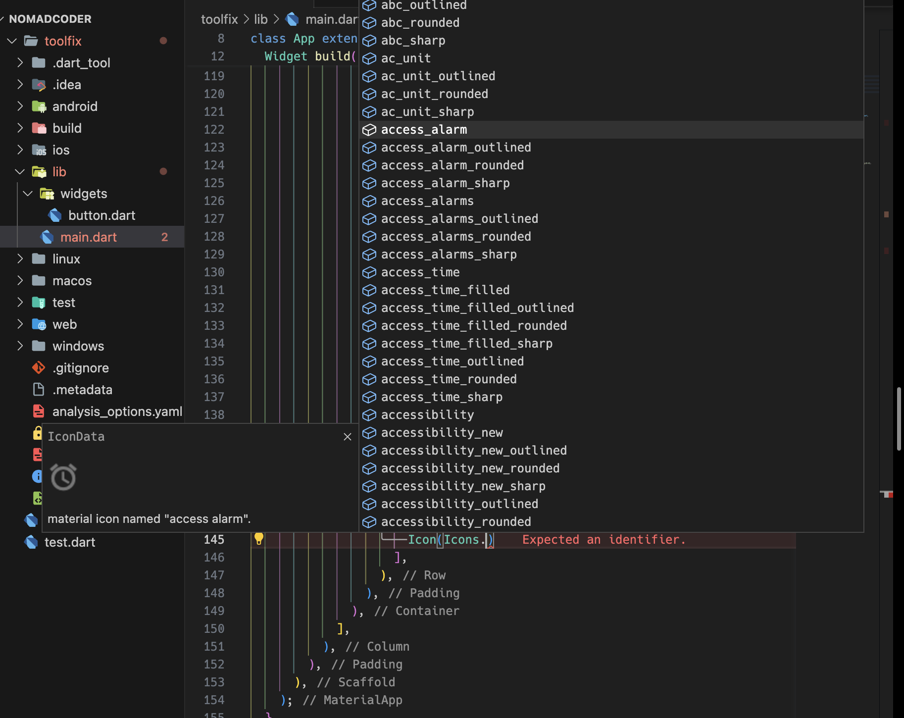
이렇게 많은 아이콘들이 있고, 어떤 아이콘인지 보인다. 엄청 많아;; 따로 필요한 게 있다면 다운로드하면 된다!
당연히 화폐 단위도 있다. 또한 컬러, 사이즈 등도 변경 가능하다.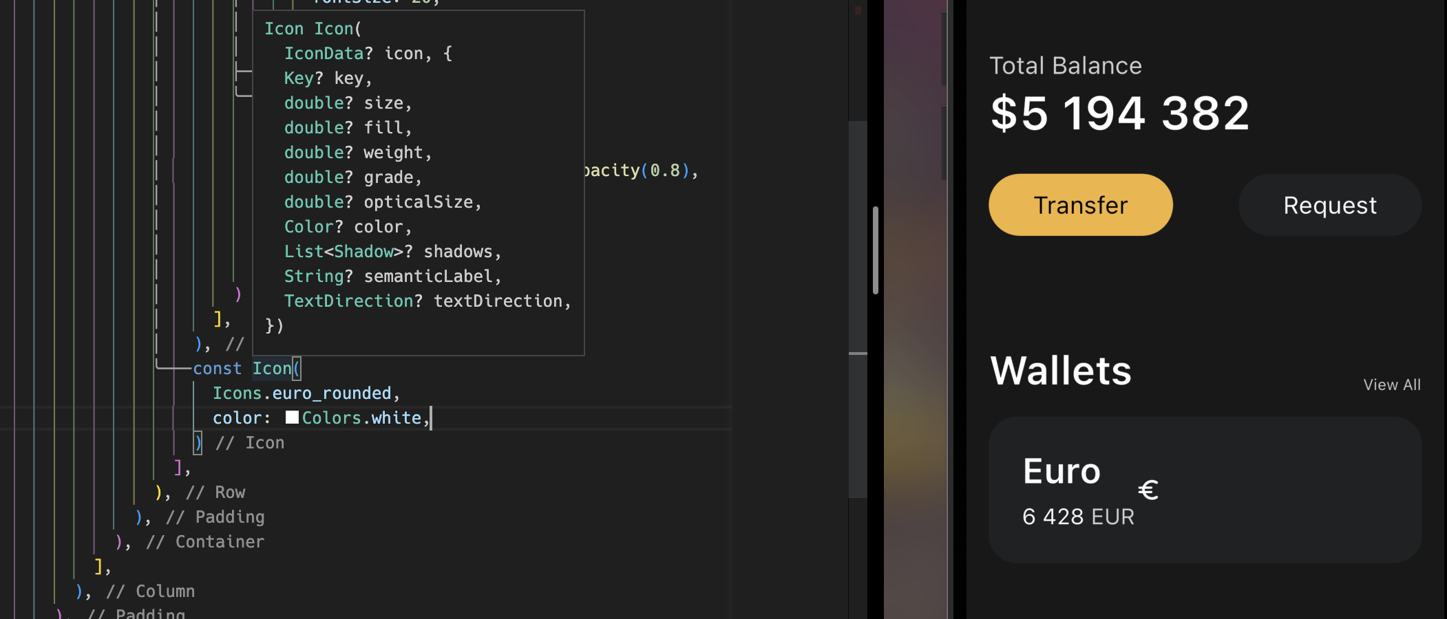
너무 좋아!
const Icon(
  Icons.euro_rounded,
  color: Colors.white,
  size: 98,
)
이렇게 입력하고 Text와 Icon이 한 줄에 있는 Row 위젯에 spaceBetween을 넣어준다면? 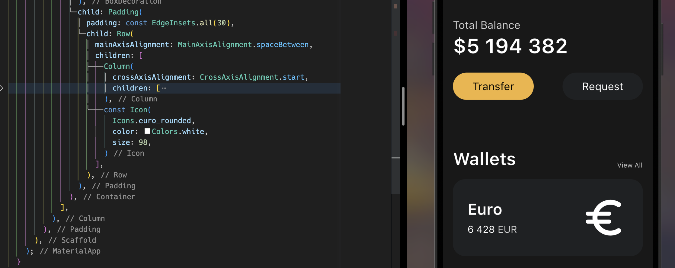
이렇게 된다.
하지만 내가 원하는 건 저런 식이 아니라 엄청 크고, Overflow돼서 살짝 잘리는 식으로 된다. 위의 사진을 보면 차이점을 알 수 있을 것이다. 그럴 땐 TransformationWidget을 사용해 설정해주면 된다.
TransformationWidget
아이콘 등등의 위젯들을 주변 요소에 영향을 받지 않고, Transform 해주어 배치, 스타일을 적용할 수 있다.
Transform이라는 위젯을 사용하여 메소드를 사용하면 된다.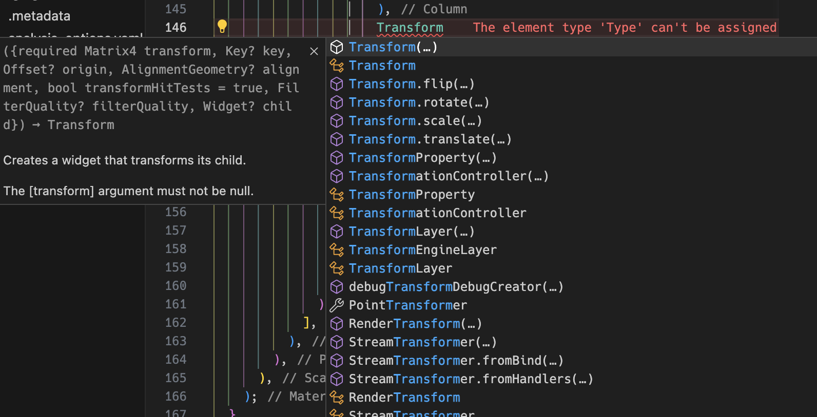
예시를 보여주겠다.
Transform.scale(
  scale: 2.2,
  child: Transform.translate(
    offset: const Offset(8, 15),
    child: const Icon(
      Icons.euro_symbol,
      color: Colors.white,
      size: 88,
    ),
  ),
)
이런 식으로 Transform 위젯을 불러와 크기를 건드리는 scale로 2.2배를 키웠고, translate와 Offset으로 배치를 옮겼다.
이렇게 하면 부모인 Conatiner에게 영향을 주지 않고도 아이콘의 스타일을 적용시킬 수 있다.

짠! 사진을 보면 유로 아이콘이 밖에 나와있어도 아이콘을 포함한 Conatiner 위젯으로 만든 카드에 크기 등의 영향이 가지 않는다. 되게 쉽고 직관적이다;;
플러터의 overFlow: hidden;
여기에 overflow한 것을 숨기려면 어떻게 해야할까?
정말 쉽다. Container나 다른 위젯에 clipBehavior: Clip.hardEdge,만 입력하면 끝이다.
원래 기본값은 Clip.none이라 흘러넘치도록 나두는 상태인데, hardEdge를 설정해 모서리보다 넘치는 것은 짜르는 상태로 설정하는 것이다.

짠! 입력하니 잘 된다! 간단하고 쉽다!
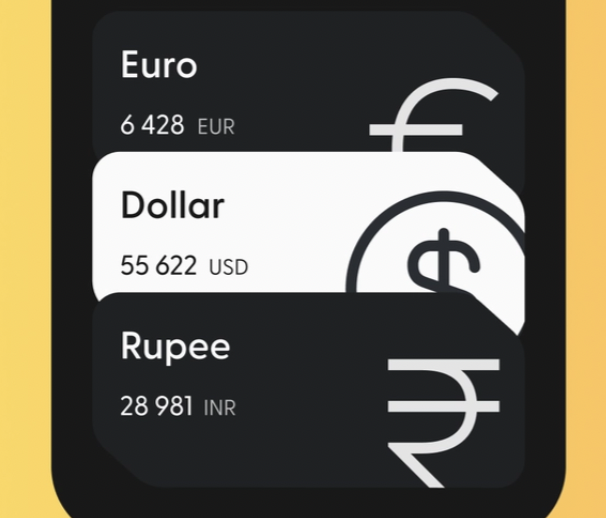
Wallet Cards 가족 만들기
위 사진을 보면 카드가 3개 이상, 여러개가 쓰이기 때문에 재사용가능하게 커스텀 위젯을 만들어야한다. 짝수개는 색상 반전이 돼있다. 그리고 위에서 아래로 겹치도록 배치해 볼 것이다.
재사용하게 만들기
저번에 버튼 만든 것 처럼 /lib/widgets/currency_card.dart 파일을 만들고 위젯을 커스텀해보자.
저번에 했던 것처럼 Code Actions를 통해 Container 전부를 들어내어 추출하고, 이름은 CurrencyCard로 하겠다.
추출하면 아래와 같다.
// currency_card.dart
import 'package:flutter/material.dart';
class CurrencyCard extends StatelessWidget {
const CurrencyCard({super.key});
Widget build(BuildContext context) {
return Container(
clipBehavior: Clip.hardEdge,
decoration: BoxDecoration(
color: const Color(0xFF1F2123),
borderRadius: BorderRadius.circular(25),
),
child: Padding(
padding: const EdgeInsets.all(30),
child: Row(
mainAxisAlignment: MainAxisAlignment.spaceBetween,
children: [
Column(
crossAxisAlignment: CrossAxisAlignment.start,
children: [
const Text(
"Euro",
style: TextStyle(
color: Colors.white,
fontSize: 32,
fontWeight: FontWeight.w600,
),
),
const SizedBox(height: 10),
Row(
children: [
const Text(
"6 428",
style: TextStyle(
color: Colors.white,
fontSize: 20,
),
),
const SizedBox(width: 5),
Text(
"EUR",
style: TextStyle(
color: Colors.white.withOpacity(0.8),
fontSize: 20,
),
),
],
)
],
),
Transform.scale(
scale: 2.2,
child: Transform.translate(
offset: const Offset(-5, 12),
child: const Icon(
Icons.euro_symbol,
color: Colors.white,
size: 88,
),
),
)
],
),
),
);
}
}이제 커스터마이징 해야할 것을 생각하고, 속성과 Constructor를 만들고 변경할 데이터인 곳에 넣자.
커스터마이징 해볼 수 있는 건 통화 이름, 통화 코드, 통화량, 통화 아이콘이다.
아이콘을 제외한 속성들은 String인 걸 알지만 통화 아이콘은 어떤 데이터를 받는 것일까? 이것은 마우스 오버해보면 안다. 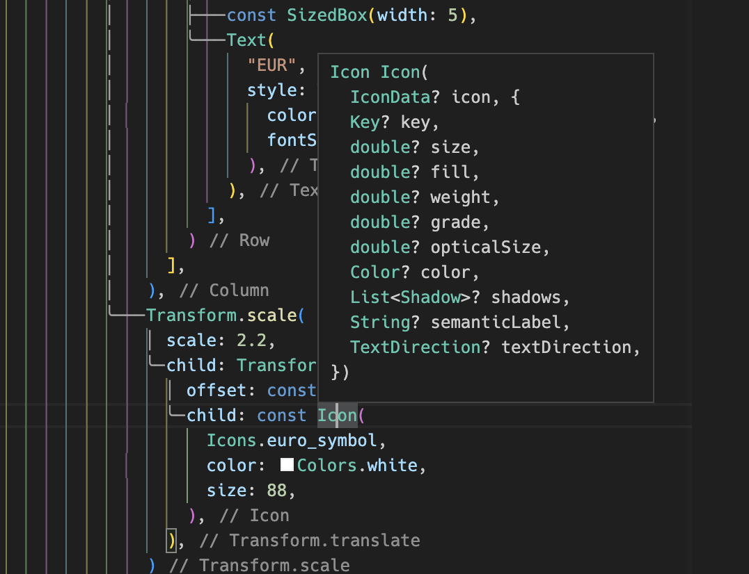
바로 IconData를 받는다고 나와있으니 타입도 IconData를 넣어주면 된다.
class CurrencyCard extends StatelessWidget {
final String name, code, amount;
final IconData icon;
const CurrencyCard(
{super.key,
required this.name,
required this.code,
required this.amount,
required this.icon});
Widget build(BuildContext context) {
...속성들과 타입 선언 해주고, Code Actions를 통해서 Named Constructor를 넣어주면 끝이다!
그리고 변수를 넣어줄 곳에 넣어주면 된다.
Widget build(BuildContext context) {
return Container(
clipBehavior: Clip.hardEdge,
decoration: BoxDecoration(
color: const Color(0xFF1F2123),
borderRadius: BorderRadius.circular(25),
),
child: Padding(
padding: const EdgeInsets.all(30),
child: Row(
mainAxisAlignment: MainAxisAlignment.spaceBetween,
children: [
Column(
crossAxisAlignment: CrossAxisAlignment.start,
children: [
Text(
// 여기!!
name,
style: const TextStyle(
color: Colors.white,
fontSize: 32,
fontWeight: FontWeight.w600,
),
),
const SizedBox(height: 10),
Row(
children: [
Text(
// 여기!!
amount,
style: const TextStyle(
color: Colors.white,
fontSize: 20,
),
),
const SizedBox(width: 5),
Text(
// 여기!!
code,
style: TextStyle(
color: Colors.white.withOpacity(0.8),
fontSize: 20,
),
),
],
)
],
),
Transform.scale(
scale: 2.2,
child: Transform.translate(
offset: const Offset(-5, 12),
child: Icon(
// 여기!!
icon,
color: Colors.white,
size: 88,
),
),
)
],
),
),
);
}그리고 main으로 가서 커스텀한 위젯을 써주자.
...
const CurrencyCard(
  name: "Euro",
  code: "EUR",
  amount: "6 428",
  icon: Icons.euro_symbol,
),
const CurrencyCard(
  name: 'Bitcoin',
  code: "BTC",
  amount: "9 785",
  icon: Icons.currency_bitcoin,
)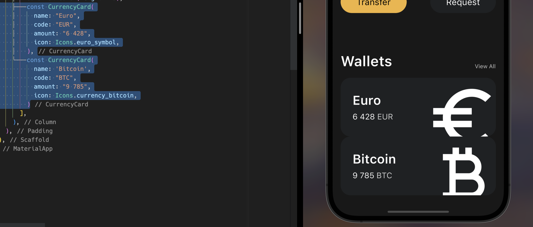
짠 됐다! 잘 적용되는 모습이다.
Invert 하기
다시 사진을 보면 2번째 꺼는 색이 반전이 돼있다. 저걸 설정해보자
- Card 커스텀 위젯에 속성을 추가한 뒤 :
isInverted
class CurrencyCard extends StatelessWidget {
  final String name, code, amount;
  final IconData icon;
  final bool isInverted;

  const CurrencyCard({
    super.key,
    required this.name,
    required this.code,
    required this.amount,
    required this.icon,
    required this.isInverted,
});- 조건을 달아주자. TS랑 비슷하게 삼항연산자로 하면 된다.
Widget build(BuildContext context) {
return Container(
clipBehavior: Clip.hardEdge,
decoration: BoxDecoration(
// 여기!!
color: isInverted ? Colors.white : const Color(0xFF1F2123),
borderRadius: BorderRadius.circular(25),
),
child: Padding(
padding: const EdgeInsets.all(30),
child: Row(
mainAxisAlignment: MainAxisAlignment.spaceBetween,
children: [
Column(
crossAxisAlignment: CrossAxisAlignment.start,
children: [
Text(
name,
style: TextStyle(
// 여기!!
color: isInverted ? const Color(0xFF1F2123) : Colors.white,
fontSize: 32,
fontWeight: FontWeight.w600,
),
),
const SizedBox(height: 10),
Row(
children: [
Text(
amount,
style: TextStyle(
color:
// 여기!!
isInverted ? const Color(0xFF1F2123) : Colors.white,
fontSize: 20,
),
),
const SizedBox(width: 5),
Text(
code,
style: TextStyle(
// 여기!!
color: isInverted
? const Color(0xFF1F2123)
: Colors.white.withOpacity(0.8),
fontSize: 20,
),
),
],
)
],
),
Transform.scale(
scale: 2.2,
child: Transform.translate(
offset: const Offset(-5, 12),
child: Icon(
icon,
// 여기!!
color: isInverted ? const Color(0xFF1F2123) : Colors.white,
size: 88,
),
),
)
],
),
),
);
}완전 노가다다;;
3. 노가다를 끝내고 이제 main의 위젯에 속성을 추가하자.
const CurrencyCard(
  name: "Euro",
  code: "EUR",
  amount: "6 428",
  icon: Icons.euro_symbol,
  isInverted: false,
),
const CurrencyCard(
  name: 'Bitcoin',
  code: "BTC",
  amount: "9 785",
  icon: Icons.currency_bitcoin,
  isInverted: true,
)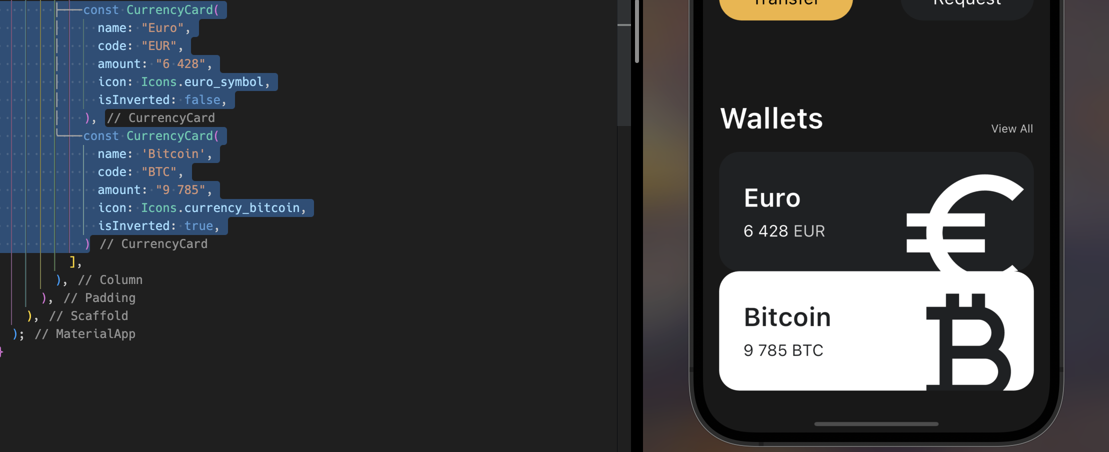
끝! 완성!
리팩토링을 한다면?
여기서 const Color(0xFF1F2123)가 하드코딩이 돼있는데 final _blackColor = const Color(0xFF1F2123);으로 만들어서 _blackColor로 변환해서 변수로 사용하면 좋다!
class CurrencyCard extends StatelessWidget {
  final String name, code, amount;
  final IconData icon;
  final bool isInverted;

  final _blackColor = const Color(0xFF1F2123);

...언더바_가 붙어있는 이유는 CurrencyCard에서만 쓰이는 private 속성이기 때문에 붙여준다.
Column의 Cards Overflow
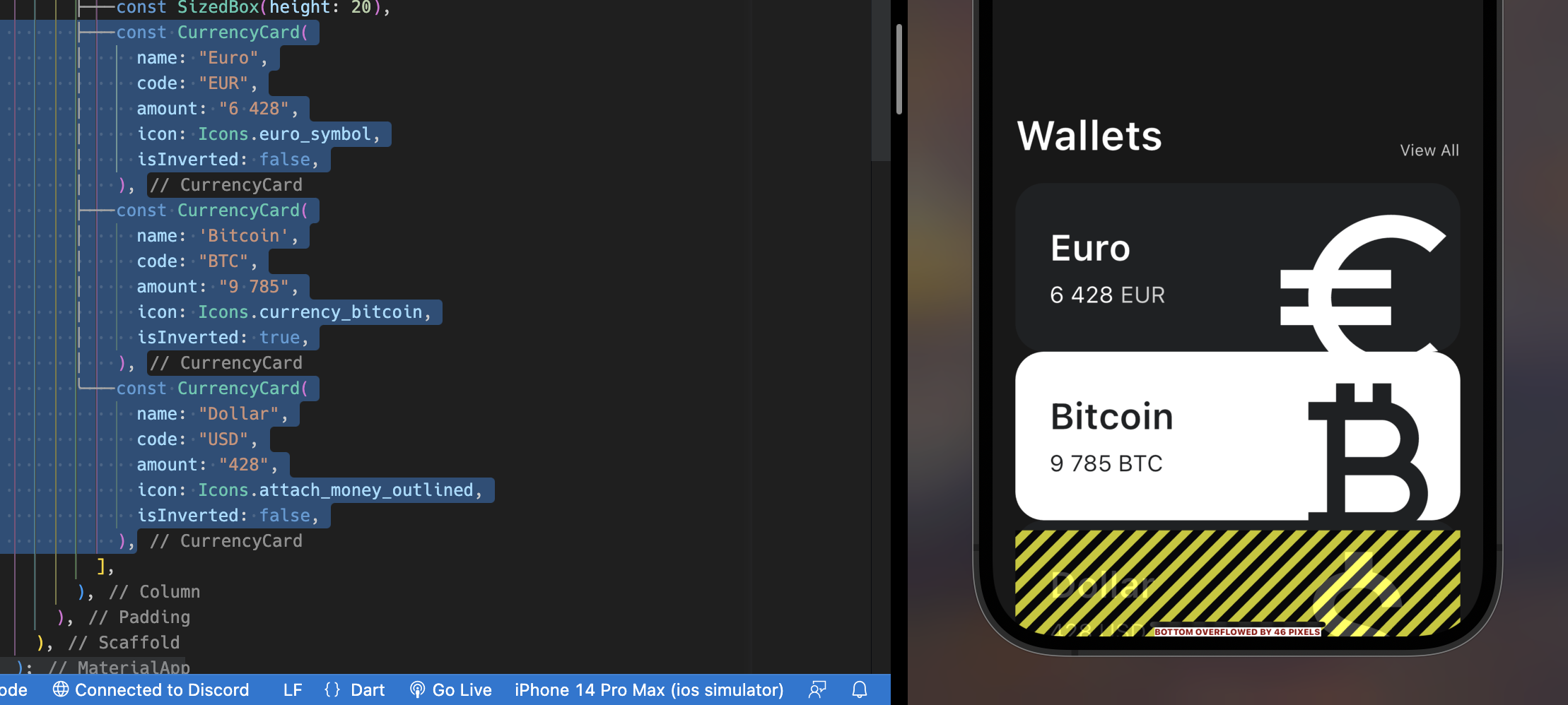
카드 3개를 만들고 보니 플러터가 화면 아래에 overflow되고 있다는 사실을 알려준다. 잘 안보이지만 저기에 46 픽셀이나 overflow 됐다고 알려주고 있다. 플러터의 엄청난 DX..
SingleChildScrollView
여기서 스크롤이 되게 만들어서 저 오류를 없앨 수 있다.
Scaffold의 body 속성에 SingleChildScrollView를 넣는다면 스크롤이 돼 오류가 없어진다.
하지만 이건 내가 원하는 바가 아니다. 그래서 겹치기를 통해 스크롤이 없으면서 한눈에 볼 수 있게 만들 것이다.
Cards 겹치기
여기서 퀴즈! 서로의 위젯에게 영향을 주지 않으면서 배치, 스타일을 적용할 수 있는 위젯은?!?!
두구두구
두구두구
두구두구
두구두구
두구두구
바로 우리가 방금 봤던 Transform을 이용하면 된다! 거기 중에 위치를 옮기는 translate를 이용해서 옮기면 된다.
const CurrencyCard(
  name: "Euro",
  code: "EUR",
  amount: "6 428",
  icon: Icons.euro_symbol,
  isInverted: false,
),
Transform.translate(
  offset: const Offset(0, -20),
  child: const CurrencyCard(
    name: 'Bitcoin',
    code: "BTC",
    amount: "9 785",
    icon: Icons.currency_bitcoin,
    isInverted: true,
  ),
),
Transform.translate(
  offset: const Offset(0, -40),
  child: const CurrencyCard(
    name: "Dollar",
    code: "USD",
    amount: "428",
    icon: Icons.attach_money_outlined,
    isInverted: false,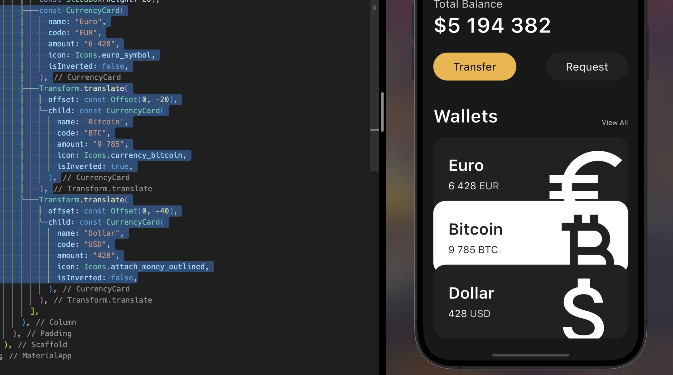
됐다!
결과
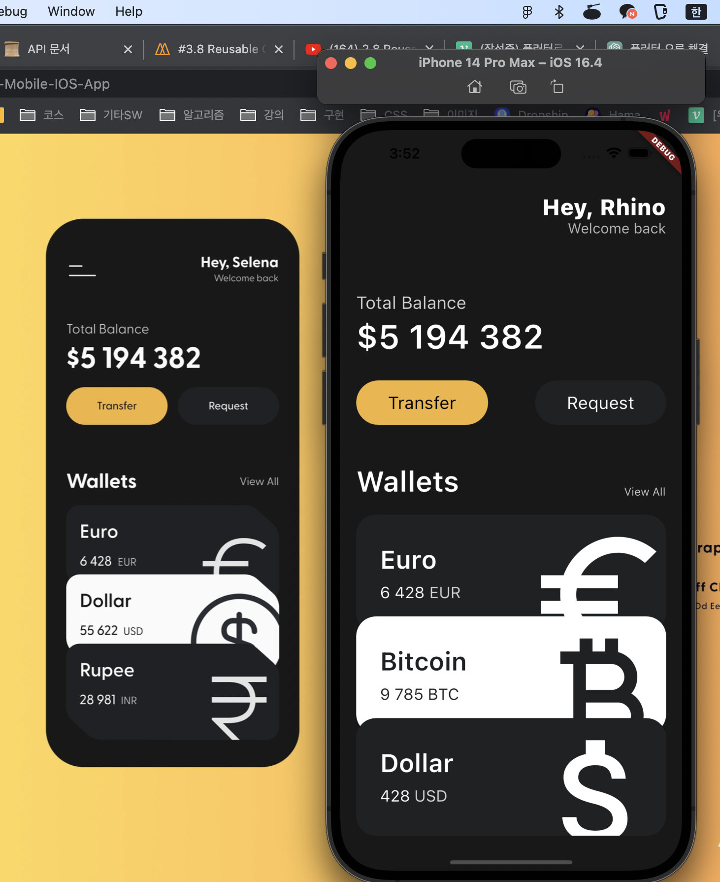
얼추 비슷하게 클론되지 않았는가? 이제 다음편은 인터랙티브한 UI, Stateful한 UI를 만들어 볼 것이다! 빠이!

7개의 댓글


오 저도 저 강의 들었어요 ! 반갑네요 ㅎㅎㅎ
저는 추가로 저 UI에 플러스 버튼 눌러서 total balance 값이 올라가도록 stateful로 바꿔 구현해보았는데 그것도 많은 도움이 되더라구요 !
같이 플러터 화이팅해요 ~!! 스터디도 잘 부탁드립니당 :)


오버플로우 히든으로 캐러셀 구현하는 예제 많던데 이렇게도 활용 가능하군요 ! 고생하셨습니당