[1] translate
: 요소의 위치를 수평 또는 수직 방향으로 변경하거나, 수평 및 수직 방향으로 변경한다. (지차원 벡터의 특징에 따라 이동시킨다.)
1) 포맷
translate : x좌표, y좌표
2) 예시
<화면>
<코드>
<!DOCTYPE html>
<html>
<head>
<style>
div {
height: 90px;
width: 40px;
background-color: red;
translate: 100px 20px;
}
</style>
</head>
<body>
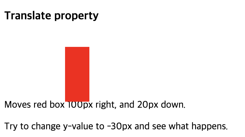
<h3>Translate property</h3>
<div></div>
<p>Moves red box 100px right, and 20px down.</p>
<p>Try to change y-value to -30px and see what happens.</p>
</body>
</html>[2] transform
: 요소에 회전, 크기 조절, 기울이기, 이동 효과 등을 부여할 때 사용한다.
1) transform-origin
: transform와 함께 사용하는 속성으로, 요소의 transform을 위한 기준점을 정하기 위해 사용된다. (기본값은 center)
2) 예시
<화면>
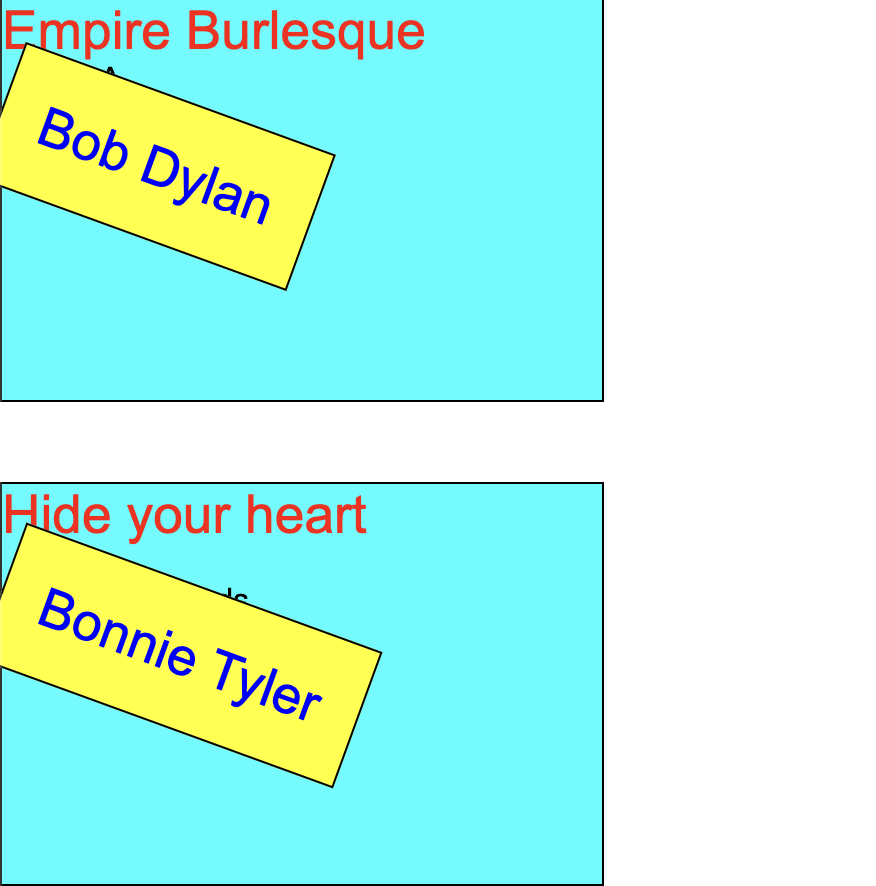
<코드>
artist {
    padding: 20px;
    position: absolute;
    border: 1px solid black;
    background-color: yellow;
    -ms-transform: rotate(15deg); /* IE 9 */
    -ms-transform-origin: 20% 40%; /* IE 9 */
    -webkit-transform: rotate(15deg); /* Safari 3-8 */
    -webkit-transform-origin: 20% 40%; /* Safari 3-8 */
    transform: rotate(20deg);
    transform-origin: 20% 40%;

}
[3] animation
: 요소에 적용되는 CSS 스타일을 다른 CSS 스타일로 부드럽게 전환시켜준다.
1) 포맷
animation {keyframes name} 시간 애니메이션 재생 횟수
2) animation의 속성 종류
- animation--name : @keyframes에서 설정한 애니메이션의 이름
nimation-name: name;

/* 키프레임 이름 = 애니메이션 이름 */
@keyframes name {
  /* from(0%), to(100%) 또는 %로 작성 */
  from {
    width: 100px;
  }
  to {
    width: 300px;
  }
  25%, 75% {
    background-color: red;
  }
}

/* 유효하지 않은 애니메이션 이름 */
animation-name: 1name; // 숫자로 시작하는 이름
animation-name: @name; // 특수 문자로 시작하는 이름- animation - duration : 실행 시간
animation-duration: time | initial | inherit;

/* 초 단위(s), 밀리 초 단위(ms)단위로 적용 가능 */
animation-duration: .5s, 500ms; - animation-timing-function : 가속, 감속 설정
animation-timing-function: linear | ease | ease-in | ease-out | ease-in-out | step-start | step-end | steps(int,start|end) | cubic-bezier(n,n,n,n) | initial | inherit;- animation-delay : 실행 지연 시간
animation-delay: time;

/* 초 단위(s), 밀리 초 단위(ms)단위로 적용 가능 */
animation-delay: .5s, 500ms;- animation-iteration-count : 애니메이션 재생 횟수
animation-iteration-count: number | infinite | initial | inherit;

/* 5회, 무한 반복 */
animation-iteration-count: 5, infinite;- animation-direction : 애니메이션 재생 방향
animation-direction: normal | reverse | alternate | alternate-reverse | initial | inherit;- animation-fill-mode : 애니메잇녀 종료 후 상태
animation-fill-mode: none | forwards | backwards | both | initial | inherit;- animation-play-state : 애니메이션 재생 / 성지
animation-play-state: paused | running | initial | inherit;- animation
nimation: name duration timing-function delay iteration-count direction fill-mode play-state;3) keyframes
: 애니메이션의 시작, 중간, 끝 상태를 정의할 수 있다.
@keyframes 애니메이션이름 {
	from {
     시작 스타일
    }
    to {
     끝 스타일
    }
[4] text-shadow
: 텍스트에 그림자 효과를 줄 수 있다.
1) 포맷
text-shadow : offset-x, offset-y, blur-radius, color
1. offset-x, offset-y (필수) : 그림자의 위치를 지정한다.
- offset-x : 양수이면 글자의 오른쪽에, 음수이면 글자의 왼쪽에 그림자가 나타난다.
- offset-y : 양수이면 글자의 아래쪽에, 음수이면 글자의 위쪽에 그림자가 나타난다.
- blur-radius : 숫자가 커질수록, 그림자가 흐릿해진다.
- color : 그림자의 색깔을 지정한다.
2) 예시
<화면>
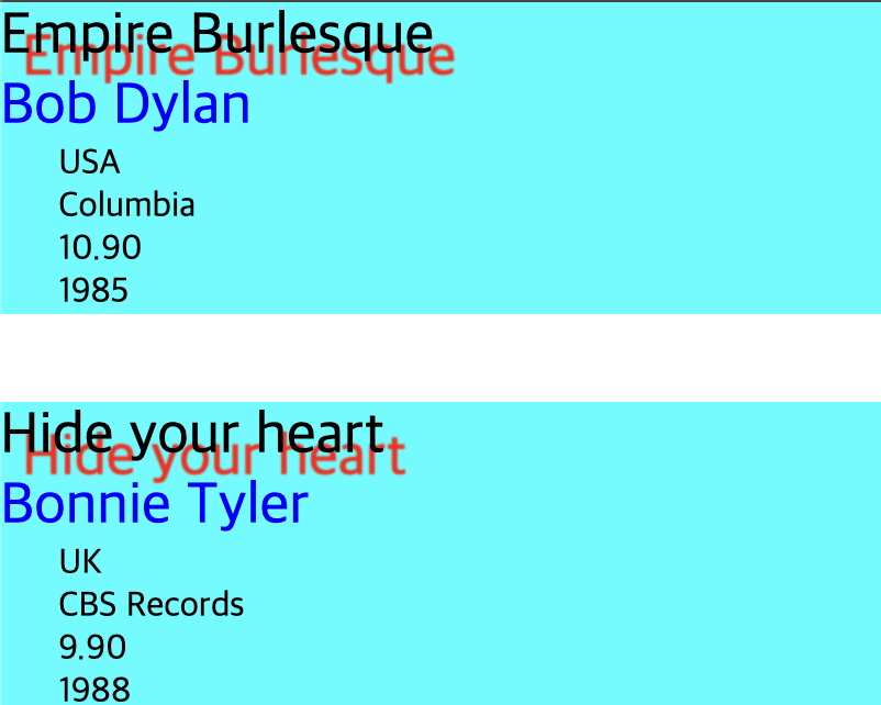
<코드>
title {
    display: block;

    font-size: 20pt;
    text-shadow: 10px 10px 1px red; /* added */
}
[5] transform - scale
: 일정한 수치로 요소의 크기를 배가시켜서 크기를 조정한다.
1) 포맷
`transform : scale(X축, Y축)
- X축으로 N배 확장
- Y축으로 N배 확장
[6] transform - skewX, skewY
: 요소를 기울이는 데 사용된다. (각도를 파라미터로 받아 왜곡시킨다)
1) 포맷
- skewX(angle)
- X축을 기준으로 요소를 기울인다.
- 파라미터는 기울일 각도를 나타낸다.
- 예: transform: skewX(30deg);
-> 이 코드를 사용하면 요소가 X축을 기준으로 오른쪽으로 30도 기울어진다.
- skewY(angle)
- Y축을 기준으로 요소를 기울인다.
- 파라미터는 Y축에서의 기울기를 나타낸다.
- 예: transform: skewY(45deg);
-> 이 코드는 요소를 Y축을 기준으로 아래쪽으로 45도 기울인다.
- skew(x-angle, y-angle)
- X축과 Y축을 동시에 기울일 수 있다.
- 예: transform: skew(30deg, 45deg);
-> 이 코드는 X축으로 30도, Y축으로 45도 기울이게 된다.

안녕하세요, 사용자들의 문제 해결을 중심으로 하는 프론트엔드 개발자입니다. 티스토리로 전환했어요 : https://pangil-log.tistory.com