0. 시작하기에 앞서,,

오늘은 웹 서비스 개발 Quiz가 있는 날..
간단한 CSS Test를 본다고 하셨고
오늘의 중점적인 부분은 포스팅의 제목에 있는 것처럼
text-shadow, transform, transition
이렇게 세 가지를 중점적으로 보시는 것 같았다.
그래서 이에 관련된 내용들을 정리해보려고 한다.
1. text-shadow
1) text-shadow란?
말 그대로 text에 shadow를 적용해주는 것을 의미한다.
흔히 '네온사인'이라고 말하는 것처럼 스타일을 주고 싶을 때 사용한다.
(1) 사용법
text-shadow : offset-x, offset-y, blur-radius, color
- offset : 그림자의 위치를 지정한다.
- offset-x : 양수이면 글자의 오른쪽에, 음수이면 글자의 왼쪽에 그림자가 나타난다.
- offset-y : 양수이면 글자의 아래쪽에, 음수이면 글자의 위쪽에 그림자가 나타난다.
- blur-radius : 숫자가 커질수록, 그림자가 흐릿해진다.
- color : 그림자의 색상을 지정한다.
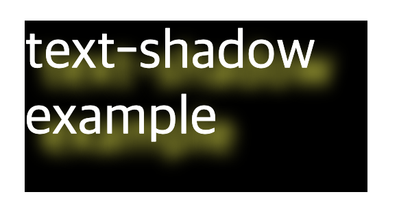
(2) 예시
<?xml version = "1.0" encoding = "euc-kr" standalone = "yes"?>
<?xml-stylesheet type = "text/css" href = "Quiz2.css"?>
<info>
    <box1>text-shadow example</box1>
</info>box1{
background-color: black;
color : white;
width: 100px;
height : 50px;
text-shadow: 5px 5px 5px yellow;
/* 오른쪽으로 5px, 아래쪽으로 5px, 5px 만큼의 yellow 색의 shadow 적용*/
}2. transform
1) transform이란?
: 리먼트에 회전, 크기 조절, 기울이기, 이동 효과 등을 부여할 때 사용하는 기능이다.
회전, 크기 조절, 기울이기, 이동 효과 등 다양한 효과를 줄 수 있다.
2) 회전 - rotate
(1) 사용법
transform : rotate(x, y) or rotateX() or rotateY()
: 회전의 각도가 양수이면 시계 방향, 음수이면 시계 반대방향으로 회전
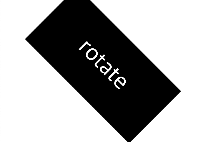
(2) 예시
<?xml version = "1.0" encoding = "euc-kr" standalone = "yes"?>
<?xml-stylesheet type = "text/css" href = "Quiz2.css"?>
<info>
    <box2>rotate example</box2>
</info>
box2 {
background-color: black;
color : white;
width: 100px;
height : 50px;
text-align: center;
line-height: 50px;
transform: rotate(45deg);
/* 45도 시계 방향으로 회전 */
}3) 크기 조절 - scale
(1) 사용법
transform : scale(x, y) or scaleX() or scaleY()
: 쉽게 말해 배율로 적용
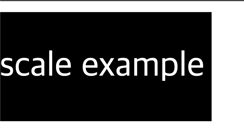
(2) 예시
<?xml version = "1.0" encoding = "euc-kr" standalone = "yes"?>
<?xml-stylesheet type = "text/css" href = "Quiz2.css"?>
<info>
    <box3>scale example</box3>
</info>
box3 {
background-color: black;
color : white;
width: 100px;
height : 50px;
text-align: center;
line-height: 50px;
transform: scale(1.5, 1.5);
/* 가로, 세로 크기를 1.5배로 확대 */
}(3) 기울이기 - skew
(1) 사용법
transform : skew(x, y) or skewX() or skewY()
(2) 예시

<?xml version = "1.0" encoding = "euc-kr" standalone = "yes"?>
<?xml-stylesheet type = "text/css" href = "Quiz2.css"?>
<info>
    <box4>skew example</box4>
</info>
box4 {
background-color: black;
color : white;
width: 100px;
height : 50px;
text-align: center;
line-height: 50px;
transform: skew(20deg, 10deg);
/* 가로 20도, 세로 10도 기울이기 */
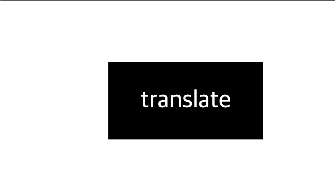
}(4) 이동 효과 - translate
(1) 사용법
transform : translate(x, y) or translateX() or translateY()
: 현재 위치를 기반으로 이동한다.
: 단위는 px, %, em 등을 사용한다.
: translate()에서는 값이 하나만 있을 경우에는 가로 이동 방향만을 나타낸다/
(2) 예시
<?xml version = "1.0" encoding = "euc-kr" standalone = "yes"?>
<?xml-stylesheet type = "text/css" href = "Quiz2.css"?>
<info>
    <box5>translate example</box5>
</info>
box5 {
background-color: black;
color : white;
width: 100px;
height : 50px;
text-align: center;
line-height: 50px;
transform: translate(50px, 20px);
/* 가로로 50px, 세로로 20px 이동 */
}3. tansition
1) tansition란?
요소의 상태 변화에 애니메이션 효과를 부여하는 기능이다.
이 기능을 사용하여 요소가 hover, focus 등 상태가 바뀔 때 점진적인 변화를 줄 수 있다.
(1) 사용법
transition : property duration timing-function delay
- property: 변화할 CSS 속성 (예: all, width, background-color 등)
- duration: 애니메이션이 진행되는 시간 (예: 2s, 500ms)
- timing-function: 애니메이션의 진행 속도 (예: ease, linear, ease-in-out 등)
- delay: 애니메이션이 시작되기 전 대기 시간
(2) 예시

<?xml version = "1.0" encoding = "euc-kr" standalone = "yes"?>
<?xml-stylesheet type = "text/css" href = "Quiz2.css"?>
<info>
	<box6>transition example</box6>
</info>
box6 {
background-color: black;
color: white;
width: 100px;
height: 50px;
text-align: center;
line-height: 50px;
transition: background-color 2s ease-in-out, transform 1s ease;
/* 배경색이 2초에 걸쳐 부드럽게 변하고, 크기 변화가 1초 동안 적용됨 */
}
box6:hover {
background-color: yellow;
transform: scale(1.5);
/* 마우스를 올렸을 때 배경색이 노란색으로 바뀌고, 크기가 1.5배로 확대됨 */
}
4. 뭔가 나올 것 같은 예제
<?xml version = "1.0" encoding = "euc-kr" standalone = "yes"?>
<!-- <?xml-stylesheet type = "text/css" href = "Quiz1_1.css"?>  -->
<?xml-stylesheet type = "text/css" href = "Quiz1_2.css"?>
<cd>
<title>Emprie Burlesque</title>
<artist>Bob Dylan</artist>
<country>USA</country>
<company>Columbia</company>
<price>10.90</price>
<year>1985</year>
</cd>
company,
country,
price,
year {
width: 100px;
height: 50px;
display: block;
margin-left: 20pt;
}
country {
background: purple;
color: yellow;
transition: width 2s, height 2s, transform 2s;
}
country:hover {
width: 200px;
height: 100px;
transform: rotate(180deg);
}
company {
background: yellow;
transition: width 2s;
}
company:hover {
width: 300px;
}
price {
background: gray;
margin-left: 0;
transition: width 3s;
transition-delay: 1s;
}
price:hover {
width: 300px;
}
year {
background: cyan;
transition: width 2s, height 2s;
}
year:hover {
width: 200px;
height: 100px;
}퀴즈 가볍게 보고 와야겠담~~~