일자 : 24-2 11주차 (1)
0. 개요
[1] CSS3 스타일로 태그에 동적 변화 만들기
1) CSS3로만 HTML 태그 모양의 동적 변화 가능
- 자바스크립트로 구현하던 것을 CSS3로 작성 가능
- 3 가지 기법 지원
- 애니메이션(animation)
- 전환(transition)
- 변환(transform)
1. CSS Animation
[1] CSS로 애니메이션 만들기
1) 특징
- HTML 태그의 모양 변화를 시간 단위로 설정
2) 애니메이션 코딩 작업
-
@keyframes으로 HTML 태그의 시간별 모양 변화 만들기
- 형태
@keyframes name{ 시간 비율 {스타일; 스타일} 시간 비율 {스타일; 스타일} } - 예시
 @keyframes textColorAnimation {
   0% { color : blue; } /* 시작 시. 0% 대신 from 사용 가능 */
   30% { color : green; } /* 30% 경과 시까지 */
   100% { color : red; } /* 끝까지. 100% 대신 to 사용 가능 */
 }
- 형태
-
애니메이션 스타일 시트 작성
- 형태
- animation-name : 애니메이션 이름;
- animation-duration : 시간;
- animation-iteraction-count : 애니메이션 반복 횟수
- 예시
span {
  animation-name : textColorAnimation; /* 애니메이션 코드 이름 */
  animation-duration : 5s; /* 애니메이션 1회 시간은 5초 */
  animation-iteration-count : infinite; /* 무한 반복 */
}
- 형태
[2] 키 프레임 정의
1) 애니메이션이 진행되는 과정에서 특정 시점에서 발생해야 하는 여러 작업을 정의하는 문법
@keyframes <키 프레임명>{
  0%{/*CSS 코드 */}
  n%{/*CSS 코드 */}
  100%{/*CSS 코드 */}
}
2) 예 (애니메이션 시작 배경은 빨간색, 종료 시점으로 갈수록 초록색으로 변하도록 지정)
@keyframes bgchange{
  0%{background-color:red;}
  100%{background-color:green;}
}
3) 대체
@keyframes bgchange{
  from{background-color:red;}
  to{background-color:green;}
}
4) 시점 스타일 속성 정의
@keyframes bgchange{
  0%{background-color:red;}
  25%{background-color:green;}
  50%{background-color:blue;}
  100%{background-color:yellow;}
}
[3-1] animation-name
1) 특정 요소에서 적용할 키 프레임명 지정
animation-name:<키 프레임명>;- animation-name: bgchange;
[3-2] animation-delay
1) 애니메이션 실행 지연 속성
animation-delay:<지연 시간>;- animation-delay: 3s;
[3-3] animation-fill-mode
1) 애니메이션이 실행되기 전과 후의 스타일 지정 속성
2) 속성값
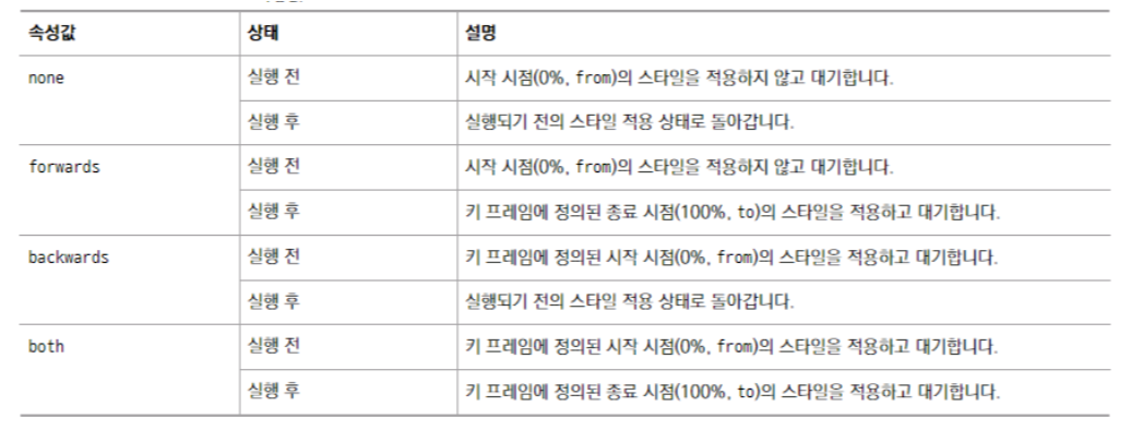
3) 예시
div{
  width:100px;
  height:100px;
  background-color:red;
  animation-name:bgchange;
  animation-duration:5s;
  animation-fill-mode:forwards;
}
[3-4] animation-iteration-count
1) 애니메이션 실행 횟수 조정 속성
animation-iteration-count:<횟수>;- animation-iteration-count:3;
2) 무한으로 하는 방법
animation-iteration-count:infinite;[3-5] animation-play-state
1) 애니메이션 재생 상태 지정 속성
2) 속성값
- paused : 애니메이션의 실행을 일시 정지한다.
- running : 애니메이션을 실행한다.
[3-6] animation-direction
1) 애니메이션 진행 방향 지정 속성
animation-direction:<속성값>;2) 속성값
- normal : 애니메이션의 진행방향을 키 프레임에 정의된 시간 순서대로 진행한다. (from -> to)
- reverse : 애니메이션의 진행방향을 키 프레임에 정의된 시간 순서의 역으로 진행한다. (to -> from)
- alternate : 애니메이션이 1회 이상 실행될 경우 홀수 번째는 normal로, 짝수 번째는 reverse로 진행한다.
- alternate-reverse : 애니메이션이 1회 이상 실행될 경우 홀수 번째는 reverse로, 짝수 번째는 normal로 진행한다.
2. CSS Transitions
[1] CSS(Cascading Style Sheet) transition
1) 전환이란?
: HTML 태그에 적용된 CSS3 프로퍼티 값의 변화를 서서히 진행시켜 애니메이션 효과 생성
- HTML 태그의 색이나 모양, 위치 등이 서서히 변하는 효과
- 전환 설정 : transition 프로퍼티 이용
2) 예시
span{
	transition : font-size 5s;
}
span:hover{
	font-size : 500%;
}
[2-1] 전환(transition)
1) CSS transition
: to change property values smoothly, over a given duration.
2) 속성
- transition: transition효과를 한 줄로 줄여서 작성하는 역할
- transition-delay: transition이 시작하는 시점을 초단위로 조절
- transition-duration: transition이 동작하는 시간을 설정(초 or millisec)
- transition-property: transition을 적용하기 위한 속성(ex. width, height …)
- transition-timing-function: transition 적용에서 timing을 설정하는 속성(6개의 효과가 있음)
3) | Transition 효과를 만들기 위해 두 가지 요소를 고려
- 효과를 주고 싶은 CSS 속성
- 효과를 위한 duration(시간)
- 효과의 duration이 없는 경우 transition효과는 발생하지 않음
4) 속성 줄여서 표현하기
div {
  transition-property: width;
  transition-duration: 2s;
  transition-timing-function: linear;
  transition-delay: 1s;
}
div {
transition: width 2s linear 1s;
}[2-2] transition-property
1) 전환 효과를 적용할 대상 속성 지정
transition-property:<속성값>;2) 속성값
- none; 전환효과 속성을 지정하지 않음
- all; 모든 속성을 전환효과 속성으로 지정
3) 예
- background-color 속성에 전환효과 주기
transition-property: background-color; - 전환효과를 여러 속성에 지정-> 쉼표 사용
transition-property: background-color, color, width; - 개별 속성이 아닌 모든 속성에 전환 효과를 넣고 싶을 때-> all 사용
transition-property: all;
[2-3] transition-duration
1) 전환 효과의 지속시간 설정
transition-duration:<시간>;2) 전환 효과의 시간 속성을 여러 개 지정-> 쉼표 사용
transition-property: background-color, color, width;
transition-duration: 1s, 500ms, 2s;
[2-4] transition-delay
1) 전환 효과의 발생을 지연할 수 있다
transition-delay:<시간>;- transition-delay: 1s; -> 1초 뒤 전환 효과 발생
[2-5] transition-timing-function
1) 전환 효과의 진행 속도 지정
transition-property:<속성값>;2) 속성값
- linear; 처음 속도와 마지막 속도가 일정
ease; 처음에는 속도가 점점 빨라지다가 중간부터 점점 느려짐 - ease-in; 처음에는 속도가 느리지만 완료될 때까지 점점 빨라짐
- ease-out; 처음에는 속도가 빠르지만 완료될 때까지 점점 느려짐
- ease-in-out; 처음에는 속도가 느리지만 점점 빨라지다가 시 점점 느려짐
- cubic-bezier(p1, p2, p3, p4); 사용자가 정의한 속도로 진행
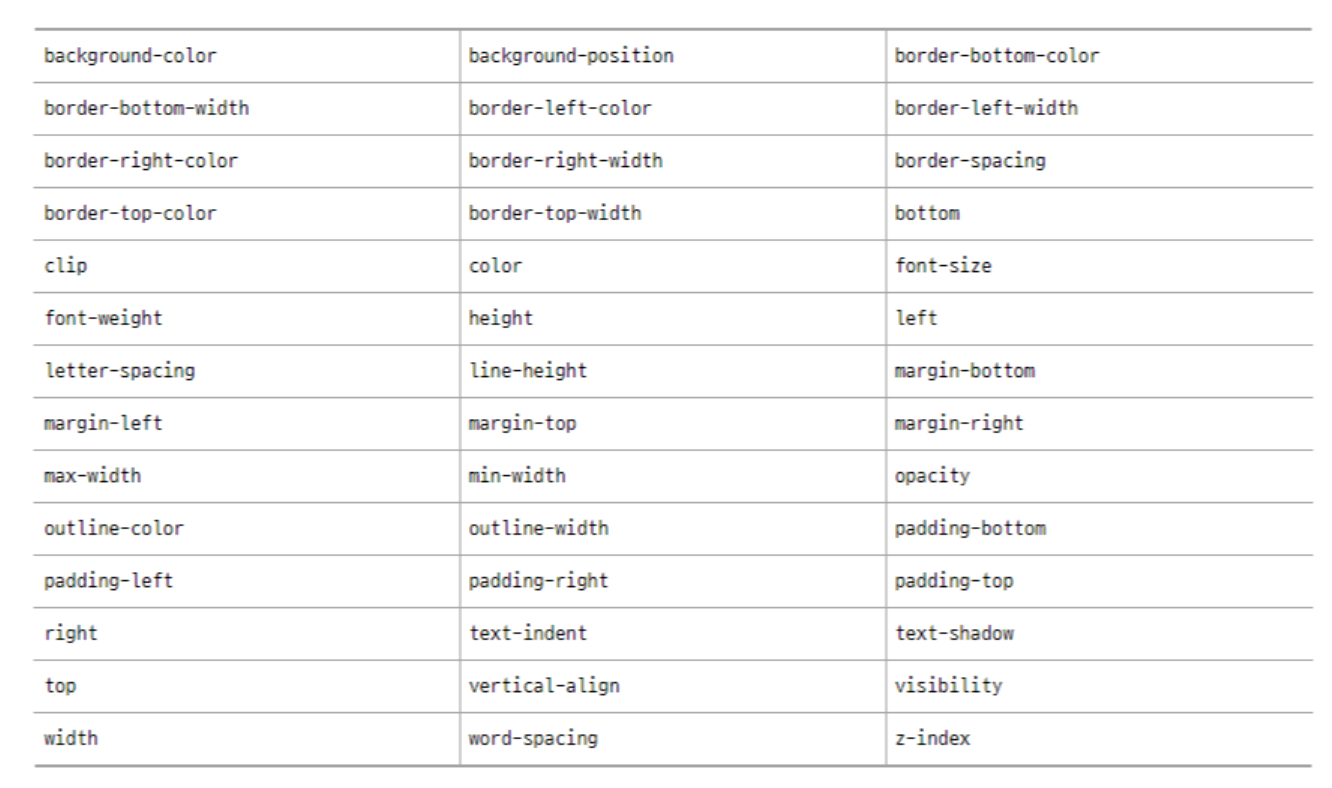
[3] 전환 효과가 가능한 속성 모음


안녕하세요, 사용자들의 문제 해결을 중심으로 하는 프론트엔드 개발자입니다. 티스토리로 전환했어요 : https://pangil-log.tistory.com