matplotlib
- 구글 matplotlib 자료를 참고하면서 코드 공부해야 한다
#matlab -> pyplot
#metaplotlib 기본 폰트가 한글을 지원하지 않아서 매번 설정 필요
import matplotlib.pyplot as plt
from matplotlib import rc
rc("font", family="Arial Unicode MS")
#%matplotlib inline
#주피터에 바로 표시
get_ipython().run_line_magic("matplotlib", "inline")
기본형태
- axhline(): 축을 따라 수평선을 표시
- axvline(): 축을 따라 수직선을 표시
- hlines(): 지정한 점을 따라 수평선을 표시
- vlines(): 지정한 점을 따라 수직선을 표시
- bar(), barh(): 수직, 수평 막대 그래프
- scatter(): 산점도
- hist(): 히스토그램
- errorbar(): 에러바
- pie(): 파이차트
- matshow(): 히트맵, colorbar(): 컬러바
- subplot():여러개 함수
#그래프 area
plt.figure(figsize=(10, 6))

#그래프 x, y값
plt.plot(x, y)

#막대 그래프
plt.bar()
plt.barh()

plt.show()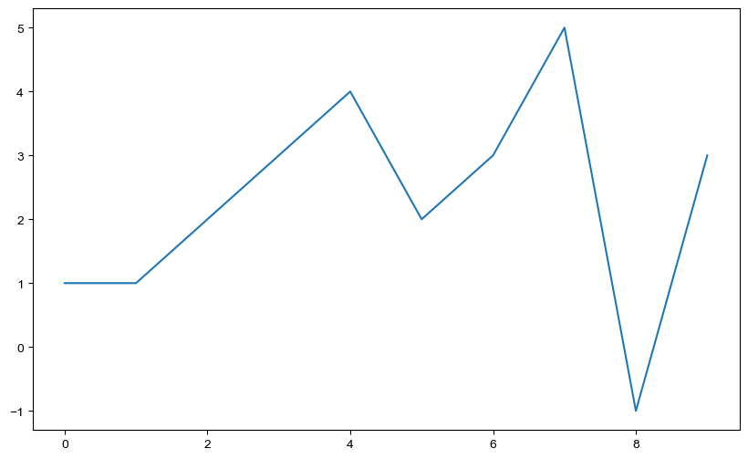
그래프 기초
- np.arange(a, b, n): a부터 b까지 n의 간격 <-> np.linspace: a부터 b까지 n개의 변수
삼각함수
- np.sin(value)
import numpy as np
t = np.arange(0, 23, 0.01)
y = np.sin(t)

plt.figure(figsize=(10, 6))
plt.plot(t, np.sin(t))
plt.plot(t, np.cos(t))
plt.show()
그래프 옵션
- 격자무늬
- 그래프 제목 추가
- x, y축 제목 추가
- 주황색, 파란색 데이터 의미 구분
def drawGraph():
    plt.figure(figsize=(10, 6))
    plt.plot(t, np.sin(t), label="sin")
    plt.plot(t, np.cos(t), label="cos")
    #plt.legend(labels=["sin", "cos"]) #범례, 가장 빈 공간 자동 위치
    #plt.legend(loc="upper right")
    #plt.legend(loc=2) #upper left
    plt.grid(True)
    plt.title("Exmple of sinwave")
    plt.xlabel("time")
    plt.ylabel("Amplitude")
    plt.show()
drawGraph()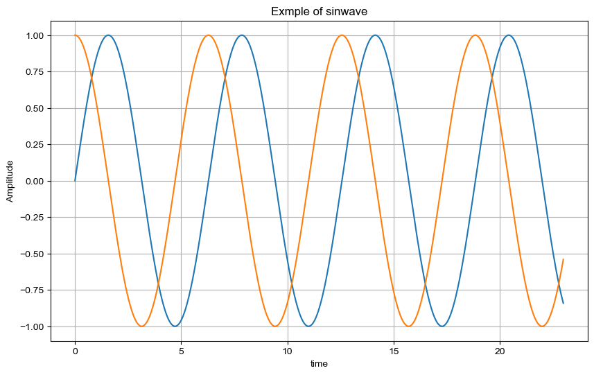
그래프 커스텀
t= np.arange(0, 5, 0.5)
plt.figure(figsize=(10, 6))
plt.plot(t, t, "r--") #red dash line
plt.plot(t, t**2, "bs") #blue sqaure
plt.plot(t, t**3, "g^") #green
---------------------------------------------------------
t = list(range(0, 7))
y = [1, 4, 5, 8, 9, 5, 3]

def drawGraph():
    plt.figure(figsize=(10, 6))
    plt.plot(
        t,
        y,
        color="green",
        linestyle = "dashed", #'--', '-'-> 실선
        marker ="s",#마커 모양
        markerfacecolor="blue",#마커 색
        markersize=15 #마커 사이즈
    )
    plt.xlim([-0.5, 6.5]) #범위
    plt.ylim([0.5, 9.5])
    plt.show()
 drawGraph()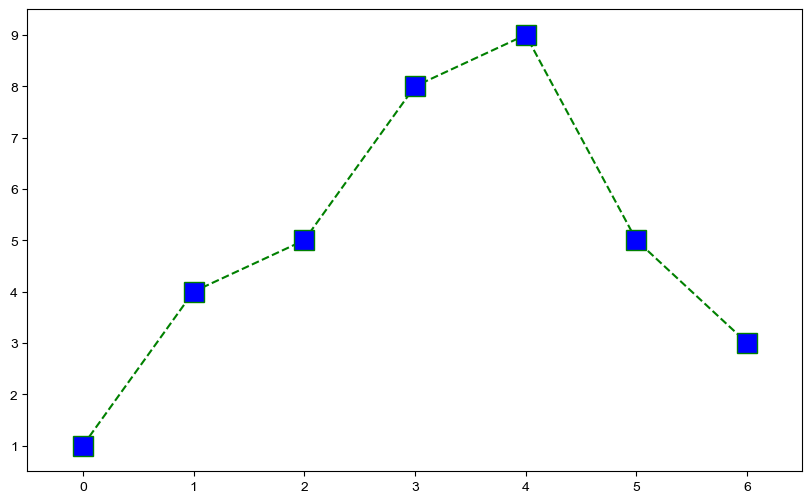
scatter plot
t = np.array(range(0, 10))
y = np.array([9, 8, 7, 9, 8, 3, 2, 4, 3, 4])
def drawGraph():
    plt.figure(figsize=(10, 6))
    plt.scatter(t, y)
    plt.show()
drawGraph()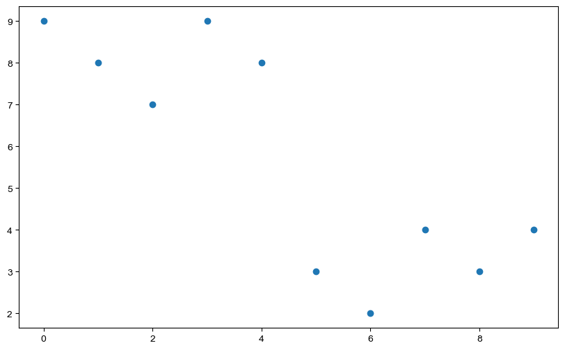
colormap
colormap = t
def drawGraph():
    plt.figure(figsize=(10, 6))
    plt.scatter(t, y, s=50, c=colormap, marker=">")#s size
    plt.colorbar()
    plt.show()
drawGraph()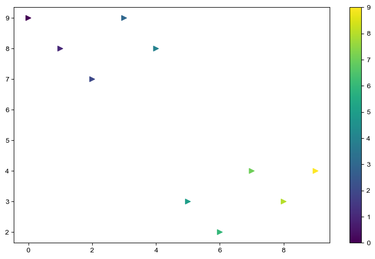
Reference
1) 제로베이스 데이터 스쿨

데이터 사이언스 / just do it