🎀 Storybook이란? + 장점
UI 컴포넌트를 독립적으로 분리해, 개별 관리, 테스트를 도와주는 도구.
작업 효율 증가
개발자들 간에 컴포넌트 디자인을 쉽게 확인 가능하고 이미 있는 컴포넌트를 다시 개발할 위험성도 크게 줄어든다.
의도치 않은 UI 변경 확인
Chromatic에 있는 '시각적 회귀 테스트'를 활용하면 실제 코드를 배포하기 전 의도치 않은 UI 변경은 없는지 정확히 판단이 가능하다.
디자인 시스템으로 활용 가능
디자인 시스템이란 한 서비스의 목적 및 일관된 이미지를 위해 회사에서 정립한 일관된 디자인 체계를 의미한다. Storybook은 디자인을 바로 확인할 수 있기 때문에 일관된 디자인으로 개발할 수 있도록 도와준다.
🎀 Storybook 시작해 보기
$ npx storybook@latest init위 명령어로 스토리북을 설치한다.
$ npm run storybook설치가 완료되면 실행시키면 끝이다.
🪄 짜쟌!!
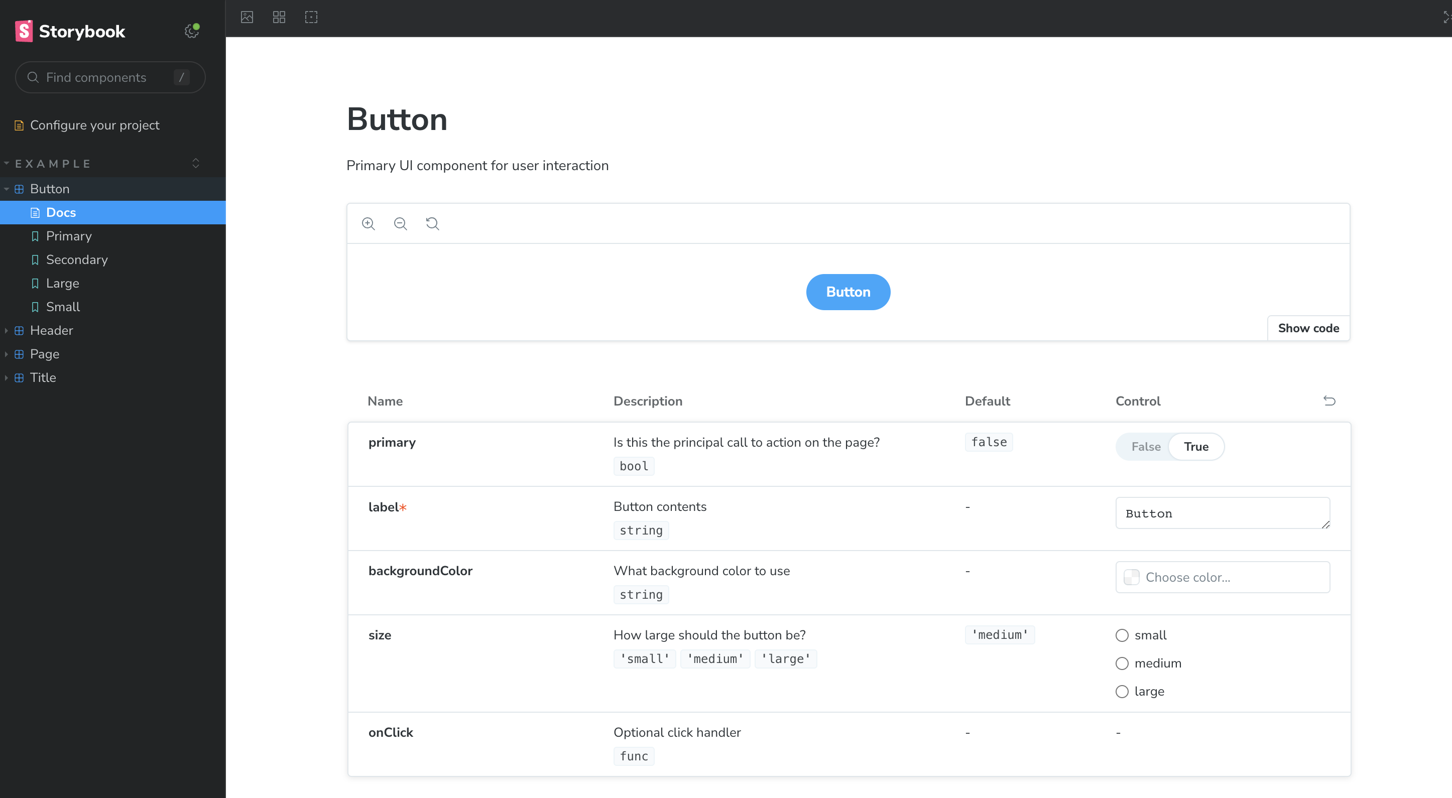
여기까진 이ZY
🎀 어떻게 사용하면 될까?
Storybook은 하나의 component 하위에 여러 story들로 구성되어진다.
components/atoms/button/CustomButton.tsx
import PropTypes from "prop-types";
import "./customButton.module.css";

interface CustomButtonProps {
  label: string;
  size?: string;
  background?: string;
}

const CustomButton = ({ label, size, background }: CustomButtonProps) => {
  return (
    <button
      className={`${buttonStyle["custom-button"]} ${buttonStyle["custom-button--" + size]}  ${buttonStyle["custom-button--" + background]}`}
    >
      {label}
    </button>
  );
};

// storybook 을 위한 prop의 타입을 지정한다.
CustomButton.propTypes = {
  label: PropTypes.string.isRequired,
  size: PropTypes.oneOf(["sm", "md", "full"]),
  background: PropTypes.string,
};

// storybook을 위한 기본 prop을 지정한다.
CustomButton.defaultProps = {
  backgroundColor: "primary",
  size: "full",
};

export default CustomButton;
우선 필요한 버튼 컴포넌트를 예시로 만들어 보았다.
components/atoms/button/CustomButton.module.css
.custom-button {
  border-radius: 8px;
  line-height: 19px;
  color: #fff;
  display: flex;
  align-items: center;
  justify-content: center;
  font-size: 1.6rem;
  font-weight: 600;
  width: auto;
  padding: 16px 0;
  font-size: 1.6rem;
  font-weight: 600;
}

.custom-button.custom-button--primary {
  background: var(--color--primary);
}

.custom-button.custom-button--red {
  background: var(--color--red);
}

.custom-button.custom-button--gradation {
  background: var(--button-gradation);
}

.custom-button.custom-button--sm {
  padding: 10px 15px;
  font-size: 1.4rem;
}

.custom-button.custom-button--md {
  padding: 16px 40px;
  font-size: 1.8rem;
}

.custom-button.custom-button--full {
  padding: 16px 0;
  font-size: 1.8rem;
  width: 100%;
}

/* mobile */
@media (max-width: 767px) {
  .custom-button.custom-button--md {
    padding: 10px 20px;
    font-size: 1.4rem;
  }

  .custom-button.custom-button--full {
    padding: 10px 0;
    font-size: 1.4rem;
  }
}
button의 props에 따른 스타일링 변화는 css로 해주면 된다.
❗️주의
전역으로 스타일을 reset해주고 있는 경우
스토리북에도 똑같이 reset이 되어줘야한다.
.storybook/preview.ts
import "../styles/reset.css";
import "../styles/theme.css";
위 파일로 가서 import해오면 해결된다.
stories/CustomButton.stories.ts
import CustomButton from "../components/ui/atoms/button/CustomButton";

export default {
  title: "atoms/CustomButton",
  component: CustomButton,
};

export const Default = {
  args: { // story에서 보여줄 버튼 스타일링
    size: "sm",
    background: "primary",
    label: "Button",
  },
};
마지막으로 위와 같이 각 버튼에 알맞은 스토리가 나올 수 있도록 설정해주면 된다.
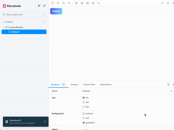
스토리를 설정해주면 위 이미지와 같이 스토리북에 컴포넌트가 보여지게 된다.
🎀 마치며
여기까지가 Storyboard의 기초라고 할 수 있겠다.
별로 어렵지 않네 ㅋㄷ

일단 해. 그리고 잘 되면 잘 된 거, 잘 못되면 그냥 해본 거!