MDN을 참고하여 내가 가지고 있는 grid를 정리해봤다.
https://developer.mozilla.org/ko/docs/Learn/CSS/CSS_layout/Grids
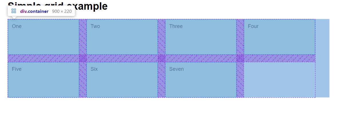
기반이 되는 코드
<!DOCTYPE html>
<html lang="en">
<head>
<meta charset="UTF-8">
<meta http-equiv="X-UA-Compatible" content="IE=edge">
<meta name="viewport" content="width=device-width, initial-scale=1.0">
<title>CSS Grid starting point</title>
<style>
body {
width: 90%;
max-width: 900px;
margin: 2em auto;
font: .9em/1.2 Arial, Helvetica, sans-serif;
}
.container > div {
border-radius: 5px;
padding: 10px;
background-color: rgb(207,232,220);
border: 2px solid rgb(79,185,227);
}
</style>
</head>
<body>
<h1>Simple grid example</h1>
<div class="container">
<div>One</div>
<div>Two</div>
<div>Three</div>
<div>Four</div>
<div>Five</div>
<div>Six</div>
<div>Seven</div>
</div>
</body>
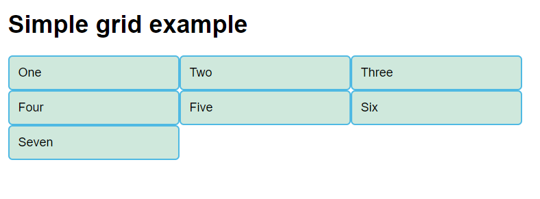
</html>이런 페이지가 나온다.

그리드 선언
여기에 이 코드를 추가하여 그리드로 사용하겠다고 선언해주자
그럼 컨테이너의 자식들이 그리드의 아이템이 된다.
음 antd나 bootstrap의 Row,Col, Col-item과 같은것같다.
.container {
    display: grid;
}
(그리드 선언되었지만 화면상 변화는 없다.)
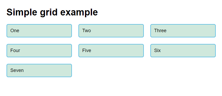
Colums 갯수/폭 설정
.container {
    display: grid;
    grid-template-columns: 200px 200px 200px;
}
요소 이름에서부터 알 수 있듯, 그리드의 columns의 폭을 설정해준다.
여기서 Row는 가로 Col은 세로라고 생각하면 편하다 (나는 맨날 헷갈린다.)
세로의 3줄 폭은 200px로 설정한다는 뜻이다.
짜잔!
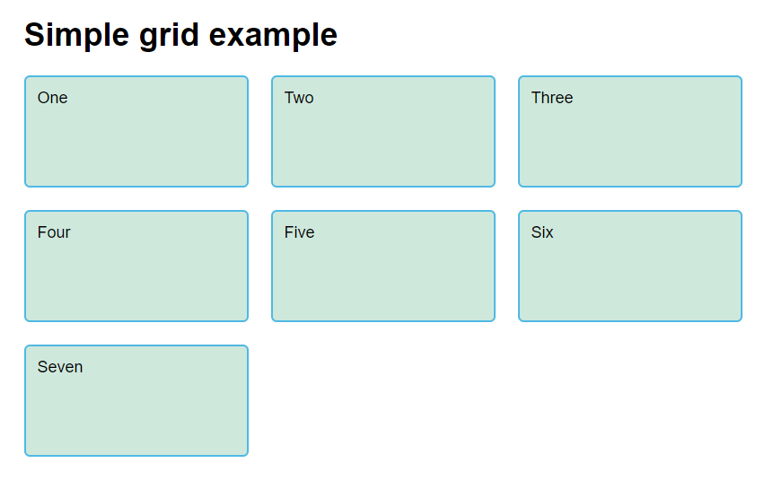
Columns 떨어뜨리기! (grid-gap)
근데 열끼리 너무 붙어있다. 떨어뜨려주자!
.container {
            display: grid;
            grid-template-columns: 200px 200px 200px;
            grid-gap: 20px;
        }
세로 길이 수정하기(grid-auto-rows)
근데 가로 폭은 수정가능하면서 세로 길이는 수정할수없을까?
.container {
            display: grid;
            grid-template-columns: 200px 200px 200px;
            grid-auto-rows: 100px;
            grid-gap: 20px;
        }
가능!
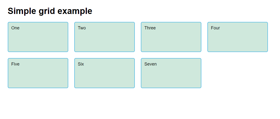
grid-template-columns에서 활용할만한 repeat과 auto-fill
columns는 같은 폭이 반복되니까 repeat을 써주자
        .container {
            display: grid;
            grid-template-columns: repeat(3, 200px);
            grid-auto-rows: 100px;
            grid-gap: 20px;
        }
근데 몇개의 열이 필요한지는 계산해줬으면 좋겠다!
        .container {
            display: grid;
            grid-template-columns: repeat(auto-fill, 200px);
            grid-auto-rows: 100px;
            grid-gap: 20px;
        }
보이다싶이 container 영역을 가득 채운 모습이다.
다음은 카드형식이 아니라 구역을 나누고 쓰는 방법을 정리해봐야겠다.

성장스택 쌓고있는 개발자🏋