
3D 효과
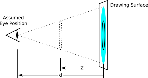
perspective를 설정하면 3d 효과를 줄 수 있음- perspective(투영점) 수치는 내 눈과의 거리.
즉, 눈에서 얼마나 멀리있는 시점에서 바라볼 것인가의 의미
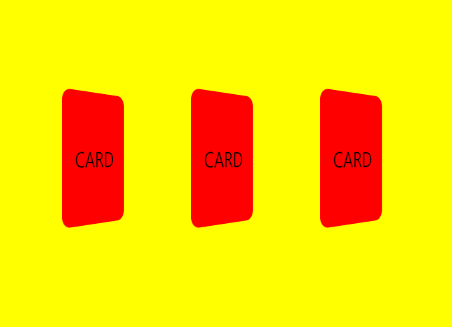
<div class="world">
     <div class="card">CARD</div>
     <div class="card">CARD</div>
     <div class="card">CARD</div>
</div>
perspective
각 요소에 perspective를 준 경우
.world{
    display: flex;
    align-items: center;
    justify-content: center;
    width:80vw;
    height: 80vh;
    background-color: yellow;
    perspective : 500px
}

.card{
    display: flex;
    align-items: center;
    justify-content: center;
    margin:1em;
    width:100px;
    height: 150px;
    background-color: red;
    border-radius: 0.5em;
    font-size:1.5rem;
    transform: rotateY(45deg) ;
}
배경에 perspective를 준 경우

.world{
    display: flex;
    align-items: center;
    justify-content: center;
    width:80vw;
    height: 80vh;
    background-color: yellow;

}

.card{
    display: flex;
    align-items: center;
    justify-content: center;
    margin:1em;
    width:100px;
    height: 150px;
    background-color: red;
    border-radius: 0.5em;
    font-size:1.5rem;
    transform: rotateY(45deg)  perspective(500px);
}
카드 뒤집기 예제
transform-style : preserve-3d
- transform-style 속성은 요소의 자식 요소가 입체적인 3D 공간에 배치 될지, 요소의 표면에 평평하게 묘사할 지를 결정
flat(default): 자식 요소는 2D의 2차원에서 부모 요소와 동일한 평면에 배치preserve-3d: 3D 공간에 배치되도록 됩니다.- 예제보기
backface-visibility: hidden;
- 뒷쪽에서 앞면이 보이게 할지 정하는 속성
- 예제보기
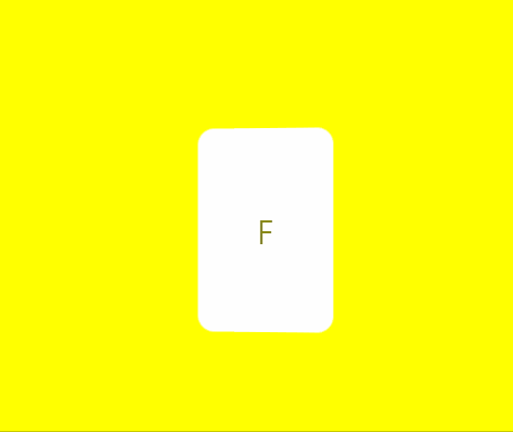
<!--html-->
<div class="world">
        <div class="card">
            <div class="card-side card-side-front">F</div>
            <div class="card-side card-side-back">B</div>
        </div>

 </div>
/*css*/
.world{
display: flex;
align-items: center;
justify-content: center;
width:80vw;
height: 80vh;
background-color: yellow;
perspective: 500px;
}
.card{
position:relative;
width:100px;
height: 150px;
transform: perspective(500px) rotateY(0deg) ;
transition: 1s;
transform-style:preserve-3d;
}
.card-side{
position: absolute;
left:0;
top:0;
width:100%;
height: 100%;
display: flex;
align-items: center;
justify-content: center;
border-radius: 0.5em;
font-size:1.5rem;
backface-visibility: hidden;
}
.card-side-front{
z-index: 1;
background-color: white;
}
.card-side-back{
background-color: red;
transform: rotateY(180deg);
}
.world:hover .card{
transform: rotateY(180deg);
}📑 reference

한약은 거들뿐