
Animation
Keyframe
- CSS 애니메이션 과정의 중간 절차를 제어할 수 있다
- 0~100%까지 지정
// css
@keyframes sample-ani{
0%{
transform: translate(0,0);
}
50%{
transform: translate(300px, 0);
}
100%{
transform: translate(700px, 400px);
}
}
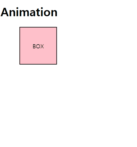
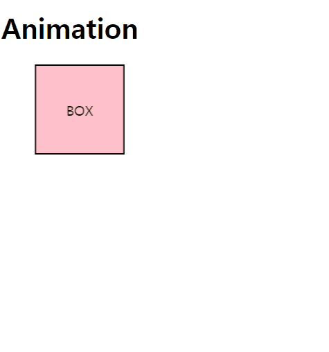
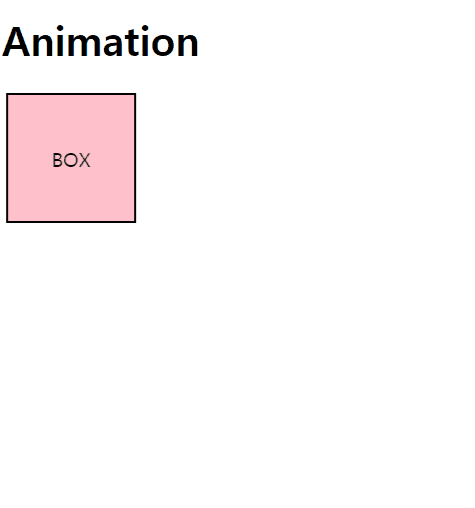
.box{
display:flex;
align-items: center;
justify-content: center;
width:100px;
height:100px;
border: 2px solid black;
background-color: pink;
animation: sample-ani 2s linear infinite;
}속성
animation-name
- 이 애니메이션의 중간 상태를 지정
- 중간 상태는 @keyframes 규칙을 이용하여 기술
animation-delay
- 엘리먼트가 로드되고 나서 언제 애니메이션이 시작될지 지정
animation-duration
- 한 싸이클의 애니메이션이 얼마에 걸쳐 일어날지 지정
- 단위 : s
animation-timing-function
중간 상태들의 전환을 어떤 시간간격으로 진행할지 지정합니다.
animation-iteration-count
- 애니메이션이 몇 번 반복될지 지정
- 무한반복 : infinite
animation-direction
- 애니메이션이 종료되고 다시 처음부터 시작할지 역방향으로 진행할지 지정
- alternate, alternate-reverse
ex] alternative
animation-fill-mode
- 애니메이션이 시작되기 전이나 끝나고 난 후 어떤 값이 적용될지 지정합니다.
- forward, both
animation-play-state
- 애니메이션을 멈추거나 다시 시작할 수 있다
- paused, running
.box:hover{
  animation-play-state:pause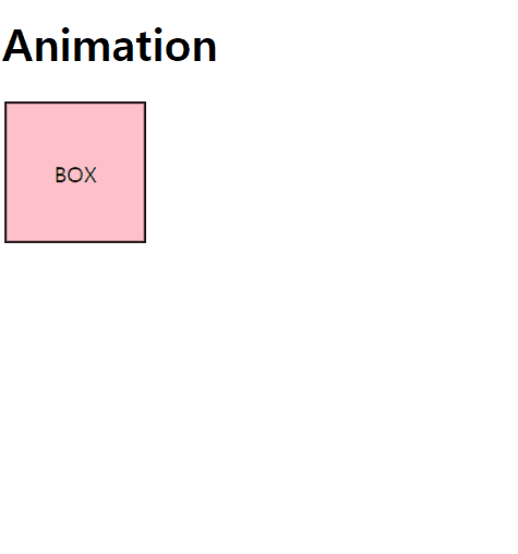
CSS 이미지 스프라이트(Image Sprite)
@keyframes spaceship-ani{
    to{
        background-position:-2550px 0;
    }
}

.spaceship{
    width:150px;
    height:150px;
    background: url('images/sprite_spaceship.png') no-repeat 0 0 /auto 150px;
    animation:spaceship-ani 2s infinite steps(17);
}
📑 reference

한약은 거들뿐