EDA To Prediction (DieTanic)
Part1: Exploratory Data Analysis(EDA)
필요한 모듈 임포트
import numpy as np
import pandas as pd
import matplotlib.pyplot as plt
import seaborn as sns
plt.style.use('fivethirtyeight')
import warnings
warnings.filterwarnings('ignore')
%matplotlib inline
데이터 불러오기
data=pd.read_csv('../input/train.csv')
data.head()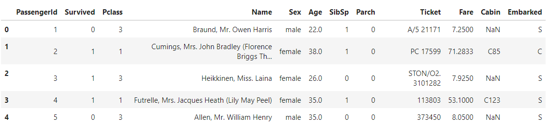
'Survived'컬럼 시각화하기
f,ax=plt.subplots(1,2,figsize=(18,8))
data['Survived'].value_counts().plot.pie(explode=[0,0.1],autopct='%1.1f%%',ax=ax[0],shadow=True)
ax[0].set_title('Survived')
ax[0].set_ylabel('')
sns.countplot('Survived',data=data,ax=ax[1])
ax[1].set_title('Survived')
plt.show()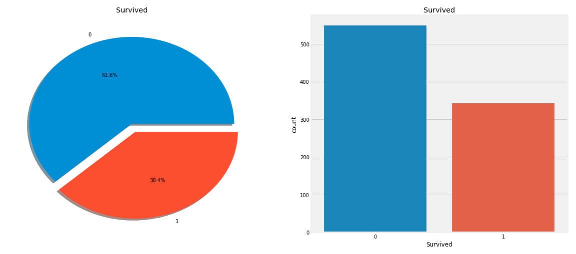
코드분석
data['Survived'].value_counts() # value_counts() : 값 갯수 세기f,ax=plt.subplots(1,2,figsize=(18,8)) # subplots(가로, 세로, ): 가로 x 세로 = 그래프 개수 data['Survived'].value_counts().plot.pie( # pie 그래프 그리기 explode=[0,0.1], # 떨어진 거리 autopct='%1.1f%%', # 소수점 ax=ax[0],shadow=True) # ax[0] : 왼쪽 그래프 ax[0].set_title('Survived') # 왼쪽 그래프 제목 ax[0].set_ylabel('') # 왼쪽 그래프 ylabel 수정 sns.countplot( # countplot : 막대 그래프 'Survived', # 'Survived'컬럼 data=data, # data 데이터프레임 ax=ax[1]) # ax[1] : 오른쪽 그래프 plt.show()
- 해석
: 총 891명의 탑승객 중에 350명만 살아남았다.
좀 더 나은 인사이트를 위해서 다양한 카테고리별로 생존율을 분석할 필요가 있다.
'Sex'컬럼(범주형 변수)에 따른 생존율 분석
data.groupby(['Sex','Survived'])['Survived'].count()
- 그래프 그리기
f,ax=plt.subplots(1,2,figsize=(18,8))
data[['Sex','Survived']].groupby(['Sex']).mean().plot.bar(ax=ax[0])
ax[0].set_title('Survived vs Sex')
sns.countplot('Sex',hue='Survived',data=data,ax=ax[1])
ax[1].set_title('Sex:Survived vs Dead')
plt.show()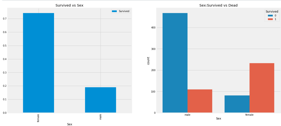
- 해석
: 남성이 여성보다 생존율이 현저히 낮은 것을 알 수 있다.
'Pclass'컬럼(순서형 변수)에 따른 생존율 분석
- Pclass에 따른 생존 데이터 표
pd.crosstab(data.Pclass,data.Survived,margins=True).style.background_gradient(cmap='summer_r')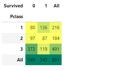
코드 분석
pd.crosstab(
    data.Pclass,        # 'Pclass' 컬럼의 값을 인데스로 설정
    data.Survived,      # 'Survived' 컬럼의 값을 컬럼으로 설정
    margins=True        # 'All' 컬럼을 생성하여 합계 출력
).style.background_gradient(cmap='summer_r') # 색 변경
- 그래프 그리기
f,ax=plt.subplots(1,2,figsize=(18,8))
data['Pclass'].value_counts().plot.bar(color=['#CD7F32','#FFDF00','#D3D3D3'],ax=ax[0])
ax[0].set_title('Number Of Passengers By Pclass')
ax[0].set_ylabel('Count')
sns.countplot('Pclass',hue='Survived',data=data,ax=ax[1])
ax[1].set_title('Pclass:Survived vs Dead')
plt.show()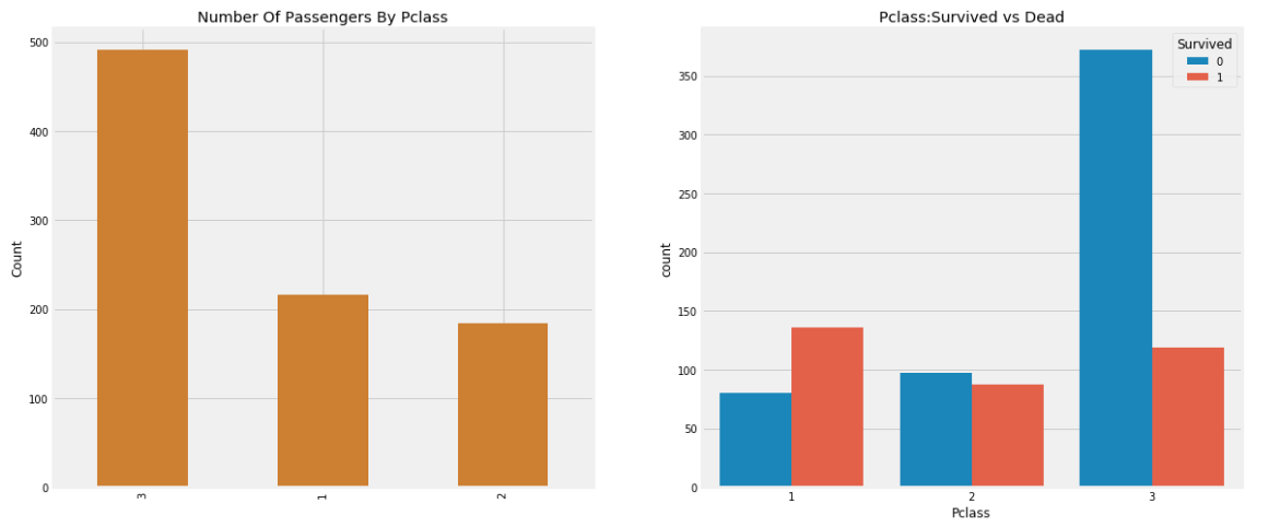
코드분석
f,ax=plt.subplots(1,2,figsize=(18,8))
data['Pclass'].value_counts().plot.bar(color=['#CD7F32','#FFDF00','#D3D3D3'],ax=ax[0]) # Pclass에 단계에 따른 수
ax[0].set_title('Number Of Passengers By Pclass')            # 왼쪽 그래프 제목
ax[0].set_ylabel('Count')                                    # 왼쪽 그래프 ylabel
sns.countplot('Pclass',hue='Survived',data=data,ax=ax[1])    # 오른쪽 그래프 Pclass 값에 따른 생존유무 막대그래프
ax[1].set_title('Pclass:Survived vs Dead')                   # 오른쪽 그래프 제목
plt.show()
- 해석
: 3 - 1 - 2 순으로 등급에 의한 승객 수가 많았고, 생존율은 1등급에서 3등급 순으로 높았다. 특히 3등급은 1, 2등급과 차이가 많이 난다는 것을 알 수 있다.
성별에 따른 생존유무와 좌석등급의 관계
- 데이터 표
pd.crosstab([data.Sex,data.Survived],data.Pclass,margins=True).style.background_gradient(cmap='summer_r')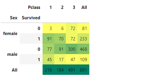
- 그래프 그리기
sns.factorplot('Pclass','Survived',hue='Sex',data=data)
plt.show()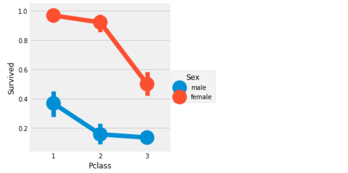
- 해석
: 남성의 경우 전체적으로 생존율이 낮지만 1등급 승객이 2, 3등급 승객보다 2배가까이 생존율이 높다.
여성의 경우 1, 2등급 승객의 생존율은 매우 높고 3등급 부터 생존율이 급격하게 떨어진다. 지금까지의 결과로 보면 성별과 좌석 등급에 따라 생존율이 매우 다르다는 것을 알 수 있다.
나이(연속형 변수)에 의한 생존율 분석
- 나이 분석(최대값, 최솟값, 평균)
print('Oldest Passenger was of:',data['Age'].max(),'Years')
print('Youngest Passenger was of:',data['Age'].min(),'Years')
print('Average Age on the ship:',data['Age'].mean(),'Years')
- 그래프 그리기
f,ax=plt.subplots(1,2,figsize=(18,8))
sns.violinplot("Pclass","Age", hue="Survived", data=data,split=True,ax=ax[0])
ax[0].set_title('Pclass and Age vs Survived')
ax[0].set_yticks(range(0,110,10))
sns.violinplot("Sex","Age", hue="Survived", data=data,split=True,ax=ax[1])
ax[1].set_title('Sex and Age vs Survived')
ax[1].set_yticks(range(0,110,10))
plt.show()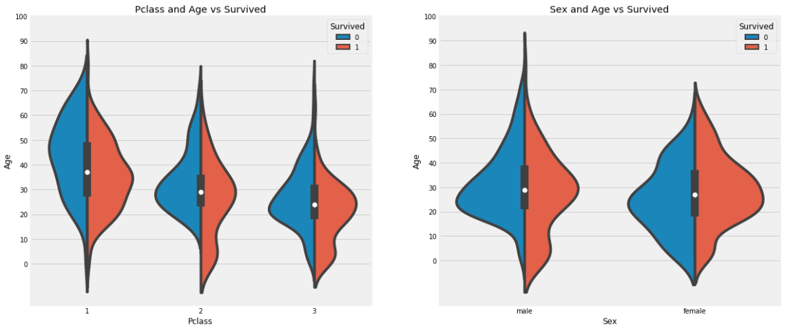
코드 분석
f,ax=plt.subplots(1,2,figsize=(18,8))
sns.violinplot(           # 여러 범주의 데이터의 밀도를 표현하기 좋은 그래프
    "Pclass",             # X 축
    "Age",                # Y 축
    hue="Survived",
    data=data,
    split=True,           # 'Survived' 값에 따라 양쪽으로 표현
    ax=ax[0])
plt.show()
-
해석
: 자녀 수는 3등급으로 갈수록 증가하며, 10세 이하의 어린 승객들의 생존율은 Pclass에 상관없이 높게 나타난다. -
문제
나이 변수에 177개의 결측치가 있다. 이를 채우기 위해 데이터셋의 평균 나이로 대체할 수 있다.
하지만 4세의 어린아이에게 평균 나이인 29세를 할당하는 것은 적절하지 않다. 승객이 어느 나이대에 속하는지 알아낼 방법이 있을까?
방법은 이름 특성을 확인하는 것이다. 이름에는 Mr, Mrs와 같은 호칭이 포함되어 있다. 따라서 Mr와 Mrs에 해당하는 그룹의 평균 나이를 각각 할당할 수 있다.
'Name' 컬럼에서 호칭 따오기
data['Initial']=0
for i in data:
    data['Initial']=data.Name.str.extract('([A-Za-z]+)\.')

data.head()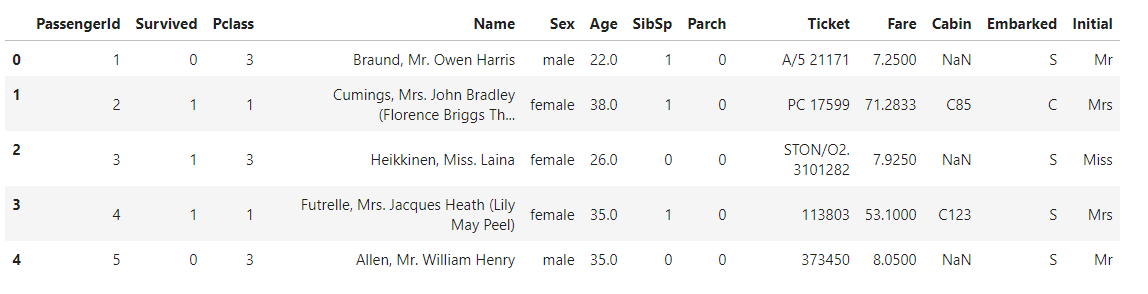
- 성별에 따른 이니셜 확인
pd.crosstab(data.Initial,data.Sex).T.style.background_gradient(cmap='summer_r')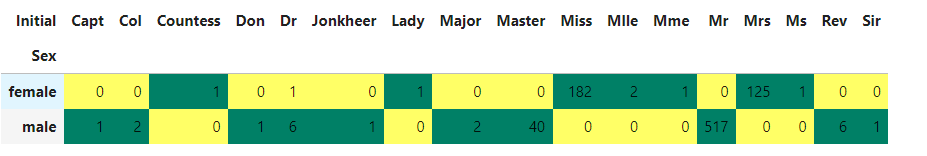
- 이니셜 통일 하고 이니셜에 따른 나이 평균 구하기
data['Initial'].replace(['Mlle','Mme','Ms','Dr','Major','Lady','Countess','Jonkheer','Col','Rev','Capt','Sir','Don'],['Miss','Miss','Miss','Mr','Mr','Mrs','Mrs','Other','Other','Other','Mr','Mr','Mr'],inplace=True)

data.groupby('Initial')['Age'].mean()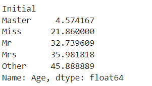
- 나이 결측치 채우기
data.loc[(data.Age.isnull())&(data.Initial=='Mr'),'Age']=33
data.loc[(data.Age.isnull())&(data.Initial=='Mrs'),'Age']=36
data.loc[(data.Age.isnull())&(data.Initial=='Master'),'Age']=5
data.loc[(data.Age.isnull())&(data.Initial=='Miss'),'Age']=22
data.loc[(data.Age.isnull())&(data.Initial=='Other'),'Age']=46- 결측치 데이터 없음 확인
data.Age.isnull().any()
- 그래프 그리기