
Matplotlib 소개
- 그래프 그려보기
import matplotlib.pyplot as ply

x = [1,2,3,4,5]
y = [1,2,3,4,5]
plt.plot(x,y)
import matplotlib.pyplot as ply
x = [1,2,3,4,5]
y = [1,2,3,4,5]
plt.plot(x,y)
plt.title("First plot")
plt.xlabel("x")
plt.xlabel("y")import matplotlib.pyplot as ply
x = [1,2,3,4,5]
y = [1,2,3,4,5]
fig, ax = plt.subplots()
ax.plot(x,y)
ax.title("First plot")
ax.xlabel("x")
ax.xlabel("y")- matplotlib 구조
Figure : 도화지
Axes : 그래프
Title : 제목
x,y label : 축 이름
line(line plot) : 선 그래프
Marker(scatter plot) : 선점도 그래프
Grid : 그래프 격자
Major tick : 큰 눈금
Minor tick : 작은 눈금
Legend : 범례
- 저장하기
import matplotlib.pyplot as ply

x = [1,2,3,4,5]
y = [1,2,3,4,5]
fig, ax = plt.subplots()
ax.plot(x,y)
ax.title("First plot")
ax.xlabel("x")
ax.xlabel("y")
fig.set_dpi(300)
fig.savefig("first_plot.png")- 여러개 그래프 그리기
x = np.linespace(0, np.pi*4, 100)
fig. axes = plt.subplots(2,1)
axes[0].plot(x, np.sin(x))
axes[1].plot(x, np.cos(x))
Matplotlib 그래프
- line plot
fig, ax = plt.subplots()
x = np.arange(15)
y = x ** 2
ax.plot(
	x,y,
    linestyle=":",
    marker="*",
    color="#524FA1"
)
- line style
x = np.arange(10)
fig, ax = plt.subplots()
ax.plot(x, x, linestyle="-") # solid
ax.plot(x, x+2, linestyle="--") # dashed
ax.plot(x, x+4, linestyle="-.") # dashdot
ax.plot(x, x+6, linestyle=":") # dotted
- Color
x = np.arange(10)
fig, ax = plt.subplots()
ax.plot(x, x, color="r")
ax.plot(x, x+2, color="green")
ax.plot(x, x+4, color="0.8")
ax.plot(x, x+6, color="#524FA1")
- Marker
x = np.arange(10)
fig, ax = plt.subplots()
ax.plot(x, x, marker=".")
ax.plot(x, x+2, marker="o")
ax.plot(x, x+4, marker="v")
ax.plot(x, x+6, marker="s")
ax.plot(x, x+8, marker="*")
- 축 경계 조정하기
x = np.linespace(0, 10, 1000)
fig, ax = plt.subplots()
ax.plot(x, np.sin(x))
ax.set_xlim(-2, 12) # -2 ~ 12
ax.set_ylim(-1.5, 1.5) # -1.5 ~ 1.5
- 범례
fig, ax = plt.subplots()
ax.plot(x, x, label='y=x')
ax.plot(x, x**2, label='y=x^2')
ax.xlabel("x")
ax.xlabel("y")
ax.legend(
	loc='upper right', # 위치
    shadow=True, # 그림자
    fancybox=True, # 테두리 모양
    borderpad=2 # 테두리 크기
)
Scatter
- Scatter
fig, ax = plt.subplots()
x = np.arange(10)
ax.plot(
	x, x**2, "o",
    markersize=15,
    markerfacecolor='white',
    markeredgecolor="blue"
)fig, ax = plt.subplots()
x = np.random.randn(50)
y = np.random.randn(50)
colors = np.random.randint(0, 100, 50)
sizes = 500 * np.pi * np.random.rand(50) ** 2
ax.scatter(
x,y, c=colors, s=sizes, alpha=0.3
)Bar & Histogram
- Bar plot
x = np.arange(10)
fig, ax = plt.subplots(figsize=(12, 4))
ax.bar(x, x*2)
x = np.random.rand(3)
y = np.random.rand(3)
z = np.random.rand(3)
data = [x,y,z]
fig, ax = plt.subplots()
x_ax = np.arange(3)
for i in x_ax:
ax.bar(x_ax, data[i],
bottom=np.sum(data[:i], axis=0)
ax.set_xticks(x_ax)
ax.set_xtickslabels(["A","B","C"])- Histogram
fig, ax = plt.subplots()
data = np.random.randn(1000)
ax.hist(data, bins=50)
Matplotlib with pandas
- Matplotlib with pandas
df = pd.read_csv("./president_heights.csv")
fig, ax = plt.subplots()
ax.plot(df["order"], df["height(cm)"], label="height")
ax.set_xlabel("order")
ax.set_ylabel("height(cm)")
fire = df[(df['Type 1']=='Fire' | ((df[Type 2'])=="Fire")]
water = df[(df['Type 1']=='Water' | ((df[Type 2'])=="Water")]
fig, ax = plt.subplots()
ax.scatter(fire['Attack'], fire['Defense'], color='R', label='Fire', marker="*", s=50)
ax.scatter(water['Attack'], water['Defense'], color='B', label='Water', marker="*", s=25)
ax.set_xlabel("Attack")
ax.set_ylabel("Defense")
ax.legend(loc="upper right")실습문제1. 토끼와 거북이 경주 결과 시각화
1초마다 토끼와 거북이의 위치를 기록
위치 데이터가 저장되어있는 csv파일을 읽어서 토끼와 거북이의 시간별 위치를 그래프로 시각화
from elice_utils import EliceUtils
from matplotlib import pyplot as plt
import pandas as pd

plt.rcParams["font.family"] = 'NanumBarunGothic'

elice_utils = EliceUtils()


# 아래 경로에서 csv파일을 읽어서 시각화 해보세요
# 경로: "./data/the_hare_and_the_tortoise.csv"
df = pd.read_csv("./data/the_hare_and_the_tortoise.csv")
print(df)

fig, ax = plt.subplots()
ax.plot(df['시간'],df['토끼'])
ax.plot(df['시간'],df['거북이'])

# 그래프를 확인하려면 아래 두 줄의 주석을 해제한 후 코드를 실행하세요.
fig.savefig("plot.png")
elice_utils.send_image("plot.png")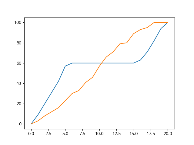
실습문제2. 월드컵 우승국가들 시각화
월드컵 우승국 데이터는 csv 파일로 저장
csv 파일을 읽어서 월드컵 우승국들의 빈도를 그래프로 시각화월드컵 국가 별 우승 횟수를 딕셔너리로 저장하여 해당 그래프를 출력
딕셔너리 데이터를 입력하여 그래프를 출력
코드의 ??? 부분을 채워 프로그램 완성
출력 예시
{'Uruguay': 2, 'Italy': 4, 'Germany FR': 3, 'Brazil': 5, 'England': 1, 'Argentina': 2, 'France': 1, 'Spain': 1, 'Germany': 1}
from elice_utils import EliceUtils
from matplotlib import pyplot as plt
import pandas as pd
elice_utils = EliceUtils()
plt.rcParams["font.family"] = 'NanumBarunGothic'


# 아래 경로에서 csv파일을 읽어서 시각화 해보세요
# 경로: "./data/WorldCups.csv"
df = pd.read_csv("./data/WorldCups.csv")    # 월드컵 정보를 담는 csv 파일을 읽어옵니다.
print(df)                                   # 어떤 자료를 갖는지 직접 확인해보세요!


winners = df['Winner']              # 읽어온 데이터 프레임 중 "우승국"을 의미하는 칼럼을 가져오세요.

# 국가 별 우승 횟수를 나타내는 딕셔너리 입니다.
winner_dict = {}


for i in winners :          # 우승국을 반복문으로 읽으며, 해당 국가의 우승 횟수를 1씩 증가시킵니다.
    if i in winner_dict :
        winner_dict[i] = winner_dict[i] + 1
        # i(우승국)이 이미 winner_dict에 있다면, value를 1 증가시킵니다.
    else :
        winner_dict[i] = 1
        # i(우승국)이 winner_dict에 최초로 등장한다면, value를 1로 설정합니다.

print(winner_dict)

X = list(winner_dict.keys())      # X축 변수, 즉 우승국을 나타냅니다.
Y = list(winner_dict.values())    # Y축 변수, 즉 우승 횟수를 나타냅니다.

fig, ax = plt.subplots(figsize=(8, 8))

# ax.plot(X, Y)

ax.bar(X, Y)

ax.set_xlabel("Country")
ax.set_ylabel("Number")

ax.set_xticks(X)

fig.savefig("Winner.png")
elice_utils.send_image("Winner.png")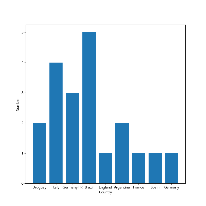

개발자 핏자의 로그들