Flutter_W5
Flutter_W5
5주차는 Scaffold, Drawer, MaterialApp class, BottomNavigationBar, SliverAppBar에 대해서 배운다.
-
Scaffold class
-
기본 머티리얼 디자인 시각적 레이아웃 구조를 구현한다.
-
This class provides APIs for showing drawers and bottom sheets.
-
persistent bottom sheet를 표시하려면
Scaffold.of를 통해 current BuildContext를 통해 ScaffoldState 를 얻고 ScaffoldState.showBottomSheet 함수 를 사용한다. -
아래 예제는 body와 FloatingActionButton이 있는 Scaffold를 보여준다.
-
The body is a Text placed in a Center in order to center the text within the Scaffold.
-
FloatingActionButton 은 카운터를 증가시키는 콜백에 연결되어 있다.
-
예제 살펴보기
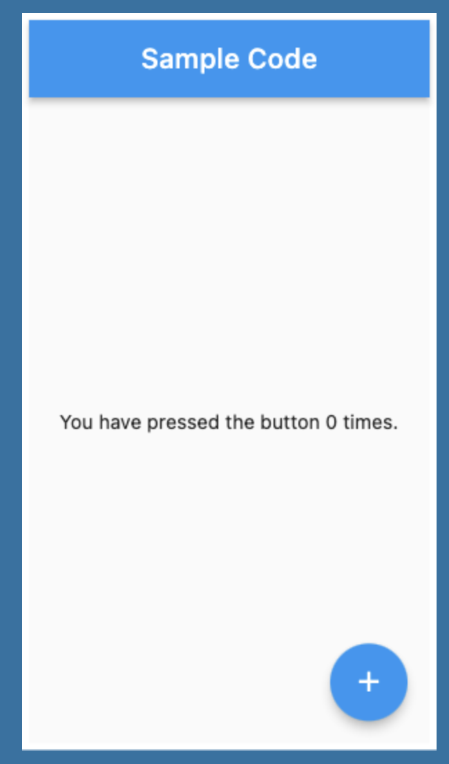
import 'package:flutter/material.dart'; void main() => runApp(const MyApp()); class MyApp extends StatelessWidget { const MyApp({super.key}); static const String _title = 'Flutter Code Sample'; Widget build(BuildContext context) { return const MaterialApp( title: _title, home: MyStatefulWidget(), ); } } class MyStatefulWidget extends StatefulWidget { const MyStatefulWidget({super.key}); State<MyStatefulWidget> createState() => _MyStatefulWidgetState(); } class _MyStatefulWidgetState extends State<MyStatefulWidget> { int _count = 0; Widget build(BuildContext context) { return Scaffold( appBar: AppBar( title: const Text('Sample Code'), ), body: Center(child: Text('You have pressed the button $_count times.')), floatingActionButton: FloatingActionButton( onPressed: () => setState(() => _count++), tooltip: 'Increment Counter', child: const Icon(Icons.add), ), ); } }
-
-
아래 예제는 AppBar, BottomAppBar, FloatingActionButton으로 이뤄진 Scaffold를 보여준다.
-
FloatingActionButton은 BottomAppBar에 FloatingActionButtonLocation.centerDocked으로 중앙에 고정되어 있다.
-
예제 살펴보기

import 'package:flutter/material.dart'; void main() => runApp(const MyApp()); class MyApp extends StatelessWidget { const MyApp({super.key}); static const String _title = 'Flutter Code Sample'; Widget build(BuildContext context) { return const MaterialApp( title: _title, home: MyStatefulWidget(), ); } } class MyStatefulWidget extends StatefulWidget { const MyStatefulWidget({super.key}); State<MyStatefulWidget> createState() => _MyStatefulWidgetState(); } class _MyStatefulWidgetState extends State<MyStatefulWidget> { int _count = 0; Widget build(BuildContext context) { return Scaffold( appBar: AppBar( title: const Text('Sample Code'), ), body: Center( child: Text('You have pressed the button $_count times.'), ), bottomNavigationBar: BottomAppBar( shape: const CircularNotchedRectangle(), child: Container(height: 50.0), ), floatingActionButton: FloatingActionButton( onPressed: () => setState(() { _count++; }), tooltip: 'Increment Counter', child: const Icon(Icons.add), ), floatingActionButtonLocation: FloatingActionButtonLocation.centerDocked, ); } }
-
-
-
Drawer
A Material Design panelthat slides in horizontallyfrom the edge of a [Scaffold](https://api.flutter.dev/flutter/material/Scaffold-class.html)toshow navigation links in an application.- Drawers are typically used with
the [Scaffold.drawer](https://api.flutter.dev/flutter/material/Scaffold/drawer.html) property. - The child of the drawer
is usually a [ListView](https://api.flutter.dev/flutter/widgets/ListView-class.html)whosefirst child is a [DrawerHeader](https://api.flutter.dev/flutter/material/DrawerHeader-class.html)that displays status information about the current user. - The remaining drawer children are
often constructed with [ListTile](https://api.flutter.dev/flutter/material/ListTile-class.html)s,often concluding with an [AboutListTile](https://api.flutter.dev/flutter/material/AboutListTile-class.html). - 예제보기 https://flutter.github.io/assets-for-api-docs/assets/material/drawer.mp4
Scaffold(
  appBar: AppBar(
    title: const Text('Drawer Demo'),
  ),
  drawer: Drawer(
    child: ListView(
      padding: EdgeInsets.zero,
      children: const <Widget>[
        DrawerHeader(
          decoration: BoxDecoration(
            color: Colors.blue,
          ),
          child: Text(
            'Drawer Header',
            style: TextStyle(
              color: Colors.white,
              fontSize: 24,
            ),
          ),
        ),
        ListTile(
          leading: Icon(Icons.message),
          title: Text('Messages'),
        ),
        ListTile(
          leading: Icon(Icons.account_circle),
          title: Text('Profile'),
        ),
        ListTile(
          leading: Icon(Icons.settings),
          title: Text('Settings'),
        ),
      ],
    ),
  ),
)
-
MaterialApp class
-
머티리얼 디자인을 사용하는 응용 프로그램이다.
-
Material Design 애플리케이션에 일반적으로 필요한 여러 위젯을 wraps하는 편리한 위젯이다.
-
AnimatedTheme 및 GridPaper 와 같은 머티리얼 디자인 관련 기능을 추가 하여 WidgetsApp 을 기반으로 한다.
-
MaterialApp은 다음 순서로 경로를 검색하여 top-level Navigator를 구성한다.
/경로의 경우 null이 아닌 경우 홈 속성이 사용한다.- 그렇지 않고 경로에 대한 항목이 있는 경우 경로 테이블이 사용된다.
- 그렇지 않으면 onGenerateRoute 가 호출된다(제공된 경우). home 및 route 에서 처리하지 않는 유효한 경로 에 대해 null이 아닌 값을 반환해야 한다.
- 마지막으로 다른 모든 것이 실패하면 onUnknownRoute 가 호출된다.
- 아래 예제에서는 앱이 시작될 때 표시될 홈 경로가 있는 "디버그" 배너를 비활성화 하는 MaterialApp 을 만드는 방법을 보여준다.

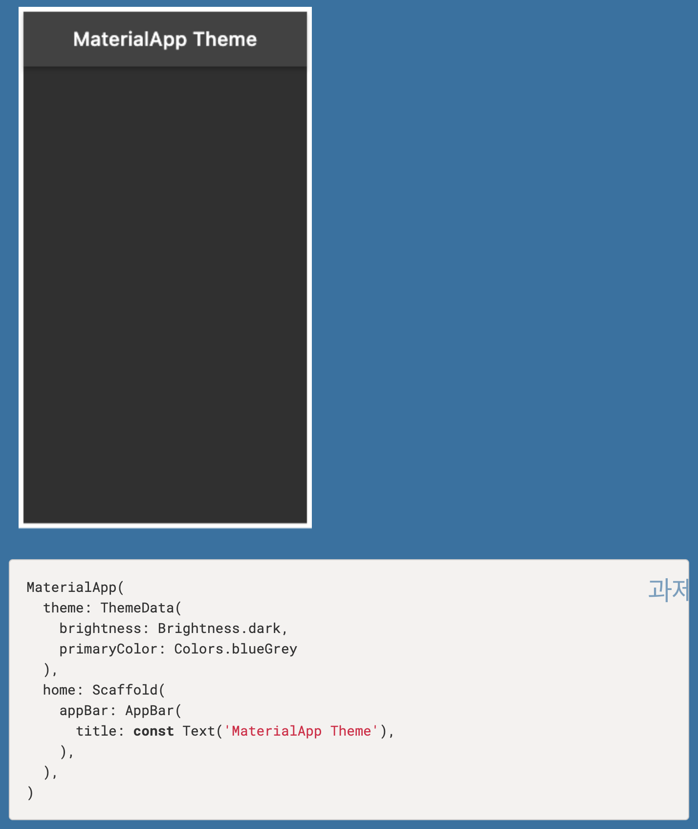
- 그 다음 예제에서는 앱의 머티리얼 위젯에 사용할 테마 를 정의하는 MaterialApp 을 만드는 방법을 보여준다.
-
-
BottomNavigationBar
-
BottomNavigationBar는 multiple items in the form of text labels, icons, 혹은 both, laid out on top of a piece of material 등으로 구성됩니다.
-
item은 적어도 2개 이상이어야 하며 각 항목의 아이콘과 제목/라벨은 null이 아니어야 합니다.
-
예제보기
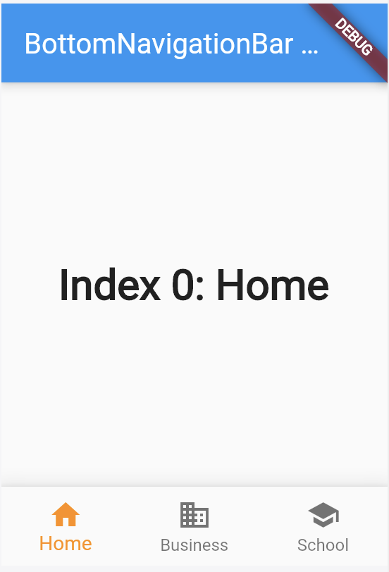
import 'package:flutter/material.dart'; void main() => runApp(const MyApp()); class MyApp extends StatelessWidget { const MyApp({super.key}); static const String _title = 'Flutter Code Sample'; Widget build(BuildContext context) { return const MaterialApp( title: _title, home: MyStatefulWidget(), ); } } class MyStatefulWidget extends StatefulWidget { const MyStatefulWidget({super.key}); State<MyStatefulWidget> createState() => _MyStatefulWidgetState(); } class _MyStatefulWidgetState extends State<MyStatefulWidget> { int _selectedIndex = 0; static const TextStyle optionStyle = TextStyle(fontSize: 30, fontWeight: FontWeight.bold); static const List<Widget> _widgetOptions = <Widget>[ Text( 'Index 0: Home', style: optionStyle, ), Text( 'Index 1: Business', style: optionStyle, ), Text( 'Index 2: School', style: optionStyle, ), ]; void _onItemTapped(int index) { setState(() { _selectedIndex = index; }); } Widget build(BuildContext context) { return Scaffold( appBar: AppBar( title: const Text('BottomNavigationBar Sample'), ), body: Center( child: _widgetOptions.elementAt(_selectedIndex), ), bottomNavigationBar: BottomNavigationBar( items: const <BottomNavigationBarItem>[ BottomNavigationBarItem( icon: Icon(Icons.home), label: 'Home', ), BottomNavigationBarItem( icon: Icon(Icons.business), label: 'Business', ), BottomNavigationBarItem( icon: Icon(Icons.school), label: 'School', ), ], currentIndex: _selectedIndex, selectedItemColor: Colors.amber[800], onTap: _onItemTapped, ), ); } }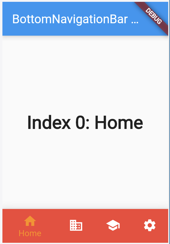
import 'package:flutter/material.dart'; void main() => runApp(const MyApp()); class MyApp extends StatelessWidget { const MyApp({super.key}); static const String _title = 'Flutter Code Sample'; Widget build(BuildContext context) { return const MaterialApp( title: _title, home: MyStatefulWidget(), ); } } class MyStatefulWidget extends StatefulWidget { const MyStatefulWidget({super.key}); State<MyStatefulWidget> createState() => _MyStatefulWidgetState(); } class _MyStatefulWidgetState extends State<MyStatefulWidget> { int _selectedIndex = 0; static const TextStyle optionStyle = TextStyle(fontSize: 30, fontWeight: FontWeight.bold); static const List<Widget> _widgetOptions = <Widget>[ Text( 'Index 0: Home', style: optionStyle, ), Text( 'Index 1: Business', style: optionStyle, ), Text( 'Index 2: School', style: optionStyle, ), Text( 'Index 3: Settings', style: optionStyle, ), ]; void _onItemTapped(int index) { setState(() { _selectedIndex = index; }); } Widget build(BuildContext context) { return Scaffold( appBar: AppBar( title: const Text('BottomNavigationBar Sample'), ), body: Center( child: _widgetOptions.elementAt(_selectedIndex), ), bottomNavigationBar: BottomNavigationBar( items: const <BottomNavigationBarItem>[ BottomNavigationBarItem( icon: Icon(Icons.home), label: 'Home', backgroundColor: Colors.red, ), BottomNavigationBarItem( icon: Icon(Icons.business), label: 'Business', backgroundColor: Colors.green, ), BottomNavigationBarItem( icon: Icon(Icons.school), label: 'School', backgroundColor: Colors.purple, ), BottomNavigationBarItem( icon: Icon(Icons.settings), label: 'Settings', backgroundColor: Colors.pink, ), ], currentIndex: _selectedIndex, selectedItemColor: Colors.amber[800], onTap: _onItemTapped, ), ); } }
-
-
SliverAppBar
- A Material Design app bar that integrates with a CustomScrollView.
- SliverAppBar는 CustomScrollView 의 첫 번째 자식으로 사용된다. https://youtu.be/R9C5KMJKluE
- 예제보기
- This is an example that could be included in a CustomScrollView's CustomScrollView.slivers list:
SliverAppBar(
  expandedHeight: 150.0,
  flexibleSpace: const FlexibleSpaceBar(
    title: Text('Available seats'),
  ),
  actions: <Widget>[
    IconButton(
      icon: const Icon(Icons.add_circle),
      tooltip: 'Add new entry',
      onPressed: () { /* ... */ },
    ),
  ]
)
import 'package:flutter/material.dart'; void main() => runApp(const AppBarApp()); class AppBarApp extends StatelessWidget { const AppBarApp({super.key}); Widget build(BuildContext context) { return const MaterialApp( home: SliverAppBarExample(), ); } } class SliverAppBarExample extends StatefulWidget { const SliverAppBarExample({super.key}); State<SliverAppBarExample> createState() => _SliverAppBarExampleState(); } class _SliverAppBarExampleState extends State<SliverAppBarExample> { bool _pinned = true; bool _snap = false; bool _floating = false; // [SliverAppBar]s are typically used in [CustomScrollView.slivers], which in // turn can be placed in a [Scaffold.body]. Widget build(BuildContext context) { return Scaffold( body: CustomScrollView( slivers: <Widget>[ SliverAppBar( pinned: _pinned, snap: _snap, floating: _floating, expandedHeight: 160.0, flexibleSpace: const FlexibleSpaceBar( title: Text('SliverAppBar'), background: FlutterLogo(), ), ), const SliverToBoxAdapter( child: SizedBox( height: 20, child: Center( child: Text('Scroll to see the SliverAppBar in effect.'), ), ), ), SliverList( delegate: SliverChildBuilderDelegate( (BuildContext context, int index) { return Container( color: index.isOdd ? Colors.white : Colors.black12, height: 100.0, child: Center( child: Text('$index', textScaleFactor: 5), ), ); }, childCount: 20, ), ), ], ), bottomNavigationBar: BottomAppBar( child: Padding( padding: const EdgeInsets.all(8), child: OverflowBar( overflowAlignment: OverflowBarAlignment.center, children: <Widget>[ Row( mainAxisSize: MainAxisSize.min, children: <Widget>[ const Text('pinned'), Switch( onChanged: (bool val) { setState(() { _pinned = val; }); }, value: _pinned, ), ], ), Row( mainAxisSize: MainAxisSize.min, children: <Widget>[ const Text('snap'), Switch( onChanged: (bool val) { setState(() { _snap = val; // Snapping only applies when the app bar is floating. _floating = _floating || _snap; }); }, value: _snap, ), ], ), Row( mainAxisSize: MainAxisSize.min, children: <Widget>[ const Text('floating'), Switch( onChanged: (bool val) { setState(() { _floating = val; _snap = _snap && _floating; }); }, value: _floating, ), ], ), ], ), ), ), ); } }
- This is an example that could be included in a CustomScrollView's CustomScrollView.slivers list:
